


 "Olen todella tyytyväinen: vedokset ovat kauniita ja toimitus oli nopea."
 "Laaja vintagejulisteiden valikoima"
 "Piilotettu helmi taiteen ystäville"
"Olen todella tyytyväinen: vedokset ovat kauniita ja toimitus oli nopea."
"Laaja vintagejulisteiden valikoima"
"Piilotettu helmi taiteen ystäville"
"Olen todella tyytyväinen: vedokset ovat kauniita ja toimitus oli nopea."
"Laaja vintagejulisteiden valikoima"
"Piilotettu helmi taiteen ystäville"
"Olen todella tyytyväinen: vedokset ovat kauniita ja toimitus oli nopea."
"Laaja vintagejulisteiden valikoima"
"Piilotettu helmi taiteen ystäville"

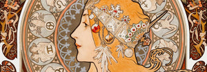

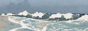
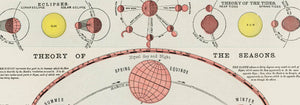
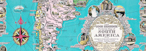





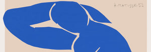

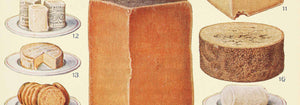
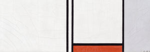
- Maantieteellinen opas naisen sydämeen Juliste
- Lissabonin kukkatori Juliste
- Olut ja savuke Juliste
- Campari Soda Juliste
- Portugali tänään Juliste
- The New Yorker -juliste
- Snoopy tulee kotiin juliste
- Münchenin eläintarhan juliste
- Pelastetaan valaat Juliste
- Papiers découpés 3 -juliste
- Herää ja lue Juliste
- Marihuana Juliste
- Barcelonan kukkatorijuliste
- Cordial Campari -juliste
- Porto Ramos-Pinto Juliste
- Le Voyage de Babar -juliste
- Matisse · tanssivat hahmot juliste
- Falbalas et fanfreluches: Laiskuus Juliste
- Juo Coca-Cola Juliste
- Babar autossa Juliste
- Solaris Juliste
- Sigmund Freud -juliste
- Panteri-juliste
- Grands Prix de France -juliste
- Barcelonatekstijuliste
- Kolmivärinen ilmapallo Juliste
- Bauhausjuliste 6
- Pink Pantherin kosto Juliste
- Unelma juliste
- Bauhaus Juliste 2
- Bauhaus 11 Juliste
- Babar ja perhe Juliste
- Babarin tarina Juliste
- Bauhaus Juliste 10
- Leikekollaasi 1 Juliste
- Mickey lukee -juliste
- Mikki Hiiri juliste
- Bauhaus 17 Juliste
- Vertigojuliste
- Brasilia 2 Juliste
- Musta leopardi juliste
- Louis Armstrongin esiintyminen Juliste
- Dracula-juliste
- Moderni riikinkukkojuliste Juliste
- Louis Armstrongin esiintyminen 2 Juliste
- Jet Clipper Havaijille Juliste
- Mars Juliste
- Loputon kesä Juliste
-

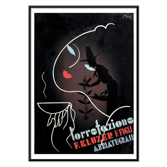
Torrefazione F.Kluzer Juliste
Carlo Piquillo Pandolfi · 1930 · italialainen Art Deco kahvijuliste, jossa rohkea kuppi ja geometriset väripinnat
Juliste €9 · Kehystetty €16
-


Kuningas Pausolen seikkailut Juliste
Umberto Brunelleschi · 1935 · art deco -tyylinen eroottinen juliste, jäinen sininen ja pehmeä vaaleanpunainen sävymaailma
Juliste €9 · Kehystetty €16
-


Vapaudenpatsasjuliste
J. C. Leyendecker · 1918 · isänmaallinen vapaudenpatsasjuliste auringonsäteillä ja tyylitellyillä meriaalloilla
Juliste €9 · Kehystetty €16
-

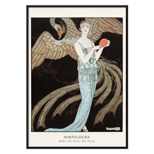
Sortilèges Juliste
George Barbier · 1922 · elegantti Art Deco -muotijuliste jossa virtaava sininen iltapuku ja majesteettinen joutsen
Juliste €9 · Kehystetty €16
-


Suositut luennot ihmisen luonnosta juliste
Tuntematon taiteilija · 1854 · yksityiskohtainen frenologiajuliste, jossa ihmisen kyvyt kartoitetaan profiilipäässä ja vintage-henki sekä graafinen ilmaisu sopivat sisustukseen
Juliste €9 · Kehystetty €16
-


Missä itä on itä Juliste
Eric Rohman · 1929 · dramaattinen elokuvajuliste Lupe Velezistä soittamassa kielisoitinta punaisissa ja keltaisissa sävyissä
Juliste €9 · Kehystetty €16
-


Mies joka saa läimäyksen Juliste
Eric Rohman · 1925 · voimakas mykkäelokuvan klovnijuliste mustan valkoisen punaisen ja sinisen kontrasteilla tyylillä
Juliste €9 · Kehystetty €16
-

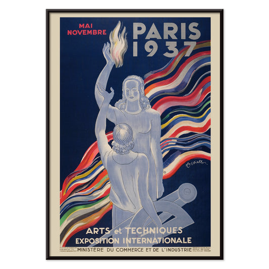
Exposition Internationale des Arts et Techniques -juliste
Leonetto Cappiello · 1937 · juhlava Art Deco -juliste voimakkaalla hahmolla ja Pariisin typografialla
Juliste €9 · Kehystetty €16
-


Cocoanuts -juliste
Eric Rohman · 1929 · art deco -uimaria esittävä elokuvajuliste vahvoin rannikkovärein
Juliste €9 · Kehystetty €16
-

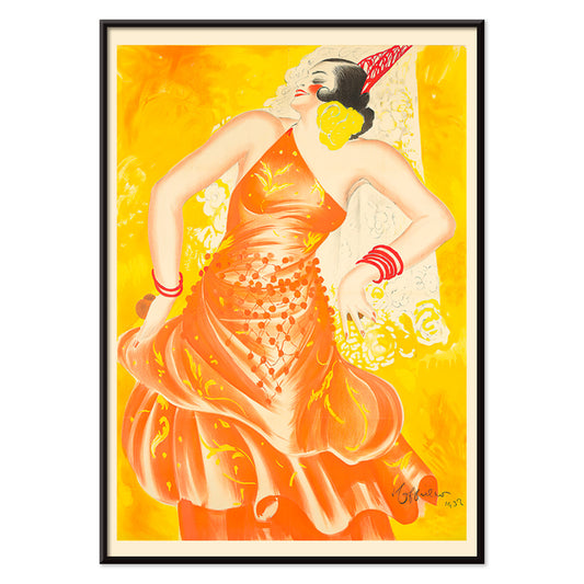
Conchita Supervia Juliste
Leonetto Cappiello · 1932 · voimakas oopperalaulajajuliste rohkeilla punaisen ja keltaisen sävyillä syvää mustaa vasten
Juliste €9 · Kehystetty €16
-

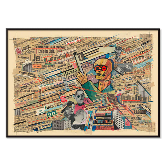
Poliittinen kollaasityö Juliste
Karl Wiener · 1938 · jännittynyt sanomalehtikollaasi, jossa kerrostetut otsikot ja voimakkaat symbolit kuvaavat sodan ennakkoa
Juliste €9 · Kehystetty €16
-


dekkarilehtijuliste
Winold Reiss · 1930 · draamaa huokuva dekkarijuliste voimakkailla punaisilla ja sinisillä korostuksilla ja noirtunnelmalla
Juliste €9 · Kehystetty €16
-


Tsaarin valokuvan otto Juliste
Lanny Sommese · 1983 · surrealistinen konseptijuliste jossa valtava korva ja pieni valokuvaaja voimakkaassa kontrastissa
Juliste €9 · Kehystetty €16
-


Opiskelijoiden taidenäyttely Juliste
Lanny Sommese · 1979 · surrealistinen näyttelyjuliste mustan ja beigen sävyissä, katedraalimainen siluetti easelien muodostamana
Juliste €9 · Kehystetty €16
-


Vesivuoristorata Juliste
Georges Meunier · 1895 · eläväinen Belle Époque -tyylinen ja retrohenkinen juliste vesivuoristoradasta kirkkaansinisin sävyin
Juliste €9 · Kehystetty €16
-


Le Gaulois artistique Juliste
Tuntematon taiteilija · 1929 · vaikuttava vintagejuliste liekkitukkaisesta hahmosta ja voimakkaasta mustasta typografiasta joka erottuu keltaisella taustalla
Juliste €9 · Kehystetty €16
-


The Platters (1955) Juliste
Tuntematon taiteilija · 1955 · retro yhtyejuliste jossa esiintyjien siluetit keltaisella taustalla ja voimakas kontrasti
Juliste €9 · Kehystetty €16
-


kirjojen mies Juliste
Moriz Jung · 1911 · oivaltava wieniläinen kahvilajuliste yksinäisestä lukijasta voimakkaissa tasaväreissä ja selkeissä muodoissa
Juliste €9 · Kehystetty €16
-


Punaiset lehdet Yunoyama Onsen Juliste
Osaka and Nagoya Rail Agency · 1930 · tyylitelty syysjuliste karminpunaisine vaahteranlehtineen kutsuu rentoutumiseen luontoon
Juliste €9 · Kehystetty €16
-


Jupiter Inlet -majakkajuliste
Tuntematon taiteilija · 2012 · vintagehenkinen majakkajuliste hehkuvalla auringonlaskulla ja lahdenpeileillä
Juliste €9 · Kehystetty €16
-

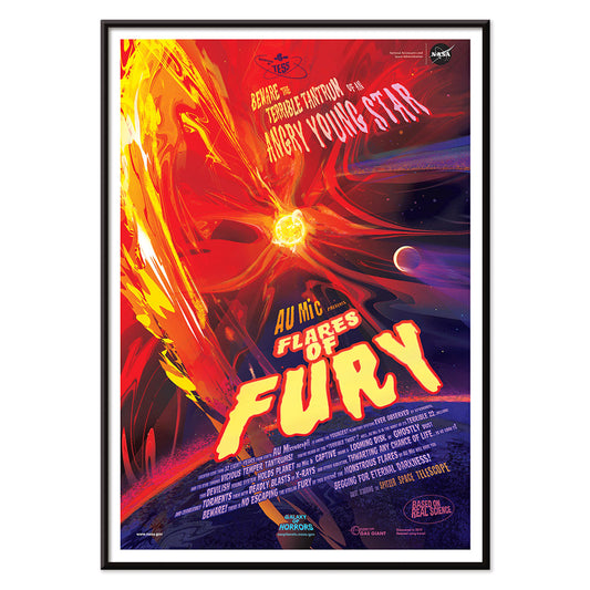
Raivon purkaukset Juliste
NASA · 2012 · räjähtävä auringonpurkajuliste liekehtivin kaarineen säteilevästä tähdestä syvässä avaruudessa voimakkaan kirkas värimaailma
Juliste €9 · Kehystetty €16
-

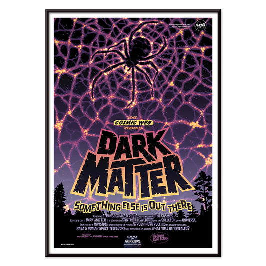
Pimeäainejuliste
NASA · 2016 · kosminen hämähäkinverkkojuliste jossa neonlangat sulautuvat syvän avaruuden pimeyteen
Juliste €9 · Kehystetty €16
-


Zombimaailmatjuliste
NASA · 2017 · aavemainen avaruusjuliste jossa planeetat kiertävät pulsaria vahvoin sinisin ja vihrein sätein
Juliste €9 · Kehystetty €16
-


Alkoholinvastainen juliste
Dominion Scientific Temperance Committee · 1912 · opettava raittiusjuliste, jossa tee ja kahvi esitellään turvallisina arjen piristeinä
Juliste €9 · Kehystetty €16
-


Raittius 1912 Juliste
Dominion Scientific Temperance Committee · 1912 · raittiusjuliste jossa moderni elämä ja pulloasetelma kontrastoidaan voimakkaasti
Juliste €9 · Kehystetty €16
-


Ranskalaiset kaiverrukset Juliste
Tuntematon taiteilija · 1785 · lempeä vintagejuliste naisesta lukemassa ikkunan ääressä pehmeissä sävyissä
Juliste €9 · Kehystetty €16
-


Pimeä energia Juliste
NASA · 2021 · vaikuttava avaruusolentojuliste neonvihrein ja keltamaisin yksityiskohdin syvän mustan taustan päällä
Juliste €9 · Kehystetty €16
-


paahdettu planeettajuliste
NASA · 2021 · dramaattinen paahdettu planeettajuliste joka hehkuu intensiivisin oranssin ja sinisen sävyin katseenvangitsijana
Juliste €9 · Kehystetty €16
-


Pelléas et Mélisande Juliste
Choudens · 1902 · unenomaisen oopperajulisteen kuva kahdesta rakastavaisesta joen sumuisella rannalla ajattomassa monokromissa
Juliste €9 · Kehystetty €16
-


Lontoon Big Ben -juliste
Dixon Scott · 1926 · sepiasävyinen lontoon siluettijuliste jossa Big Ben ja parlamentin talot Thamesin yllä
Juliste €9 · Kehystetty €16
-


Salsbourgin nykymusiikkifestivaalijuliste
Edmund Dulac · 1924 · myyttinen kentaurijuliste jossa lyyra voimakas mustavalkoinen kontrasti ja runollinen ilmaisu
Juliste €9 · Kehystetty €16
-

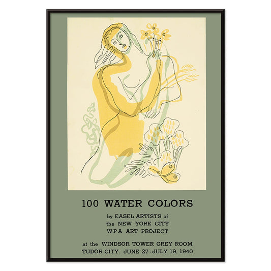
100 akvarellia juliste
WPA Art Project · 1940 · modernistinen juliste jossa tyylitelty nainen kukkien kanssa voimakkaissa keltaisissa ja vihreissä sävyissä
Juliste €9 · Kehystetty €16
-

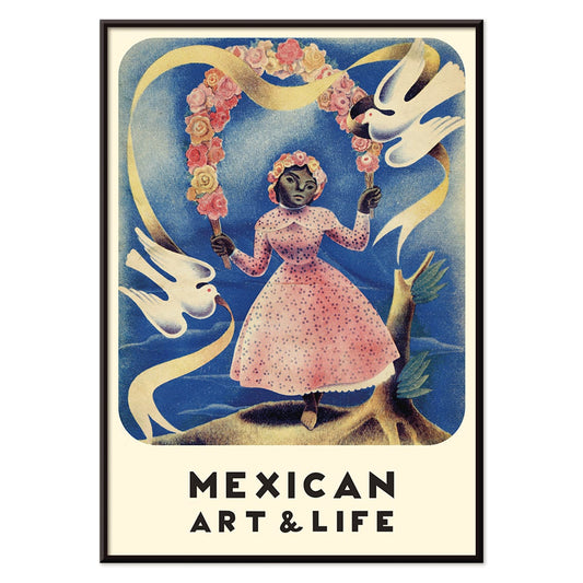
Mexican Art & Life 2 Juliste
Tuntematon taiteilija · 1938 · vintagejuliste aikakauslehden kansikuva tytöstä vaaleanpunaisessa mekossa joka pitää valkoisia kyyhkyjä
Juliste €9 · Kehystetty €16
-

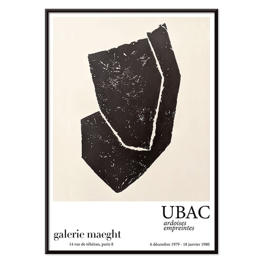
Ardoises Empreintes Juliste
Raoul Ubac · 1979 · abstrakti juliste jossa kaiverretun liuskekiven tekstuureja ja varjostuneita orgaanisia muotoja
Juliste €9 · Kehystetty €16
-

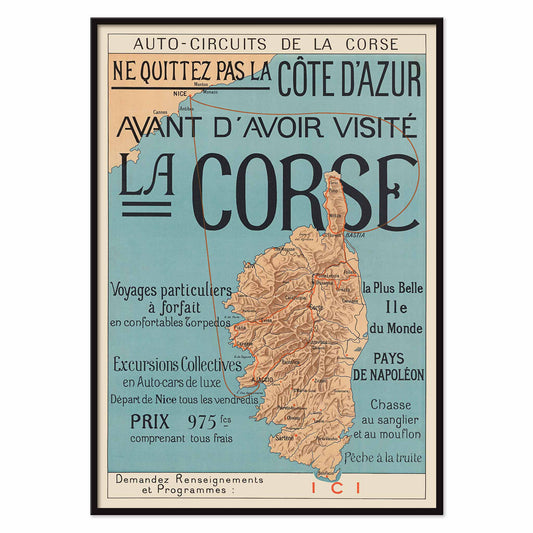
Vieraile Korsikalla Juliste
Tuntematon taiteilija · 1922 · Korsikan matkailujulisteessa punaiset autoreitit halkovat vuoristoista saarta sinivihreän meren keskellä
Juliste €9 · Kehystetty €16
-

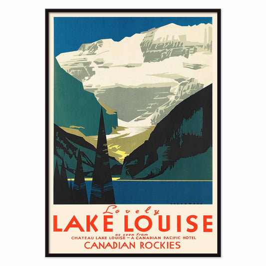
Lovely Lake Louise Juliste
Tuntematon taiteilija · 1950 · Kanadan Kalliovuorten matkajulisteessa lumiset huiput kohoavat sinisen järven ja tummien mäntyjen yllä
Juliste €9 · Kehystetty €16
-

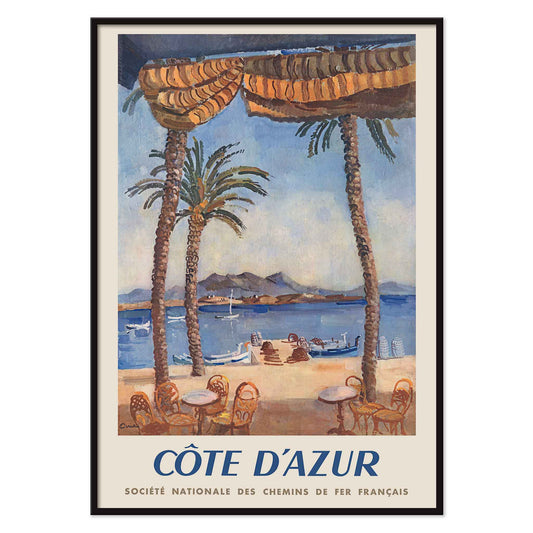
Rautateitse Ranskan Rivieralle Juliste
Edmond Céria · 1951 · Ranskan Rivieran matkajuliste turkoosista lahdesta, korkeista palmuista ja okranvärisistä päivänvarjoista
Juliste €9 · Kehystetty €16
-

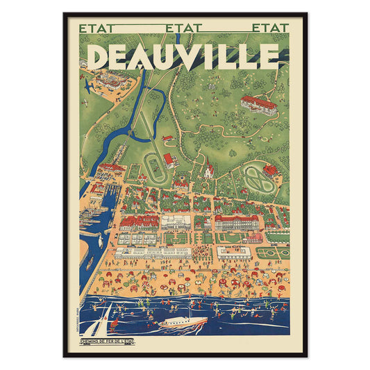
Junamatka Deauvilleen Juliste
Tuntematon taiteilija · 1931 · kuvitettu Deauvillen matkajuliste näyttää vilkkaan rannan vehreän, kumpuilevan rannikkomaiseman ja sataman äärellä
Juliste €9 · Kehystetty €16
-


La Loïe Fuller -juliste
Jean de Paléologue · 1897 · sähköinen henkeäsalpaava serpentiinidanssijuliste, keltainen liehuva kangas mustaa taustaa vasten
Juliste €9 · Kehystetty €16
-


Brumaire Juliste
Armand Vallée · 1922 · elegantti syksyinen juliste jossa itsevarma nainen ja pyörteileviä lehtiä lämpimissä oranssin ja ruskean sävyissä
Juliste €9 · Kehystetty €16
-


Nainen sateenvarjolla Juliste
Edward Penfield · 1897 · hienostunut muotijuliste naisesta sateenvarjon kanssa sinisessä ja beigessä, elegantti ja ajaton seinätaide
Juliste €9 · Kehystetty €16
-


Aja Stearnsilla ja ole tyytyväinen Juliste
Edward Penfield · 1896 · ikoninen pyöräilyn mainosjuliste tyylikkäällä pyöräilijällä ja selkeällä typografialla, ajaton vintageestetiikka
Juliste €9 · Kehystetty €16
-


Ivens & Co. juliste
Johann Georg van Caspel · 1899 · artnouveaujuliste hillityillä sinisillä ja keltaisilla kontrasteilla elegantilla ja graafisella otteella
Juliste €9 · Kehystetty €16
-


Taikurien prinssi Juliste
Springer and Welty Lith · 1910 · loistelias taikurijuliste jossa lepäävä viettelijä, vesipiippu ja tiikerinmatto
Juliste €9 · Kehystetty €16
-


Barcelonan bussiliput Juliste
Tuntematon taiteilija · 1972 · värikäs Barcelonan bussilippujuliste järjestetty graafiseksi ruudukoksi joka herättää nostalgisia muistoja
Juliste €9 · Kehystetty €16
-


Le Capitaine Corcoran Juliste
Vincent Lorant-Heilbronn · 1902 · juhlava teatterijuliste jossa tanssijat piirittävät nuotion ja koristeet hehkuvat Art Nouveau -tyyliin
Juliste €9 · Kehystetty €16
-


Kielonoksajuliste
Léo Fontan · 1905 · art nouveau -tyylinen kielojuliste, elegantti naishahmo ja selkeä typografia, vintagehenkinen tunnelma
Juliste €9 · Kehystetty €16
-


Yleistajuinen tiede Juliste
F. Sagristá · 1915 · elegantti Art Nouveau -taidejuliste, säteilevä hahmo soihtua ja laakeria pitelemässä
Juliste €9 · Kehystetty €16
-


Quartier Latin -juliste
Louis Rhead · 1890 · eloisa Art Nouveau -juliste naisartistista ja voimakkaista väreistä
Juliste €9 · Kehystetty €16
-


Jantzen Juliste
Joseph Binder · 1952 · energinen ja värikäs laskettelujuliste, jossa tyylitelty pariskunta leikkaa rohkeiden alppimuotojen läpi
Juliste €9 · Kehystetty €16
-


Pétrole Stella Juliste
Henri Boulanger · 1897 · unenomaisen art nouveau -juliste, siivekäs muusa mainostamassa Pétrole Stella
Juliste €9 · Kehystetty €16
-

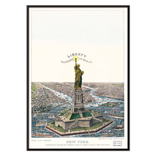
Bartholdin suuri patsas Juliste
Currier & Ives · 1885 · isänmaallinen New Yorkin satamajuliste, jossa Bartholdin patsas ja vilkas höyrylaivaliikenne
Juliste €9 · Kehystetty €16
-


Vaikuttava painatus juliste
Sam Maitin · 1962 · abstrakti juliste rohkealla mustalla geometrialla, johon punaiset ja keltaiset yksityiskohdat tuovat energiaa
Juliste €9 · Kehystetty €16
-


kaksikymmentäviisi alastonta juliste
Eric Gill · 1951 · minimalistinen alastonhahmojuliste jossa kaksikymmentäviisi mustalinjaista studiota ruudukossa
Juliste €9 · Kehystetty €16
-


Follies of 1930 -juliste
Eric Rohman · 1930 · art deco -juliste jossa tyyliteltyjä tanssijoita ja muusikoita vahvoissa perusväreissä
Juliste €9 · Kehystetty €16
-


Suojelu ympäri vuoden Juliste
U.S. Information Agency · 1953 · luontoteemainen terävä suojelujuliste, jossa värikkäitä lintuja rehevän puun oksilla
Juliste €9 · Kehystetty €16
-

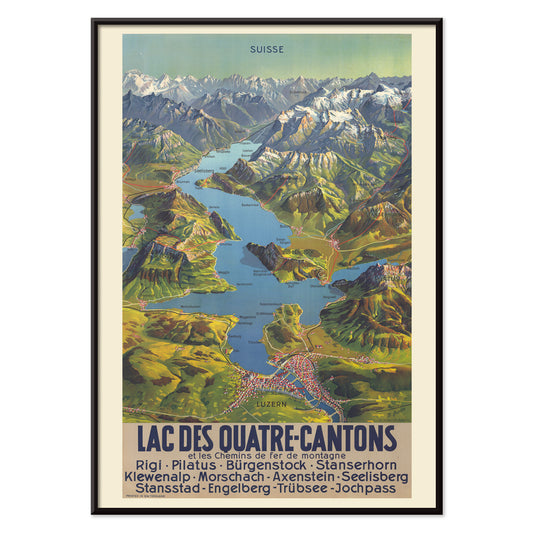
Luzerninjärvi Juliste
M. Bieder · 1935 · sveitsiläinen Luzerninjärven karttajuliste kirkkaan sinisellä järvellä, tyylitellyillä vuorimuodostelmilla ja selkeällä typografialla retrovaikutelmalla
Juliste €9 · Kehystetty €16
-


Automobile Club Belgique Juliste
Georges Gaudy · 1898 · dynaaminen kilpajuliste punaiseen verhoutuneella hahmolla ja ajanlaskijan symboliikalla mielikuvituksellisella tunnelmalla
Juliste €9 · Kehystetty €16
-


Moullot Marseille Juliste
E. Roux · 1900 · elegantti Art Nouveau -juliste, jossa kukkakruunussa oleva nainen ja Marseille -tekstitys
Juliste €9 · Kehystetty €16
-


Kirjat ovat parhaat lahjat Juliste
Edward Arthur Wilson · 1927 · leikkisä kirjaharrastajajuliste, lukijoita maapallon päällä ja tähtikuvioita
Juliste €9 · Kehystetty €16
-

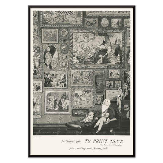
Printklubi Juliste
Arnold Roston · 1960 · voimakas kontrastinen mustavalkoinen juliste rohkealla typografialla juhlistaa vedostuskulttuuria
Juliste €9 · Kehystetty €16
-

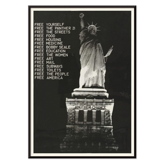
Vapauttakaa pantteri Juliste
Tuntematon taiteilija · 1971 · voimakas mustavalkoinen protestijuliste jossa vapaudenpatsas ja vapauttakaa pantteriteksti
Juliste €9 · Kehystetty €16
-

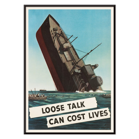
Kevyt puhe voi maksaa ihmishenkiä Juliste
Stevan Dohanos · 1942 · dramaattinen sotaaikainen juliste jossa uppoava laiva, selkeä varoitusteksti ja vaikuttava sininen värimaailma
Juliste €9 · Kehystetty €16
-


Lippincott Juliste
William Carqueville · 1895 · rauhallinen belle époque -ajan juliste naisesta lukemassa veden äärellä sinisin sävyin
Juliste €9 · Kehystetty €16
-

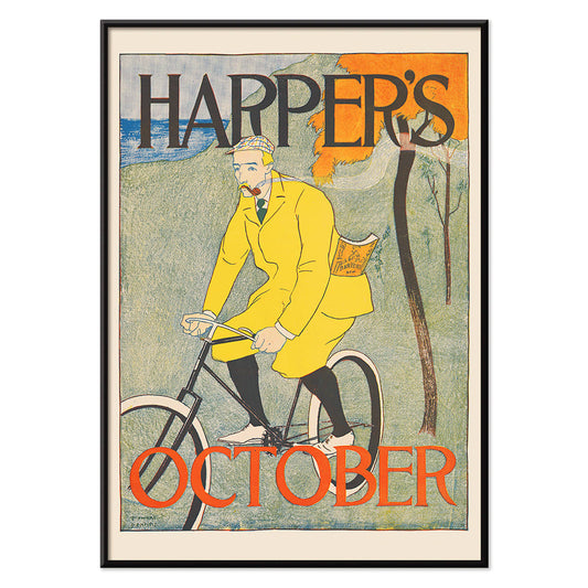
Harperin lokakuu Juliste
Edward Penfield · 1894 · syksyinen pyöräilijäjuliste voimakkailla tasaisilla väreillä ja käsinkirjoitetulla Harper's Magazine tekstillä
Juliste €9 · Kehystetty €16
-

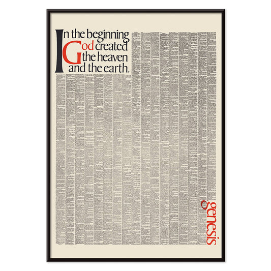
Alussa Jumala loi taivaan Juliste
Herb Lubalin · 1965 · vaikuttava typografinen juliste joka muuntaa alkutekstin mustaksi ja punaiseksi sanaveistokseksi
Juliste €9 · Kehystetty €16
-

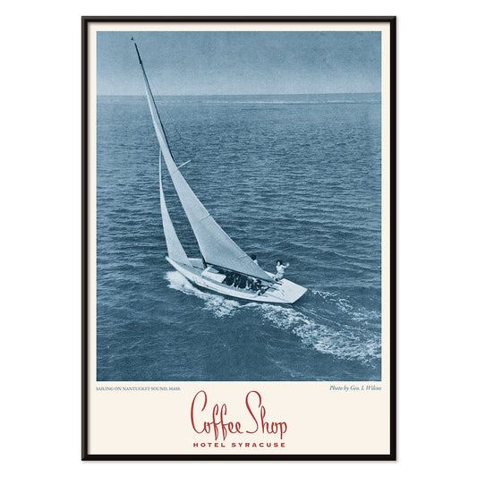
Kahvila Syracuse -juliste
Tuntematon taiteilija · 2015 · sininen purjevenejuliste, rauhallinen vesi ja selkeä Kahvila Syracuse typografia
Juliste €9 · Kehystetty €16
-


Le roi d'Ys Juliste
Auguste François-Marie Gorguet · 1888 · dramaattinen meriaiheinen juliste myrskyisillä aalloilla ja kirkkaalla rannikon valolla ajattomalla
Juliste €9 · Kehystetty €16
-


alastomia naisia uimassa juliste
Leo Gestel · 1925 · ilmaisuvoimainen mustavalkoinen juliste alastomista uimareista rohkeilla ja sulavilla viivoilla
Juliste €9 · Kehystetty €16
-

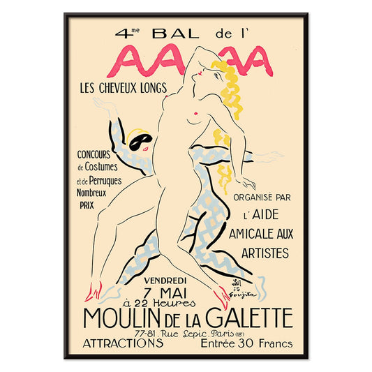
4. Bal de l'AAAA Juliste
Foujita · 1926 · elegantti montmartreballojuliste selkeällä viivatyöllä ja vaaleanpunaisin, keltaisin ja sinisin aksentein
Juliste €9 · Kehystetty €16
-


Metropolis Julie Juliste
Dennis Mukai · 1988 · voimakas naismuotokuvajuliste mustan, punaisen ja sinisen kontrasteilla kaupungin yöenergialla
Juliste €9 · Kehystetty €16
-

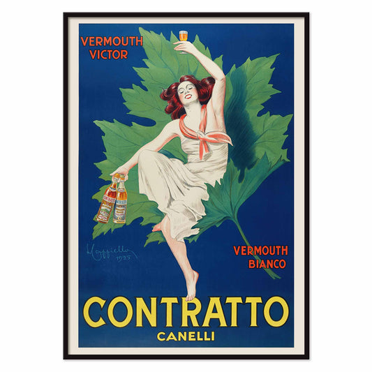
Contratto vermouth Canelli Juliste
Leonetto Cappiello · 1922 · italialaisessa vermuttijulisteessa nainen kohottaa lasiaan valtavia vihreitä lehtiä vasten
Juliste €9 · Kehystetty €16


72/536 items
The street as gallery
Advertising posters began as a public language, pasted to kiosks, tram stops, and café walls where images had seconds to do their work. From the Belle Époque to postwar modernism, the poster and the print evolved into everyday wall art that sat between news and theatre. Chromolithography offered velvety colour; later decades sharpened the message with blunt sans-serif typography and silhouettes legible from across a boulevard. These vintage sheets were never neutral decoration: they recorded what a city wanted to sell, celebrate, or warn against, with a pace set by crowds and streetlight.
Art Nouveau seduction and graphic simplification
At the turn of the century, Art Nouveau treated commerce as spectacle, wrapping everyday products in ornamental line and stylised figure. Alphonse Mucha’s Job (1897) builds its profile from looping contours and muted golds, with smoke rendered as pattern, not haze. Leonetto Cappiello pushed further toward instant recognition: Vermouth Martini (1920) stages lemon-yellow bottles against a night-black field, a lesson in contrast that anticipates modern branding. Théophile Alexandre Steinlen’s Tournée du Chat Noir (1896) adds Montmartre bite with flat red, sharp whiskers, and a stare calibrated for the street. For adjacent styles and signatures, move between Advertising, Alphonse Mucha, and Leonetto Cappiello.
Placing vintage wall art in contemporary rooms
Because these posters were designed for quick reading, they behave well as design objects at home. Start with scale: one large poster over a sideboard reads like a piece of architecture, while two medium prints stacked can stabilise a narrow wall. Pull colour cues from the room rather than matching everything; a single echo of carmine, olive, or brass is enough to let the print feel intentional. In a studio or hallway, the disciplined geometry of Bauhaus keeps the rhythm brisk; in a living room with curved furniture and velvet, Art Nouveau line sits naturally beside softer textures. If the room already has strong pattern, consider calmer companions from Black & White to give the eye a rest.
Cinema modernism and Japanese graphic punch
Mid-century design traded flourish for impact, and film posters became a laboratory for visual economy. Saul Bass’s Vertigo (1958) is practically a diagram of anxiety: spiral, figure, and off-kilter title arranged to deny stillness. Nearby, in Japanese modernism, Ikko Tanaka’s Kabuki (1974) treats black calligraphy as a drumbeat, letting white paper function as active space rather than background. These prints pair well with lacquer, walnut, brushed aluminium, and clean-lined shelving. To extend the same graphic cadence across eras, connect Movie with the calmer emphasis of Minimalist and the brisk motion cues in Bike.
Curating a wall that feels lived-in
To build a coherent gallery wall, repeat one constraint and vary everything else: keep margins consistent, or hold a tight palette while letting typography and illustration shift from piece to piece. Mixing vertical and horizontal formats can create a more editorial rhythm; Vertical Posters make strong anchors, while a single landscape print can act as a pause line. Frame choice matters less than proportion: a narrow black or walnut frame keeps type crisp, while a generous mat turns a commercial image into a considered art print. If you want a broad survey while keeping the theme, All Posters provides the wider context for building your own timeline of vintage decoration.