


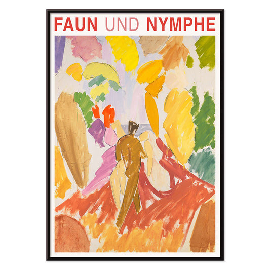
- Fauni ja nymfi juliste
- Unelma juliste
- Vieraile Puerto Rico -juliste
- Voi Juliste
- Ecchu Umidani sola Juliste
- Vihreä kirjastopuu Juliste
- Munsellin värijärjestelmäatlas Juliste
- Adelaster Albivenis Juliste
- Kukkatori Mumbai Juliste
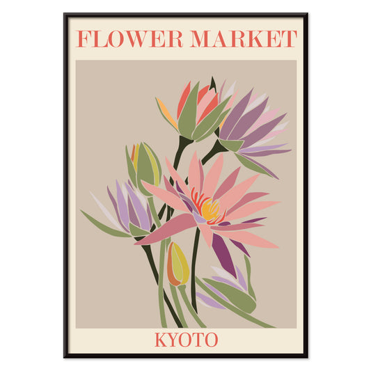
- Kyoton kukkatori Juliste
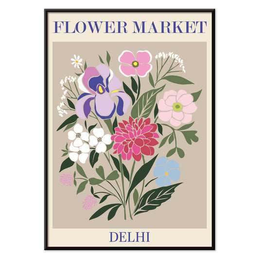
- Kukkatori - Dehli Juliste
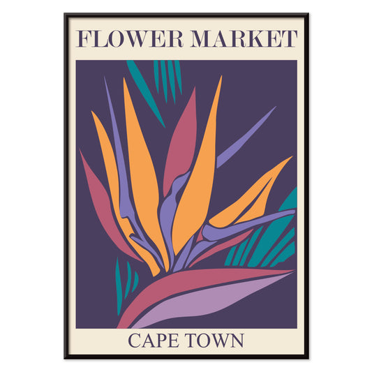
- Kukkatori – Kapkaupunki Juliste
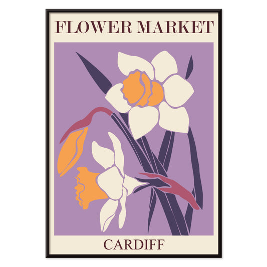
- Kukkatori Cardiff Juliste
- Kukkamarkkinat – Seoul 2 Juliste
- Kukkatori São Paulo Juliste
- Kukkatori - Rooma Juliste
- Milanon kukkamarkkinat Juliste
- Kukkatori, Berliini juliste
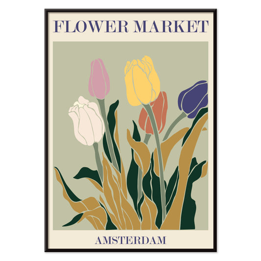
- Kukkatori - Amsterdam Juliste
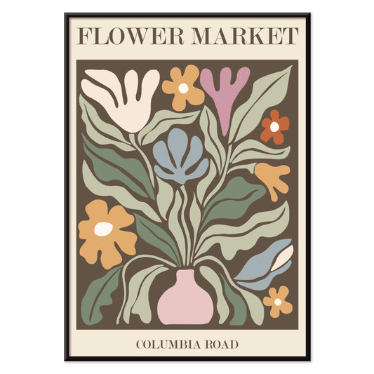
- Kukkatori Columbia Road Juliste
- Japanilaiset lelut 2 Juliste
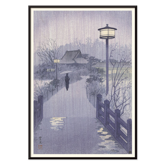
- Shinobazu-lampi Juliste
- Värin teoria ja käytäntö Juliste
- Vihreät vihannekset ja yrtit Juliste
- Viulun metamorfosi Juliste
- Bauhaus 11 Juliste
- Bauhaus Juliste 10
- Faust, Goethen tragedia -juliste
- Farbstudien, 10 Blätter IX Juliste
- Farbstudien, 10 Blätter VIII Juliste
- Randy Brecker Quintet -juliste
- Ei mikään voita hyvää kirjaa Juliste
- Tutut värit juliste
- Värin viehätys Juliste
-
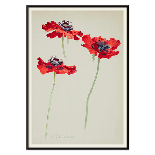
Kolme unikkotutkielmaa Juliste
Sophia Crownfield · 1900 · herkän kasviaiheinen taidejuliste, kolmen unikkotutkielman sarja kirkkaine terälehtineen ja ajattomalla eleganssilla
Juliste €9 · Kehystetty €16
Normaalihinta Alkaen €6,00Normaalihinta -
Fauni ja nymfi juliste
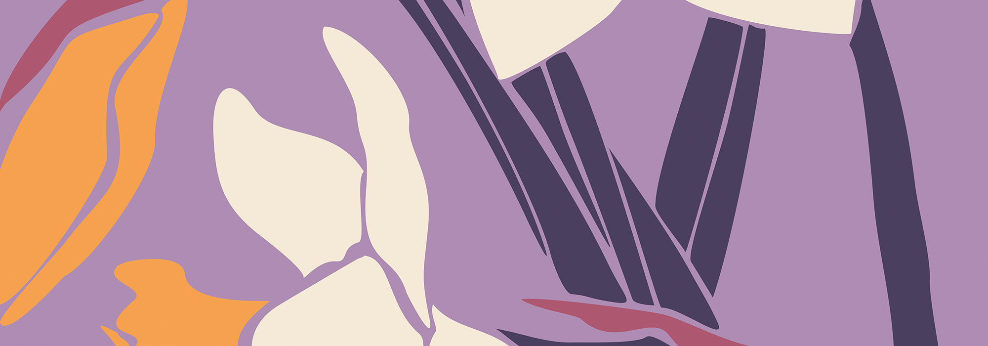
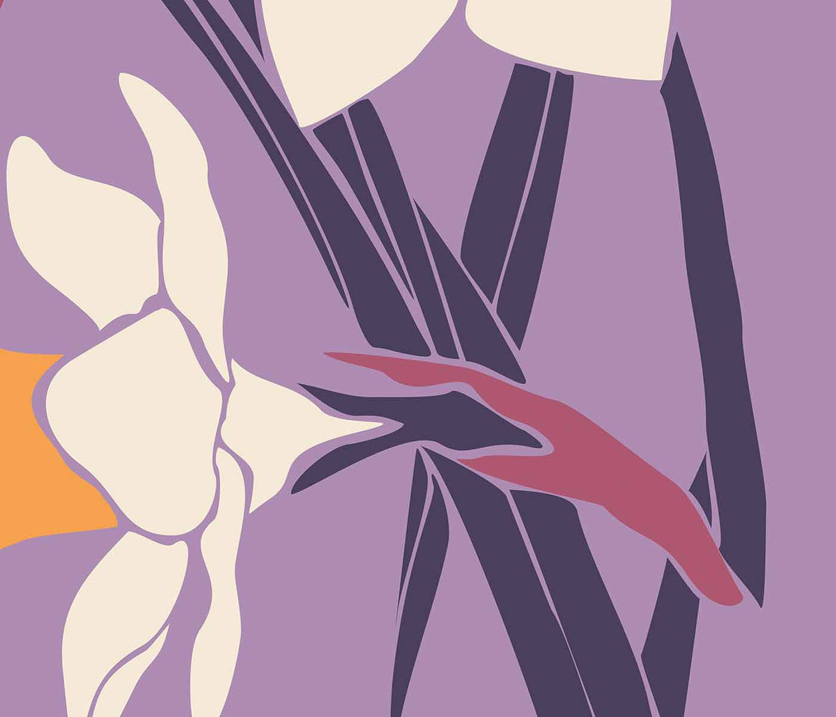
Edvard Weie · 1941 · ekspressiivinen myyttinen juliste, jossa fauni ja nymfi voimakkaissa modernistisissa värikentissä
Juliste €9 · Kehystetty €16
Normaalihinta Alkaen €6,00Normaalihinta -
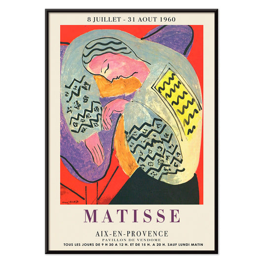
Unelma juliste
Henri Matisse · 1960 · eloisa nukkuvajuliste, virtaavat ääriviivat, rytmiset väripinnat, rauhallinen ajaton tunnelma, lämmin modernistinen eleganssi
Juliste €9 · Kehystetty €16
Normaalihinta Alkaen €6,00Normaalihinta -
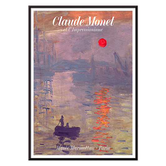
Auringonnousu Juliste
Claude Monet · 1872 · sumuinen sataman aamun juliste oranssilla auringolla ja pehmeillä sininsävyisillä heijastuksilla
Juliste €9 · Kehystetty €16
Normaalihinta Alkaen €6,00Normaalihinta -
Max Bill Juliste
Max Bill · 1974 · abstrakti geometrinen juliste punaisen, oranssin, vihreän ja liilan lomittuvilla muodoilla
Juliste €9 · Kehystetty €16
Normaalihinta Alkaen €6,00Normaalihinta -
Vieraile Puerto Rico -juliste
Tuntematon taiteilija · 1950 · 1950-luvun Puerto Rico -matkailujuliste merellinen purjeveneellä ja historiallisella rannikkolinnoituksella
Juliste €9 · Kehystetty €16
Normaalihinta Alkaen €6,00Normaalihinta -
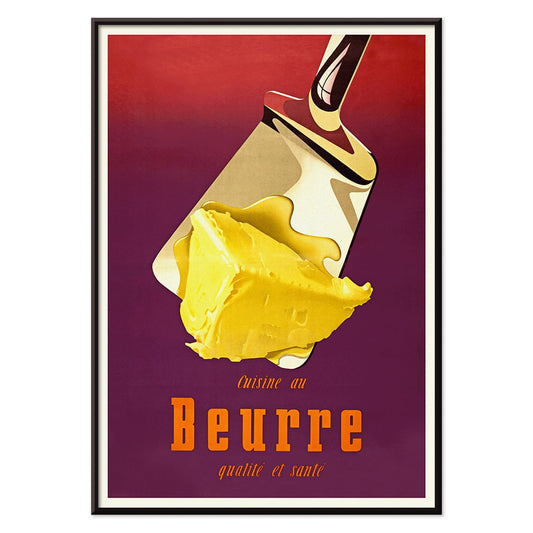
Voi Juliste
Donald Brun · 1951 · leikkisä voi juliste pehmeällä airbrushvarjostuksella rohkeilla 1950-luvun keltaisilla ja punaisilla väreillä
Juliste €9 · Kehystetty €16
Normaalihinta Alkaen €6,00Normaalihinta -
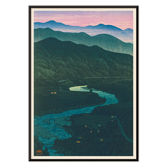
Ecchu Umidani sola Juliste
Kawase Hasui · 1923 · rauhallinen solan taidejuliste kerroksittaisilla sinisillä harjanteilla ja kiemurtelevalla polulla ajaton
Juliste €9 · Kehystetty €16
Normaalihinta Alkaen €6,00Normaalihinta -
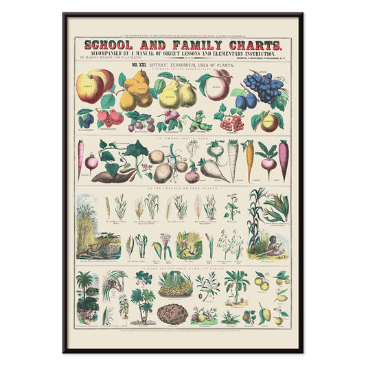
Kasvien taloudellinen käyttö Juliste
Marcius Willson · 1865 · yksityiskohtainen kasviaiheinen taulukkojuliste joka esittelee kasvien käytöt selkein nimityksin ja historiallisella otteella
Juliste €9 · Kehystetty €16
Normaalihinta Alkaen €6,00Normaalihinta -
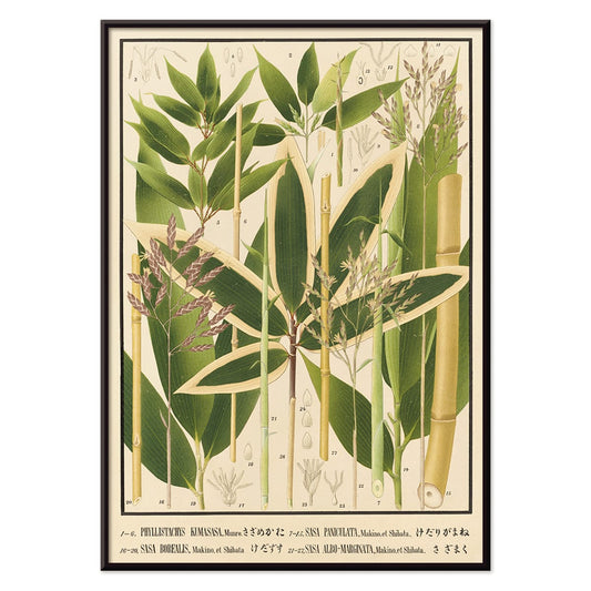
Nihon chikurui zufu Pl.11 Juliste
Yasuyoshi Shirasawa · 1912 · japanilainen bambutaidejuliste, ohuet varret, ilmavat lehdet ja hillityt beige‑sävyiset taustat
Juliste €9 · Kehystetty €16
Normaalihinta Alkaen €6,00Normaalihinta -
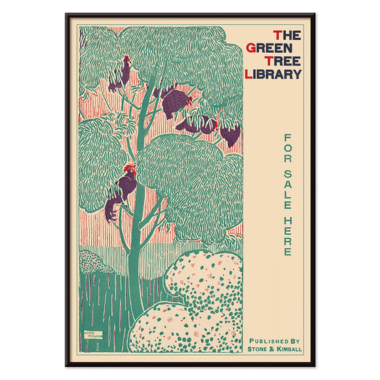
Vihreä kirjastopuu Juliste
Henry McCarter · 1890 · koristeellinen kirjastojuliste ajattomalla tyylitellyllä vihreällä puulla ja Art Nouveau -kirjaimilla
Juliste €9 · Kehystetty €16
Normaalihinta Alkaen €6,00Normaalihinta -
Yachigusa Pl.24 Juliste
Seikō Ueno · 1902 · tyylitelty punainen purje ja violetit kukat vintagejuliste, rauhallinen japanilainen eleganssi
Juliste €9 · Kehystetty €16
Normaalihinta Alkaen €6,00Normaalihinta -
Yachigusa Pl.06 Juliste
Seikō Ueno · 1902 · kiehtova oranssi kimonokuvioinen vintagejuliste rytmisillä kaarilla ja selkeällä negatiivisella tilalla
Juliste €9 · Kehystetty €16
Normaalihinta Alkaen €6,00Normaalihinta -
Pimeäainejuliste
NASA · 2016 · kosminen hämähäkinverkkojuliste jossa neonlangat sulautuvat syvän avaruuden pimeyteen
Juliste €9 · Kehystetty €16
Normaalihinta Alkaen €6,00Normaalihinta -
Raivon purkaukset Juliste
NASA · 2012 · räjähtävä auringonpurkajuliste liekehtivin kaarineen säteilevästä tähdestä syvässä avaruudessa voimakkaan kirkas värimaailma
Juliste €9 · Kehystetty €16
Normaalihinta Alkaen €6,00Normaalihinta -
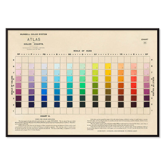
Munsellin värijärjestelmäatlas Juliste
Albert Henry Munsell · 1915 · ikoninen värijärjestelmäjuliste kartoittaa sävyt, arvot ja kromaisuuden täydellisesti
Juliste €9 · Kehystetty €16
Normaalihinta Alkaen €6,00Normaalihinta -
Maailmanympärimatka 148 Juliste
Louis-Isidore Duperrey · 1825 · luonnontieteellinen lintujuliste rauhallisessa profilissa, herkkä käsiväritys ja historiallinen beige sävy
Juliste €9 · Kehystetty €16
Normaalihinta Alkaen €6,00Normaalihinta -
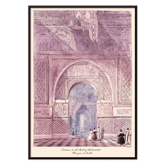
Lähettiläiden sali Juliste
Charles Hamilton Smith · 1835 · yksityiskohtainen arkkitehtuurijuliste Alcazarin seremoniaalisesta salista harmonisilla sinisillä ja violeteilla sävyillä luomaan rauhallinen ja ajaton tunnelma
Juliste €9 · Kehystetty €16
Normaalihinta Alkaen €6,00Normaalihinta -
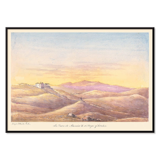
La Fuen de Munia Juliste
Charles Hamilton Smith · 1835 · rauhallinen kyläjuliste auringonlaskun kulta ja sinisävyissä viehättää hillitysti
Juliste €9 · Kehystetty €16
Normaalihinta Alkaen €6,00Normaalihinta -
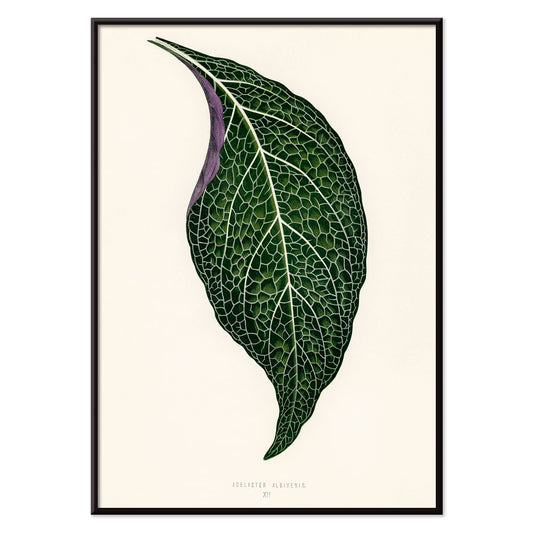
Adelaster Albivenis Juliste
Shirley Hibberd · 1855 · elegantti kasviaiheinen juliste yhdestä vihreästä lehdestä yksityiskohtaisella purppuran suonituksella
Juliste €9 · Kehystetty €16
Normaalihinta Alkaen €6,00Normaalihinta -
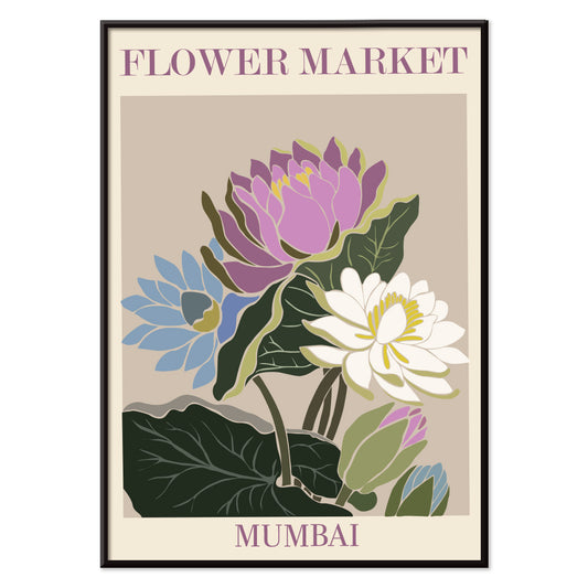
Kukkatori Mumbai Juliste
MORYARTY · 2022 · vesililjajuliste joka tuo mieleen Mumbain kukkatorin violetissa, vihreässä ja sinisessä
Juliste €9 · Kehystetty €16
Normaalihinta Alkaen €6,00Normaalihinta -
Kyoton kukkatori Juliste
MORYARTY · 2021 · eläväinen Kyoton kukkatorijuliste tyylitellyillä kukilla ja selkeillä graafisilla linjoilla kodin sisustukseen aksentiksi
Juliste €9 · Kehystetty €16
Normaalihinta Alkaen €6,00Normaalihinta -
Kukkatori - Dehli Juliste
MORYARTY · 2023 · elinvoimainen Dehlin kukkatorijuliste kerroksellisilla kukilla, eloisaa grafiikkaa ja runsauden tunnetta
Juliste €9 · Kehystetty €16
Normaalihinta Alkaen €6,00Normaalihinta -
Kukkatori – Kapkaupunki Juliste
MORYARTY · 2013 · eloisa paratiisilintujuliste abstrakteista muodoista tuo trooppista energiaa ja rohkeita värejä
Juliste €9 · Kehystetty €16
Normaalihinta Alkaen €6,00Normaalihinta -
Kukkatori Cardiff Juliste
MORYARTY · 2010 · graafinen narsissijuliste syvän violetilla taustalla tuo kirkkaan sesongin ilmeen kodin
Juliste €9 · Kehystetty €16
Normaalihinta Alkaen €6,00Normaalihinta -
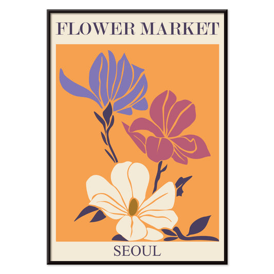
Kukkamarkkinat – Seoul 2 Juliste
MORYARTY · 2021 · energinen kukkamarkkinajuliste voimakkaalla oranssitaustalla ja graafisilla kukilla vaaleanpunaisissa ja violeteissa sävyissä
Juliste €9 · Kehystetty €16
Normaalihinta Alkaen €6,00Normaalihinta -
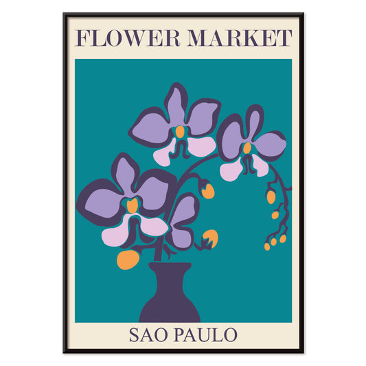
Kukkatori São Paulo Juliste
MORYARTY · 2017 · eloisa orkideajuliste, selkeä vaasimuoto ja syvän sinivihreä tausta luovat rauhallisen mutta elävän ilmeen
Juliste €9 · Kehystetty €16
Normaalihinta Alkaen €6,00Normaalihinta -
Kukkatori - Rooma Juliste
MORYARTY · 2019 · eloisa liljakimppujuliste joka ammentaa Rooman kukkatorien tunnelmasta lämpimissä vaaleanpunaisen ja oranssin sävyissä
Juliste €9 · Kehystetty €16
Normaalihinta Alkaen €6,00Normaalihinta -
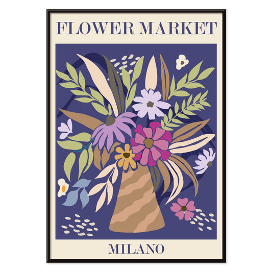
Milanon kukkamarkkinat Juliste
MORYARTY · 2022 · värikäs kukkakimppujuliste joka välittää Milanon kukkatorin eloisuuden
Juliste €9 · Kehystetty €16
Normaalihinta Alkaen €6,00Normaalihinta -
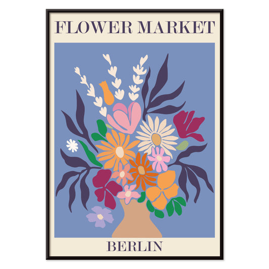
Kukkatori, Berliini juliste
MORYARTY · 2019 · värikäs kukkakimppujuliste rohkealla berliinin typografialla ja elävällä torihen gellä joka piristää sisustusta
Juliste €9 · Kehystetty €16
Normaalihinta Alkaen €6,00Normaalihinta -
Kukkatori - Amsterdam Juliste
MORYARTY · 2019 · retro tulppaanikauppajuliste joka vangitsee Amsterdamin energian maanläheisillä sävyillä
Juliste €9 · Kehystetty €16
Normaalihinta Alkaen €6,00Normaalihinta -
Kukkatori Columbia Road Juliste
MORYARTY · 2017 · värikäs kukkajuliste jossa tyylitelty maljakko ja kimppu voimakkaissa moderneissa sävyissä ja kirkkaassa kontrastissa
Juliste €9 · Kehystetty €16
Normaalihinta Alkaen €6,00Normaalihinta -
Tyhjä lautanen Juliste
James Fitton · 1950 · keskivuosisadan ruokajuliste voimakkaalla lautaskuvituksella ja viestillä ruokahävikin välttämisestä
Juliste €9 · Kehystetty €16
Normaalihinta Alkaen €6,00Normaalihinta -
Japanilaiset lelut 2 Juliste
Kawasaki Kyosen · 1919 · leikillinen leluaiheinen taidejuliste selkeillä ääriviivoilla ja värikkäillä korostuksilla
Juliste €9 · Kehystetty €16
Normaalihinta Alkaen €6,00Normaalihinta -
Brazil 1 Juliste
Waldomiro Goncalves Christino · 1984 · aurinkoinen matkailujuliste Riosta joka välittää rantaelämän ja modernien väriblokkien tunnelman
Juliste €9 · Kehystetty €16
Normaalihinta Alkaen €6,00Normaalihinta -
Shinobazu-lampi Juliste
Kasamatsu Shirô · 1938 · sateinen ilta taidejuliste Shinobazu-lammesta, yksinäinen kulkija ja heijastusten rauhallinen hehku
Juliste €9 · Kehystetty €16
Normaalihinta Alkaen €6,00Normaalihinta


- Fauni ja nymfi juliste
- Unelma juliste
- Vieraile Puerto Rico -juliste
- Voi Juliste
- Ecchu Umidani sola Juliste
- Vihreä kirjastopuu Juliste
- Munsellin värijärjestelmäatlas Juliste
- Adelaster Albivenis Juliste
- Kukkatori Mumbai Juliste
- Kyoton kukkatori Juliste
- Kukkatori - Dehli Juliste
- Kukkatori – Kapkaupunki Juliste
- Kukkatori Cardiff Juliste
- Kukkamarkkinat – Seoul 2 Juliste
- Kukkatori São Paulo Juliste
- Kukkatori - Rooma Juliste
- Milanon kukkamarkkinat Juliste
- Kukkatori, Berliini juliste
- Kukkatori - Amsterdam Juliste
- Kukkatori Columbia Road Juliste
- Japanilaiset lelut 2 Juliste
- Shinobazu-lampi Juliste
A Color That Thinks in Shadows
Purple behaves like dusk in interior decoration: it deepens neutrals, cools bright whites, and makes brass read warmer. In the history of the vintage poster and art print, violet also signals modern chemistry and modern taste, from late nineteenth-century inks to mid-century screen processes. This selection gathers posters and wall art where purple appears as pigment, twilight, or a single accent note, moving between floral studies, symbolist reverie, and studio-style diagrams. For nearby palettes, it pairs naturally with Black & White contrast, the open air of Landscape scenes, and the quiet structure of Minimalist compositions.
From Secession Ornament to Visionary Abstraction
Gustav Klimt used pattern as atmosphere, and violet shadows help hold his surfaces together. In The Kiss (1907–1908) by Gustav Klimt, the gold mosaic reads like textile and icon at once, while the surrounding purples keep the embrace grounded rather than sugary. Hilma af Klint treats purple less as mood than as a register of thought: The Ten Largest, No. 6 (1907) by Hilma af Klint uses lilac and violet as structural cues, guiding the eye through spirals, seed forms, and annotated curves. This lineage connects easily to the symbolic undercurrents in Esoteric imagery and the lyrical experiments of Abstract art.
Where Purple Works at Home
Purple is most convincing when it operates as an accent rather than a single-note statement. In a bedroom, a violet-heavy poster above stone, oat, or chalk textiles reads calm without turning sweet; in a living room, it negotiates between walnut, bouclé, chrome, and smoked glass. It also flatters greenery: place a purple print near terracotta pots or dried grasses, then echo the hue with one plum cushion or a muted rug detail. If you want the color to feel botanically anchored, hang it near plates from Botanical studies; if you prefer sharper rhythm, let it sit beside strict geometry from Bauhaus.
Modernist Color Lessons You Can Live With
Some works here feel like studio notes turned into wall art, where hue is both subject and method. Robert Delaunay’s Composition (1930) by Robert Delaunay stacks circular intervals of plum, emerald, and lemon to create depth without traditional perspective. Albert Henry Munsell goes the other way: Atlas of the Munsell color system Pl.01 (1915) by Albert Henry Munsell maps color with measured clarity, useful in a studio corner, kitchen, or hallway where you want structure. For related graphic sensibilities, the wit of Advertising posters and the measured diagrams of Science prints keep purple from drifting into pure romance.
Curating Dusk, Distance, and Paper
To keep violet from feeling precious, combine it with scenes that carry weather and space. Ecchu Umidani Pass (1923) by Kawase Hasui offers indigo quiet and a single lantern glow, linking the palette to Japanese printmaking and the broader language of Oriental works. In framing, purple rewards breathing room: a pale mat clarifies lilac tones, while a walnut or black frame gives aubergine weight. Mixing one horizontal piece with a smaller vertical print keeps a gallery wall paced rather than symmetrical, letting the color appear, recede, and return like evening light.