


- Sipulijuliste
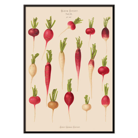
- Retiisijuliste
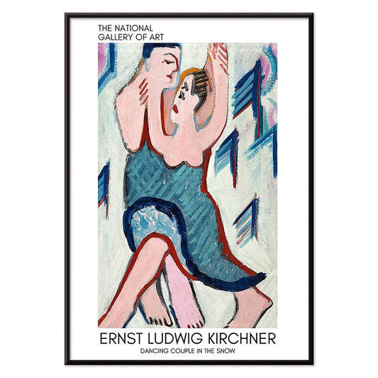
- Tanssiva pari lumessa Juliste
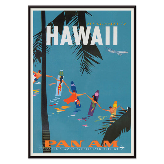
- Jet Clipper Havaijille Juliste
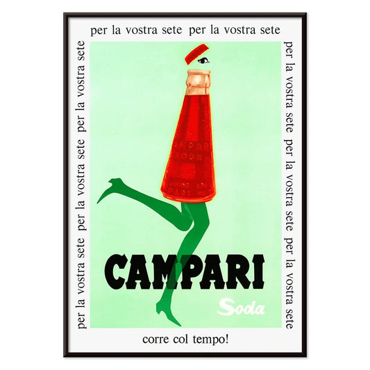
- Campari Soda Juliste
- Bec-Kina Juliste
- Mansikkavaras Juliste
- Matisse · tanssivat hahmot juliste
- Tom Krojerin näyttelyjuliste Juliste
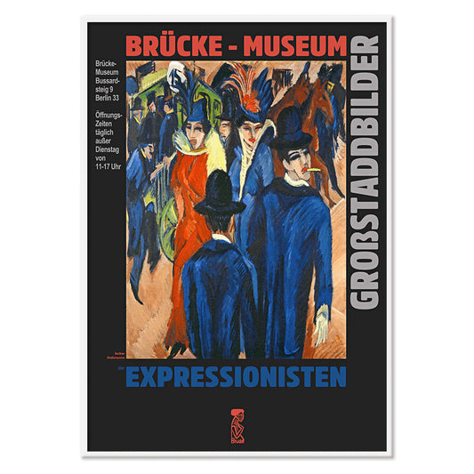
- Berliinin katunäkymä Juliste
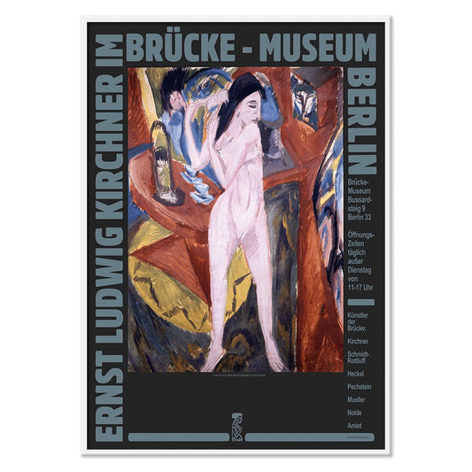
- Ernst Kirchner -näyttelyjuliste
- Puisto lähellä Lu juliste
- Alku Juliste
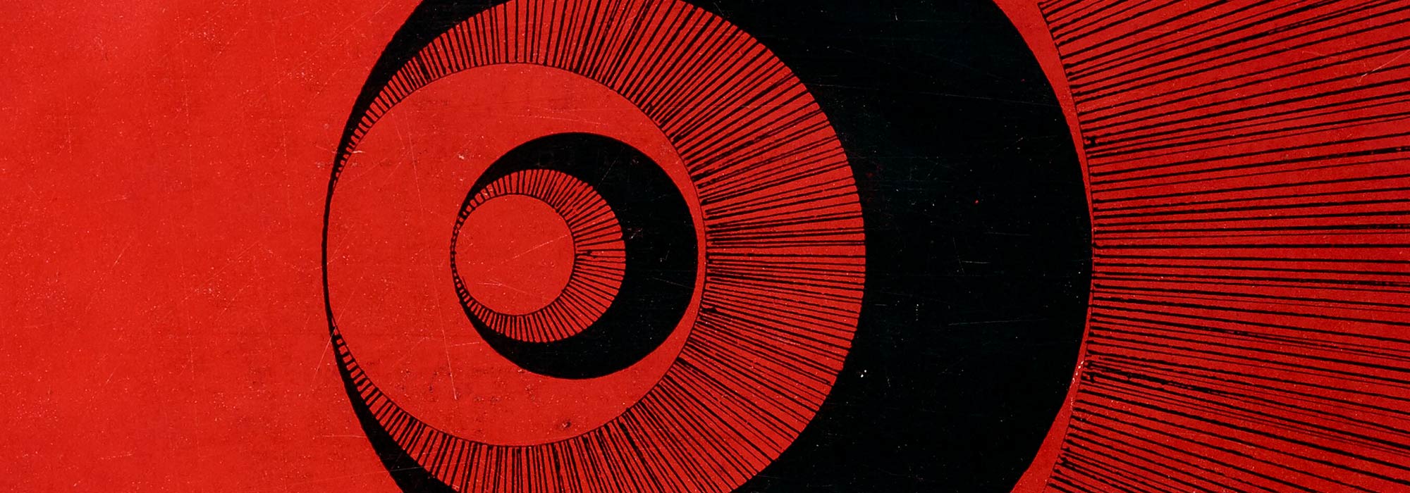
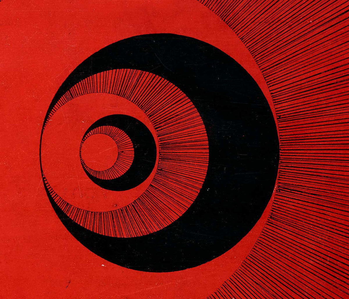
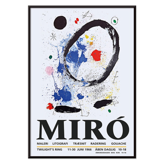
- Hämärän rengas Juliste
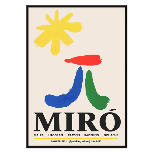
- Parler Seul -juliste
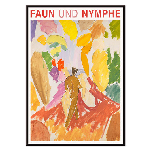
- Fauni ja nymfi juliste
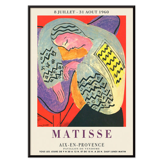
- Unelma juliste
- Konserttijuliste
- Nainen ja lintu yössä juliste
- Bauhaus 20 Juliste
- Bauhaus 21 Juliste
- Syö enemmän hedelmiä juliste
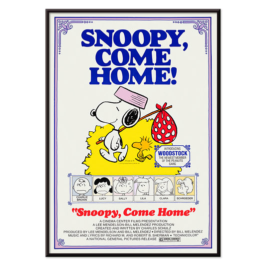
- Snoopy tulee kotiin juliste
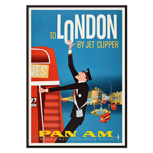
- Lontooseen Jet Clipperillä Juliste
- Kyushu-Okinawa-juliste
- Xerez Pedro Domecq Juliste
- Balsam Aperitif -juliste
- Voi Juliste
- Crans-Montana Juliste
- Monte Carlo Juliste
- Tyynen värähtelyt juliste
- Continental Hawaii -lentoyhtiön juliste
- Mustakissa 4 juliste
- Musta kissa 3 juliste
- Olut ja savuke Juliste
-
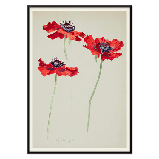
Kolme unikkotutkielmaa Juliste
Sophia Crownfield · 1900 · herkän kasviaiheinen taidejuliste, kolmen unikkotutkielman sarja kirkkaine terälehtineen ja ajattomalla eleganssilla
Juliste €9 · Kehystetty €16
Normaalihinta Alkaen €6,00Normaalihinta -
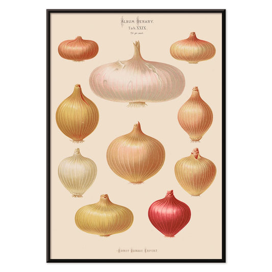
Sipulijuliste
Ernst Benary · 1876 · yksityiskohtainen sipulijuliste jossa mukulat, juuret ja vihreät versot beigeä taustaa vasten keittiöön
Juliste €9 · Kehystetty €16
Normaalihinta Alkaen €6,00Normaalihinta -
Retiisijuliste
Ernst Benary · 1876 · yksityiskohtainen retiisijuliste, jossa selkeät juuret ja lehtikruunut lämpimällä beigetaustalla kodikasta tunnelmaa
Juliste €9 · Kehystetty €16
Normaalihinta Alkaen €6,00Normaalihinta -
Tanssiva pari lumessa Juliste
Ernst Ludwig Kirchner · 1928 · ekspressionistinen taidejuliste tanssivasta parista elävässä lumimaisemassa vahvoin sinisen ja punaisen aksentein
Juliste €9 · Kehystetty €16
Normaalihinta Alkaen €6,00Normaalihinta -
Jet Clipper Havaijille Juliste
Tuntematon taiteilija · 1950 · 1950-luvun vintagejuliste Havaijista, suihkukoneita, palmurantoja, hula-tanssia, surffausmateriaalia, retrotyyliä ja aurinkoa
Juliste €9 · Kehystetty €16
Normaalihinta Alkaen €6,00Normaalihinta -
Campari Soda Juliste
Tuntematon taiteilija · 1932 · leikkisä Campari Sodamainosjuliste kävelevällä pullolla syvässä mustassa taustassa, retrotyylinen eloisa
Juliste €9 · Kehystetty €16
Normaalihinta Alkaen €6,00Normaalihinta -
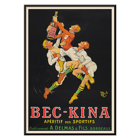
Bec-Kina Juliste
Michel Liebeaux · 1900 · energinen rugby-aiheinen aperitiivijuliste voimakkailla hahmoilla ja kirkkailla väreillä luo kilpailuhenkisen tunnelman kotibaariin
Juliste €9 · Kehystetty €16
Normaalihinta Alkaen €6,00Normaalihinta -
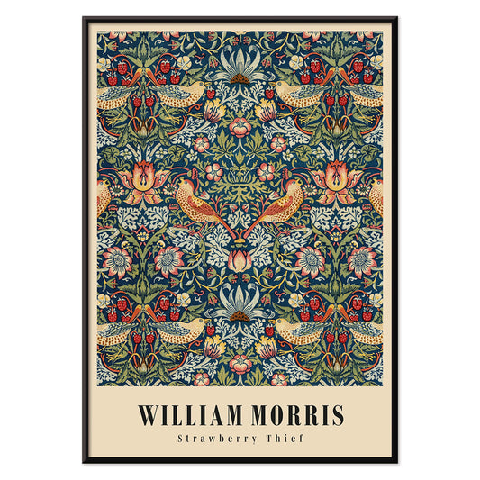
Mansikkavaras Juliste
William Morris · 1883 · ikoninen Arts and Crafts -juliste rastasaiheesta ja mansikoista syvän sinisissä sävyissä
Juliste €9 · Kehystetty €16
Normaalihinta Alkaen €6,00Normaalihinta -
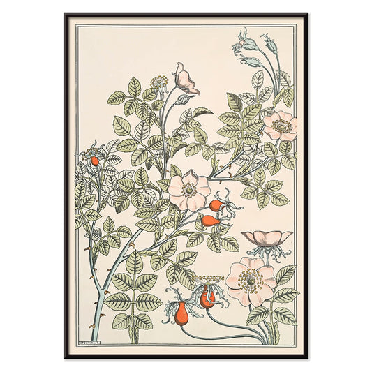
Eglantier Juliste
Maurice Pillard Verneuil · 1896 · elegantti luonnonruusujuliste virtaavilla versoilla, lehdillä ja herkillä kukinnoilla kodin seinätilaan
Juliste €9 · Kehystetty €16
Normaalihinta Alkaen €6,00Normaalihinta -
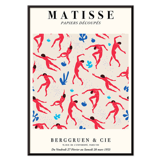
Matisse · tanssivat hahmot juliste
Henri Matisse · 1909 · energinen tanssivat hahmot juliste, rohkeat punaiset siluetit syvää sinistä vasten
Juliste €9 · Kehystetty €16
Normaalihinta Alkaen €6,00Normaalihinta -
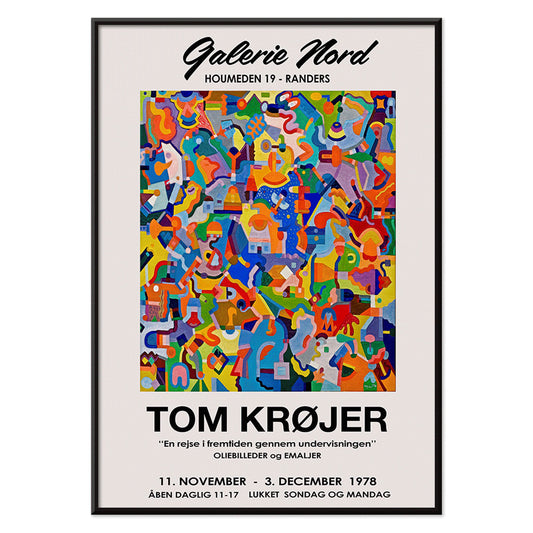
Tom Krojerin näyttelyjuliste Juliste
Tom Krojer · 1989 · dynaaminen geometrinen näyttelyjuliste, jossa elävät väripinnat ja selkeä moderni typografia
Juliste €9 · Kehystetty €16
Normaalihinta Alkaen €6,00Normaalihinta -
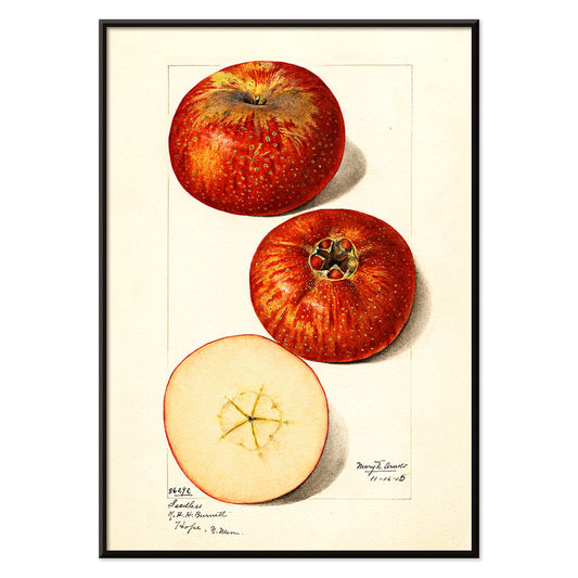
Malus domestica -juliste
Mary Daisy Arnold · 1915 · yksityiskohtainen omenataidejuliste kokonaisella hedelmällä ja viipaloidulla poikkileikkauksella lämmin paperitausta
Juliste €9 · Kehystetty €16
Normaalihinta Alkaen €6,00Normaalihinta -
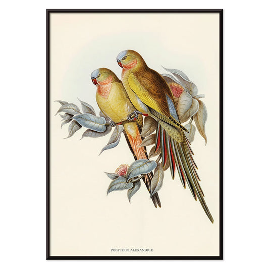
Polytelis Alexandrae Juliste
Tuntematon taiteilija · 1873 · elegantti parakeettijuliste kahdella pitkähäntäisellä linnulla tuoreissa vihreän ja ruusunpunaisen sävyissä
Juliste €9 · Kehystetty €16
Normaalihinta Alkaen €6,00Normaalihinta -
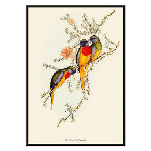
Euphema splendida Juliste
Tuntematon taiteilija · 1848 · yksityiskohtainen papukaijajuliste, kolme lintua oksilla lehtien keskellä, ajaton seinätaide sisustukseen
Juliste €9 · Kehystetty €16
Normaalihinta Alkaen €6,00Normaalihinta -
Berliinin katunäkymä Juliste
Ernst Kirchner · 1913 · dynaaminen Berliinin katunäkymäjuliste, kirkkailla väreillä ja kulmikkailla hahmoilla
Juliste €9 · Kehystetty €16
Normaalihinta Alkaen €6,00Normaalihinta -
Ernst Kirchner -näyttelyjuliste
Ernst Kirchner · 1910 · ekspressionistinen alastonnäyttelyjuliste vahvoilla mustilla ääriviivoilla ja kirkkaina sinisen ja punaisen sävyinä
Juliste €9 · Kehystetty €16
Normaalihinta Alkaen €6,00Normaalihinta -
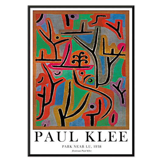
Puisto lähellä Lu juliste
Paul Klee · 1938 · unenomaisen abstrakti taidejuliste rytmisillä muodoilla, musiikillisella rytmillä ja lämpimillä sävyillä
Juliste €9 · Kehystetty €16
Normaalihinta Alkaen €6,00Normaalihinta -
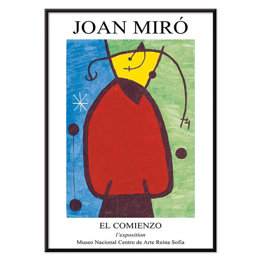
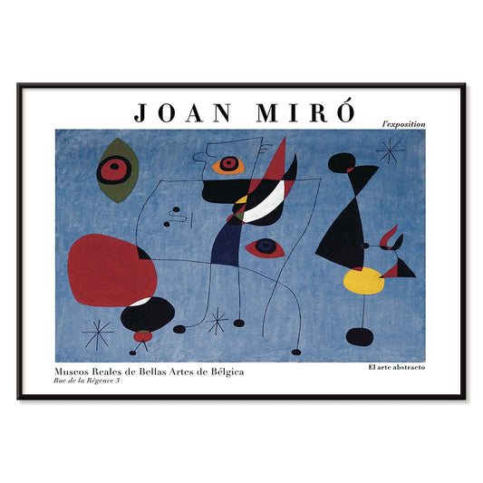
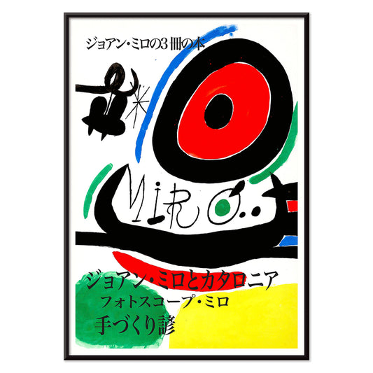
Alku Juliste
Joan Miró · 1972 · leikkisä abstrakti juliste biomorfisilla muodoilla ja vahvoilla viivoilla kirkkaissa perusväreissä
Juliste €9 · Kehystetty €16
Normaalihinta Alkaen €6,00Normaalihinta -
Hämärän rengas Juliste
Joan Miró · 2018 · leikkisä abstrakti juliste kiertävistä muodoista ja tähdenomaisista merkeistä syvän sinisellä pohjalla
Juliste €9 · Kehystetty €16
Normaalihinta Alkaen €6,00Normaalihinta -
Parler Seul -juliste
Joan Miró · 1948 · leikkisä abstrakti juliste kelluvin symbolein, voimakkaiden viivojen ja primaarivärien aksentein
Juliste €9 · Kehystetty €16
Normaalihinta Alkaen €6,00Normaalihinta -
Fauni ja nymfi juliste
Edvard Weie · 1941 · ekspressiivinen myyttinen juliste, jossa fauni ja nymfi voimakkaissa modernistisissa värikentissä
Juliste €9 · Kehystetty €16
Normaalihinta Alkaen €6,00Normaalihinta -
Unelma juliste
Henri Matisse · 1960 · eloisa nukkuvajuliste, virtaavat ääriviivat, rytmiset väripinnat, rauhallinen ajaton tunnelma, lämmin modernistinen eleganssi
Juliste €9 · Kehystetty €16
Normaalihinta Alkaen €6,00Normaalihinta -
Konserttijuliste
Hulusi Mercan · 1960 · energinen abstrakti juliste musiikkisoittimista vahvoin punaisen sinisen ja keltaisen sävyin
Juliste €9 · Kehystetty €16
Normaalihinta Alkaen €6,00Normaalihinta -
Nainen ja lintu yössä juliste
Joan Miró · 1947 · leikkisä surrealistinen juliste syvän sinisellä kentällä ja kirkkailla punaisilla ja keltaisilla merkeillä
Juliste €9 · Kehystetty €16
Normaalihinta Alkaen €6,00Normaalihinta -
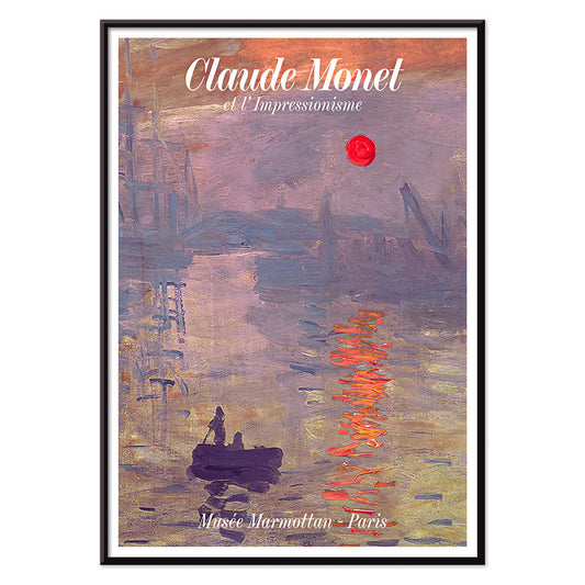
Auringonnousu Juliste
Claude Monet · 1872 · sumuinen sataman aamun juliste oranssilla auringolla ja pehmeillä sininsävyisillä heijastuksilla
Juliste €9 · Kehystetty €16
Normaalihinta Alkaen €6,00Normaalihinta -
Metropolis Julie Juliste
Dennis Mukai · 1988 · voimakas naismuotokuvajuliste mustan, punaisen ja sinisen kontrasteilla kaupungin yöenergialla
Juliste €9 · Kehystetty €16
Normaalihinta Alkaen €6,00Normaalihinta -
Max Bill Juliste
Max Bill · 1974 · abstrakti geometrinen juliste punaisen, oranssin, vihreän ja liilan lomittuvilla muodoilla
Juliste €9 · Kehystetty €16
Normaalihinta Alkaen €6,00Normaalihinta -
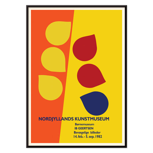
Ib Geertsen Juliste
Ib Geertsen · 1982 · värikäs geometrinen juliste jossa vahvat päävärit ja skandinaavinen selkeys ajaton
Juliste €9 · Kehystetty €16
Normaalihinta Alkaen €6,00Normaalihinta -
Joan Miró Osaka Juliste
Joan Miró · 1970 · leikkisä ja vahva abstrakti juliste kalligrafisilla mustilla muodoilla ja kirkkain perusvärein
Juliste €9 · Kehystetty €16
Normaalihinta Alkaen €6,00Normaalihinta -
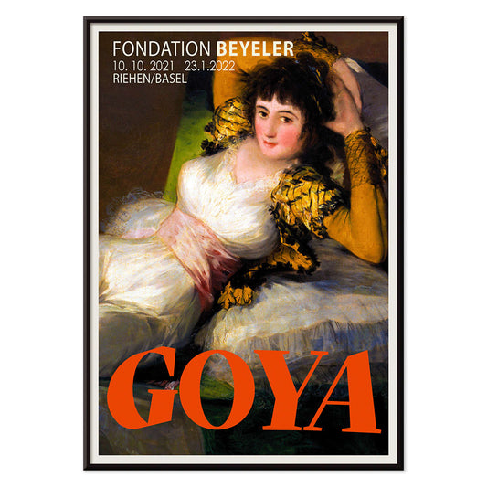
Pukeutunut maja Juliste
Francisco Goya · 1802 · ikoninen pukeutunut majajuliste kirkkailla valkoisilla, vihreällä vyöllä ja kultaisilla tyynyillä
Juliste €9 · Kehystetty €16
Normaalihinta Alkaen €6,00Normaalihinta -
El Maestro 3 -juliste
tuntematon taiteilija · 1921 · graafinen opetusjuliste monumentaalisella kirjurin hahmolla mustassa, beigessä ja punaisessa, sopii työhuoneeseen ja lukunurkkaan
Juliste €9 · Kehystetty €16
Normaalihinta Alkaen €6,00Normaalihinta -
Bauhaus 20 Juliste
Tuntematon taiteilija · 1923 · dynaaminen Bauhausjuliste, jossa rohkea väriblokki ja tarkka geometria kutsuvat katsetta
Juliste €9 · Kehystetty €16
Normaalihinta Alkaen €6,00Normaalihinta -
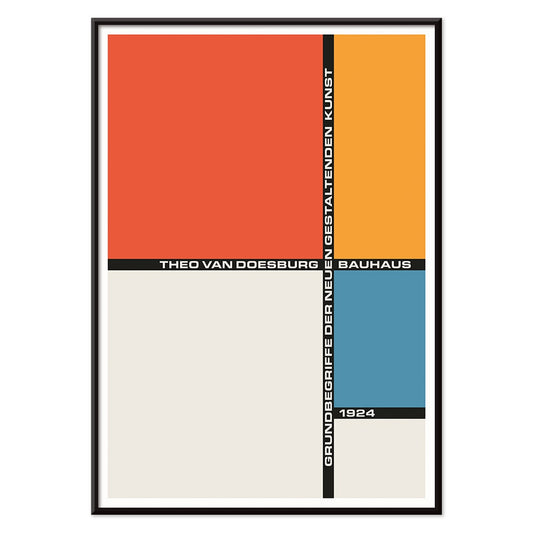
Bauhaus 21 Juliste
Tuntematon taiteilija · 1924 · geometrinen Bauhausjuliste oranssilla ympyrällä, sinisellä blokilla ja tarkoilla mustilla viivoilla
Juliste €9 · Kehystetty €16
Normaalihinta Alkaen €6,00Normaalihinta -
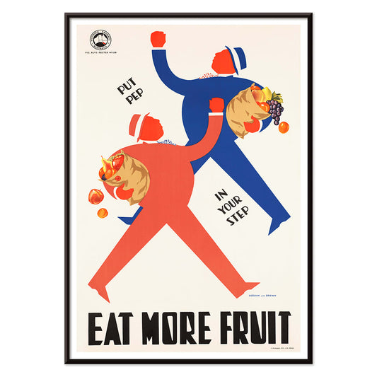
Syö enemmän hedelmiä juliste
Tuntematon taiteilija · 1950 · iloinen terveystiedotusjuliste, jossa tyylitellyt ostajat ja täynnä olevat hedelmäkorit
Juliste €9 · Kehystetty €16
Normaalihinta Alkaen €6,00Normaalihinta -
Snoopy tulee kotiin juliste
Tuntematon taiteilija · 1972 · iloinen juliste jossa Snoopy ja Woodstock selkeillä viivoilla ja kirkkailla väreillä
Juliste €9 · Kehystetty €16
Normaalihinta Alkaen €6,00Normaalihinta -
Lontooseen Jet Clipperillä Juliste
Tuntematon taiteilija · 1955 · keskisadan matkajulisteen retrohenkinen kuva Pan Am -stewardessista ja punaisesta kaksikerrosbussista
Juliste €9 · Kehystetty €16
Normaalihinta Alkaen €6,00Normaalihinta


36/766 items
- Sipulijuliste
- Retiisijuliste
- Tanssiva pari lumessa Juliste
- Jet Clipper Havaijille Juliste
- Campari Soda Juliste
- Bec-Kina Juliste
- Mansikkavaras Juliste
- Matisse · tanssivat hahmot juliste
- Tom Krojerin näyttelyjuliste Juliste
- Berliinin katunäkymä Juliste
- Ernst Kirchner -näyttelyjuliste
- Puisto lähellä Lu juliste
- Alku Juliste
- Hämärän rengas Juliste
- Parler Seul -juliste
- Fauni ja nymfi juliste
- Unelma juliste
- Konserttijuliste
- Nainen ja lintu yössä juliste
- Bauhaus 20 Juliste
- Bauhaus 21 Juliste
- Syö enemmän hedelmiä juliste
- Snoopy tulee kotiin juliste
- Lontooseen Jet Clipperillä Juliste
Red, the most intentional accent
In the Red collection, color operates less as a subject than as a signal: a poppy stamp, a lacquered headline, a warm blush on paper. These posters move between illustration, modernism, travel graphics, and diagrammatic prints, yet each relies on red to steer attention. Vermilion against cream, brick against graphite, or a single scarlet form in calm space can change how a room reads. As wall art, red behaves like seasoning in home decor: a small accent energizes a gallery wall, while a larger field establishes a focal point and a sense of direction in decoration.
Craft, pigment, and the art of persuasion
Red has carried technical and cultural weight across print history. Early dyes and pigments such as cochineal and madder informed textiles and the decorative arts, while lithography made bold red lettering and flat color fields central to public visual culture. William Morris’s Strawberry Thief (1883) by William Morris uses red as a structural note inside the repeat, keeping birds and fruit in rhythmic tension. In Hygieia (1907) by Gustav Klimt, the robe reads as both emblem and warning, with crimson acting like a boundary around the figure. Wassily Kandinsky’s Heavy Red (1924) by Wassily Kandinsky shows red as mass, a plane that pushes adjacent shapes into motion and makes geometry feel physical.
Where red posters live best
Red accents settle most naturally alongside honest materials: walnut, terracotta, brass, linen, and worn stone. In kitchens and dining corners, fruit studies and plant imagery echo table colors and ceramics, which makes Botanical prints an easy companion to red-led decoration. In hallways and entryways, one bold red element helps pull the eye through a narrow space; the graphic logic of Advertising works well with mirrors, coat hooks, and darker floorboards. For bedrooms, keep red smaller and warmer, leaning toward brick or rose rather than primary scarlet, and balance it with pale bedding and low, amber light. If the room opens onto greenery, red becomes a clear counterpoint; quieter scenes from Landscape help keep the palette grounded.
Pairing, framing, and building a gallery wall
To keep red from dominating, treat it as one voice within a measured palette. A white mount gives red air, while a slim black frame sharpens saturated areas and echoes the discipline of Black & White imagery. For structured pairings, place a red-led poster beside geometric work from Bauhaus, where red often appears as a controlled block rather than a flourish. For a more theatrical register, Leonetto Cappiello’s Cachou Lajaunie (1920) by Leonetto Cappiello plays like streetlight against deep wood tones and muted walls. When arranging a gallery wall, repeat red twice, once as a larger area and once as a small accent, so the eye has a clear path between prints.
A closing thought on red
Red is also a useful clue for reading images: in travel graphics it signals heat, nightlife, and appetite; in modernist composition it marks the point where wandering attention snaps into focus. That is why this selection can jump from pattern to symbolist figure to hard-edged abstraction without losing coherence. Leave breathing space around the loudest red field, and let neighboring prints carry quieter tones such as sand, ink, and sea-glass green. Used this way, red becomes rhythm rather than noise, and decoration starts to feel intentional without becoming strict.