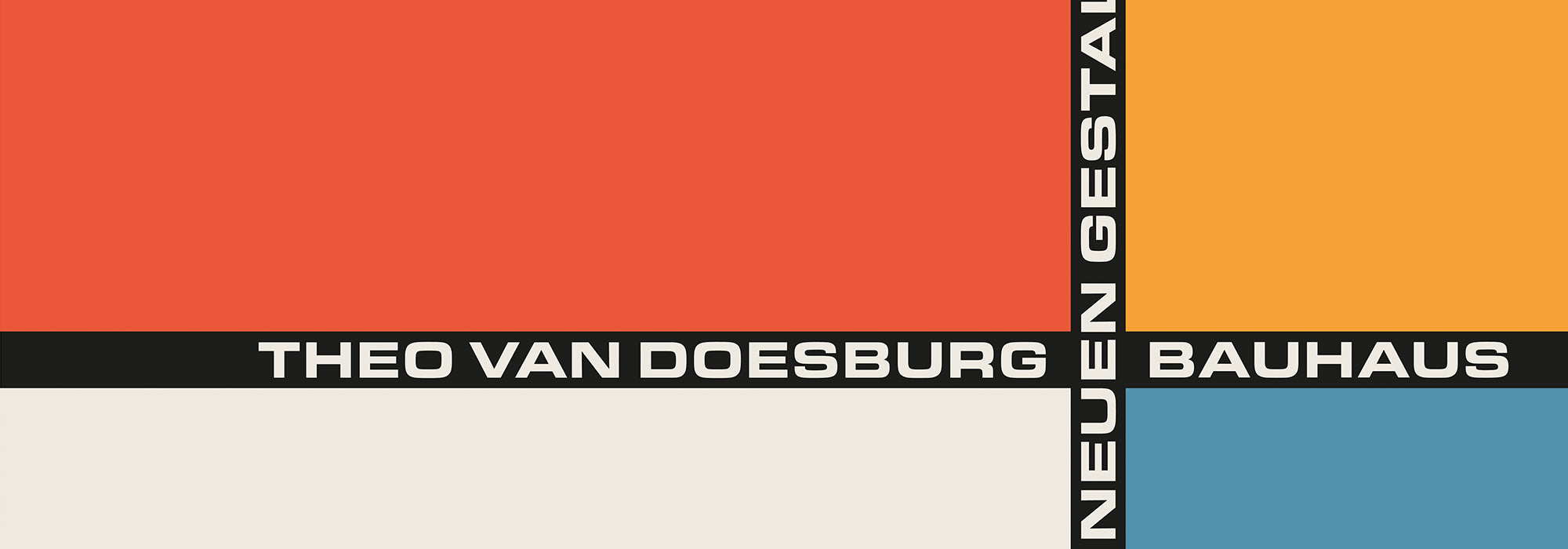
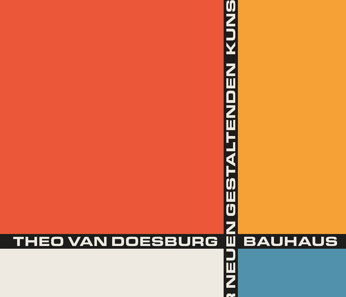


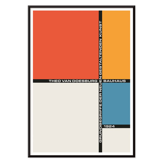
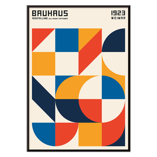
- Bauhaus 21 Juliste
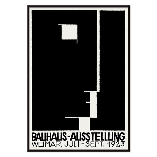
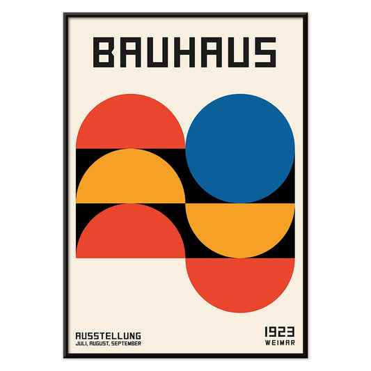
- Bauhausnäyttelyjuliste
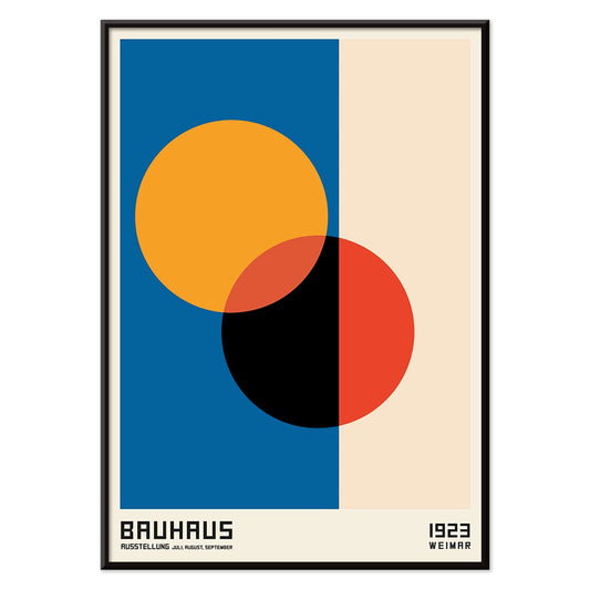
- Bauhaus Juliste 19
- Bauhausjuliste 18
- Bauhaus 17 Juliste
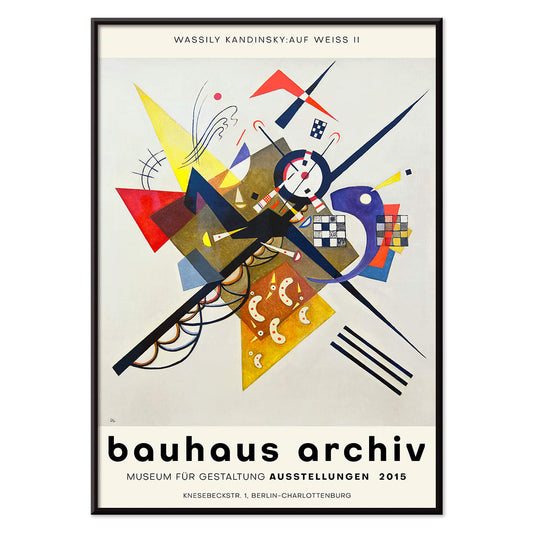
- Auf Weiss II Juliste
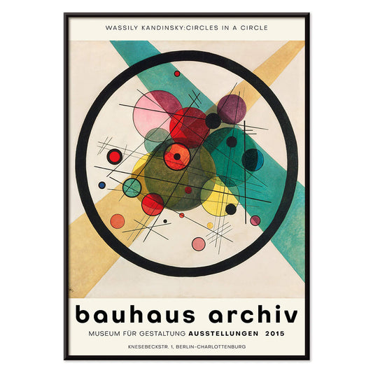
- Ympyröitä ympyrässä Juliste
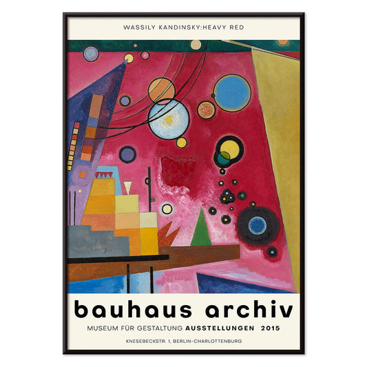
- Voimakas punainen Juliste
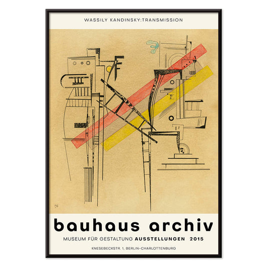
- Transmissiojuliste
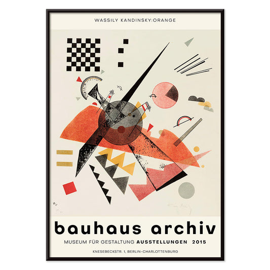
- Oranssi Juliste
- Valopiiri Juliste
- Bauhaus 16 juliste
- Bauhaus-juliste 15
- Bauhaus 14 juliste
- Bauhaus 13 juliste
- Bauhaus 12 juliste
- Bauhaus 11 Juliste
- Bauhaus Juliste 10
- Bauhausjuliste 9
- Bauhaus 7 Juliste
- Bauhausjuliste 6
- Bauhaus 4 Juliste
- Bauhaus Juliste 5
- Bauhaus Juliste 2
- Bauhaus 1 Juliste
- Bauhaus Juliste 3
- Iloinen nousu juliste
- Gewebe Juliste
- Kleine Welten IV Juliste
- Violetti Juliste
- Neljä osaa Juliste
- Pienet maailmat I Juliste
-
Bauhaus 21 Juliste
Tuntematon taiteilija · 1924 · geometrinen Bauhausjuliste oranssilla ympyrällä, sinisellä blokilla ja tarkoilla mustilla viivoilla
Juliste €9 · Kehystetty €16
Normaalihinta Alkaen €6,00Normaalihinta -
Bauhausnäyttelyjuliste
Tuntematon taiteilija · 1923 · bauhausnäyttelyjuliste jossa rohkeaa mustavalkoista geometriaa ja selkeää sansseriftypografia
Juliste €9 · Kehystetty €16
Normaalihinta Alkaen €6,00Normaalihinta -
Bauhaus Juliste 19
MORYARTY · 1923 · geometrinen Bauhausjuliste jossa tasapainoiset ympyrät ja neliöt kirkkaissa perusväreissä seinätaiteessa
Juliste €9 · Kehystetty €16
Normaalihinta Alkaen €6,00Normaalihinta -
Bauhausjuliste 18
MORYARTY · 1926 · geometriset ympyrät ja palkit primaariväreissä tuovat modernistista eleganssia sisustukseen
Juliste €9 · Kehystetty €16
Normaalihinta Alkaen €6,00Normaalihinta -
Bauhaus 17 Juliste
MORYARTY · geometrinen Bauhausjuliste jossa risteävät ympyrät kirkkailla perusväreillä ja voimakkaalla graafisella ilmeellä olohuoneen seinälle
Juliste €9 · Kehystetty €16
Normaalihinta Alkaen €6,00Normaalihinta -
Auf Weiss II Juliste
Wassily Kandinsky · 1923 · dynaaminen geometrinen taidejuliste valkoisella taustalla primaarivärein ja terävin mustin viivoin
Juliste €9 · Kehystetty €16
Normaalihinta Alkaen €6,00Normaalihinta -
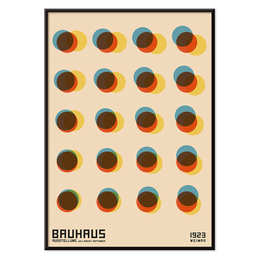
Ympyröitä ympyrässä Juliste
Wassily Kandinsky · 1923 · säteilevä abstrakti juliste, kerrokselliset ympyrät ja dynaaminen väripaletti syvällä mustalla kentällä
Juliste €9 · Kehystetty €16
Normaalihinta Alkaen €6,00Normaalihinta -
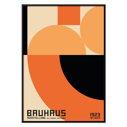
Voimakas punainen Juliste
Wassily Kandinsky · 1924 · dynaaminen abstrakti juliste, jossa keskellä voimakas punainen lohko ja selkeät geometriset aksentit
Juliste €9 · Kehystetty €16
Normaalihinta Alkaen €6,00Normaalihinta -
Transmissiojuliste
Wassily Kandinsky · 1935 · abstrakti geometrinen juliste leikkisillä ympyröillä, viivoilla ja kromaattisilla aksenteilla värikkäällä
Juliste €9 · Kehystetty €16
Normaalihinta Alkaen €6,00Normaalihinta -
Oranssi Juliste
Wassily Kandinsky · 1923 · geometrinen oranssi juliste, jossa ympyrät ja terävät linjat leikkivät ilmavalla valkoisella taustalla
Juliste €9 · Kehystetty €16
Normaalihinta Alkaen €6,00Normaalihinta -
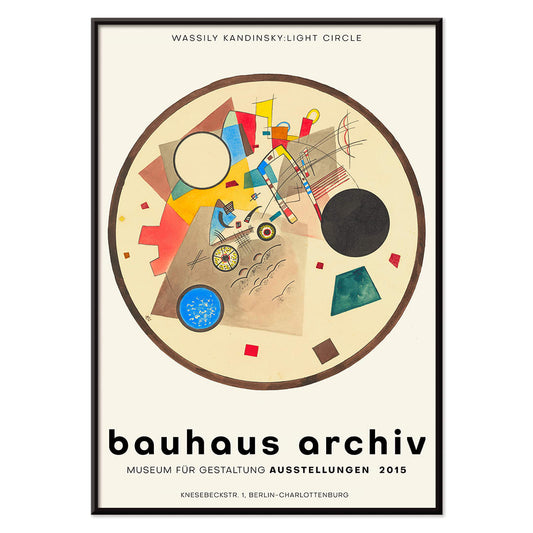
Valopiiri Juliste
Wassily Kandinsky · 1922 · geometrinen abstrakti juliste jossa hehkuvia renkaita ja teräviä kulmia syvällä tummalla pohjalla
Juliste €9 · Kehystetty €16
Normaalihinta Alkaen €6,00Normaalihinta -
Bauhaus 16 juliste
MORYARTY · 1923 · geometrinen Bauhausjuliste, primaarivärit ja voimakkaat mustat viivat puhtaalla valkoisella ilme
Juliste €9 · Kehystetty €16
Normaalihinta Alkaen €6,00Normaalihinta -
Bauhaus-juliste 15
MORYARTY · 1926 · geometrinen Bauhaus juliste jossa ympyröitä ja rohkeita väripintoja valkoisella taustalla
Juliste €9 · Kehystetty €16
Normaalihinta Alkaen €6,00Normaalihinta -
Bauhaus 14 juliste
MORYARTY · 1923 · geometrinen Bauhausjuliste päävärein ja selkeällä modernistisella typografialla, täydellinen seinätaide sisustukseen
Juliste €9 · Kehystetty €16
Normaalihinta Alkaen €6,00Normaalihinta -
Bauhaus 13 juliste
MORYARTY · nykyaikainen · geometrinen Bauhausjuliste voimakkailla perusväreillä ja mustalla kontrastilla, täydellinen moderniin seinätaiteeseen
Juliste €9 · Kehystetty €16
Normaalihinta Alkaen €6,00Normaalihinta -
Bauhaus 12 juliste
MORYARTY · 1923 · geometrinen Bauhausjuliste, jossa ympyrät ja suorakulmiot tasapainottavat punaisen, sinisen, keltaisen ja mustan
Juliste €9 · Kehystetty €16
Normaalihinta Alkaen €6,00Normaalihinta -
Bauhaus 11 Juliste
MORYARTY · 1923 · hillitty geometrinen juliste, vahvat ympyrät ja diagonaalit valkoisella taustalla
Juliste €9 · Kehystetty €16
Normaalihinta Alkaen €6,00Normaalihinta -
Bauhaus Juliste 10
MORYARTY · 1923 · geometrinen Bauhausjuliste jossa ympyröitä, palkkeja ja kontrasteja sekä selkeä rakenne voimakkaissa pääväreissä
Juliste €9 · Kehystetty €16
Normaalihinta Alkaen €6,00Normaalihinta -
Bauhausjuliste 9
MORYARTY · geometriset ympyrät ja primaarivärit tasapainossa terävien mustien linjojen kanssa
Juliste €9 · Kehystetty €16
Normaalihinta Alkaen €6,00Normaalihinta -
Bauhausjuliste 8 Juliste
MORYARTY · 1923 · geometrinen Bauhausjuliste voimakkaalla ympyrä- ja neliöristillä, hillityn beige taustan sävyissä
Juliste €9 · Kehystetty €16
Normaalihinta Alkaen €6,00Normaalihinta -
Bauhaus 7 Juliste
MORYARTY · 1923 · geometriset ympyrät primaarivärein, selkeä Bauhausin tasapaino, rytmikäs päällekkäisyys ja moderni seinätaide
Juliste €9 · Kehystetty €16
Normaalihinta Alkaen €6,00Normaalihinta -
Bauhausjuliste 6
MORYARTY · 1923 · bauhausvaikutteinen abstrakti juliste mustilla viivoilla, oransseilla yksityiskohdilla ja sinisellä geometrialla
Juliste €9 · Kehystetty €16
Normaalihinta Alkaen €6,00Normaalihinta -
Bauhaus 4 Juliste
MORYARTY · 1923 · geometrinen Bauhausjuliste oranssin ja mustan muodoin lämpimällä beigen taustalla ajaton katseenvangitsija moderniin sisustukseen
Juliste €9 · Kehystetty €16
Normaalihinta Alkaen €6,00Normaalihinta -
Bauhaus Juliste 5
MORYARTY · 1923 · geometrinen Bauhausjuliste, rohkeat ympyrät ja palkit lämpimällä beigetaustalla, selkeä arkkitehtoninen tunnelma
Juliste €9 · Kehystetty €16
Normaalihinta Alkaen €6,00Normaalihinta -
Bauhaus Juliste 2
MORYARTY · 1923 · bauhausvaikutteinen geometrinen juliste mustan, oranssin ja sinisen korostuksin selkeillä linjoilla
Juliste €9 · Kehystetty €16
Normaalihinta Alkaen €6,00Normaalihinta -
Bauhaus 1 Juliste
MORYARTY · 1923 · geometrinen Bauhaus -juliste kerroksellisin muodoin ja rohkein modernistisin värikontrastein, sopii minimalistiseen ja moderniin sisustukseen
Juliste €9 · Kehystetty €16
Normaalihinta Alkaen €6,00Normaalihinta -
Bauhaus Juliste 3
MORYARTY · 1923 · geometrinen Bauhausjuliste pääväreillä, selkeä typografia ja harmoninen modernistinen tasapaino kodin sisustukseen
Juliste €9 · Kehystetty €16
Normaalihinta Alkaen €6,00Normaalihinta -
Iloinen nousu juliste
Wassily Kandinsky · 1923 · dynaaminen geometrinen juliste nousevilla linjoilla, ympyröillä ja vahvoilla pääväreillä, energinen ja selkeä
Juliste €9 · Kehystetty €16
Normaalihinta Alkaen €6,00Normaalihinta -
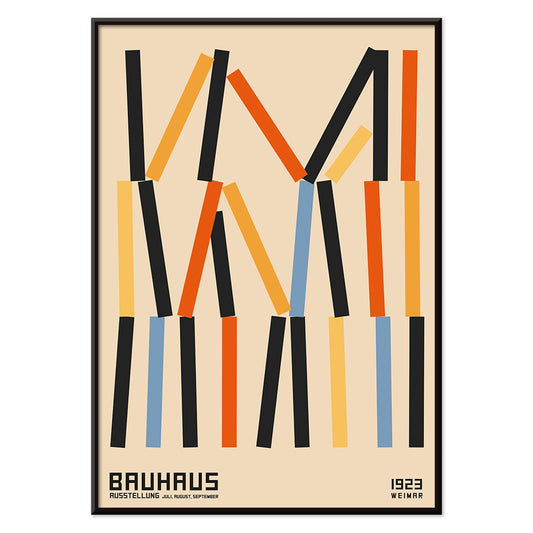
Gewebe Juliste
Wassily Kandinsky · 1923 · geometrinen abstrakti taidejuliste rytmisillä lohkoilla ja viivoilla lämmittävässä beigessä
Juliste €9 · Kehystetty €16
Normaalihinta Alkaen €6,00Normaalihinta -
Kleine Welten II Juliste
Wassily Kandinsky · 1922 · rytminen geometrinen taidejuliste kelluvilla ympyröillä ja terävillä viivoilla ja voimakkailla väreillä
Juliste €9 · Kehystetty €16
Normaalihinta Alkaen €6,00Normaalihinta -
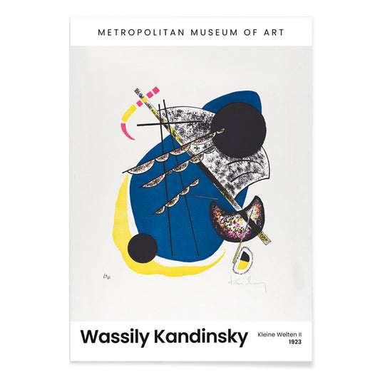
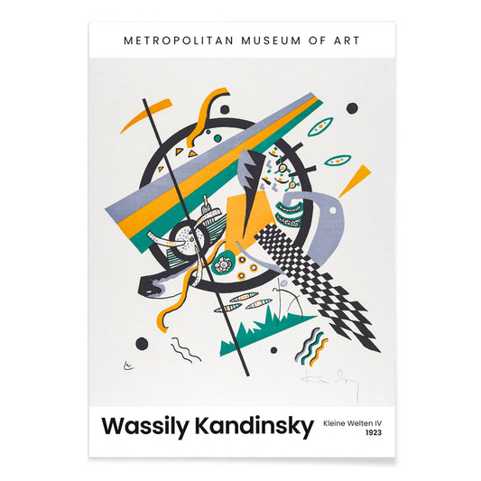
Kleine Welten IV Juliste
Wassily Kandinsky · 1922 · abstrakti taidejuliste ympyröistä ja terävistä viivoista, kirkkaat siniset, keltaiset ja vihreät aksentit
Juliste €9 · Kehystetty €16
Normaalihinta Alkaen €6,00Normaalihinta -
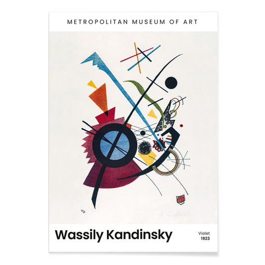
Violetti Juliste
Wassily Kandinsky · 1923 · geometrinen abstrakti taidejuliste violeteilla, sinisillä ja keltaisilla muodoilla moderniin sisustukseen, olohuoneeseen ja työtilaan
Juliste €9 · Kehystetty €16
Normaalihinta Alkaen €6,00Normaalihinta -
Neljä osaa Juliste
Wassily Kandinsky · 1932 · abstrakti taidejuliste jaettu neljään selkeään kenttään terävin viivoin ja muodoilla
Juliste €9 · Kehystetty €16
Normaalihinta Alkaen €6,00Normaalihinta -
Pienet maailmat V Juliste
Wassily Kandinsky · 1922 · rytminen geometrinen juliste ympyröillä ja terävillä viivoilla syvän mustan taustan vastapainona
Juliste €9 · Kehystetty €16
Normaalihinta Alkaen €6,00Normaalihinta -
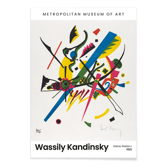
Pienet maailmat I Juliste
Wassily Kandinsky · 1922 · geometrinen abstrakti juliste, ympyröitä ja viivoja, kirkkaat primaarivärit rytmittävät teosta voimakkaasti seinätilan energisoivana
Juliste €9 · Kehystetty €16
Normaalihinta Alkaen €6,00Normaalihinta -
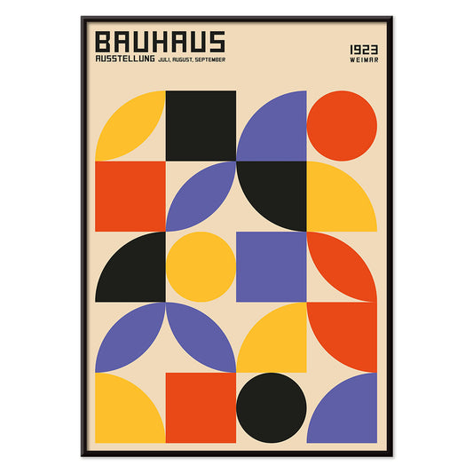
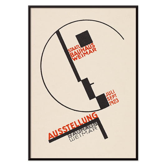
Bauhaus Weimar -näyttely Juliste
Dörte Helm · 1923 · Bauhaus-juliste, jossa rohkea geometria ja punainen typografia kohtaavat beigen pohjan
Juliste €9 · Kehystetty €16
Normaalihinta Alkaen €6,00Normaalihinta


36/37 items
- Bauhaus 21 Juliste
- Bauhausnäyttelyjuliste
- Bauhaus Juliste 19
- Bauhausjuliste 18
- Bauhaus 17 Juliste
- Auf Weiss II Juliste
- Ympyröitä ympyrässä Juliste
- Voimakas punainen Juliste
- Transmissiojuliste
- Oranssi Juliste
- Valopiiri Juliste
- Bauhaus 16 juliste
- Bauhaus-juliste 15
- Bauhaus 14 juliste
- Bauhaus 13 juliste
- Bauhaus 12 juliste
- Bauhaus 11 Juliste
- Bauhaus Juliste 10
- Bauhausjuliste 9
- Bauhaus 7 Juliste
- Bauhausjuliste 6
- Bauhaus 4 Juliste
- Bauhaus Juliste 5
- Bauhaus Juliste 2
- Bauhaus 1 Juliste
- Bauhaus Juliste 3
- Iloinen nousu juliste
- Gewebe Juliste
- Kleine Welten IV Juliste
- Violetti Juliste
- Neljä osaa Juliste
- Pienet maailmat I Juliste
Bauhaus posters as modern folklore
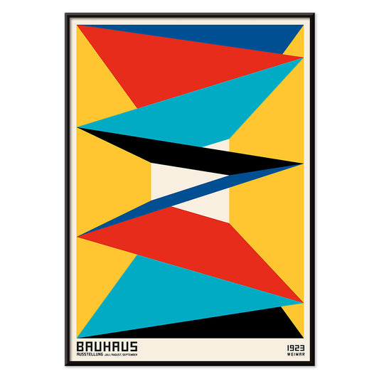
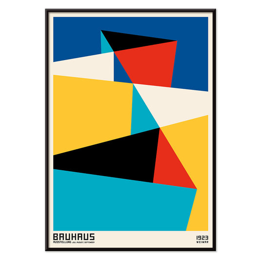
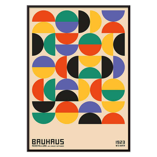
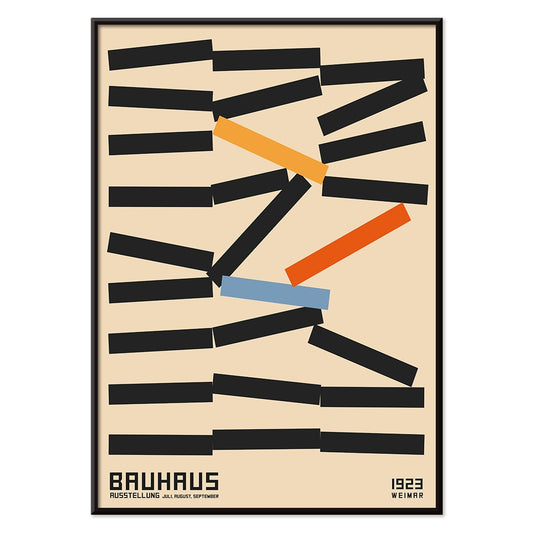
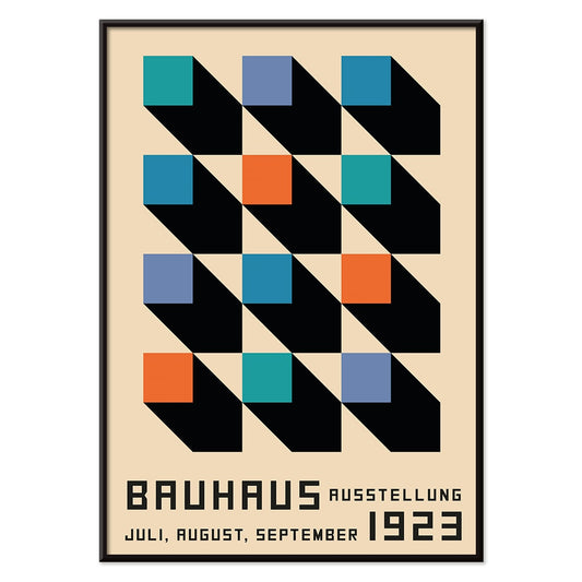
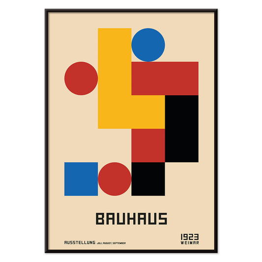
Born in Weimar and sharpened in Dessau, the Bauhaus treated the poster as a laboratory: clean type, hard-edged geometry, and color used like a tool. These vintage compositions still read as current wall art because they describe structure rather than fashion. Across the Bauhaus collection, circles, bars, grids, and diagonals become visual music, balanced between order and play. The result is graphic decoration with an architectural pulse, closer to a floor plan or a score than to illustration.
Kandinsky and the grammar of color
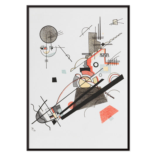
Wassily Kandinsky’s Bauhaus period shows how abstraction can be both rigorous and lyrical, with forms that behave like signs as much as shapes. In Four Parts (1932) by Wassily Kandinsky, four panels read like movements in a suite: slender lines, arcs, and measured pauses, each section nudging the next. Circles in a Circle, Bauhaus exhibition (1923) turns the page into a cosmic diagram where discs overlap and glow against a dark field, echoing classroom exercises in balance and tension. For a wider context, the Wassily Kandinsky and Abstract collections trace how this visual language moved between pedagogy and painting.
Placing Bauhaus wall art at home
Because Bauhaus design was made for real rooms, these posters sit naturally where materials already have presence: hallways with strong sightlines, offices with shelving, kitchens with steel and tile, or living rooms with low seating. Let saturated red or mustard shapes play against warm woods; let quieter compositions hold space above linen or wool upholstery. If your palette leans neutral, start with companions from Black & White, then add one controlled accent from Red or Yellow. When you want the Bauhaus logic without visual noise, Minimalist posters keep the same economy of form while lowering contrast.
Pairing, scale, and framing decisions
When curating Bauhaus prints, think in rhythm: alternate dense, diagram-like works with open, airy ones. Heavy Red, Bauhaus exhibition (1924) by Wassily Kandinsky uses a weighty scarlet block that can anchor a wall above a sideboard; pair it with the pale geometry of Auf Weiss II, Bauhaus exhibition (1923) to let the eye breathe. For a more playful counterpoint, Kleine Welten IV (1922) by Wassily Kandinsky scatters tiny forms like notes on a workbench, useful when you need energy without a large block of color. Keep framing simple with Frames or the pared-back profiles in Classic Frame; wide mats echo Bauhaus spacing and make the print feel more architectural.
Why the Bauhaus still speaks
What makes these designs endure is their ethic of legibility: form clarifies how we live, move, and read. That is why a Bauhaus poster can coexist with Scandinavian furniture, 1970s chrome, or even natural-history prints without feeling out of place. If you like seeing movements in conversation, Famous Artists widens the view beyond the school, while All Posters helps you track recurring motifs across themes. Leave a margin of blank wall around one strong composition and the room reads as intentionally structured, not merely filled.