


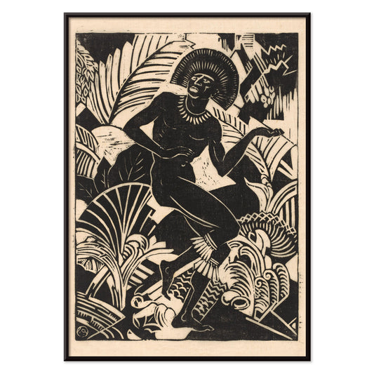
- Tuhoa tämä hurja peto Juliste
- Shaw vai ironia Juliste
- Les Lalanne -juliste
- Punch Boutique -juliste
- Juudaisuuden ja pakanallisuuden näkökulma Juliste
- Jet Clipper Havaijille Juliste
- Campari Soda Juliste
- Bec-Kina Juliste
- Berliinin katunäkymä Juliste
- Ernst Kirchner -näyttelyjuliste
- Eiffeltorni 2 Juliste
- selin istuva nainen Juliste
- Puisto lähellä Lu juliste
- Alku Juliste
- Parler Seul 2 Juliste
- Mahatmojen nykyinen näkökulma Juliste
- Hämärän rengas Juliste
- Parler Seul -juliste
- Unelma juliste
- Konserttijuliste
- Lintu pilven läpi Juliste
- Naistaiteilija Juliste
- Pink Pantherin kosto Juliste
- Nainen ja lintu yössä juliste
- Riley Blaze Juliste
- Almanaquejuliste
- Bauhaus 20 Juliste
- Bauhaus 21 Juliste
- Syö enemmän hedelmiä juliste
- Sininen japanilaiskurkijuliste
- Snoopy tulee kotiin juliste
- Lontooseen Jet Clipperillä Juliste
- La Paresse Juliste
- Xerez Pedro Domecq Juliste
- Balsam Aperitif -juliste
- Crans-Montana Juliste
-
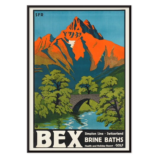
Bexin suolakylpyläjuliste
Aime-Felix Nicollerat · 1896 · alppien kylpyläjuliste kivisillalla, virtaavalla joella ja säteilevillä huipuilla, rauhoittava vintage-tunnelma
Juliste €9 · Kehystetty €16
Normaalihinta Alkaen €6,00Normaalihinta -
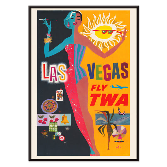
Las Vegas – TWA-lento juliste
David Klein · 1962 · värikäs Las Vegas -matkailujuliste, showtyttö, neonkylttien säihke, retrohenkinen tunnelma
Juliste €9 · Kehystetty €16
Normaalihinta Alkaen €6,00Normaalihinta -
Osen Juliste
Komura Settai · 1934 · hiljainen sadekohtaus ja anonyymit hahmot wagasasateenvarjojen alla, eleganti ja meditatiivinen taidejuliste
Juliste €9 · Kehystetty €16
Normaalihinta Alkaen €6,00Normaalihinta -
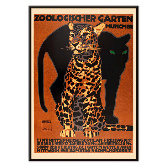
Münchenin eläintarhan juliste
Ludwig Hohlwein · 1912 · vaikuttava Münchenin eläintarhujuliste voimakkaalla raidallisella suurella kissalla ja selkeällä typografialla
Juliste €9 · Kehystetty €16
Normaalihinta Alkaen €6,00Normaalihinta -
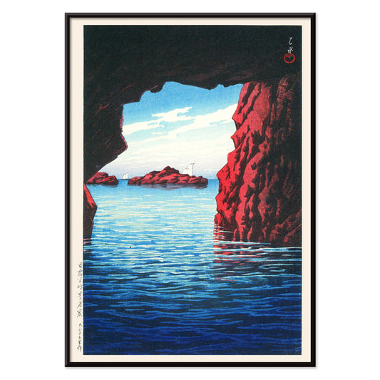
Matkojeni muistot juliste
Kawase Hasui · 1940 · rauhallinen rannikkojuliste luolasta tummien kallioiden ja kirkkaan mainingin yllä
Juliste €9 · Kehystetty €16
Normaalihinta Alkaen €6,00Normaalihinta -
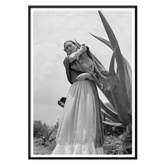
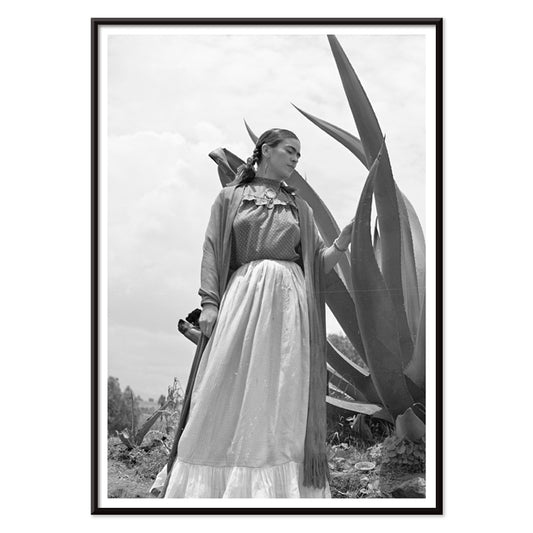
Frida Kahlo agaven vieressä Juliste
Toni Frissell · 1937 · ikoninen mustavalkoinen juliste Frida Kahlosta agaven vierellä vahvalla graafisella ilmeellä
Juliste €9 · Kehystetty €16
Normaalihinta Alkaen €6,00Normaalihinta -
Frida Kahlo agaven vierellä Juliste
Toni Frissell · 1937 · näyttävä mustavalkoinen muotokuva Frida Kahlosta agaven vierellä kodin taidejulisteena seinälle
Juliste €9 · Kehystetty €16
Normaalihinta Alkaen €6,00Normaalihinta -
Tavistockin markiisi juliste
Toni Frissell · 1955 · tyylikäs mustavalkoinen pari juliste joka tuo 1950-luvun Bermudan lomaglamourin sisustukseen
Juliste €9 · Kehystetty €16
Normaalihinta Alkaen €6,00Normaalihinta -
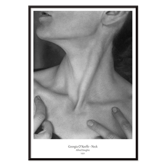
Georgia O'Keeffe - Kaula Juliste
Alfred Stieglitz · 1921 · intiimi mustavalkoinen taidejuliste, joka rajaa kaulan ja leukalinjan veistokselliseksi abstraktioksi
Juliste €9 · Kehystetty €16
Normaalihinta Alkaen €6,00Normaalihinta -
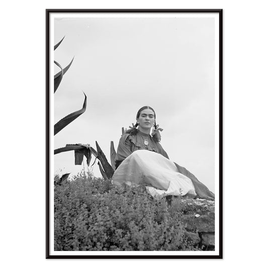
Frida Kahlo agaven vieressä Juliste
Toni Frissell · 1937 · ikoninen mustavalkoinen juliste Frida Kahlosta agaven monumentaalisen siluetin vieressä vahvaa dokumentaarista estetiikkaa ja ajaton seinätaide
Juliste €9 · Kehystetty €16
Normaalihinta Alkaen €6,00Normaalihinta -
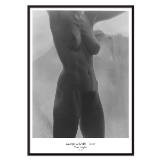
Georgia O'Keeffe – vartalojuliste
Alfred Stieglitz · 1918 · rajattu mustavalkoinen vartalojuliste pehmeässä valossa, modernistista intiimiyttä ja herkkyyttä sekä voimaa
Juliste €9 · Kehystetty €16
Normaalihinta Alkaen €6,00Normaalihinta -
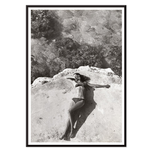
Nickerson Paine bikinissä Juliste
Toni Frissell · 1971 · mustavalkoinen bikinijuliste auringonpaisteisella rannikonäkymällä, ajaton editoriaalinen tunnelma ja selkeä kontrasti
Juliste €9 · Kehystetty €16
Normaalihinta Alkaen €6,00Normaalihinta -
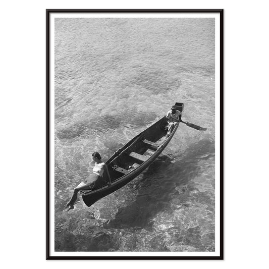
Muotimalli veneen reunalla juliste
Toni Frissell · 1946 · elegantti mustavalkoinen juliste muotimallista veneen reunalla, ajaton matkailutunnelma ja tyylikäs sisustuselementti kotisi seinälle
Juliste €9 · Kehystetty €16
Normaalihinta Alkaen €6,00Normaalihinta -
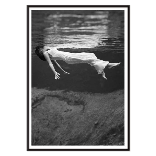
muotimallin vedenalainen Juliste
Toni Frissell · 1947 · surrealistinen vedenalainen muotijuliste kelluva malli mustavalkoisessa unenomaisessa tunnelmassa ajaton eleganssi ja liikkeen kontrasti
Juliste €9 · Kehystetty €16
Normaalihinta Alkaen €6,00Normaalihinta -
Weeki Wachee -lähde Juliste
Toni Frissell · 1947 · unenomaisen vedenalainen muotijuliste, kelluva nainen mustavalkoisessa valossa, vintagehenkinen seinätaide olohuoneeseen
Juliste €9 · Kehystetty €16
Normaalihinta Alkaen €6,00Normaalihinta -
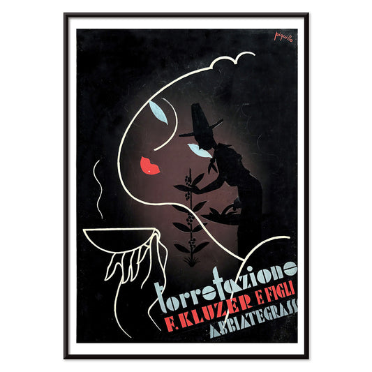
Torrefazione F.Kluzer Juliste
Carlo Piquillo Pandolfi · 1930 · italialainen Art Deco kahvijuliste, jossa rohkea kuppi ja geometriset väripinnat
Juliste €9 · Kehystetty €16
Normaalihinta Alkaen €6,00Normaalihinta -
Sigmund Freud -juliste
Seymour Chwast · 1970 · oivaltava Freudmuotokuvajuliste joka yhdistää poptypografian ja surrealistisia symboleja vihreän ja oranssin sävyissä
Juliste €9 · Kehystetty €16
Normaalihinta Alkaen €6,00Normaalihinta -
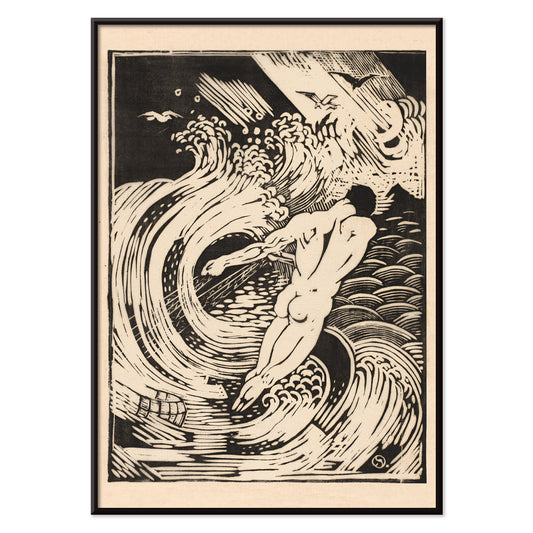
Kalastaja juliste
Henri van der Stok · 1900 · dramaattinen mustavalkoinen juliste voimakkaalla grafiikalla alastomasta sukeltajasta
Juliste €9 · Kehystetty €16
Normaalihinta Alkaen €6,00Normaalihinta -
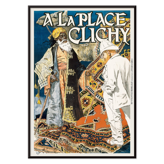
A la Place Clichy Juliste
Eugène Grasset · 1891 · art nouveau -ajan pariisijuliste jossa tyylikäs nainen ja voimakas sinioranssi värimaailma
Juliste €9 · Kehystetty €16
Normaalihinta Alkaen €6,00Normaalihinta -
Metsästäjäjuliste
Henri van der Stok · 1880 · vaikuttava mustavalkoinen juliste metsastajahahmosta tiheän lehviston keskellä ja rytmikkäällä sommittelulla
Juliste €9 · Kehystetty €16
Normaalihinta Alkaen €6,00Normaalihinta -
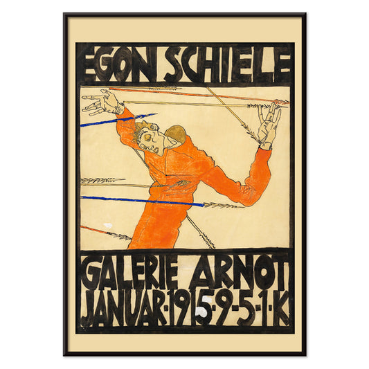
Schielen näyttely Galerie Arnot Juliste
Egon Schiele · 1915 · ekspressionistinen näyttelyjuliste, kulmikas hahmo, voimakas oranssi aksentti ja ajaton graafinen vaikutus tilassa
Juliste €9 · Kehystetty €16
Normaalihinta Alkaen €6,00Normaalihinta -
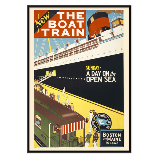
Laivajuna Juliste
Charles W. Holmes · 1925 · dynaaminen Art Deco -tyylinen matkailujuliste jossa kiireinen juna ja laivasiluetti, retrohenkinen ja näyttävä osa kodin sisustusta
Juliste €9 · Kehystetty €16
Normaalihinta Alkaen €6,00Normaalihinta -
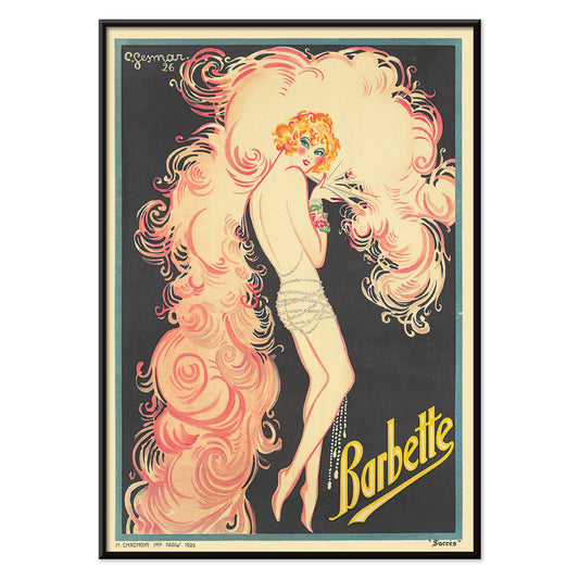
Barbette Juliste
Charles Gesmar · 1926 · glamourinen kabareejuliste Barbettestä, retrohenkinen ja näyttävä, vaaleanpunaiset sulat ja keltainen valokeila korostavat teatterimaista ilmettä
Juliste €9 · Kehystetty €16
Normaalihinta Alkaen €6,00Normaalihinta -
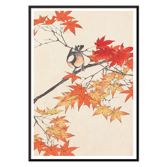
Keinen kacho gafu -juliste
Imao Keinen · 1892 · herkkä lintujuliste syksyn lehdillä lämpimissä punaisen ja pehmeän beigen sävyissä
Juliste €9 · Kehystetty €16
Normaalihinta Alkaen €6,00Normaalihinta -
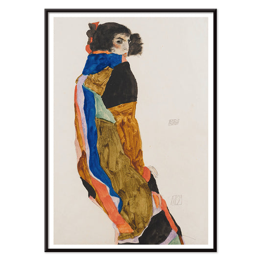
Moa Juliste
Egon Schiele · 1911 · intiimi taidevedos naisesta kuviollisessa kaavussa, rauhallinen ja itseen suuntautunut
Juliste €9 · Kehystetty €16
Normaalihinta Alkaen €6,00Normaalihinta -
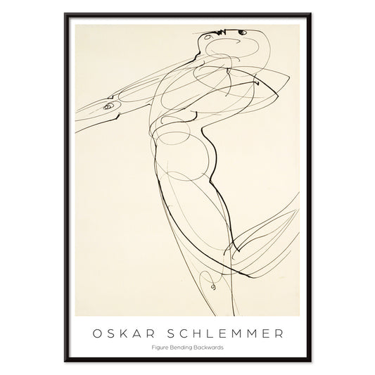
Taaksepäin taivuttuva hahmo Juliste
Oskar Schlemmer · 1931 · taidejuliste Bauhaus -tyylisestä hahmosta taaksepäin taivuttuvassa asennossa, minimalistinen mustavalkoinen seinätaidonteos
Juliste €9 · Kehystetty €16
Normaalihinta Alkaen €6,00Normaalihinta -
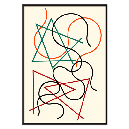
Geometriset ja aaltoilevat linjat Juliste
Myriam Thyes · 2014 · energinen geometrinen taidejuliste aaltoilevilla linjoilla ja tummalla mustalla rakenteella lämpimällä beigen taustalla
Juliste €9 · Kehystetty €16
Normaalihinta Alkaen €6,00Normaalihinta -
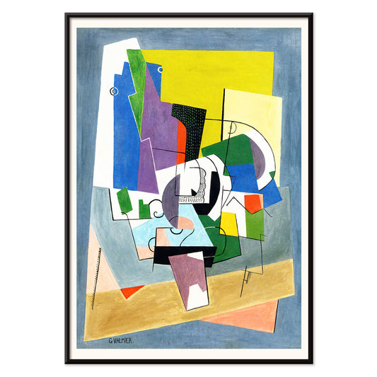
Kompositio Juliste
Georges Valmier · 1921 · värikäs geometrinen taidejuliste joka tasapainottaa kaarevia ja kulmikkaita muotoja sinisessä, keltaisessa ja vihreässä
Juliste €9 · Kehystetty €16
Normaalihinta Alkaen €6,00Normaalihinta -
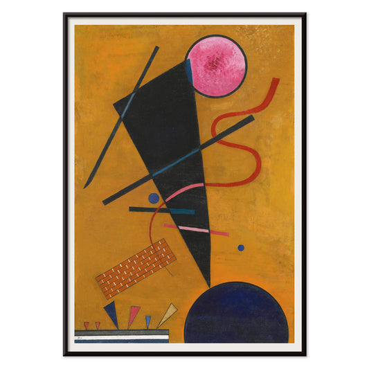
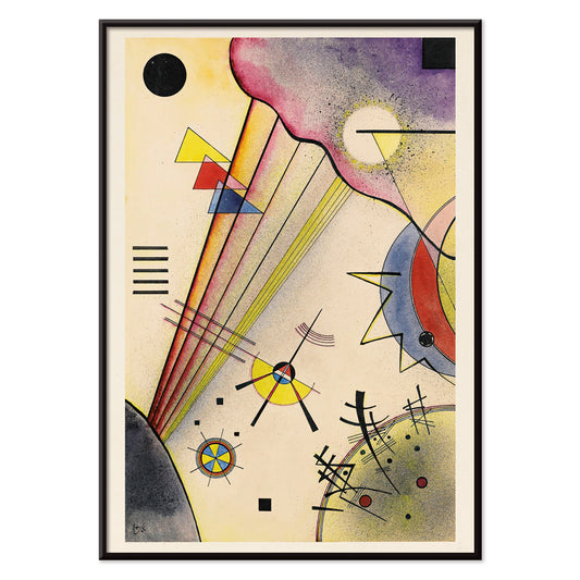
Kosketus Juliste
Wassily Kandinsky · 1924 · dynaaminen abstrakti juliste leikkaavilla ympyröillä, kulmikkain linjoin ja rohkein punaisin ja oranssein korostuksin
Juliste €9 · Kehystetty €16
Normaalihinta Alkaen €6,00Normaalihinta -
Himo Juliste
Mikuláš Galanda · 1927 · modernistinen juliste varjostetulla profiililla ja voimakkaan punaisilla huulilla beigellä eleganssilla
Juliste €9 · Kehystetty €16
Normaalihinta Alkaen €6,00Normaalihinta -
Sininen pyöreä ja terävä -juliste
Wassily Kandinsky · 1933 · abstrakti geometrinen taidejuliste sinisillä ympyröillä, terävillä kulmilla ja punaisilla korostuksilla
Juliste €9 · Kehystetty €16
Normaalihinta Alkaen €6,00Normaalihinta -
Hento sielu Juliste
Wassily Kandinsky · 1925 · geometrinen abstrakti taidejuliste terävin mustin viivoin, keltaisin korostuksin ja pehmein liilan sävyin
Juliste €9 · Kehystetty €16
Normaalihinta Alkaen €6,00Normaalihinta -
Pieni lämpö Juliste
Wassily Kandinsky · 1928 · lämmin abstrakti taidejuliste kelluvilla ympyröillä ja terävillä mustilla viivoilla punaisen ja keltaisen sävyissä
Juliste €9 · Kehystetty €16
Normaalihinta Alkaen €6,00Normaalihinta -
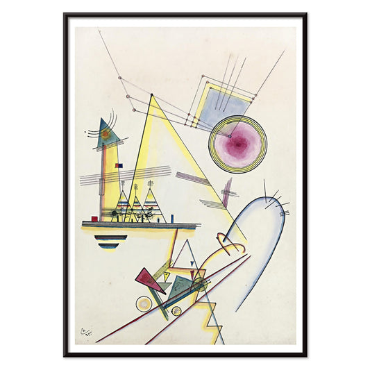
Selkeä yhteys Juliste
Wassily Kandinsky · 1925 · geometrinen abstrakti taidejuliste jossa ympyrät ja kulmat tasapainottuvat energisissä primaarisävyissä ja violeteissa
Juliste €9 · Kehystetty €16
Normaalihinta Alkaen €6,00Normaalihinta -
Nimetön Juliste
Wassily Kandinsky · 1930 · abstrakti geometrinen taidejuliste kelluvista viivoista ja ympyröistä lämpimällä beigetaustalla eleganssilla
Juliste €9 · Kehystetty €16
Normaalihinta Alkaen €6,00Normaalihinta -
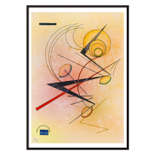
Lyrisches juliste
Wassily Kandinsky · 1911 · lyyrinen abstrakti taidevedos energisilla mustilla viivoilla ja kirkkailla primaariväreillä
Juliste €9 · Kehystetty €16
Normaalihinta Alkaen €6,00Normaalihinta


36/819 items
- Bexin suolakylpyläjuliste
- Las Vegas – TWA-lento juliste
- Osen Juliste
- Münchenin eläintarhan juliste
- Matkojeni muistot juliste
- Frida Kahlo agaven vieressä Juliste
- Frida Kahlo agaven vierellä Juliste
- Tavistockin markiisi juliste
- Frida Kahlo agaven vieressä Juliste
- Nickerson Paine bikinissä Juliste
- Muotimalli veneen reunalla juliste
- muotimallin vedenalainen Juliste
- Weeki Wachee -lähde Juliste
- Sigmund Freud -juliste
- Schielen näyttely Galerie Arnot Juliste
- Laivajuna Juliste
- Barbette Juliste
- Moa Juliste
- Geometriset ja aaltoilevat linjat Juliste
- Kompositio Juliste
- Pieni lämpö Juliste
- Lyrisches juliste
Black as structure in vintage poster design
Black often behaves less like a colour and more like a framework. In vintage poster design, it sharpens edges, steadies ornament, and gives breathing space to colour. This Black collection gathers posters where darkness appears as ink, silhouette, night sky, or typographic spine, an editorial filter rather than a monochrome rule. It is a useful thread for wall art and decoration, especially when you want a room to feel composed without feeling severe. Pair these prints with materials that already carry a dark note, such as iron hardware, a matte lamp base, or a charcoal textile, and the rest of the palette reads more intentional.
How artists used black to hold the image together
In Gustav Klimt’s The Kiss (1907–1908), black works like velvet behind the gold, making the surface feel lit from within and helping the ornament stay legible. Théophile Alexandre Steinlen’s Tournée du Chat Noir (1896) turns a flat midnight field into theatre, proving how silhouette can carry character and humour with almost no modelling. Modernist balance comes through in Wassily Kandinsky’s Circles in a Circle (1923), where black lines act as a scaffold for colour and motion. Even advertising bravura depends on darkness: Leonetto Cappiello’s Vermouth Martini (1920) uses deep shadow to make citrus yellow and skin tones snap into focus, a classic poster trick for instant readability.
Placing black-accent wall art in home decor
Because black reads as structure, these poster choices suit spaces that benefit from visual order: entryways, kitchens, and work corners. Against pale walls, black-accent prints look crisp and architectural; against saturated paint, they create tension and depth. In bedrooms, a dark outline or border can quiet a busy palette, while in dining rooms it behaves like a tailored jacket, giving candlelight and ceramics a clearer stage. For high-contrast companions, see Black & White; for restrained compositions, Minimalist keeps the rhythm clean. If you prefer period graphics and signage energy, Advertising adds bold lettering and dramatic figure-ground play.
Curating pairings, subjects, and frames
On a mixed gallery wall, let black be the repeating note: one graphic poster, one figurative plate, one abstract print. A wildlife sheet like Abbott Handerson Thayer’s Tiger’s Head (1911) brings dense brushwork and shadowed fur that sits naturally with brass, leather, and dark wood. For measured spacing and typographic discipline, mix in geometry from Bauhaus; for natural subjects, Animals keeps imagery coherent while still letting black linework recur. If you want a more symbolic register, Esoteric introduces tarot-like borders, stars, and diagrams that echo scientific line culture. Framing matters: black ash or thin walnut can mirror the ink without making the room heavy, while a generous white mat adds air around intricate contours and small type.
A dark accent that stays flexible
Black details are often what persist in memory: the outline of a cat, a modernist grid, the thin border around a label. Treat this collection as a tool for decoration, choosing one vintage print to anchor a room and letting colour, texture, and light shift around it over time. When black is used as a finishing note rather than a statement, posters feel less like period nostalgia and more like clear-eyed design.