


- Tanssiva pari lumessa Juliste
- Juudaisuuden ja pakanallisuuden näkökulma Juliste
- Jet Clipper Havaijille Juliste
- Campari Soda Juliste
- Bec-Kina Juliste
- Kohler Chocolat Juliste
- Eiffeltorni 2 Juliste
- Mahatmojen nykyinen näkökulma Juliste
- Hämärän rengas Juliste
- Riley Blaze Juliste
- Almanaquejuliste
- Bauhaus 20 Juliste
- Jefferson Airplane -juliste
- Snoopy tulee kotiin juliste
- Lontooseen Jet Clipperillä Juliste
- Kyushu-Okinawa-juliste
- La Paresse Juliste
- Balsam Aperitif -juliste
- Crans-Montana Juliste
- Monte Carlo Juliste
- Tyynen värähtelyt juliste
- Continental Hawaii -lentoyhtiön juliste
- Sherlock Holmes Juliste
- Olut ja savuke Juliste
- Meksikon länsirannikko Juliste
- Rita Gaufres · Juliste
- Kanagawan suuri aalto -juliste
- Cordial Campari -juliste
- Solaris Juliste
- Blow Up -juliste
- Hibiskusjuliste
- Pisan kalteva torni Juliste
- Punaiset huulet Juliste
- Keinu kirjoihin juliste
- Meksikon taide ja elämä 4 Juliste
- Bauhausnäyttelyjuliste
-
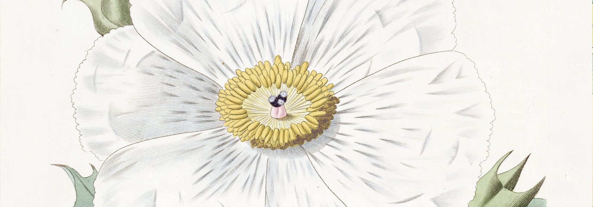
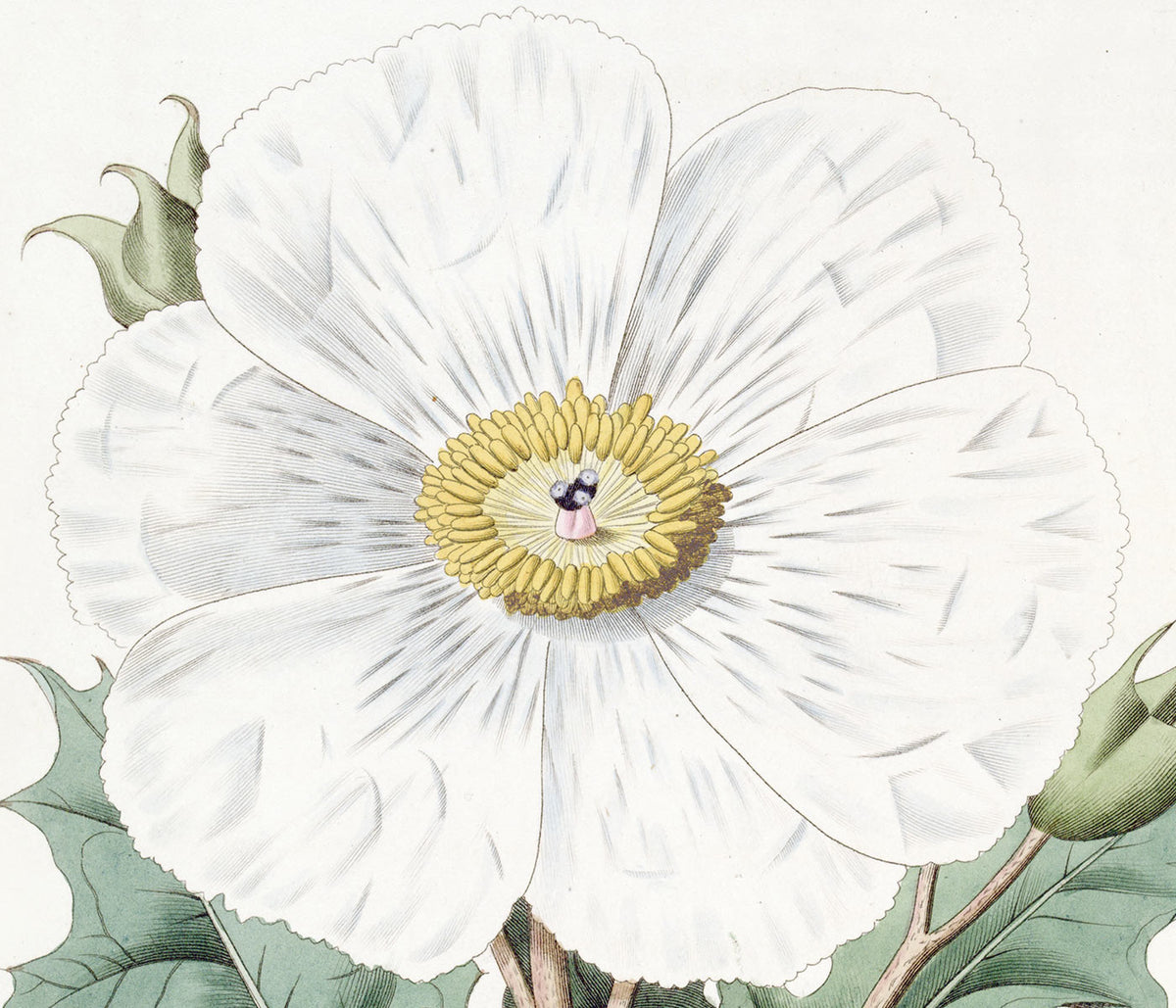
Sateenkaaren tyynykaktus ja pääsiäislilja Juliste
Tuntematon taiteilija · 1899 · yksityiskohtainen taidejuliste tyynykaktuksesta ja pääsiäisliljasta, kontrasti piikikkään ja pehmeän välillä
Juliste €9 · Kehystetty €16
Normaalihinta Alkaen €6,00Normaalihinta -
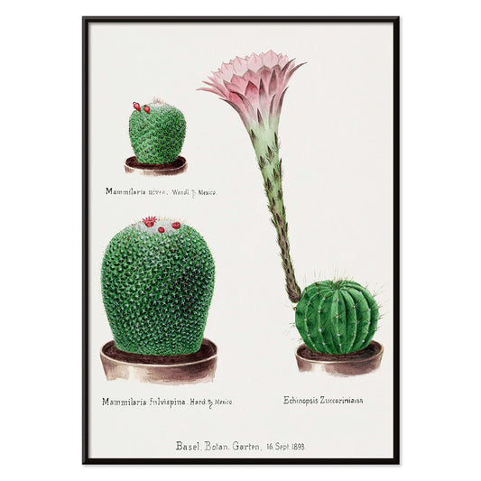
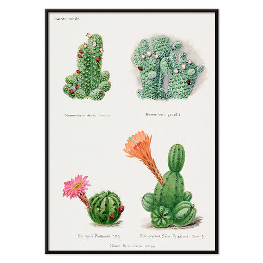
Erilaiset kaktukset Juliste
Tuntematon taiteilija · 1899 · eläväinen kaktusjuliste monimuotoisilla muodoilla ja kirkkailla kukilla puhtaalla paperilla ajaton sisustukseen
Juliste €9 · Kehystetty €16
Normaalihinta Alkaen €6,00Normaalihinta -
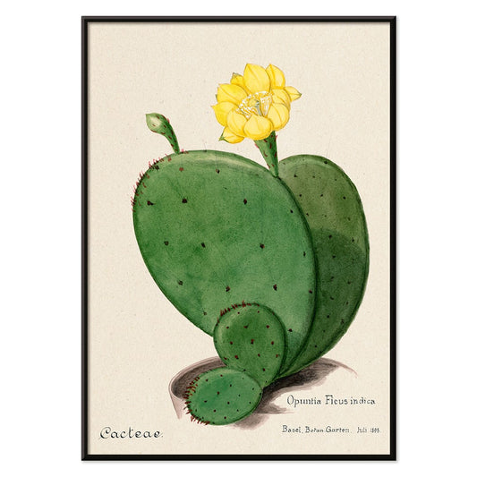
opuntia eli intianviikuna Juliste
Tuntematon taiteilija · 1899 · yksityiskohtainen opuntiakaktus taidejuliste segmentoiduilla vihreillä paloilla ja pehmeällä keltaisella kukalla
Juliste €9 · Kehystetty €16
Normaalihinta Alkaen €6,00Normaalihinta -
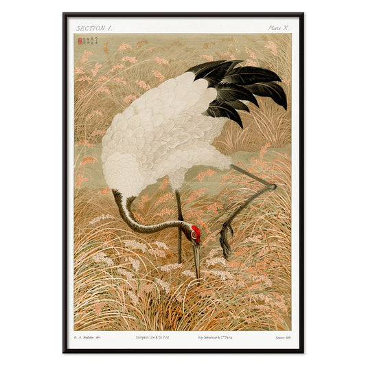
Saruskurki riisipellolla Juliste
Tuntematon taiteilija · 1884 · sulavalinjainen saruskurkijuliste riisipellon keskellä, lämpimän beige ja hillitty punainen korostus
Juliste €9 · Kehystetty €16
Normaalihinta Alkaen €6,00Normaalihinta -
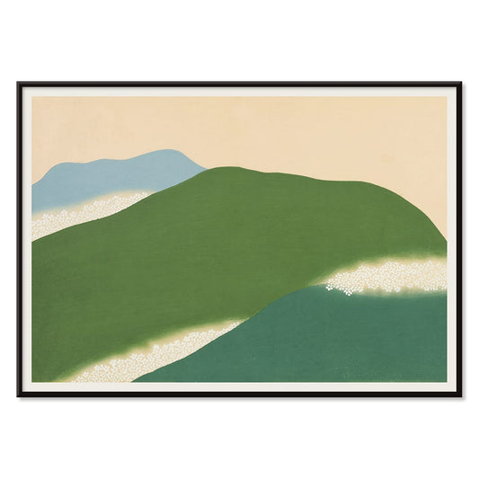
Yoshino Juliste
Kamisaka Sekka · 1909 · seesteinen japanilainen maisemajuliste abstrakteilla vihreän ja sinisen kukkuloilla lämpimällä beigellä
Juliste €9 · Kehystetty €16
Normaalihinta Alkaen €6,00Normaalihinta -
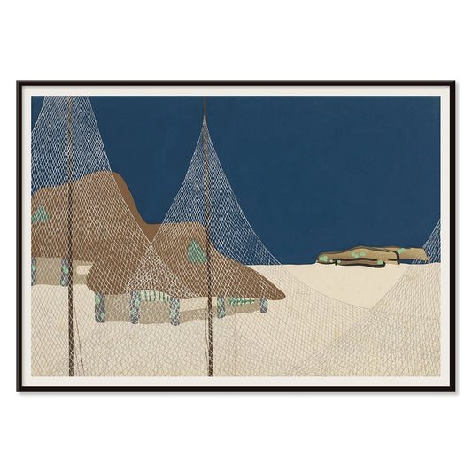
Ryoson Juliste
Kamisaka Sekka · 1909 · rauhallinen merimaisemataidejuliste tyylitellyillä aalloilla ja hiljaisella rannansiluetilla, harmoninen väripaletti ja minimalistinen tunnelma
Juliste €9 · Kehystetty €16
Normaalihinta Alkaen €6,00Normaalihinta -
Tomoe no yuki Juliste
Kamisaka Sekka · 1909 · hiljainen lumisadejuliste, jossa vahvat mustat kaaret ja beige negatiivinen tila
Juliste €9 · Kehystetty €16
Normaalihinta Alkaen €6,00Normaalihinta -
Barcelonatekstijuliste
MORYARTY · 2021 · moderni Barcelonatekstijuliste rohkeilla pinoitetyillä kirjaimilla ja geometrisilla muotoblokeilla kirkkaissa väreissä
Juliste €9 · Kehystetty €16
Normaalihinta Alkaen €6,00Normaalihinta -
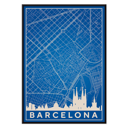
Barcelonan kartta 2 Juliste
MORYARTY · 2019 · minimalistinen sinivalkoinen Barcelonan karttajuliste jossa siluetti yhdistyy tarkkoihin katulinjoihin
Juliste €9 · Kehystetty €16
Normaalihinta Alkaen €6,00Normaalihinta -
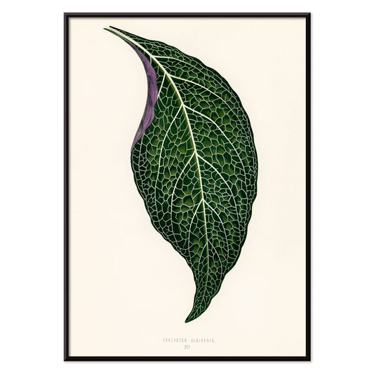
Adelaster Albivenis Juliste
Shirley Hibberd · 1855 · elegantti kasviaiheinen juliste yhdestä vihreästä lehdestä yksityiskohtaisella purppuran suonituksella
Juliste €9 · Kehystetty €16
Normaalihinta Alkaen €6,00Normaalihinta -
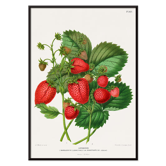
Mansikkakromolitografiajuliste
Abraham Jacobus Wendel · 1879 · eloisa mansikkajuliste terävällä kasvitieteellisellä yksityiskuvauksella ja kypsyneen hedelmän läsnäololla
Juliste €9 · Kehystetty €16
Normaalihinta Alkaen €6,00Normaalihinta -
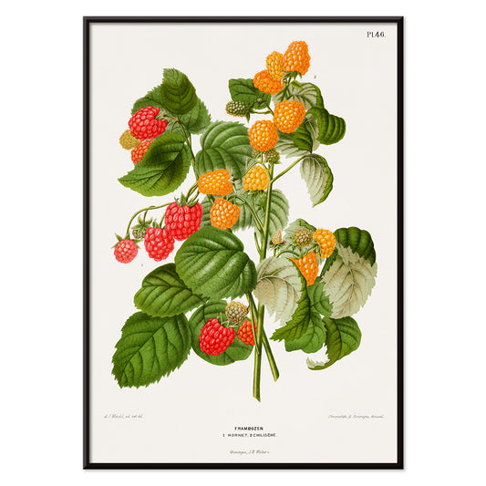
Vadelmakromolitografiajuliste
Abraham Jacobus Wendel · 1879 · yksityiskohtainen vadelmaaiheinen taidejuliste kypsiä punaisia marjoja ja sahalaitaisia lehtiä
Juliste €9 · Kehystetty €16
Normaalihinta Alkaen €6,00Normaalihinta -
Paperileikkaukset 5 Juliste
MORYARTY · 2023 · värikkäitä abstrakteja kasvoja paperileikkausjuliste, jossa leikattuja muotoja, elävä väripaletti ja pehmeä tausta
Juliste €9 · Kehystetty €16
Normaalihinta Alkaen €6,00Normaalihinta -
Leikattupaperit 4 Juliste
MORYARTY · 1952 · iloinen leikattupaperityylinen abstrakti juliste, jossa rohkeat punaiset ja siniset muodot beige taustalla
Juliste €9 · Kehystetty €16
Normaalihinta Alkaen €6,00Normaalihinta -
Papiers découpés 3 -juliste
MORYARTY · 1949 · matissea innoittaneesta syntynyt juliste, voimakkaat punaiset lehdet ilmavalla valko- ja vaaleanpunaisella taustalla
Juliste €9 · Kehystetty €16
Normaalihinta Alkaen €6,00Normaalihinta -
Papiers découpés 2 Juliste
MORYARTY · 2023 · matissevaikutteinen abstrakti juliste, värikkäät leikatut paperimuodot tuovat modernia ilmettä ja energistä kontrastia olohuoneeseen
Juliste €9 · Kehystetty €16
Normaalihinta Alkaen €6,00Normaalihinta -
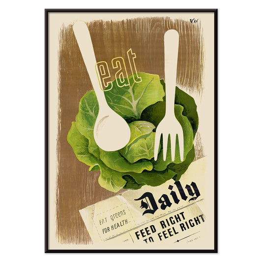
Syö vihreää terveyden vuoksi Juliste
Hans Schleger · 1943 · modernistinen ravintojuliste voimakkailla vihreillä ja terävällä sodanaikaisella typografialla vaikutuksella
Juliste €9 · Kehystetty €16
Normaalihinta Alkaen €6,00Normaalihinta -
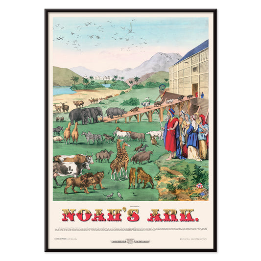
Nooan arkin juliste
H. C. Tunison · 1899 · satukirjamaiset eläinjulisteet pareittain eteneviä eläimiä kohti puuarkkia palmujen alla
Juliste €9 · Kehystetty €16
Normaalihinta Alkaen €6,00Normaalihinta -
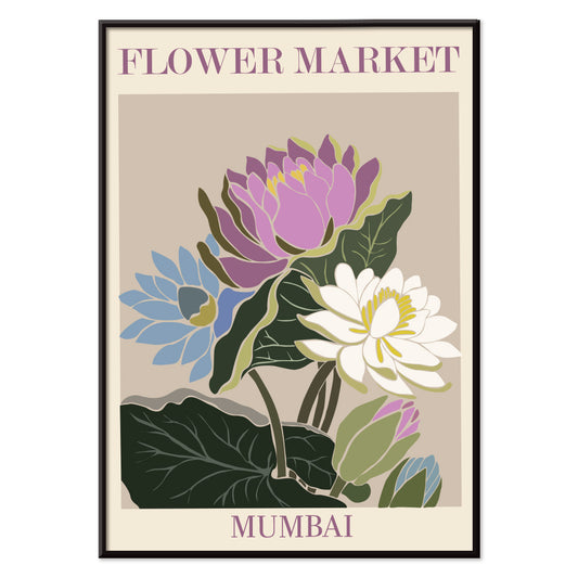
Kukkatori Mumbai Juliste
MORYARTY · 2022 · vesililjajuliste joka tuo mieleen Mumbain kukkatorin violetissa, vihreässä ja sinisessä
Juliste €9 · Kehystetty €16
Normaalihinta Alkaen €6,00Normaalihinta -
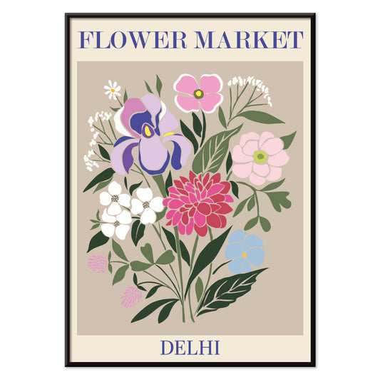
Kukkatori - Dehli Juliste
MORYARTY · 2023 · elinvoimainen Dehlin kukkatorijuliste kerroksellisilla kukilla, eloisaa grafiikkaa ja runsauden tunnetta
Juliste €9 · Kehystetty €16
Normaalihinta Alkaen €6,00Normaalihinta -
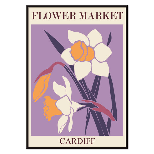
Kukkatori Cardiff Juliste
MORYARTY · 2010 · graafinen narsissijuliste syvän violetilla taustalla tuo kirkkaan sesongin ilmeen kodin
Juliste €9 · Kehystetty €16
Normaalihinta Alkaen €6,00Normaalihinta -
Kukkamarkkinat – Amsterdam 2 Juliste
MORYARTY · 2023 · vintage tulppaanijuliste, jossa valkoiset kukat, vihreät varret ja rauhallinen sinivihreä tausta
Juliste €9 · Kehystetty €16
Normaalihinta Alkaen €6,00Normaalihinta -
Kukkamarkkinat – Seoul 2 Juliste
MORYARTY · 2021 · energinen kukkamarkkinajuliste voimakkaalla oranssitaustalla ja graafisilla kukilla vaaleanpunaisissa ja violeteissa sävyissä
Juliste €9 · Kehystetty €16
Normaalihinta Alkaen €6,00Normaalihinta -
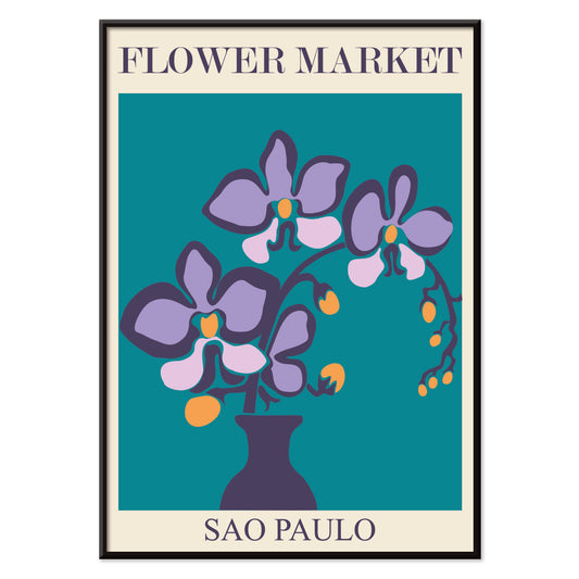
Kukkatori São Paulo Juliste
MORYARTY · 2017 · eloisa orkideajuliste, selkeä vaasimuoto ja syvän sinivihreä tausta luovat rauhallisen mutta elävän ilmeen
Juliste €9 · Kehystetty €16
Normaalihinta Alkaen €6,00Normaalihinta -
Kukkatori - Rooma Juliste
MORYARTY · 2019 · eloisa liljakimppujuliste joka ammentaa Rooman kukkatorien tunnelmasta lämpimissä vaaleanpunaisen ja oranssin sävyissä
Juliste €9 · Kehystetty €16
Normaalihinta Alkaen €6,00Normaalihinta -
Ensimmäisen kansainvälisen animaatiokiertueen juliste
Paul Showalter · 1970 · surrealistinen kasvomuotoinen ja geometrinen juliste sinisen ja harmaan viileissä sävyissä, kirkkaalla vaaleanpunaisella aksentilla
Juliste €9 · Kehystetty €16
Normaalihinta Alkaen €6,00Normaalihinta -
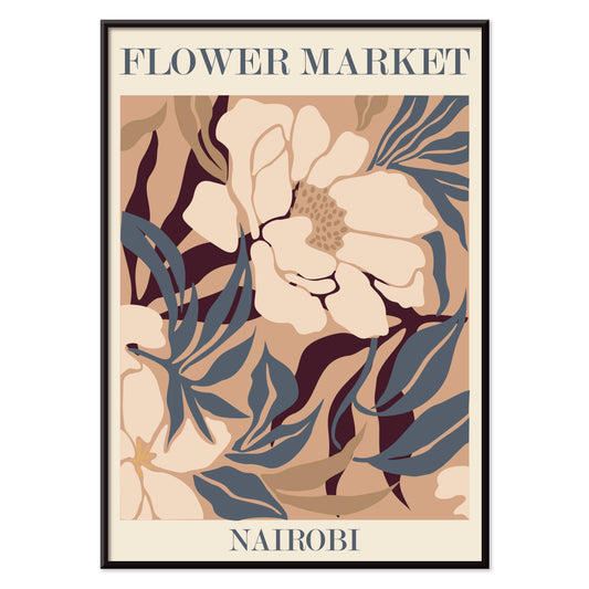
Kukkatori – Nairobi Juliste
MORYARTY · 2019 · abstrakti kukkajuliste beigen, ruskean ja sinisen sävyissä, markkinatunnelma matkailuhenkinen ajaton sisustusvalinta
Juliste €9 · Kehystetty €16
Normaalihinta Alkaen €6,00Normaalihinta -
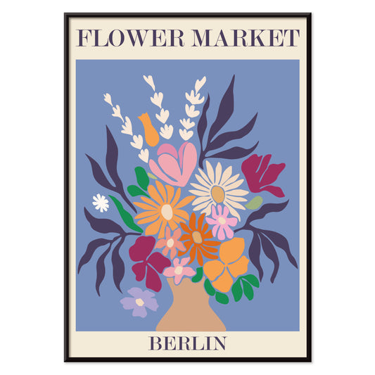
Kukkatori, Berliini juliste
MORYARTY · 2019 · värikäs kukkakimppujuliste rohkealla berliinin typografialla ja elävällä torihen gellä joka piristää sisustusta
Juliste €9 · Kehystetty €16
Normaalihinta Alkaen €6,00Normaalihinta -
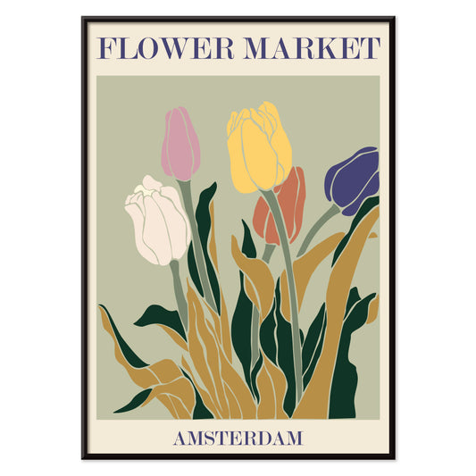
Kukkatori - Amsterdam Juliste
MORYARTY · 2019 · retro tulppaanikauppajuliste joka vangitsee Amsterdamin energian maanläheisillä sävyillä
Juliste €9 · Kehystetty €16
Normaalihinta Alkaen €6,00Normaalihinta -
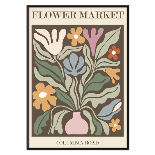
Kukkatori Columbia Road Juliste
MORYARTY · 2017 · värikäs kukkajuliste jossa tyylitelty maljakko ja kimppu voimakkaissa moderneissa sävyissä ja kirkkaassa kontrastissa
Juliste €9 · Kehystetty €16
Normaalihinta Alkaen €6,00Normaalihinta -
Kukkatori New York Juliste
MORYARTY · 2019 · eläväinen kasviaiheinen juliste tyylitellyillä torikukilla ja selkeällä New York -tekstillä beigen taustalla
Juliste €9 · Kehystetty €16
Normaalihinta Alkaen €6,00Normaalihinta -
Lippincott Juliste
William Carqueville · 1895 · rauhallinen belle époque -ajan juliste naisesta lukemassa veden äärellä sinisin sävyin
Juliste €9 · Kehystetty €16
Normaalihinta Alkaen €6,00Normaalihinta -
Kukkien maailma Juliste
Tuntematon taiteilija · 1964 · iloinen kukkajuliste rohkein terälehtimuodoin ja lehtielementein ilmeellään vintagehenkisessä tyyliissä
Juliste €9 · Kehystetty €16
Normaalihinta Alkaen €6,00Normaalihinta -
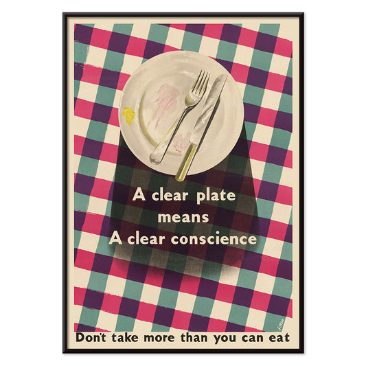
Tyhjä lautanen Juliste
James Fitton · 1950 · keskivuosisadan ruokajuliste voimakkaalla lautaskuvituksella ja viestillä ruokahävikin välttämisestä
Juliste €9 · Kehystetty €16
Normaalihinta Alkaen €6,00Normaalihinta -
Itämaisen tanssijan juliste
Cesare Biseo · 1876 · runollinen itämainen tanssijajuliste, yksityiskohtaiset tekstiilit ja rauhallinen vesipiippuhetki lämmintä sävyä
Juliste €9 · Kehystetty €16
Normaalihinta Alkaen €6,00Normaalihinta -
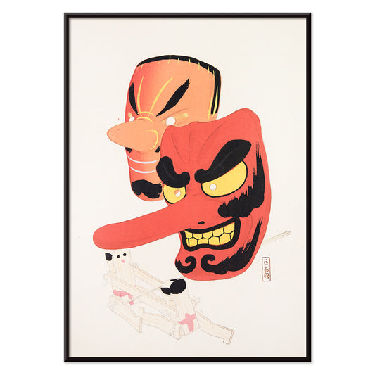
Japanilaiset lelut 1 Juliste
Kawasaki Kyosen · 1919 · leikkisä festivaalinaamiojuliste selkeillä viivoilla, kirkkailla väreillä ja leikkisällä ilmeellä kodin tilaan
Juliste €9 · Kehystetty €16
Normaalihinta Alkaen €6,00Normaalihinta -
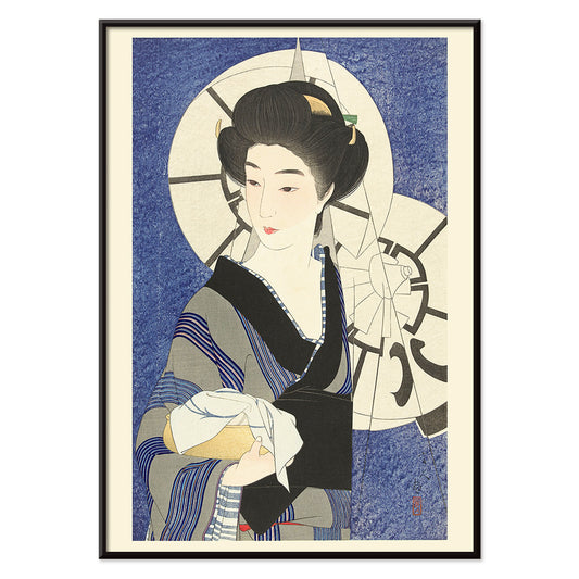
Kylpyläkäynnin jälkeen Juliste
Kotondo Torii · 1933 · hienostunut shinhangataidejuliste kimonoasuinen nainen sateenvarjon alla lempeässä sateessa
Juliste €9 · Kehystetty €16
Normaalihinta Alkaen €6,00Normaalihinta -
Azuma nishikie Juliste
Tuntematon taiteilija · 1860 · voimakas ukiyoejuliste jossa kimonoasuisen hahmon ja tiikerinpään kontrasti vangitsee katseen
Juliste €9 · Kehystetty €16
Normaalihinta Alkaen €6,00Normaalihinta -
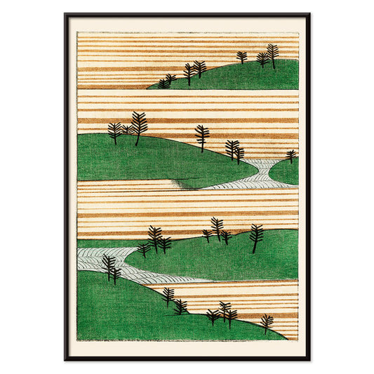
Vihreä maisemajuliste
Watanabe Seitei · 1900 · rauhallinen japanilainen maisemataidejuliste, kerrokselliset vihreät kukkulat ja harmoninen tunnelma
Juliste €9 · Kehystetty €16
Normaalihinta Alkaen €6,00Normaalihinta -
Bijutsukai 175 Juliste
Korin Furuya · 1901 · japanilainen aaltokuvajuliste, voimakas sininen ja herkkä punainen rauhallisella grafiikalla sisustukseen
Juliste €9 · Kehystetty €16
Normaalihinta Alkaen €6,00Normaalihinta -
Japanilaiset lelut 2 Juliste
Kawasaki Kyosen · 1919 · leikillinen leluaiheinen taidejuliste selkeillä ääriviivoilla ja värikkäillä korostuksilla
Juliste €9 · Kehystetty €16
Normaalihinta Alkaen €6,00Normaalihinta -
Kuu (Tarot) juliste
Lauron William de Laurence · 1918 · mystinen kuu tarotjuliste, ulvovat koirat ja kaksoistorni, mutkitteleva polku, unenomaiset symbolit, lämpimät vintage sävyt
Juliste €9 · Kehystetty €16
Normaalihinta Alkaen €6,00Normaalihinta -
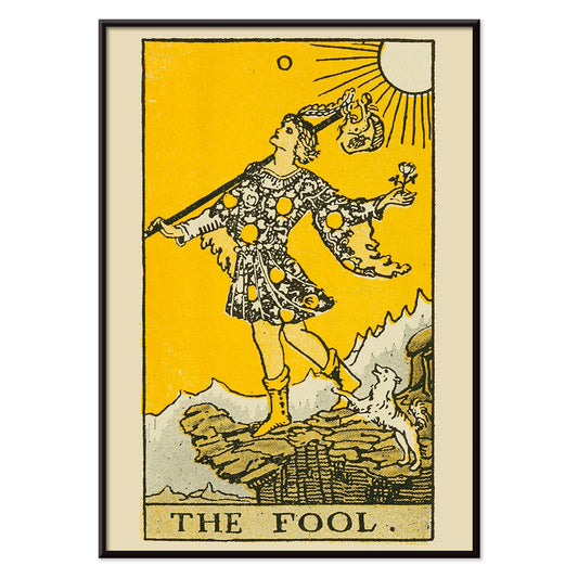
Tarot: Narri Juliste
Lauron William de Laurence · 1918 · kirkas narrijuliste voimakkailla ääriviivoilla, keltainen tausta ja uskollinen koira
Juliste €9 · Kehystetty €16
Normaalihinta Alkaen €6,00Normaalihinta -
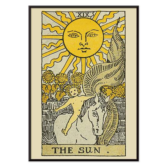
Aurinko (tarot) Juliste
Lauron William de Laurence · 1918 · säteilevä aurinkotarotjuliste, lapsi valkoisella hevosella kirkkaan auringon alla
Juliste €9 · Kehystetty €16
Normaalihinta Alkaen €6,00Normaalihinta -
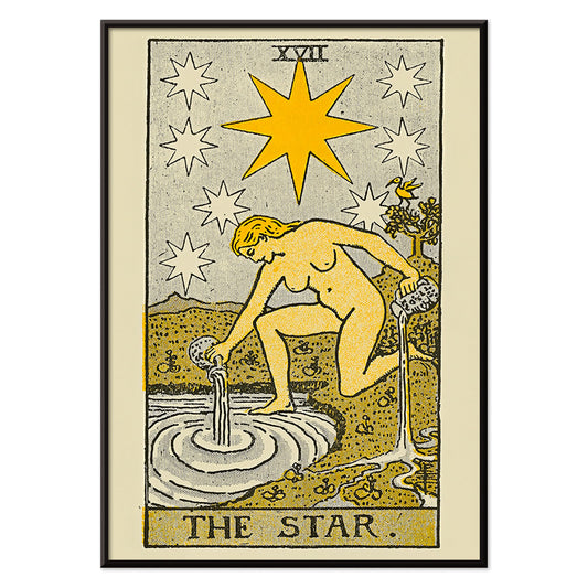
Tähti (tarot) juliste
Lauron William de Laurence · 1918 · symbolinen tarotjuliste jossa polvistuva hahmo kaataa vettä kirkkaiden tähtien alla
Juliste €9 · Kehystetty €16
Normaalihinta Alkaen €6,00Normaalihinta -
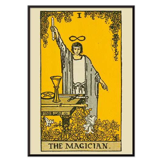
Taikurijuliste
Lauron William de Laurence · 1918 · taianomainen taikurijuliste, kohotettu sauva ja symbolinen pöytäteos vintagehenkinen
Juliste €9 · Kehystetty €16
Normaalihinta Alkaen €6,00Normaalihinta -
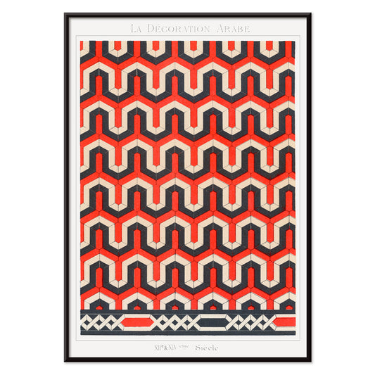
La Decoration Arabe 3 Juliste
Emile Prisse dAvennes · 1885 · monimutkainen geometrinen juliste punaisen, mustan ja valkoisen islamilaisen kuvion tasapaino
Juliste €9 · Kehystetty €16
Normaalihinta Alkaen €6,00Normaalihinta -
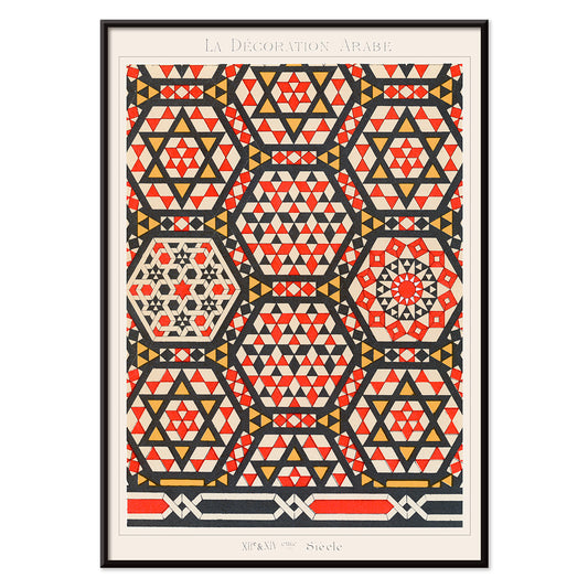
La Decoration Arabe 2 Juliste
Emile Prisse d’Avennes · 1885 · ornamentaalinen geometrinen juliste jossa kietoutuvat tähdet ja voimakkaat punaisen ja keltaisen sävyt
Juliste €9 · Kehystetty €16
Normaalihinta Alkaen €6,00Normaalihinta -
The Platters (1955) Juliste
Tuntematon taiteilija · 1955 · retro yhtyejuliste jossa esiintyjien siluetit keltaisella taustalla ja voimakas kontrasti
Juliste €9 · Kehystetty €16
Normaalihinta Alkaen €6,00Normaalihinta -
naishahmo Juliste
Gert Wollheim · 1920 · abstrakti naishahmojuliste voimakkailla mustilla viivoilla ja kirkkailla punaisen ja sinisen alueilla
Juliste €9 · Kehystetty €16
Normaalihinta Alkaen €6,00Normaalihinta -
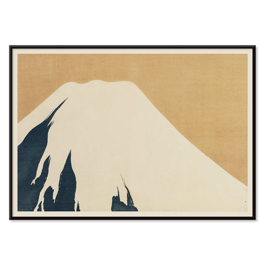
Fujivuori Juliste
Kamisaka Sekka · 1909 · hillitty fujivuoritaidejuliste sinisävyillä ja selkeillä linjoilla, ajaton eleganssi olohuoneeseen ja makuuhuoneeseen tai työhuoneeseen
Juliste €9 · Kehystetty €16
Normaalihinta Alkaen €6,00Normaalihinta -
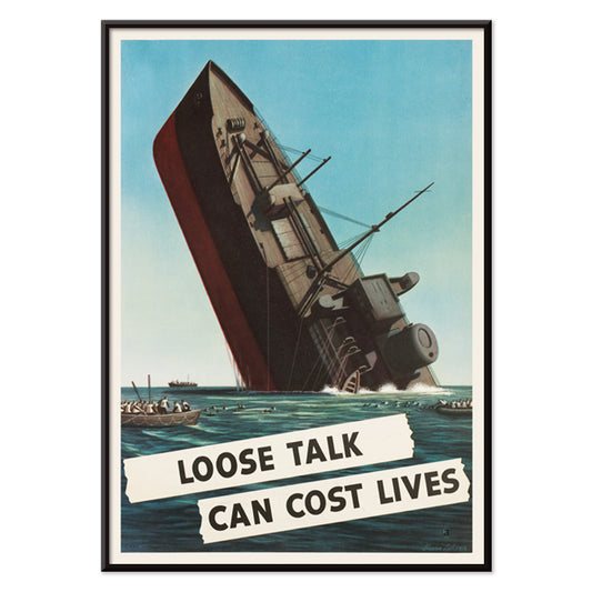
Kevyt puhe voi maksaa ihmishenkiä Juliste
Stevan Dohanos · 1942 · dramaattinen sotaaikainen juliste jossa uppoava laiva, selkeä varoitusteksti ja vaikuttava sininen värimaailma
Juliste €9 · Kehystetty €16
Normaalihinta Alkaen €6,00Normaalihinta -
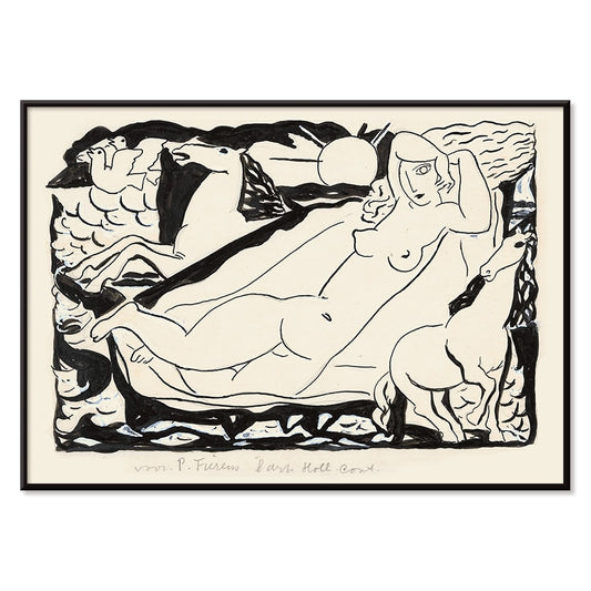
Venusvignetti Juliste
Leo Gestel · 1932 · mustavalkoinen kubistinen venusvignetti nopeine hevosineen ja kulmikkain liikelinjoin
Juliste €9 · Kehystetty €16
Normaalihinta Alkaen €6,00Normaalihinta -
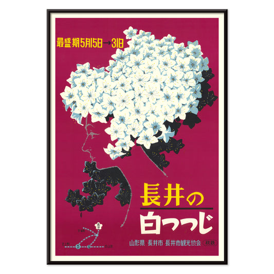
Nagai City Juliste
Nagai City Tourism Association · 1960 · tyylitelty kukkasiluettijuliste naisellisella profiililla ja selkeällä japanilaisella grafiikalla
Juliste €9 · Kehystetty €16
Normaalihinta Alkaen €6,00Normaalihinta -
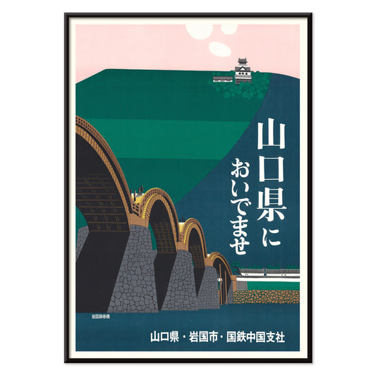
Iwakuni City 1960 juliste
Japan National Railways · 1960 · rauhallinen vintagejuliste Kintai Bridgen kaarista ja linnavuoren siluetista
Juliste €9 · Kehystetty €16
Normaalihinta Alkaen €6,00Normaalihinta -
Kaksivärinen piirros Juliste
Winold Reiss · 1915 · kaksivärinen tanssijajuliste terävin mustin viivoin ja kirkkaalla punaisella vivahteella
Juliste €9 · Kehystetty €16
Normaalihinta Alkaen €6,00Normaalihinta -
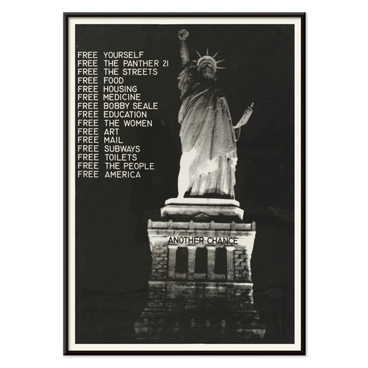
Vapauttakaa pantteri Juliste
Tuntematon taiteilija · 1971 · voimakas mustavalkoinen protestijuliste jossa vapaudenpatsas ja vapauttakaa pantteriteksti
Juliste €9 · Kehystetty €16
Normaalihinta Alkaen €6,00Normaalihinta -
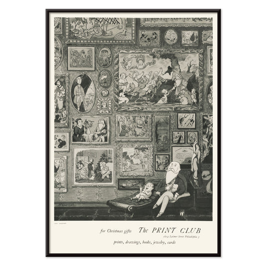
Printklubi Juliste
Arnold Roston · 1960 · voimakas kontrastinen mustavalkoinen juliste rohkealla typografialla juhlistaa vedostuskulttuuria
Juliste €9 · Kehystetty €16
Normaalihinta Alkaen €6,00Normaalihinta -
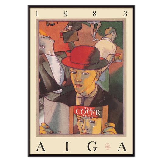
Kannenäyttelyjuliste
Jeff Smith · 1983 · leikkisä ja värikäs juliste miehestä punaisessa hatussa uppoutuneena lehteen, arkinen hetki
Juliste €9 · Kehystetty €16
Normaalihinta Alkaen €6,00Normaalihinta -
Brasilia 2 Juliste
Waldomiro Goncalves Christino · 1970 · eloisa brasilian matkailujuliste voimakkailla muodoilla ja aurinkoisella rantanunnelmalla
Juliste €9 · Kehystetty €16
Normaalihinta Alkaen €6,00Normaalihinta -
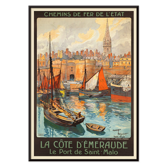
Smaragdirannikko Juliste
Maurice Toussaint · 1890 · eläväinen Saint-Malon rannikkojuliste rohkealla typografialla ja terävällä horisontilla sinisävyissä
Juliste €9 · Kehystetty €16
Normaalihinta Alkaen €6,00Normaalihinta -
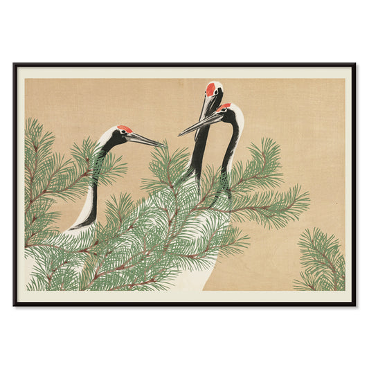
Kurjet (tsuru) Juliste
Kamisaka Sekka · 1910 · elegantti kurjijuliste, kurjet ja mänty yhdistyvät hillittyyn rinpan tyyliin, tuo rauhaa ja eleganssia huoneeseen
Juliste €9 · Kehystetty €16
Normaalihinta Alkaen €6,00Normaalihinta -
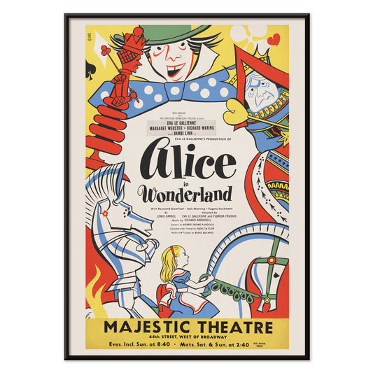
Liisa ihmemaassa Juliste
Artcraft Lithograph · 1947 · leikkisä liisa ihmemaassa juliste voimakkaalla teatterisella ilmeellä ja satumaisella tunnelmalla
Juliste €9 · Kehystetty €16
Normaalihinta Alkaen €6,00Normaalihinta -
Utopia Ltd Juliste
Dietmar Winkler · 1969 · geometrinen typografinen juliste syvänsinisellä taustalla ja kirkkailla popväreillä vahvalla värikontrastilla
Juliste €9 · Kehystetty €16
Normaalihinta Alkaen €6,00Normaalihinta -
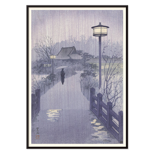
Shinobazu-lampi Juliste
Kasamatsu Shirô · 1938 · sateinen ilta taidejuliste Shinobazu-lammesta, yksinäinen kulkija ja heijastusten rauhallinen hehku
Juliste €9 · Kehystetty €16
Normaalihinta Alkaen €6,00Normaalihinta -
Näyttelijä Kawarazaki Gonjuro Juliste
Utagawa Kunisada II · 1864 · dramaattinen kabukijuliste voimakkailla asukuvioilla, tarkalla painotekniikalla ja intensiivisellä ilmeellä, vahva seinätaide
Juliste €9 · Kehystetty €16
Normaalihinta Alkaen €6,00Normaalihinta -
Islamilaisen taiteen elementit 1 Juliste
Jules Bourgoin · 1879 · tarkka geometrinen juliste kutoutuneista tähtikuviosta, ajaton mustavalkoinen arkkitehtoninen ilme esteettinen
Juliste €9 · Kehystetty €16
Normaalihinta Alkaen €6,00Normaalihinta -
Arabialaisen taiteen elementit 2 Juliste
Jules Bourgoin · 1879 · monimutkainen geometrinen vintagejuliste mustavalkoisena, islamilaisen ornamentin inspiroima ja graafinen seinätaide, sopii minimalistiseen sisustukseen
Juliste €9 · Kehystetty €16
Normaalihinta Alkaen €6,00Normaalihinta -
Arabitaiteen elementit 3 Juliste
Jules Bourgoin · 1879 · islamilainen geometriajuliste, jossa lomittuvat viivat luovat rauhallisen mustavalkoisen verkon
Juliste €9 · Kehystetty €16
Normaalihinta Alkaen €6,00Normaalihinta -
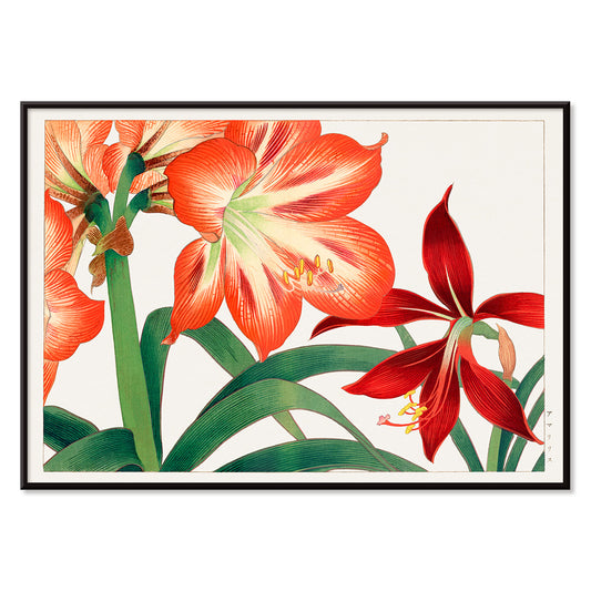
Amaryllis Juliste
Tanigami Kônan · 1917 · elegantti amarylliskukkajuliste, jossa kirkkaat punaiset kukat luovat rauhallisen tunnelman
Juliste €9 · Kehystetty €16
Normaalihinta Alkaen €6,00Normaalihinta -
Vihreä kasviaiheinen kuosijuliste Juliste
Owen Jones · 1867 · viktoriaaninen kasviaiheinen juliste rytmikkäällä vihreällä lehdistöllä ja kirkkain kukkavärein
Juliste €9 · Kehystetty €16
Normaalihinta Alkaen €6,00Normaalihinta -
Kasvit, eläimet ja ilma -juliste
Edward Livingston Youmans · 1856 · opettavainen tieteellinen juliste joka kuvaa kasvien ja eläinten hengitystä selkeässä mustavalkoisessa viivapiirroksessa
Juliste €9 · Kehystetty €16
Normaalihinta Alkaen €6,00Normaalihinta


72/940 items
- Yoshino Juliste
- Ryoson Juliste
- Tomoe no yuki Juliste
- Barcelonatekstijuliste
- Barcelonan kartta 2 Juliste
- Adelaster Albivenis Juliste
- Paperileikkaukset 5 Juliste
- Leikattupaperit 4 Juliste
- Papiers découpés 3 -juliste
- Papiers découpés 2 Juliste
- Syö vihreää terveyden vuoksi Juliste
- Nooan arkin juliste
- Kukkatori Mumbai Juliste
- Kukkatori - Dehli Juliste
- Kukkatori Cardiff Juliste
- Kukkamarkkinat – Amsterdam 2 Juliste
- Kukkamarkkinat – Seoul 2 Juliste
- Kukkatori São Paulo Juliste
- Kukkatori - Rooma Juliste
- Ensimmäisen kansainvälisen animaatiokiertueen juliste
- Kukkatori – Nairobi Juliste
- Kukkatori, Berliini juliste
- Kukkatori - Amsterdam Juliste
- Kukkatori Columbia Road Juliste
- Kukkatori New York Juliste
- Japanilaiset lelut 1 Juliste
- Kylpyläkäynnin jälkeen Juliste
- Vihreä maisemajuliste
- Bijutsukai 175 Juliste
- Japanilaiset lelut 2 Juliste
- Kuu (Tarot) juliste
- Tarot: Narri Juliste
- Aurinko (tarot) Juliste
- Tähti (tarot) juliste
- Taikurijuliste
- La Decoration Arabe 3 Juliste
- Fujivuori Juliste
- Nagai City Juliste
- Iwakuni City 1960 juliste
- Vapauttakaa pantteri Juliste
- Brasilia 2 Juliste
- Kurjet (tsuru) Juliste
- Liisa ihmemaassa Juliste
- Utopia Ltd Juliste
- Shinobazu-lampi Juliste
- Näyttelijä Kawarazaki Gonjuro Juliste
- Amaryllis Juliste
- Vihreä kasviaiheinen kuosijuliste Juliste
White as a canvas
White is not a theme so much as a breathing space. This collection gathers poster and print designs where generous margins, pale grounds, and paper-toned light do the heavy lifting. Think studio walls, quiet libraries, coastal apartments: white becomes a deliberate kind of decoration, not an absence. You will see it across Advertising graphics, modernist abstraction, scientific plates, and minimalist cartography. Because the background stays open, you notice the texture of ink, the pause between shapes, and the way a title line sits on the page. It is wall art for rooms that crave clarity and air.
When the background becomes the subject
Look closely and the white becomes an active surface. In Anna Atkins’s Fern (1850), the cyanotype process fixes Prussian blue on sensitized paper, turning blankness into a halo around every frond and making the sheet itself feel like an image. Wassily Kandinsky’s Four Parts (1932) uses crisp intervals of empty ground so its geometry reads like music on a staff, each form given room to sound. For a different kind of graphic poise, Kohler Chocolat (1914) by F. Champenois floats ornament and typography on a clean field, letting the peacock motif feel almost sculptural. Even Gustav Klimt’s Portrait of Adele Bloch-Bauer I (1907) reads brighter when the pale surround sets off gold and pattern.
Where white prints live best at home
In interiors, this kind of wall art behaves like daylight: it spreads rather than crowds. In a narrow hallway, a white-led art print extends the sense of depth; in a kitchen, it keeps busy shelves and countertops from feeling visually noisy. Bedrooms benefit too, especially above linen headboards where the paper tone echoes fabric. Pair these prints with oak, travertine, rattan, and brushed steel, then pull small accents from the room: sage tiles, terracotta ceramics, or ink-black hardware. For higher contrast, see Black & White; for pared-back structure, Minimalist; for delicate linework, Botanical; and for graphic cartography, Maps.
Building a gallery wall with air
Curating a gallery wall with white space is about rhythm and distance. Start with one assertive image, then give it quieter neighbors, keeping 5 to 8 cm between frames so the wall itself reads as part of the composition. The sweeping curve of Hokusai’s The Great Wave off Kanagawa (c. 1830) can sit beside modernist geometry, especially works linked to Bauhaus where circles and grids echo the surf. For a softer counterpoint, travel scenes and woodblock traditions in Oriental add misty gradients and calligraphic line. Choose off-white mats if your walls are bright white; that small shift keeps a vintage print from looking clinical under LEDs.
The quiet power of restraint
What ties the collection together is not a single school, but a shared respect for the blank. White carries pencil marks, lithographic dots, and ink washes; it also holds the story of age, like a page pulled from an archive and pinned up again. That is why these posters sit comfortably beside objects with patina: ceramics, worn wood, brass, or a stack of art books. If you want the same sense of air with a more photographic register, Photo offers pale tonal fields and controlled contrast. Chosen as a poster or art print, this vintage-minded decoration leaves room for furniture and for light to move across the wall.