
 "Olen todella tyytyväinen: vedokset ovat kauniita ja toimitus oli nopea."
 "Laaja vintagejulisteiden valikoima"
 "Piilotettu helmi taiteen ystäville"
"Olen todella tyytyväinen: vedokset ovat kauniita ja toimitus oli nopea."
"Laaja vintagejulisteiden valikoima"
"Piilotettu helmi taiteen ystäville"
"Olen todella tyytyväinen: vedokset ovat kauniita ja toimitus oli nopea."
"Laaja vintagejulisteiden valikoima"
"Piilotettu helmi taiteen ystäville"
"Olen todella tyytyväinen: vedokset ovat kauniita ja toimitus oli nopea."
"Laaja vintagejulisteiden valikoima"
"Piilotettu helmi taiteen ystäville"
"Piilotettu helmi taiteen ystäville"
"Olen todella tyytyväinen: vedokset ovat kauniita ja toimitus oli nopea."
"Laaja vintagejulisteiden valikoima"
"Piilotettu helmi taiteen ystäville"
"Olen todella tyytyväinen: vedokset ovat kauniita ja toimitus oli nopea."
"Laaja vintagejulisteiden valikoima"
"Piilotettu helmi taiteen ystäville"
"Olen todella tyytyväinen: vedokset ovat kauniita ja toimitus oli nopea."
"Laaja vintagejulisteiden valikoima"
"Piilotettu helmi taiteen ystäville"
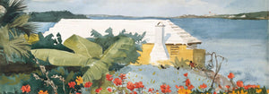
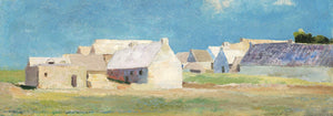

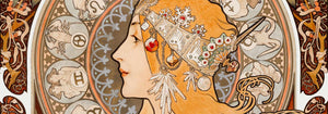
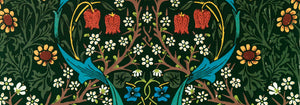
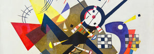

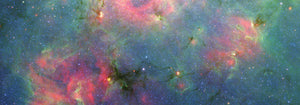
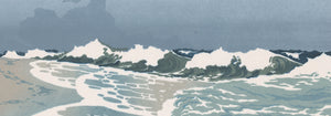
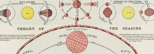
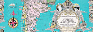
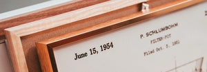
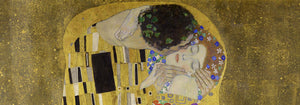
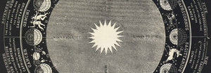


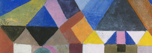
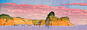
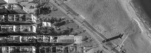
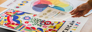





- Maantieteellinen opas naisen sydämeen Juliste
- Olut ja savuke Juliste
- Portugali tänään Juliste
- The New Yorker -juliste
- Münchenin eläintarhan juliste
- Pelastetaan valaat Juliste
- Papiers découpés 3 -juliste
- Merenpohjajuliste
- Herää ja lue Juliste
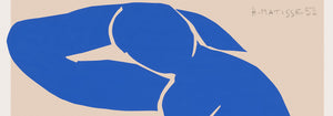
- Sininen alaston III juliste
- Marihuana Juliste
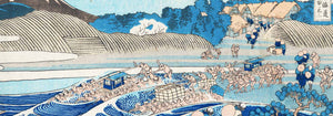
- Kanagawan suuri aalto -juliste
- Cordial Campari -juliste
- Musta kissa 2 Juliste
- Porto Ramos-Pinto Juliste
- Coffea arabica 3 Juliste
- Le Voyage de Babar -juliste
- Matisse · tanssivat hahmot juliste
- Babar autossa Juliste
- Solaris Juliste
- Ryōkokun tiikeri Juliste
- Sigmund Freud -juliste
- Panteri-juliste
- Grands Prix de France -juliste
- Taivaansininen Juliste
- Kolmivärinen ilmapallo Juliste
- Barcelonatekstijuliste
- Nu Bleu II Juliste
- Suuri aalto Juliste
- Bauhausjuliste 6
- Unelma juliste
- Bauhaus Juliste 2
- Bauhaus 11 Juliste
- Babarin tarina Juliste
- Bauhaus Juliste 10
- La Paresse Juliste
- Leikekollaasi 1 Juliste
- Star Wars AT-AT patenttijuliste
- Mikki Hiiri juliste
- Väestökarttajuliste
- Kahvipuu (Coffea arabica) 2 Juliste
- Suudelma juliste
- Musta leopardi juliste
- Vertigojuliste
- Värikäs arkkitehtuurijuliste
- Brasilia 2 Juliste
- Surffilaudan patenttijuliste
- punakruunukurki Juliste
- Selin istuva kissa Juliste
- Istuva kissa vasemmalle juliste
-

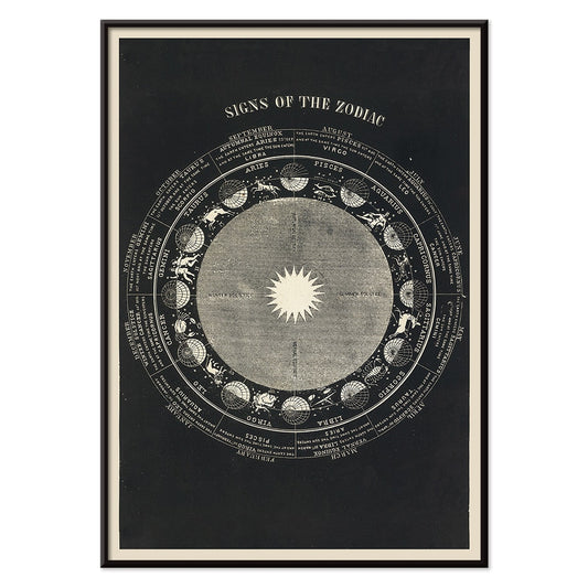
Horoskooppimerkit Juliste
Asa Smith · 1850 · yksityiskohtainen horoskooppikaaviojuliste jossa tähtikuviot selkeät viivat pedagoginen ilme ja ajaton vintagetunnelma mustavalkoinen
Juliste €9 · Kehystetty €16
-

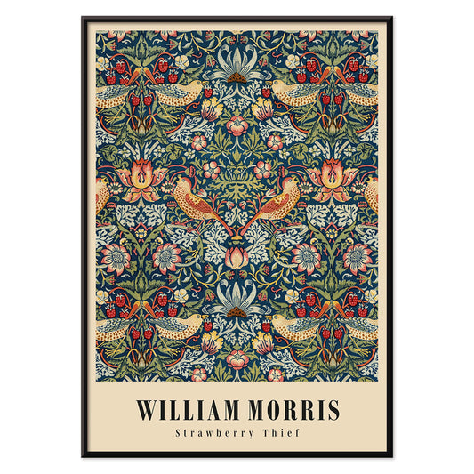
Mansikkavaras Juliste
William Morris · 1883 · ikoninen Arts and Crafts -juliste rastasaiheesta ja mansikoista syvän sinisissä sävyissä
Juliste €9 · Kehystetty €16
-


Syö hedelmiä – pysy terveenä Juliste
Work Projects Administration · 1936 · vintagejuliste, jossa vahva typografia ja hedelmämuodot tukevat terveellistä viestiä
Juliste €9 · Kehystetty €16
-

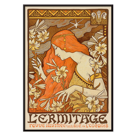
L'Ermitage Juliste
Paul Berthon · 1900 · Art Nouveau -juliste punahiuksisesta muusasta liljojen keskellä
Juliste €9 · Kehystetty €16
-

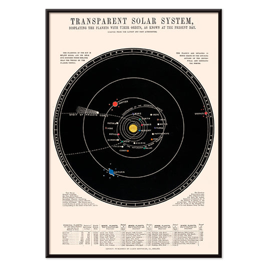
Läpinäkyvä aurinkokuntajuliste
James Reynolds · 1851 · yksityiskohtainen aurinkokuntajuliste, jossa merkityt radat, käsinvärjätyt planeettakorostukset ja opetuksellinen selkeys
Juliste €9 · Kehystetty €16
-

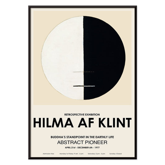
Buddhan näkökulma maallisessa elämässä juliste
Hilma af Klint · 1917 · meditatiivinen abstrakti taidejuliste jossa buddhalaista symboliikkaa rauhallisessa elegantissa ympyräkaaviossa
Juliste €9 · Kehystetty €16
-

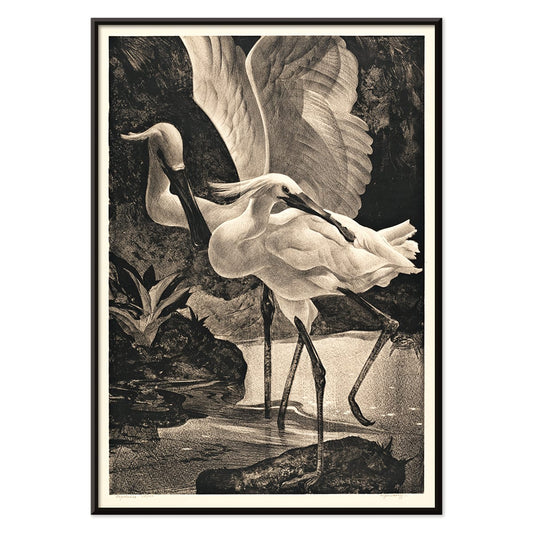
Lusikkahaikara Juliste
Adriaan van Hoff · 1923 · elegantti lusikkahaikarajuliste selkeissä mustan ja valkoisen sävyissä Art Deco -vaikutteella
Juliste €9 · Kehystetty €16
-

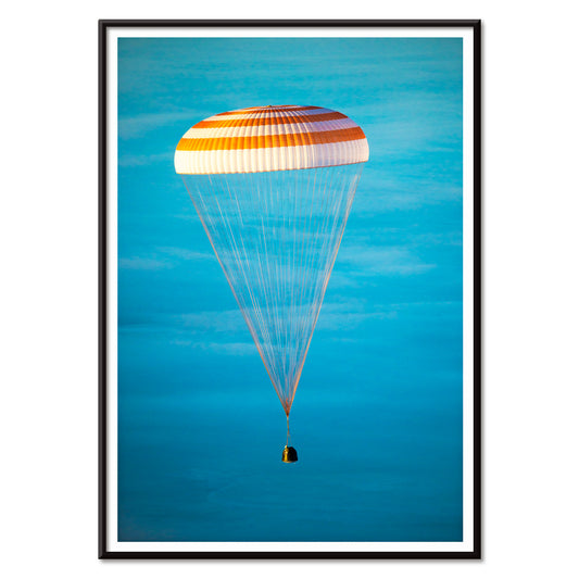
Soyuz TMA-14M avaruusalusjuliste
NASA · 2015 · dramaattinen Soyuzkapselijuliste laskeutuu oranssin laskuvarjon alla ja täyttää tilan rauhallisella sinisellä taivaalla
Juliste €9 · Kehystetty €16
-

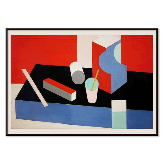
Kubik Juliste
Patrick Henry Bruce · 1917 · geometrinen kubistinen taidejuliste lomittuvilla tasoilla punaisen, sinisen, mustan ja valkoisen sävyissä
Juliste €9 · Kehystetty €16
-

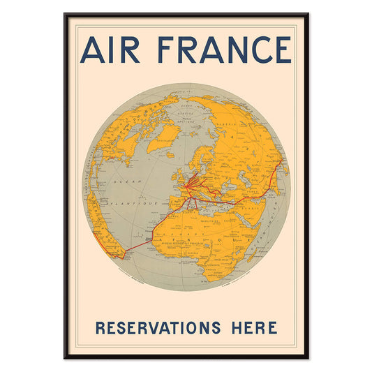
Air France Juliste
E.Giraud · 1938 · Art Deco -tyylinen maailmankarttujuliste, jossa Air Francen reitit piirtyvät vahvoina punaisina viivoina
Juliste €9 · Kehystetty €16
-

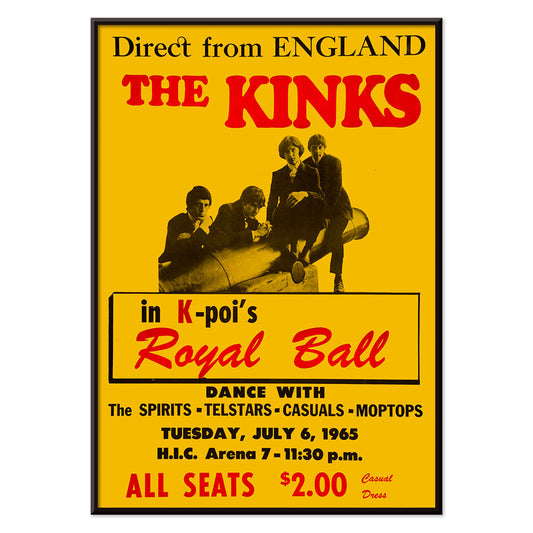
The Kinks Honolulussa 1965 juliste
Tuntematon taiteilija · 1965 · rohkea punaisen ja keltaisen konserttijuliste Honolulun keikasta historiallinen kerailykappale fanille
Juliste €9 · Kehystetty €16
-

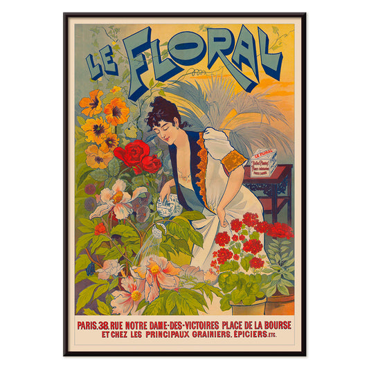
Le Floral Juliste
Tuntematon taiteilija · 1891 · elegantti Art Nouveau -juliste jossa nainen kukkien ympäröimänä ja koristeellinen typografia
Juliste €9 · Kehystetty €16
-


Meksikolainen taide ja elämä 3 Juliste
Tuntematon taiteilija · 1938 · modernistinen metsäjuliste leikkisillä eläinhahmoilla ja voimakkaalla meksikolaisen taiteen ja elämän -typografialla
Juliste €9 · Kehystetty €16
-

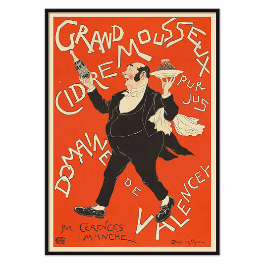
Runsaasti kuohuva siideri Juliste
Eugène Le Mouel · 1897 · eloisa siiderijuliste kuvaa punaista taustaa vasten pulloa kohottavaa tarjoilijaa
Juliste €9 · Kehystetty €16
-

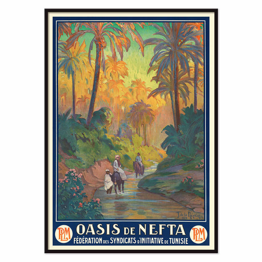
Oasis de Nefta Juliste
Joseph de La Nézière · 1925 · vintagejuliste kuvaa palmujen reunustamaa puroa Neftan rauhallisessa keitaassa
Juliste €9 · Kehystetty €16
-

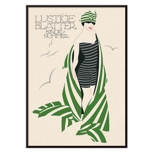
Lustige Blatter Badenummer Juliste
Julius Klinger · 1911 · raidallinen uimapuku, Art Nouveau -linjat ja vihreä lehvästö rakentavat selkeän mainoskuvan
Juliste €9 · Kehystetty €16
-

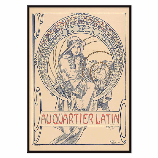
Au Quartier Latin Juliste
Alphonse Mucha · 1900 · hillitty Art Nouveau -juliste vakaasta hahmosta ja koristeellisesta pyöreästä kehyksestä
Juliste €9 · Kehystetty €16
-

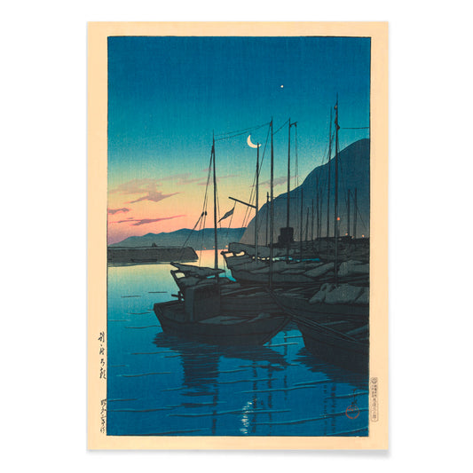
Aamu Beppussa Juliste
Kawase Hasui · 1937 · rauhallinen satamajuliste auringonnoususta veneineen, utuista ilmaa, heijastuksia ja lempeää sinisävyä
Juliste €9 · Kehystetty €16
-

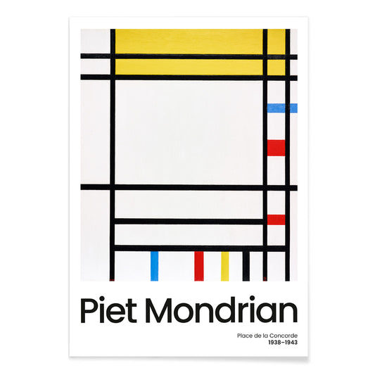
Place de la Concorde -juliste
Piet Mondrian · 1941 · geometrinen abstrakti juliste jossa musta ruudukko ja punaiset keltaiset siniset kentät
Juliste €9 · Kehystetty €16
-

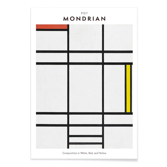
Kompositio valkoisessa, punaisessa ja keltaisessa Juliste
Pieter Cornelis Mondriaan · 1936 · geometrinen taidejuliste, valkoista tilaa, terävät mustat linjat ja primaarivärit
Juliste €9 · Kehystetty €16
-

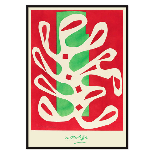
Valkoinen levä punaisella ja vihreällä taustalla Juliste
Henri Matisse · 1947 · abstrakti taidejuliste, jossa vaaleat, merilevää muistuttavat muodot erottuvat kirkkaan punaista ja vihreää vasten
Juliste €9 · Kehystetty €16
-

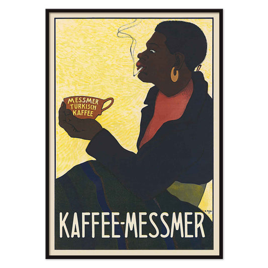
Messmer Turkish Coffee Juliste
Karl Hofer · 1900 · tupakoivaa kahvinjuojaa ja kirjaimin koristeltua kuppia esittävä vintagemainosjuliste hehkuvankeltaisella taustalla
Juliste €9 · Kehystetty €16
-

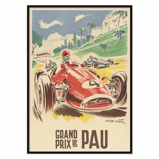
Grand prix de Pau Juliste
Georges Hamel · 1950 · julisteessa punainen kilpa-auto syöksyy kohti katsojaa palmujen reunustamalla Paun katuradalla
Juliste €9 · Kehystetty €16
-

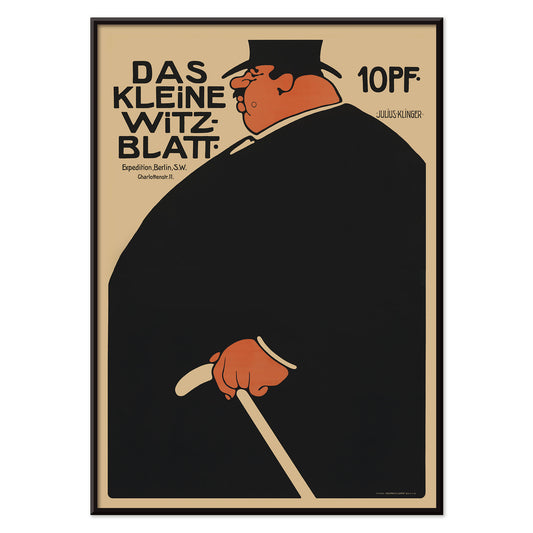
Das kleine Witzblatt Juliste
Julius Klinger · 1901 · rohkea vintagejuliste mustan ja oranssin graafisena mainoskuvana
Juliste €9 · Kehystetty €16
-

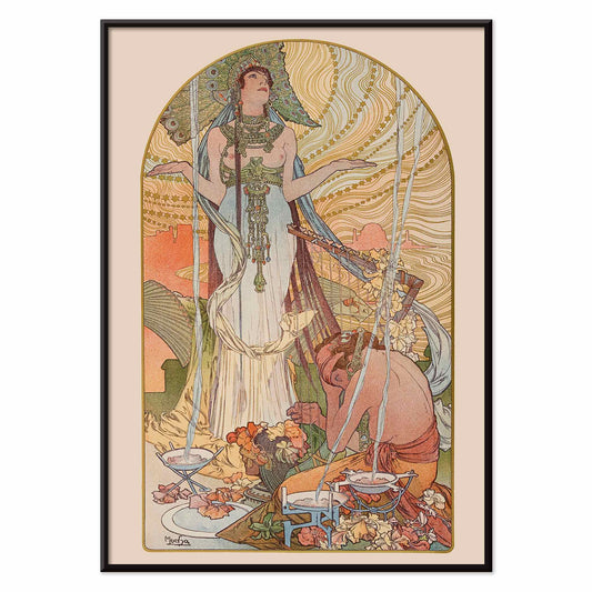
Salammbô: The Incantation Juliste
Alphonse Mucha · 1897 · pystysuuntainen Art Nouveau -juliste Salammbôsta rituaalinomaisessa kohtauksessa
Juliste €9 · Kehystetty €16
-

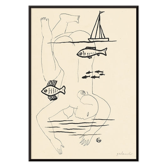
Hukkunut Juliste
Mikuláš Galanda · 1930 · surrealistinen mustavalkoinen juliste jossa ihmisen haavoittuvuus sulautuu kalateemaan ja hiljaiseen jännitteeseen
Juliste €9 · Kehystetty €16
-

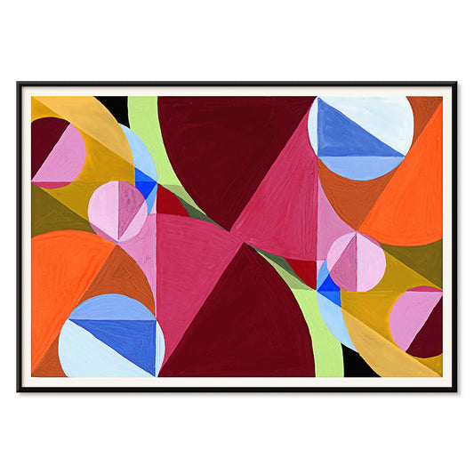
Kohtisuorilla jaettu alue Juliste
Joseph Schillinger · 1934 · geometrinen abstrakti juliste jossa kohtisuorat ruudukot ja elävät värilohkot rytmisessä tasapainossa
Juliste €9 · Kehystetty €16
-


Lontoon loiste Juliste
Horace Taylor · 1924 · energinen ajaton kuva Lontoon yöelämästä hehkuine valoineen ja undergroundin kirjaimineen
Juliste €9 · Kehystetty €16
-

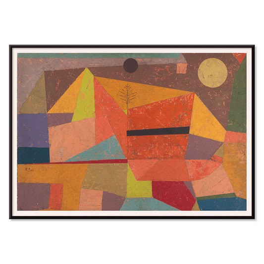
Iloinen vuori juliste
Paul Klee · 1929 · iloinen abstrakti vuorojuliste, rytmisiä värilohkoja ja ohuet mustat viivat
Juliste €9 · Kehystetty €16
-

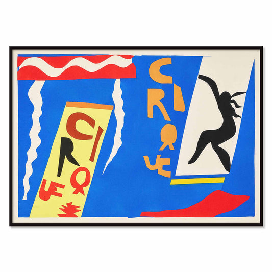
Sirkus Juliste
Henri Matisse · 1947 · sirkusjuliste, jossa musta akrobaatti hyppää kirkkaansinisellä taustalla hajalleen siroteltujen kirjainten lomassa
Juliste €9 · Kehystetty €16
-

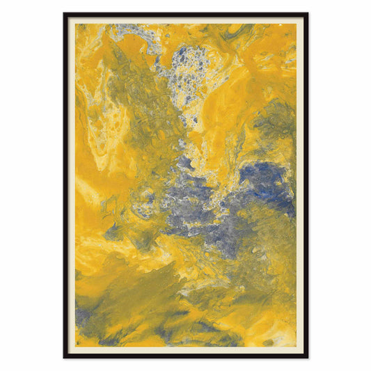
Keltainen marmoroitu paperi Juliste
Margarete Rumpf · 1909 · kullanhohtoinen taidevedos marmoroidusta paperista, siniharmaine pyörteineen ja hienoine kermanvärisine juovineen
Juliste €9 · Kehystetty €16
-

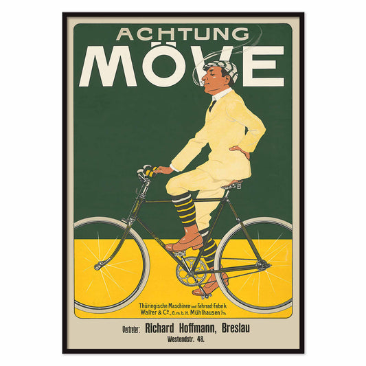
Achtung Möve Juliste
J. & Co. Aberle · 1902 · vaaleapukuinen pyöräilijä erottuu syvänvihreää taustaa ja kirkkaankeltaista väripintaa vasten
Juliste €9 · Kehystetty €16
-

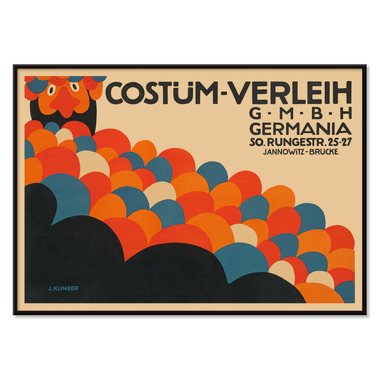
Costüm-Verleih Germania Juliste
Julius Klinger · 1909 · graafinen juliste rohkeilla abstrakteilla ympyröillä ja vahvalla berliiniläisellä typografialla
Juliste €9 · Kehystetty €16
-

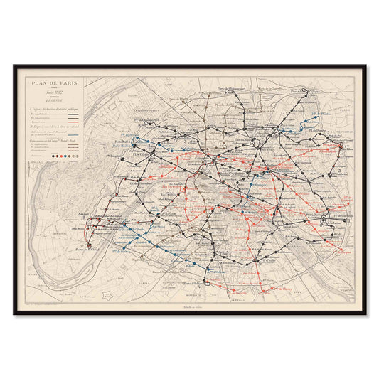
Pariisin kartta ja metropolirautatie Juliste
Louis Wuhrer · 1912 · historiallinen Pariisin metrojuliste tarkkoine reitteineen ja yksityiskohtaisine kaupunkikarttoineen
Juliste €9 · Kehystetty €16
-

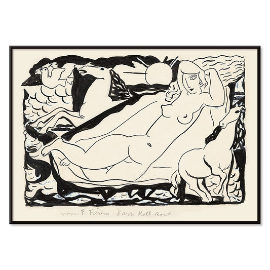
Venusvignetti Juliste
Leo Gestel · 1932 · mustavalkoinen kubistinen venusvignetti nopeine hevosineen ja kulmikkain liikelinjoin
Juliste €9 · Kehystetty €16
-

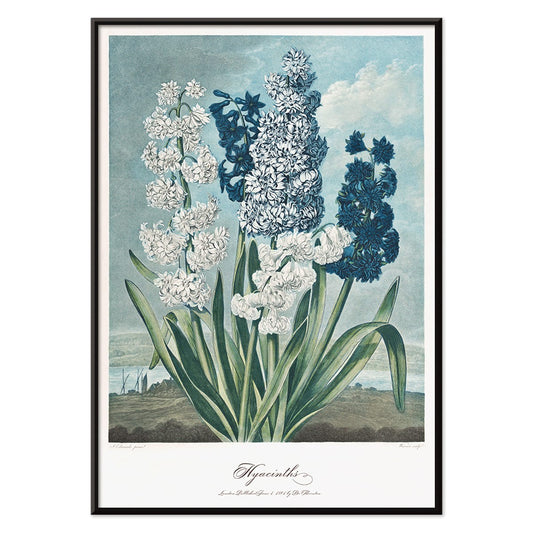
Hyasintit juliste
Robert John Thornton · 1807 · ajaton, elegantti hyasinttijuliste vaaleilla kukinnoilla ja veistoksellisilla vihreillä lehdillä
Juliste €9 · Kehystetty €16
-

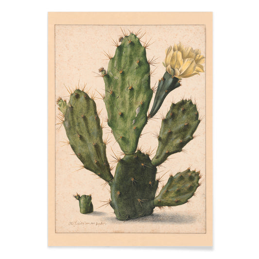
päärynäkaktuksen kukinta Juliste
Herman Saftleven the Younger · 1650 · päärynäkaktusjuliste jossa segmentoituneet vihreät tyynyt ja hennon keltainen kukka
Juliste €9 · Kehystetty €16
-
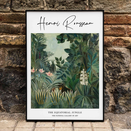
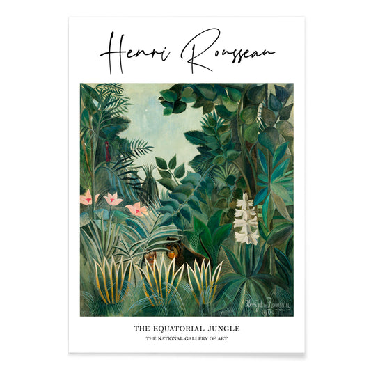
Ekvatoriaalinen viidakko Juliste
Henri Julien Félix Rousseau · 1909 · unenomaisen viidakon kerroksellinen vihreä lehvästö ja piileskelevät eläimet
Juliste €9 · Kehystetty €16
-

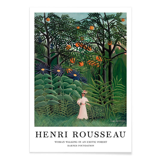
Nainen kävelee eksoottisessa metsässä Juliste
Henri Julien Félix Rousseau · 1905 · unenomaisen viidakkajulisteen nainen kävelee tiheässä trooppisessa kasvillisuudessa ja lumoaa tunnelmallaan
Juliste €9 · Kehystetty €16
-

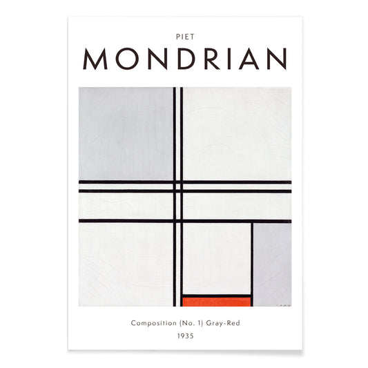
Kompositio (nro 1) Juliste
Piet Mondrian · 1935 · epäsymmetrinen ruutujuliste mustilla viivoilla, harmailla alueilla ja yhdellä punaisella lohkolla
Juliste €9 · Kehystetty €16
-
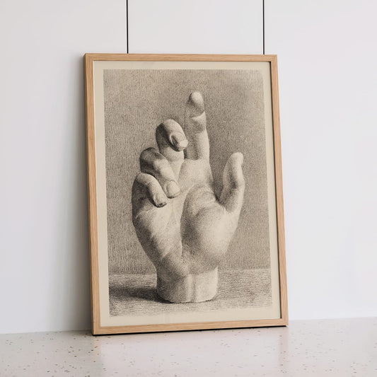
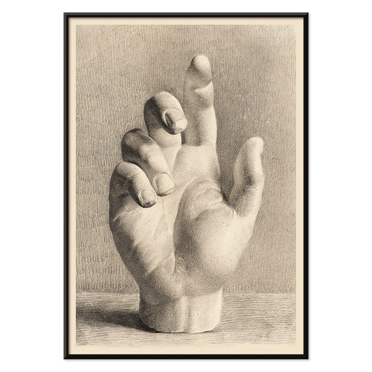
Kipsikäsi Juliste
Dankvart Dreyer · 1829 · akateeminen käsitutkielma taidejuliste, pehmeillä varjoilla ja lämpimällä beige paperilla, rauhallinen seinätaide
Juliste €9 · Kehystetty €16
-

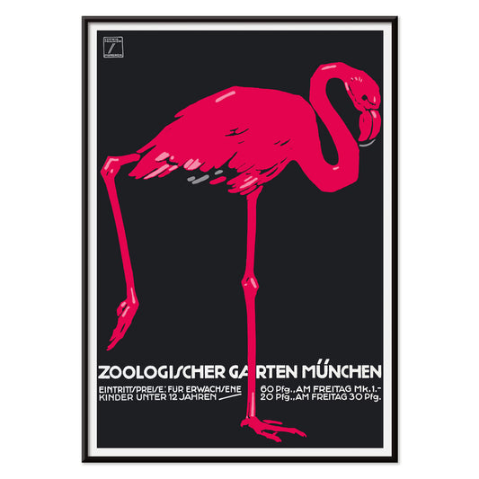
Zoologischer Garten München 2 -juliste
Ludwig Hohlwein · 1930 · graafinen flamingojuliste voimakkaalla mustalla pohjalla ja kirkkaan vaaleanpunaisella siluetilla esteettisesti
Juliste €9 · Kehystetty €16
-

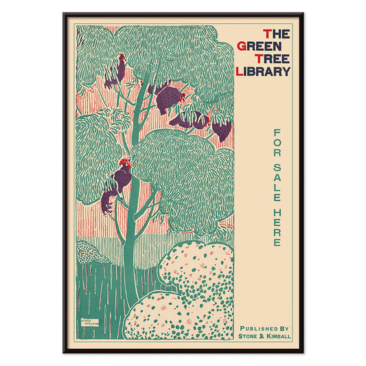
Vihreä kirjastopuu Juliste
Henry McCarter · 1890 · koristeellinen kirjastojuliste ajattomalla tyylitellyllä vihreällä puulla ja Art Nouveau -kirjaimilla
Juliste €9 · Kehystetty €16
-


Xochimilco Juliste
Tuntematon taiteilija · 1944 · Xochimilcon matkajuliste kuvaa kukkien kantajia ja kanavilla liikkuvia veneilijöitä korkeiden puiden varjossa
Juliste €9 · Kehystetty €16
-


Jamaikan banaanit Juliste
Tuntematon taiteilija · 1920 · vintagejuliste, jossa kypsät banaanitertut toistuvat rytmikkäinä riveinä syvänvihreällä pohjalla
Juliste €9 · Kehystetty €16
-

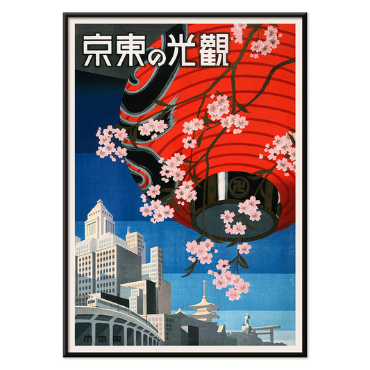
Tule Tokioon Juliste
Tuntematon taiteilija · 1930 · eloisa Tokiomatkailujuliste punaisella lyhdyllä ja kirsikankukilla syvän sinisellä taustalla, retrohenkinen
Juliste €9 · Kehystetty €16
-

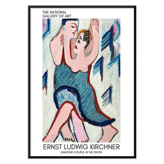
Tanssiva pari lumessa Juliste
Ernst Ludwig Kirchner · 1928 · ekspressionistinen taidejuliste tanssivasta parista elävässä lumimaisemassa vahvoin sinisen ja punaisen aksentein
Juliste €9 · Kehystetty €16
-

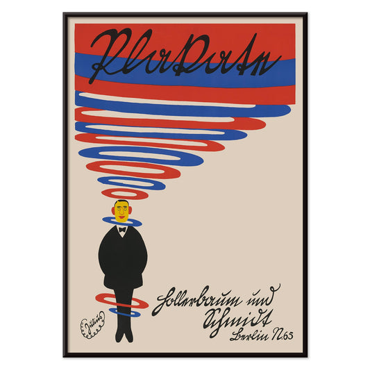
Hollerbaum und Schmidt Juliste
Julius Klinger · 1910 · spiraalimainen mainosjuliste, pieni pukuhahmo ja voimakkaat punaiset sekä siniset nauhat
Juliste €9 · Kehystetty €16
-

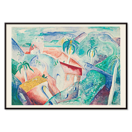
Kuuban maisema Juliste
Paul Gaulois · 1926 · aurinkoinen kuubalainen maisemajuliste rehevine vihreine, kobolttisine taivassävyine ja lämpimine kyläsävyine
Juliste €9 · Kehystetty €16
-

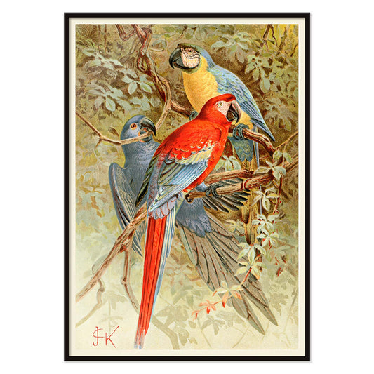
Aralinnut juliste
Tuntematon taiteilija · 1893 · eloisa aralintujuliste rehevine sademetsälehtineen ja tarkoin kuvatuilla sulilla, sopii seinätaiteeksi
Juliste €9 · Kehystetty €16
-


Markkinakohtaus Alankomaiden Itä-Intiassa Juliste
Pierre Jean Apol · 1912 · auringonläikkäinen trooppinen markkinajuliste, vilkas katutunnelma, lämpimät okran ja indigon sävyt
Juliste €9 · Kehystetty €16
-

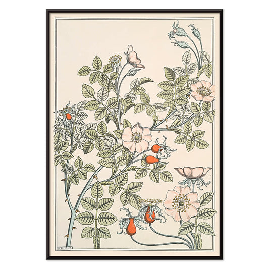
Eglantier Juliste
Maurice Pillard Verneuil · 1896 · elegantti luonnonruusujuliste virtaavilla versoilla, lehdillä ja herkillä kukinnoilla kodin seinätilaan
Juliste €9 · Kehystetty €16
-

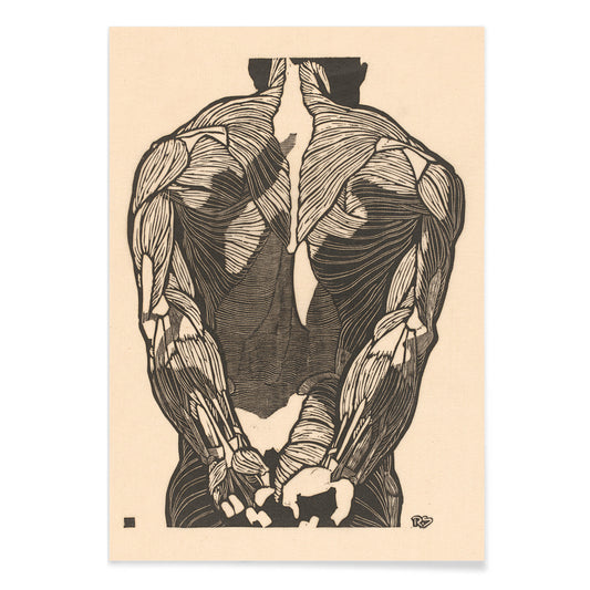
Selkälihakset 2 Juliste
Reijer Stolk · 1932 · tarkka ajaton anatominen taidevedos selkälihaksista mustalla viivalla beigen taustalla
Juliste €9 · Kehystetty €16
-

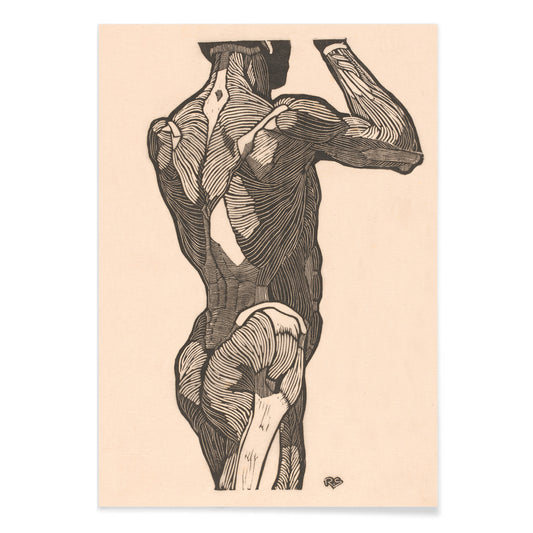
Pakaralihakset Juliste
Reijer Jan Stolk · 1930 · tarkka anatominen taidejuliste pakaralihaksista mustalla viivalla ja beige taustalla
Juliste €9 · Kehystetty €16
-

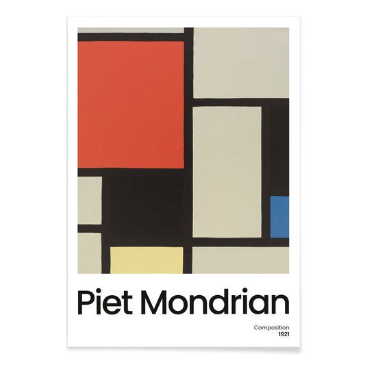
Kompositio suurella punaisella alueella Juliste
Piet Mondrian · 1921 · geometrinen abstrakti taidejuliste suurella punaisella pinnalla ja tarkalla mustalla ruudukolla
Juliste €9 · Kehystetty €16
-
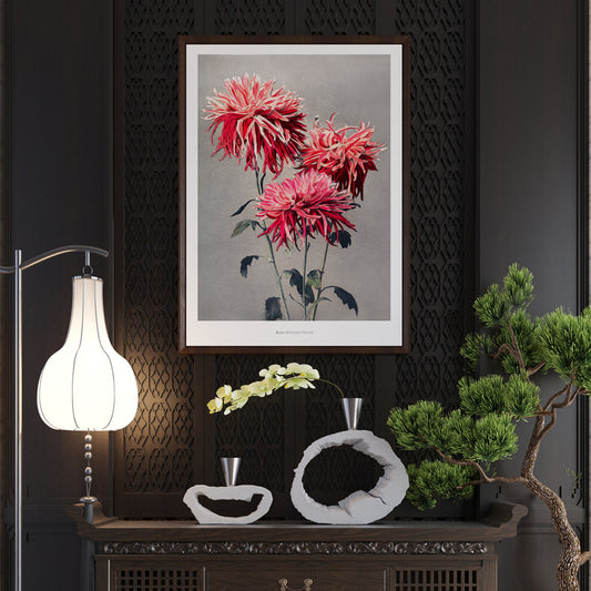
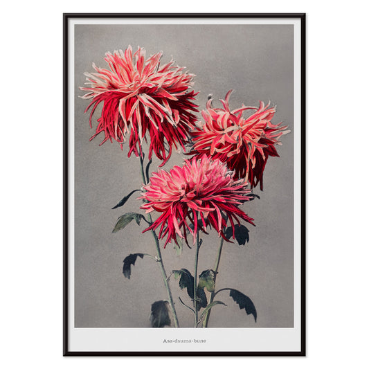
Asa–dsuma–bune Juliste
Kazumasa Ogawa · 1896 · käsin sävytetty kasviaiheinen juliste jossa kirkaat punaiset kukat ja tarkat lehdet
Juliste €9 · Kehystetty €16
-

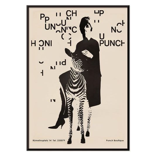
Punch Boutique -juliste
Paul Mitzkat · 1950 · nokkela mustan ja beigen sävyinen juliste, jossa elegantti nainen poseeraa seepra rinnallaan tyylikkäästi
Juliste €9 · Kehystetty €16
-

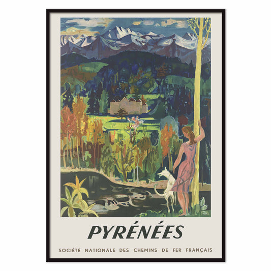
Pyreneiden rautatie Juliste
Roger Aujame · 1950 · rautatiejuliste vaaleanpunaiseen pukeutuneesta matkailijasta ja valkoisesta vuohesta lumihuippuisten Pyreneiden juurella
Juliste €9 · Kehystetty €16
-

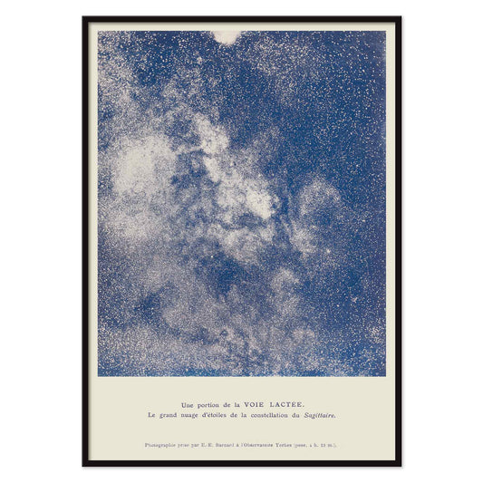
Osa Linnunrataa Juliste
Lucien Rudaux · 1923 · hohtava tieteellinen taidevedos näyttää Linnunradan tiheät tähdet ja vaaleat galaktiset pilvet
Juliste €9 · Kehystetty €16
-

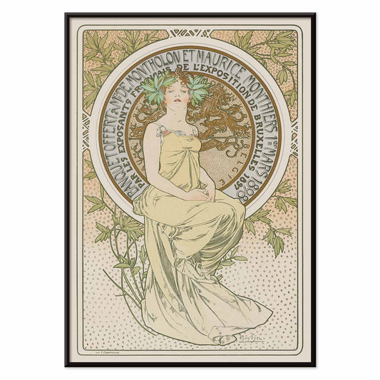
Exposition de Bruxelles Juliste
Alphonse Mucha · 1897 · Art Nouveau -juliste Exposition de Bruxelles -näyttelyyn istuvan hahmon kanssa
Juliste €9 · Kehystetty €16
-

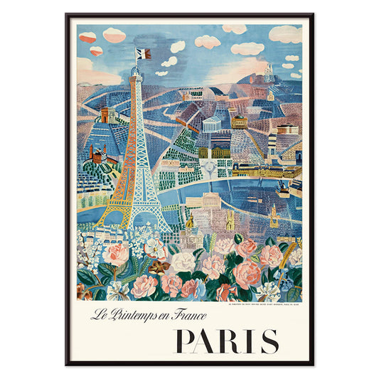
Kevät Ranskassa Juliste
Raoul Dufy · 1925 · iloinen eiffeltornijuliste keväisine ilmavine viivoineen ja kirkkaalla pariisilaisenergialla lämpimällä sävyllä
Juliste €9 · Kehystetty €16
-

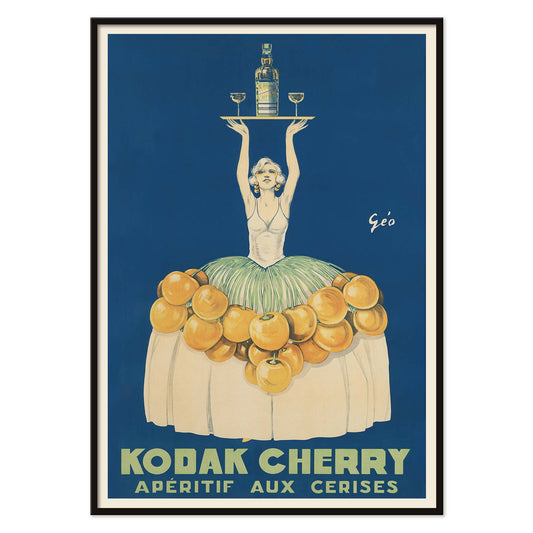
Kodak Cherry Juliste
Géo Vermeire · 1925 · teatraalisessa aperitiivijulisteessa nainen esiintyy kirsikoiden peittämässä puvussa syvänsinistä taustaa vasten
Juliste €9 · Kehystetty €16
-

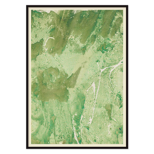
Vihreä marmoroitu paperi Juliste
Margarete Rumpf · 1909 · vintagejuliste vihreästä marmoroinnista, pilvimäisistä pinnoista ja vaaleista haarautuvista juovista
Juliste €9 · Kehystetty €16
-

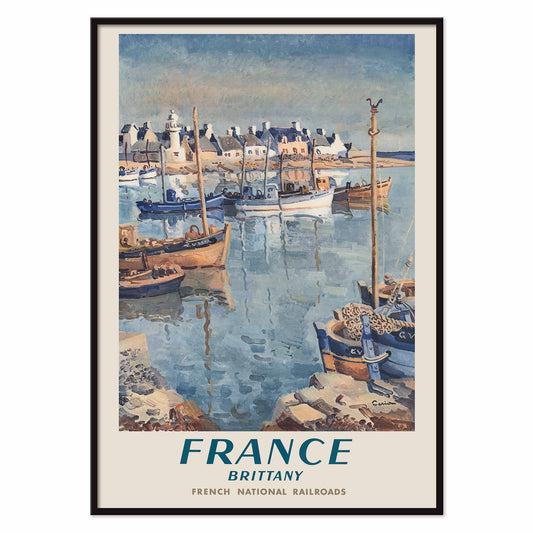
Ranska – Bretagne rautateitse Juliste
Edmond Céria · 1952 · maalauksellinen ranskalainen rautatiejuliste kalastusveneistä vaalean bretonikylän edustalla rauhallisessa sinisessä satamassa
Juliste €9 · Kehystetty €16
-

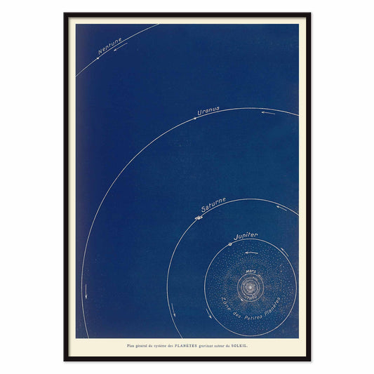
Yleissuunnitelma planeettajärjestelmästä Juliste
Lucien Rudaux · 1923 · syvänsininen tieteellinen juliste kartoittaa planeettojen kiertoradat Auringon ympärillä
Juliste €9 · Kehystetty €16
-

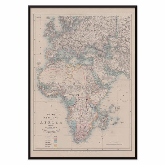
Uusi Afrikan kartta Juliste
Wyld · 1887 · hillittysävyinen vintagekarttajuliste, jossa Afrikan rannikot ja rajat piirtyvät tarkasti pehmein sinisin ja punaisin korostuksin
Juliste €9 · Kehystetty €16
-

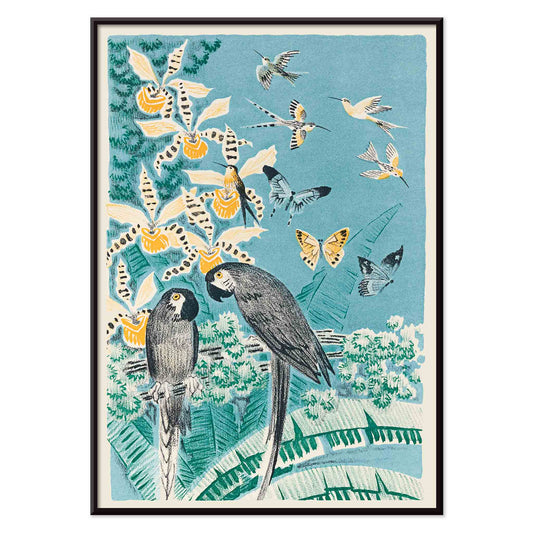
Douze contes Juliste
José-Maria de Heredia · 1879 · leikillinen lintu ja perhosjuliste joka kehystää ranskalaista kertomusta rehevässä tarinallisessa lehvistössä ja värimaailmallaan
Juliste €9 · Kehystetty €16
-

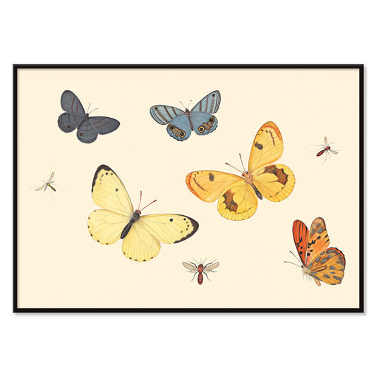
Viisi perhosta juliste
Pieter Withoos · 1675 · herkkä hyönteisten taidejuliste viisi perhosta, yksi ampiainen ja kaksi kärpästä
Juliste €9 · Kehystetty €16
-

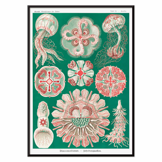
Discomedusae Juliste
Ernst Haeckel · 1904 · yksityiskohtainen meduusajuliste tieteellisellä otteella kelluvat kupolit ja pitsimäiset lonkerot
Juliste €9 · Kehystetty €16
-

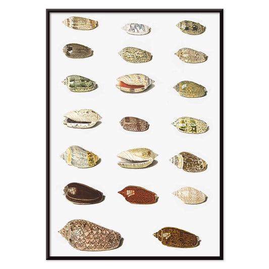
Kaksikymmentä trooppista simpukkaa Juliste
Johann Gustav Hoch · 1750 · yksityiskohtainen trooppisten simpukoiden juliste järjestetty keräilijän lautasen tapaan valkoisella pohjalla
Juliste €9 · Kehystetty €16
-

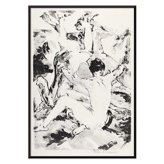
Kolme akrobaattia juliste
Arthur Bowen Davies · 1920 · notkeita sirkusakrobaatteja mustavalkoisessa taidejulisteessa, rytminen modernistinen viiva ja hillitty ajaton eleganssi seinätaiteena
Juliste €9 · Kehystetty €16
-

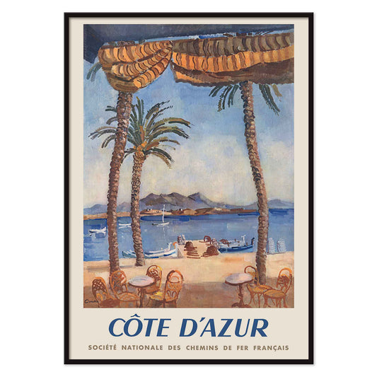
Rautateitse Ranskan Rivieralle Juliste
Edmond Céria · 1951 · Ranskan Rivieran matkajuliste turkoosista lahdesta, korkeista palmuista ja okranvärisistä päivänvarjoista
Juliste €9 · Kehystetty €16


72/222 items
- Horoskooppimerkit Juliste
- Mansikkavaras Juliste
- Soyuz TMA-14M avaruusalusjuliste
- Kubik Juliste
- Air France Juliste
- The Kinks Honolulussa 1965 juliste
- Le Floral Juliste
- Meksikolainen taide ja elämä 3 Juliste
- Aamu Beppussa Juliste
- Place de la Concorde -juliste
- Kompositio valkoisessa, punaisessa ja keltaisessa Juliste
- Kohtisuorilla jaettu alue Juliste
- Lontoon loiste Juliste
- Iloinen vuori juliste
- päärynäkaktuksen kukinta Juliste
- Ekvatoriaalinen viidakko Juliste
- Nainen kävelee eksoottisessa metsässä Juliste
- Kompositio (nro 1) Juliste
- Kipsikäsi Juliste
- Zoologischer Garten München 2 -juliste
- Vihreä kirjastopuu Juliste
- Tanssiva pari lumessa Juliste
- Selkälihakset 2 Juliste
- Pakaralihakset Juliste
- Kompositio suurella punaisella alueella Juliste
- Asa–dsuma–bune Juliste
- Punch Boutique -juliste
- Kevät Ranskassa Juliste
A curator-led cross section of poster culture
Our Selection gathers the kind of images that once lived on street corners, in shop windows, and on gallery walls, then learned how to behave in a home. It is not a single movement but a conversation between vintage poster design, modern art print sensibilities, and documentary photography. The common thread is legibility and atmosphere: work that reads clearly from a distance, then rewards a closer look with paper grain, ink edges, and deliberate restraint. For a broader overview of formats and eras, the main All Posters index helps place this edit in context.
Design history in miniature, from lithography to the photo screen
Classic posters were engineered for attention, which is why their compositions tend to be decisive: simplified shapes, high contrast, and typography that can hold its own against city noise. Many of the most memorable examples relied on lithography, where separate colour stones built flat fields that still feel fresh today. Later processes introduced halftone dots and photographic grain, adding a different kind of texture and realism. If you gravitate toward structure and reduced form, the language of abstract graphics often sits nearby; for an image with a quieter, observational pull, Photo offers a related sensibility. A more nervous, handwritten line can be found through Egon Schiele, where drawing becomes psychology as much as depiction.
Interior placement: how to use a varied edit room by room
Because the selection spans several visual registers, it works best when the room sets the volume. In living spaces with oak, linen, or boucle, choose a vintage poster with softened pigments or warm paper tones so the wall art feels integrated rather than loud. Hallways benefit from vertical emphasis and repeated intervals, which is where Vertical Posters can help establish rhythm. In kitchens and dining corners, sharper typography and botanical detail tend to feel natural; pairing with Botanical keeps the palette grounded in greens and off-whites. For bedrooms, lean toward lower contrast prints and calmer spacing, or move into the tonal discipline of Black & White to keep the light gentle.
Curating a gallery wall without forcing harmony
Good decoration relies on pacing: one assertive image, several quieter ones, and a repeated cue that ties the set together, such as a single ink colour or shared margin width. A practical approach is to anchor the group with a typographic or emblematic sheet, then add a photograph or landscape fragment as a softer counterweight. When you want a stronger graphic note, borrow a companion from Advertising; when you want slower, museum-like cadence, echo it with a piece from Classic Art. Frame choice does the final editing: pale wood lifts warm palettes, black metal sharpens linework, and a generous mount makes aged paper feel intentional. A simple route is to keep frames consistent while letting imagery vary, then adjust spacing until the negative space becomes part of the composition.
An edit that can evolve with your rooms
The strength of Our Selection is its openness: it behaves like a personal archive, ready to be re-sequenced as furniture shifts and colour choices mature. Some homes keep the mix eclectic; others gradually steer it toward a decade, a subject, or a single dominant hue. Either way, the poster and print languages here were made to coexist, and the most convincing gallery walls are the ones that look accumulated rather than planned.