


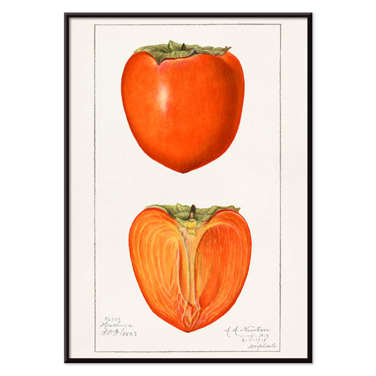
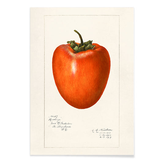
- Persimmons Poster
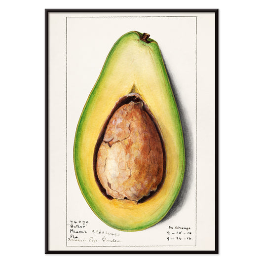
- Avocado (Persea) Poster
- Avocado (Persea) Poster
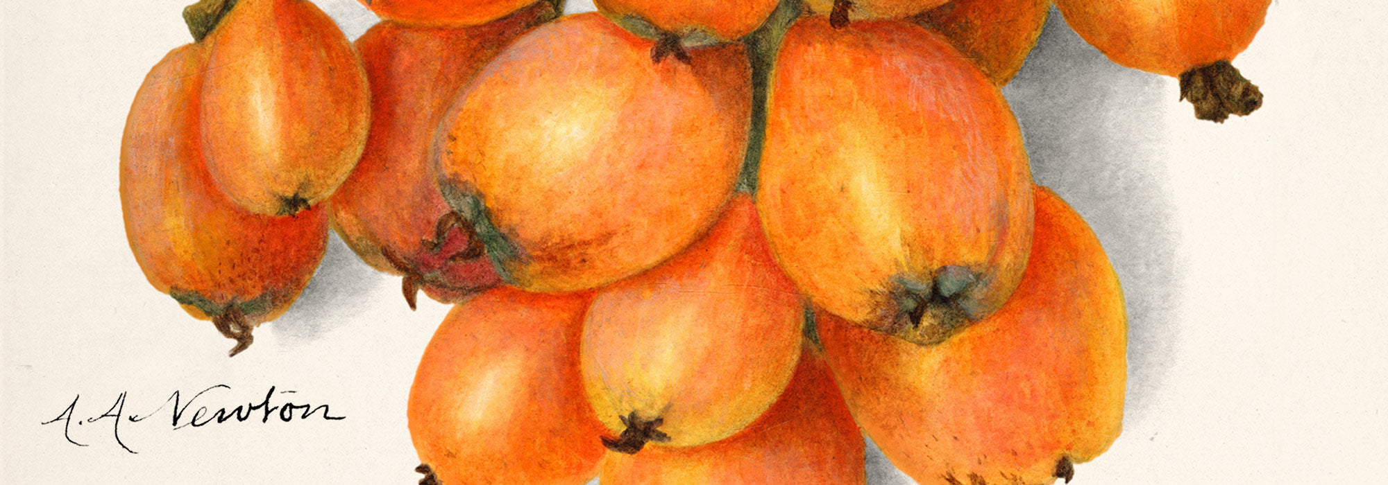
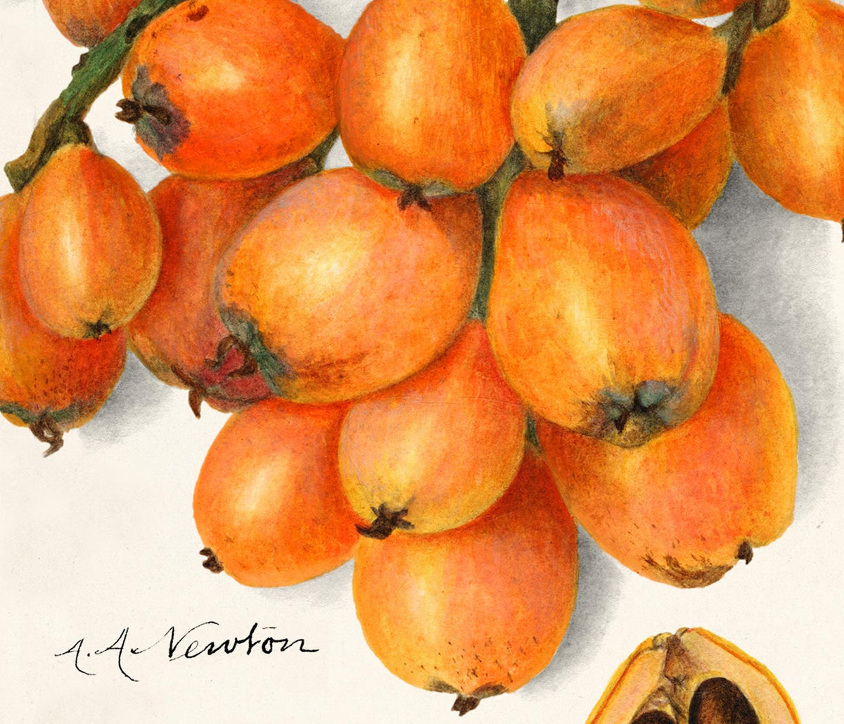
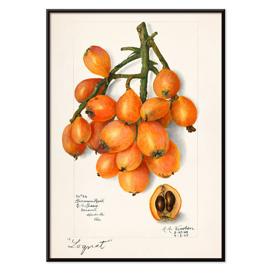
- Loquats (Eriobotrya Japonica) Poster
- Prunus Domestica Poster
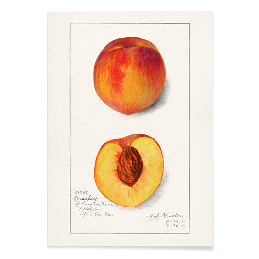
- Prunus Persica Poster
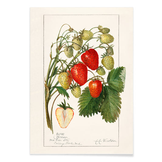
- Fragaria Poster
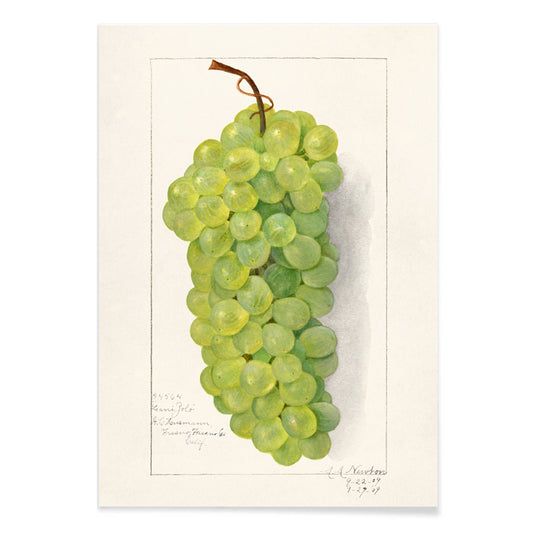
- Bunch of green grapes Poster
- Avocado Persea Poster
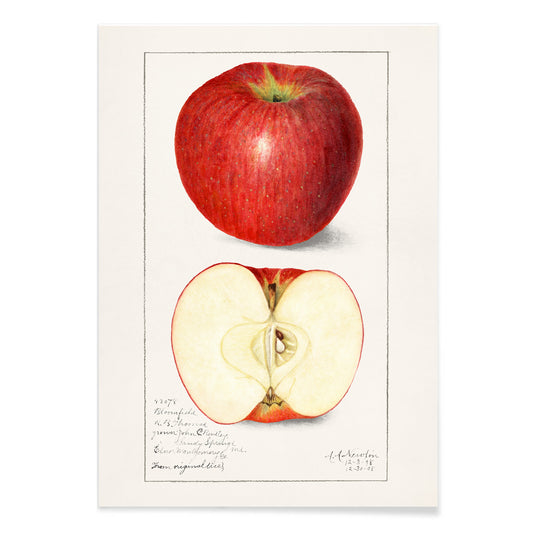
- Malus Domestica Poster
- Malus Domestica Poster
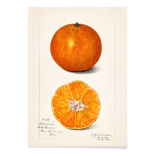
- Citrus Sinensis Poster
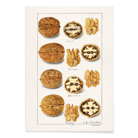
- Walnuts Poster
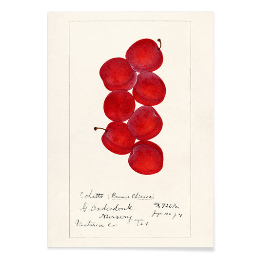
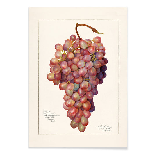
- Vintage bunch of red grape Poster
-
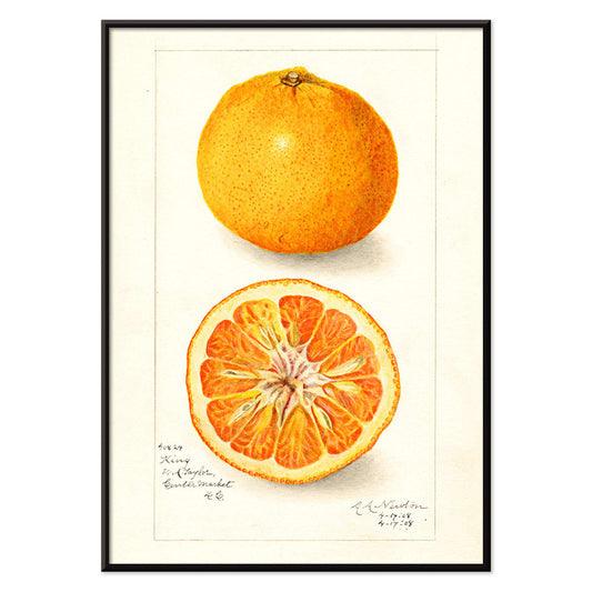
Citrus nobilis Poster
Amanda Almira Newton · 1908 · Detailed mandarin botanical print with clean negative space and warm orange tones
Poster from €9 · Framed from €16
Regular price From €6,00Regular price -
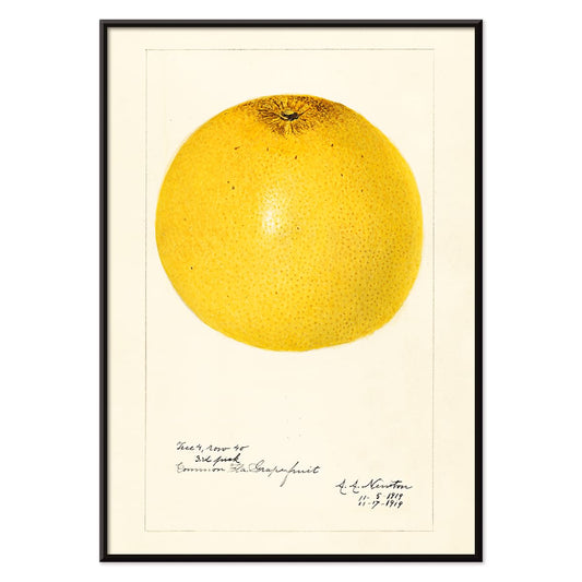
Citrus paradisi Poster
Amanda Almira Newton · 1919 · Luminous grapefruit botanical print balancing scientific clarity with soft watercolor shading
Poster from €9 · Framed from €16
Regular price From €6,00Regular price -
Persimmons Poster
Amanda Almira Newton · 1923 · Delicate botanical print of ripe persimmons on a leafy branch against clean white space
Poster from €9 · Framed from €16
Regular price From €6,00Regular price -
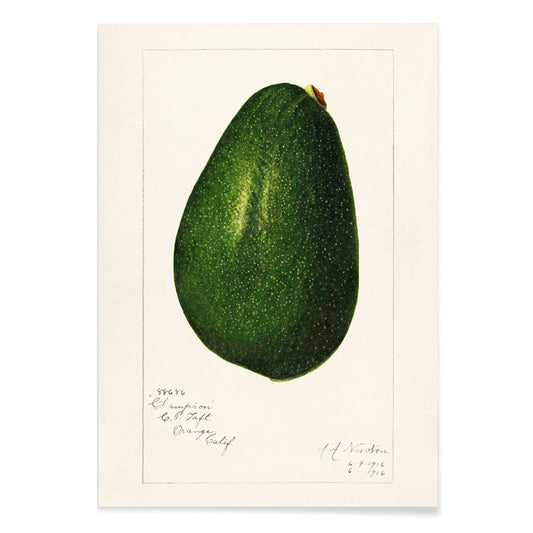
Avocado (Persea) Poster
Amanda Almira Newton · 1916 · Refined avocado botanical print with green fruit and a cut half revealing the pit
Poster from €9 · Framed from €16
Regular price From €6,00Regular price -
Avocado (Persea) Poster
Amanda Almira Newton · 1916 · Detailed avocado botanical print featuring ripe fruit halves and glossy green leaves
Poster from €9 · Framed from €16
Regular price From €6,00Regular price -
Loquats (Eriobotrya Japonica) Poster
Amanda Almira Newton · 1908 · Luminous loquat botanical print with warm orange fruit and crisp white space
Poster from €9 · Framed from €16
Regular price From €6,00Regular price -
Prunus Domestica Poster
Amanda Almira Newton · 1888 · Lush plum botanical print with ripe fruit and crisp leaves on white ground
Poster from €9 · Framed from €16
Regular price From €6,00Regular price -
Prunus Persica Poster
Amanda Almira Newton · 1911 · Delicate peach botanical print with ripening fruit and soft leaves on white ground
Poster from €9 · Framed from €16
Regular price From €6,00Regular price -
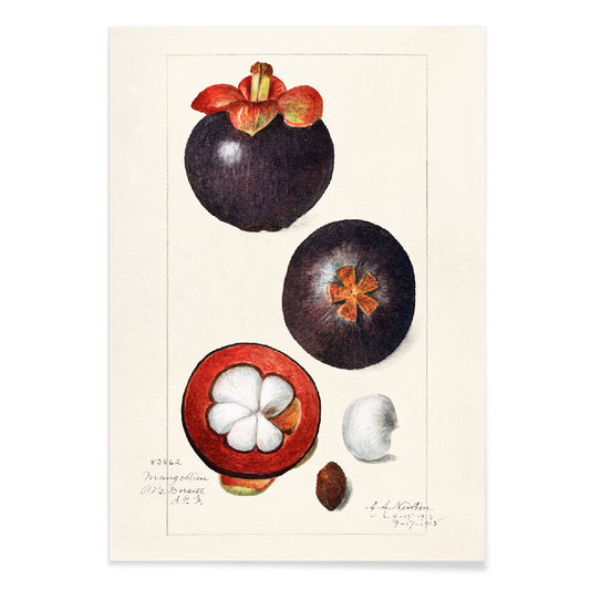
Garcinia Mangostana Poster
Amanda Almira Newton · 1915 · Delicate mangosteen print featuring glossy green leaves and a split fruit with white pulp
Poster from €9 · Framed from €16
Regular price From €6,00Regular price -
Fragaria Poster
Amanda Almira Newton · 1912 · Detailed strawberry botanical print with ripe fruit and leafy stems on white
Poster from €9 · Framed from €16
Regular price From €6,00Regular price -
Bunch of green grapes Poster
Amanda Almira Newton · 1896 · Delicate botanical print of green grapes with translucent skins and soft shadowing
Poster from €9 · Framed from €16
Regular price From €6,00Regular price -
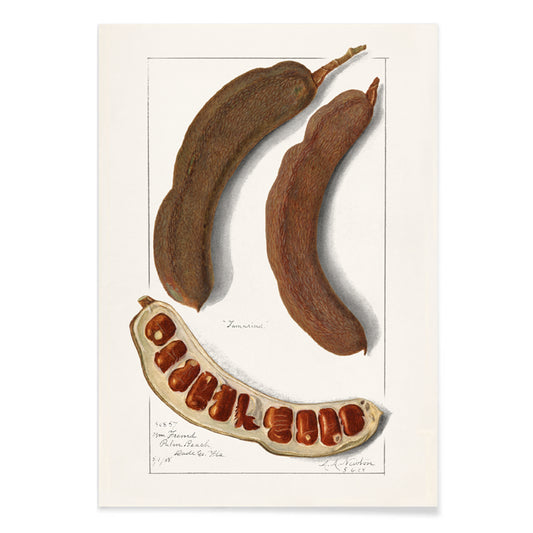
Indian Tamarind Poster
Amanda Almira Newton · 1908 · Delicate tamarind botanical print featuring airy leaves and warm brown pods on cream
Poster from €9 · Framed from €16
Regular price From €6,00Regular price -
Avocado Persea Poster
Amanda Almira Newton · 1916 · Refined avocado botanical print with luminous green skins and a softly painted cut fruit
Poster from €9 · Framed from €16
Regular price From €6,00Regular price -
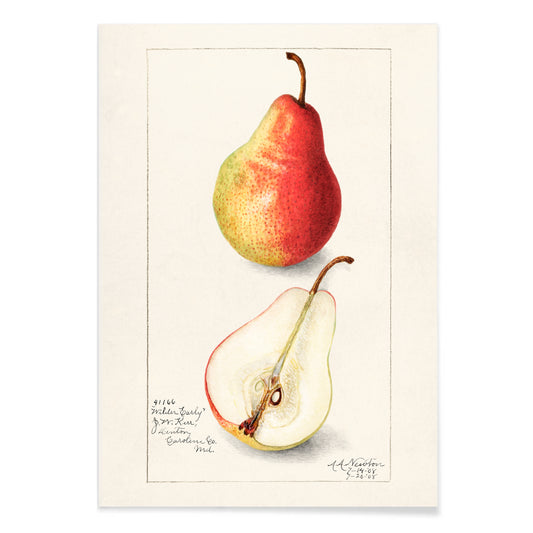
Pyrus Communis 2 Poster
Amanda Almira Newton · 1908 · Delicate pear botanical print with warm yellow skin, red blush, and crisp leaves
Poster from €9 · Framed from €16
Regular price From €6,00Regular price -
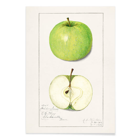
Malus Domestica Poster
Amanda Almira Newton · 1913 · Delicate apple botanical print with whole fruit, leafy stem, and a sliced cross section
Poster from €9 · Framed from €16
Regular price From €6,00Regular price -
Persimmon Poster
Amanda Almira Newton · 1916 · Delicate botanical print of persimmon fruit and glossy leaves on white
Poster from €9 · Framed from €16
Regular price From €6,00Regular price -
Malus Domestica Poster
Amanda Almira Newton · 1908 · Refined apple botanical print with luminous red fruit and crisp leaves on white
Poster from €9 · Framed from €16
Regular price From €6,00Regular price -
Citrus Sinensis Poster
Amanda Almira Newton · 1916 · Luminous orange botanical print showing fruit, leaves, blossoms, and a clean cutaway
Poster from €9 · Framed from €16
Regular price From €6,00Regular price -
Walnuts Poster
Amanda Almira Newton · 1911 · Detailed walnut botanical print pairing shells, leaves, and nuts with natural shading
Poster from €9 · Framed from €16
Regular price From €6,00Regular price -
Vintage bunch of red grape Poster
Amanda Almira Newton · 1912 · Lifelike red grape botanical print with plump clustered fruit and delicate vine leaves
Poster from €9 · Framed from €16
Regular price From €6,00Regular price


- Persimmons Poster
- Avocado (Persea) Poster
- Avocado (Persea) Poster
- Loquats (Eriobotrya Japonica) Poster
- Prunus Domestica Poster
- Prunus Persica Poster
- Fragaria Poster
- Bunch of green grapes Poster
- Avocado Persea Poster
- Malus Domestica Poster
- Malus Domestica Poster
- Citrus Sinensis Poster
- Walnuts Poster
- Vintage bunch of red grape Poster
A botanical pantry in watercolor
In the early twentieth century, botanical illustration often sat between laboratory discipline and domestic delight, and Amanda Almira Newton’s fruit studies inhabit that middle ground. Her images read like working notes made with patience: an object isolated, observed, and left to speak for itself. As posters, the compositions keep a deliberate calm, using open paper as part of the design rather than empty space to be filled. The result is vintage wall art that feels equally at home beside cookbooks and ceramics, and it sits naturally near related themes in Botanical, Science, and the broader context of Famous Artists.
Newton’s approach: observation, spacing, and wash
Newton worked in watercolor with a clarity that prioritizes contour, surface, and scale over drama. The paint stays translucent so the fruit remains readable as specimen, not theatrical still life. Egon Schiele once used blank paper as tension; Newton uses it as quiet measurement, letting the viewer compare shape, rind, and flesh without distraction. In Avocado (Persea) (1916), the halved fruit becomes a small lesson in structure: pale greens, a firm outline, and the pit acting like a weight at the center. Strawberries (Fragaria) (1912) shifts the register toward brightness, where seeds, blossoms, and serrated leaves keep sweetness grounded in botany.
Interior placement: kitchen light and dining materials
Because the imagery is straightforward and the palette stays gentle, these prints settle into rooms with active surfaces. In a kitchen, they pair well with tile grids, butcher-block warmth, and brass or steel hardware, echoing the functional order of Kitchen interiors without becoming signage. In a dining room, hang one poster above a sideboard so the white space can catch daylight and the pigments can read true rather than muddy. If the room is built around light woods, linen, and stoneware, pull supporting tones from Beige; if you want crisper contrast, a restrained companion from Black & White can sharpen the wall without fighting the fruit colors.
Curating a series: rhythm, scale, and frames
A good group relies on visual rhythm: round forms against branching diagonals, reds against greens, smooth skins against cracked shells. Loquats (Eriobotrya Japonica) (1908) brings an elegant slant that leads the eye along stem and leaf, while Walnuts (Juglans) (1911) lowers the tempo with earthier browns and a more tactile subject. Keep spacing consistent and use mats to preserve the archive-sheet feeling. Thin oak frames warm the paper; black metal frames emphasize line and labeling. For a cohesive finish across a gallery wall, coordinate formats through Vertical Posters or explore practical options in Frames.
Collecting fruit as an archive of attention
Newton’s fruit studies are persuasive because they refuse symbolism and instead reward attention: you notice bloom, bruising, and the slight shadow under a stem. As vintage posters, they offer decoration that behaves like a record, not a slogan. Leave generous margins, let paper texture show, and the wall art will feel closer to a kept notebook page than to a loud display.