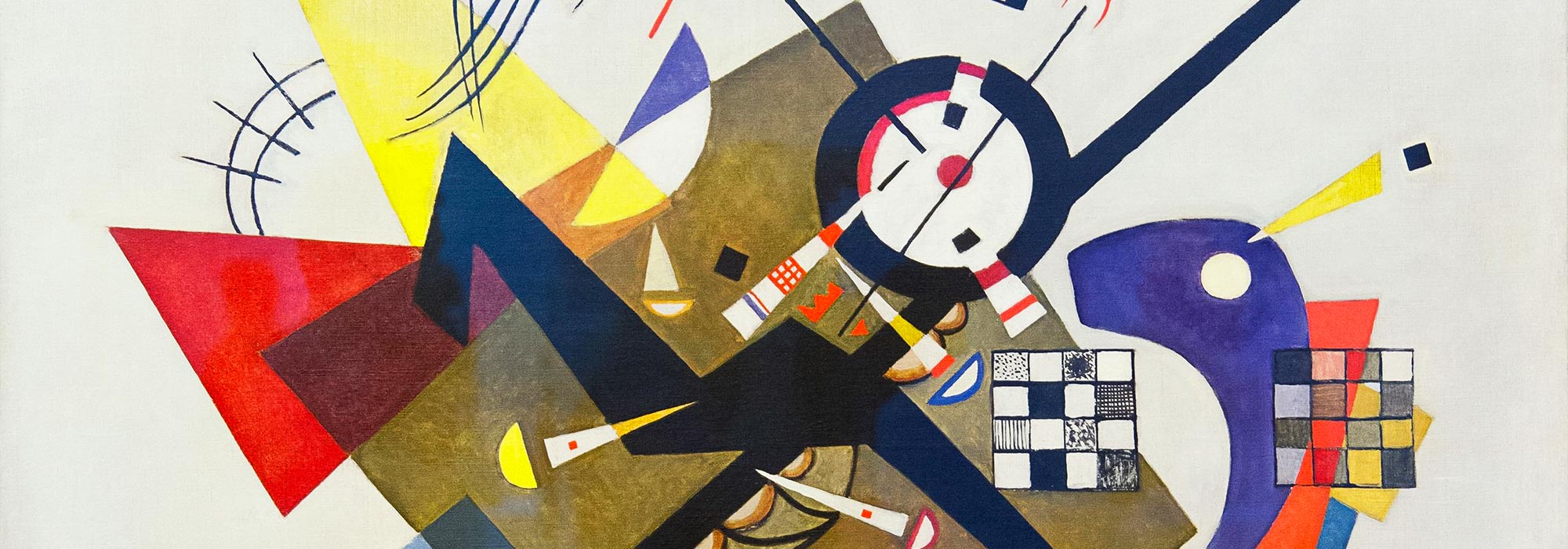


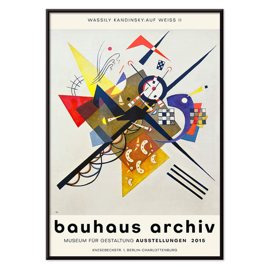
- Auf Weiss II Poster
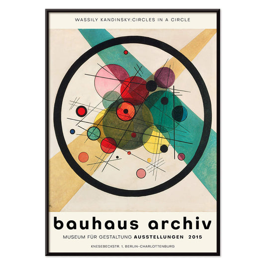
- Circles in a circle Poster
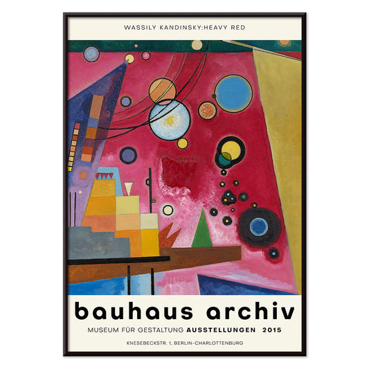
- Heavy Red Poster
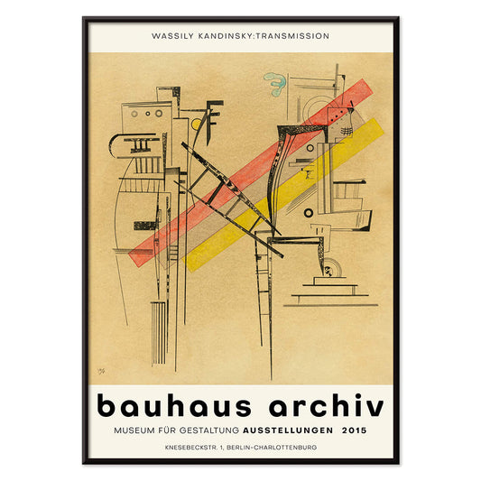
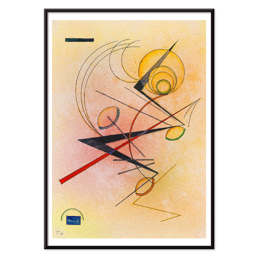
- Transmission Poster
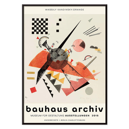
- Orange Poster
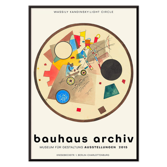
- Light Circle Poster
- Bleu de Ciel Poster
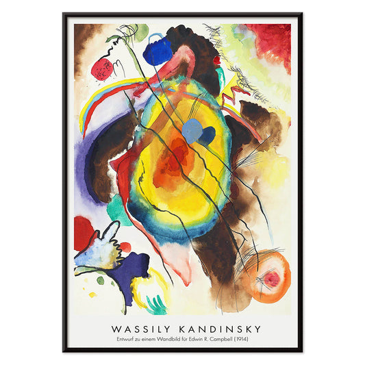
- Design for a mural Poster
- Der Blaue Reiter Poster
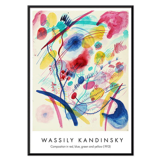
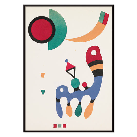
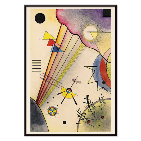
- Composition in red, blue, green and yellow Poster
- 11 tableux et 7 poèmes Poster
- Kleines Warm Poster
- Klänge Pl.19 Poster
- Lyrisches Poster
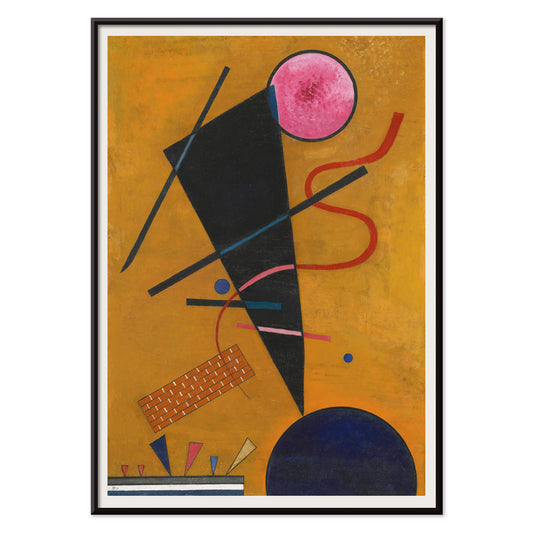
- Fröhlicher Aufstieg Poster
- Gewebe Poster
- Kandinsky 1941 Poster
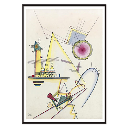
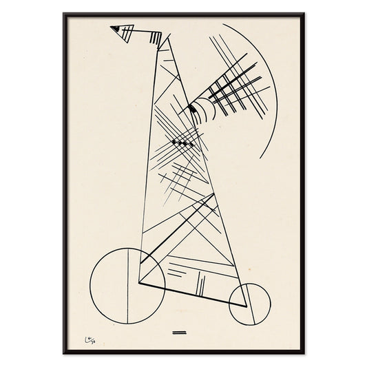
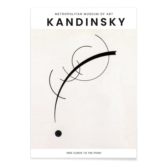
- Free Curve to the Point Poster
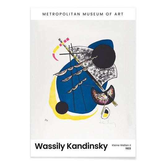
- Kleine Welten IV Poster
- Violet Poster
- Four Parts Poster
- Kleine Welten I Poster
-
Auf Weiss II Poster
Wassily Kandinsky · 1923 · Dynamic geometric abstract poster on white with primary colors and crisp black lines
Poster from €9 · Framed from €16
Regular price From €6,00Regular price -
Circles in a circle Poster
Wassily Kandinsky · 1923 · Radiant abstract poster of layered circles floating on a deep black field
Poster from €9 · Framed from €16
Regular price From €6,00Regular price -
Heavy Red Poster
Wassily Kandinsky · 1924 · Dynamic abstract poster centered on a heavy red block with crisp geometric accents
Poster from €9 · Framed from €16
Regular price From €6,00Regular price -
Transmission Poster
Wassily Kandinsky · 1935 · Abstract geometric poster with playful circles, lines, and chromatic accents on warm ground
Poster from €9 · Framed from €16
Regular price From €6,00Regular price -
Orange Poster
Wassily Kandinsky · 1923 · Geometric orange poster balancing circles and sharp lines on an airy white ground
Poster from €9 · Framed from €16
Regular price From €6,00Regular price -
Light Circle Poster
Wassily Kandinsky · 1922 · Geometric abstract poster with luminous circles and sharp angles on a deep dark ground
Poster from €9 · Framed from €16
Regular price From €6,00Regular price -
Bleu de Ciel Poster
Wassily Kandinsky · 1925 · Airy abstract art print of floating forms on sky-blue ground with bright accents
Poster from €9 · Framed from €16
Regular price From €6,00Regular price -
Design for a mural Poster
Wassily Kandinsky · 1914 · Energetic abstract poster of geometric forms and rhythmic lines in vivid primary tones
Poster from €9 · Framed from €16
Regular price From €6,00Regular price -
Der Blaue Reiter Poster
Wassily Kandinsky · 1914 · Expressive abstract poster with a blue rider silhouette and radiant color blocks
Poster from €9 · Framed from €16
Regular price From €6,00Regular price -
Composition in red, blue, green and yellow Poster
Wassily Kandinsky · 1913 · Energetic abstract art print with layered circles, angles, and bright primary color accents
Poster from €9 · Framed from €16
Regular price From €6,00Regular price -
Berührung Poster
Wassily Kandinsky · 1924 · Dynamic abstract poster featuring intersecting circles, angular lines, and bold red and orange accents
Poster from €9 · Framed from €16
Regular price From €6,00Regular price -
11 tableux et 7 poèmes Poster
Wassily Kandinsky · 1945 · Rhythmic geometric poster balancing bright primary shapes with refined modernist typography
Poster from €9 · Framed from €16
Regular price From €6,00Regular price -
Standing Poster
Wassily Kandinsky · 1930 · Energetic abstract poster balancing circles, lines, and blocks in primary tones
Poster from €9 · Framed from €16
Regular price From €6,00Regular price -
Blau in Rund und Spitz Poster
Wassily Kandinsky · 1933 · Abstract geometric art print balancing blue circles, sharp angles, and red accents
Poster from €9 · Framed from €16
Regular price From €6,00Regular price -
Delicate Soul Poster
Wassily Kandinsky · 1925 · Geometric abstract art print with crisp black lines, yellow highlights, and soft purple forms
Poster from €9 · Framed from €16
Regular price From €6,00Regular price -
Kleines Warm Poster
Wassily Kandinsky · 1928 · Warm abstract poster with floating circles and sharp black lines in red and yellow
Poster from €9 · Framed from €16
Regular price From €6,00Regular price -
Deutliche Verbindung Poster
Wassily Kandinsky · 1925 · Geometric abstract art print balancing circles and angles in energetic primary and violet accents
Poster from €9 · Framed from €16
Regular price From €6,00Regular price -
Ohne Titel Poster
Wassily Kandinsky · 1930 · Abstract geometric art print of floating lines and circles on warm beige
Poster from €9 · Framed from €16
Regular price From €6,00Regular price -
Klänge Pl.19 Poster
Wassily Kandinsky · 1913 · Abstract poster with rhythmic shapes echoing music across a warm beige field
Poster from €9 · Framed from €16
Regular price From €6,00Regular price -
Lyrisches Poster
Wassily Kandinsky · 1911 · Lyrical abstract art print with energetic black linework and bright red, blue, yellow accents
Poster from €9 · Framed from €16
Regular price From €6,00Regular price -
Fröhlicher Aufstieg Poster
Wassily Kandinsky · 1923 · Dynamic geometric poster with rising diagonals, circles, and bold primary accents
Poster from €9 · Framed from €16
Regular price From €6,00Regular price -
Gewebe Poster
Wassily Kandinsky · 1923 · Geometric abstract art print featuring rhythmic blocks and lines on warm beige
Poster from €9 · Framed from €16
Regular price From €6,00Regular price -
Kandinsky 1941 Poster
Wassily Kandinsky · 1941 · Lyrical abstract poster with floating geometric accents in blue, yellow, pink, and red
Poster from €9 · Framed from €16
Regular price From €6,00Regular price -
Free Curve to the Point Poster
Wassily Kandinsky · 1925 · Monochrome abstract poster of curves and geometric forms with a poised focal point
Poster from €9 · Framed from €16
Regular price From €6,00Regular price -
Kleine Welten II Poster
Wassily Kandinsky · 1922 · Rhythmic geometric art print with floating circles, sharp lines, and a bold black field
Poster from €9 · Framed from €16
Regular price From €6,00Regular price -
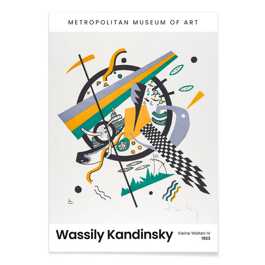
Kleine Welten IV Poster
Wassily Kandinsky · 1922 · Abstract art print of circles and angular lines with bright blue yellow green accents
Poster from €9 · Framed from €16
Regular price From €6,00Regular price -
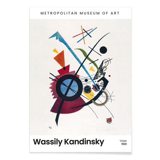
Violet Poster
Wassily Kandinsky · 1923 · Geometric abstract art print with violet, blue, and yellow shapes on pale ground
Poster from €9 · Framed from €16
Regular price From €6,00Regular price -
Four Parts Poster
Wassily Kandinsky · 1932 · Abstract art print divided into four fields of crisp lines and shapes
Poster from €9 · Framed from €16
Regular price From €6,00Regular price -
Kleine Welten V Poster
Wassily Kandinsky · 1922 · Rhythmic geometric poster of circles and sharp lines against a deep black field
Poster from €9 · Framed from €16
Regular price From €6,00Regular price -
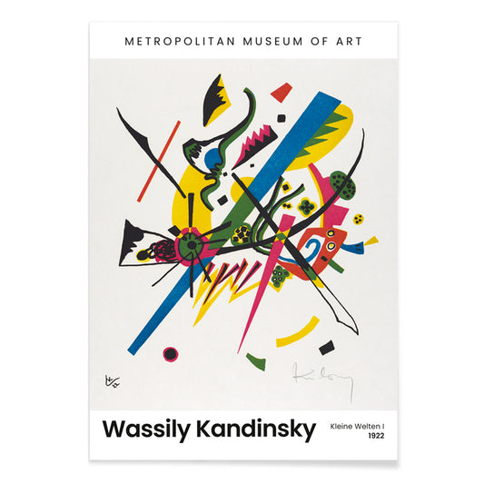
Kleine Welten I Poster
Wassily Kandinsky · 1922 · Geometric abstract poster balancing circles, lines, and bright primary accents on white
Poster from €9 · Framed from €16
Regular price From €6,00Regular price


- Auf Weiss II Poster
- Circles in a circle Poster
- Heavy Red Poster
- Transmission Poster
- Orange Poster
- Light Circle Poster
- Bleu de Ciel Poster
- Design for a mural Poster
- Der Blaue Reiter Poster
- Composition in red, blue, green and yellow Poster
- 11 tableux et 7 poèmes Poster
- Kleines Warm Poster
- Klänge Pl.19 Poster
- Lyrisches Poster
- Fröhlicher Aufstieg Poster
- Gewebe Poster
- Kandinsky 1941 Poster
- Free Curve to the Point Poster
- Kleine Welten IV Poster
- Violet Poster
- Four Parts Poster
- Kleine Welten I Poster
A modernist grammar of color
Kandinsky built a language for painting that did not need objects to make meaning. Circles, angled bars, and drifting signs suggest sound and motion, while watercolor softness meets hard-edged structure. As poster and print, this modernist vocabulary keeps its charge: a vintage approach to abstraction that still reads clearly as wall art and decoration in contemporary home decor.
From Der Blaue Reiter to the Bauhaus classroom
His early years around Der Blaue Reiter lean toward intuition, where stains and strokes feel improvised but never accidental. In Lyrisches (1911), color behaves like atmosphere, building depth through translucent layers rather than perspective. By the 1920s, teaching at the Bauhaus encouraged a cleaner syntax of forms and spacing, closer to design systems than to landscape. The shift is visible in Circles in a circle, Bauhaus exhibition (1923), where the composition becomes a measured diagram, poised between art and visual communication. For broader context, the typographic restraint of Bauhaus posters and the image-first directness of Advertising prints help place Kandinsky inside a wider culture of the modern poster.
Interior placement: color energy without clutter
Kandinsky works well when a room needs a focal point that is lively but not busy with narrative detail. In a restrained space, one print can act as the color key for textiles and ceramics: repeat a single hue once or twice and let the rest stay quiet. If you prefer clean architecture and spare furniture, pairing with Minimalist wall art keeps the room structured while Kandinsky supplies movement. If you are building a more painterly mix, neighboring pieces from Abstract collections can echo his geometry without competing for attention. For cooler palettes, Blue works as a guide when you want the art to align with glass, linen, or steel finishes. A small area like a hallway can handle a concentrated spark such as Kleines Warm (1928), where yellow reads as light rather than decoration.
Curating pairs and gallery walls with rhythm
Hanging Kandinsky is easiest when you think in musical terms: intervals, pauses, and refrains. Start with an orderly anchor like Four Parts (1932), then add a looser counterpoint such as Bleu de Ciel (1925), whose floating motifs feel airy and improvisational. Keep consistent margins and give each frame space so complex passages read as rhythm, not noise. Pale oak frames soften the geometry; matte black frames sharpen it and can bridge into Black & White photography for a tighter, graphic gallery wall.
Why abstraction still feels personal
Kandinsky argued that color could act directly on feeling, and that idea survives the century because it matches how we actually live with images. A print changes across the day: blues cool in noon light, reds deepen toward evening, and the balance of forms shifts as you move through the room. The result is wall art that rewards slow looking, where the same vintage poster can feel analytical at a distance and intimate up close.