


-
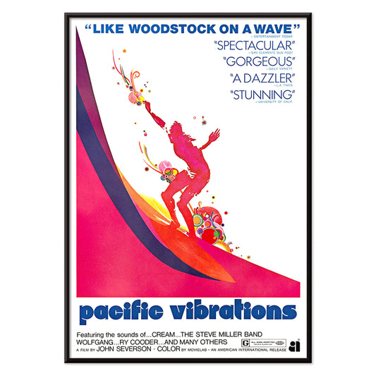
Pacific Vibrations Poster
Unknown artist · 1970 · Vibrant surfer poster featuring dynamic figures in ocean blue with warm pink and orange accents
Poster from €9 · Framed from €16
Regular price From €6,00Regular price -
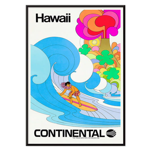
Continental Hawaii Airline Poster
Unknown artist · 1960 · Joyful Hawaii surf poster with lei-wearing surfer and psychedelic flower backdrop
Poster from €9 · Framed from €16
Regular price From €6,00Regular price -
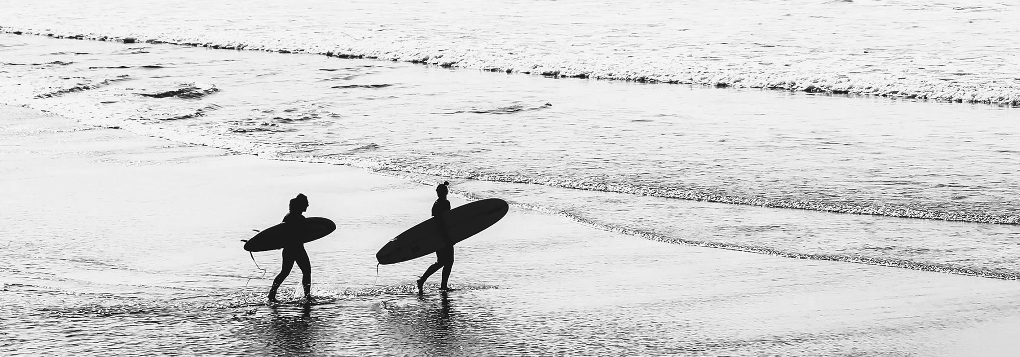
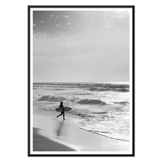
Surfer in Portugal Poster
MORYARTY · 2022 · Minimal black-and-white surfer poster capturing calm shoreline energy and open Atlantic horizons
Poster from €9 · Framed from €16
Regular price From €6,00Regular price -
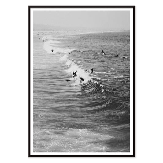
Surfers in Venice Beach Poster
Unknown artist · 2011 · Black-and-white surf art print showing surfers carrying boards along Venice Beach
Poster from €9 · Framed from €16
Regular price From €6,00Regular price -
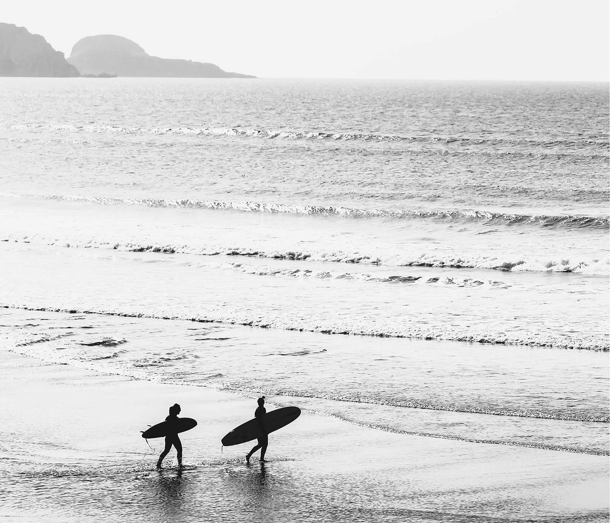
Surfers walking on the beach Poster
Unknown artist · 1976 · Black and white surfers poster with figures carrying boards along the shoreline
Poster from €9 · Framed from €16
Regular price From €6,00Regular price


Salt air, ink, and mid-century optimism
Surf posters hold a specific nostalgia: the decades when beach life became graphic design, travel myth, and everyday decoration. From late 1950s board culture to 1970s film and airline imagery, the vintage poster learned to speak in clean silhouettes, sun-faded gradients, and a few decisive lines. This collection moves between photography and illustration, so each print reads like a postcard never mailed. Expect turquoise water, hot sand tones, and the easy geometry of boards against long horizon lines, a form of wall art that brings motion into home decor without noise. For adjacent moods, drift toward Sea & Ocean or the reportage angle of Photo.
From documentary beach walks to airline-era graphics
The best surf imagery balances observation with design. In Surfers walking on the beach, the composition is built on rhythm: repeating figures, a low-tide sheen, and wind implied by the emptiness of sky. It reads almost like a frieze, with human scale measured against weather. By contrast, Continental Hawaii Airline Surf (1960) channels the logic of modern advertising, reducing a wave to a sign and letting the board cut a diagonal through flat color. That simplification echoes screen and offset printing of the era, where slight misregistration and grain become part of the charm. If you like this graphic lineage, the typography-first energy of Advertising is a natural companion.
Where surf wall art sits well at home
In a living room, a wide horizon print often works best hung a touch lower than a portrait, so the visual line steadies the seating area. Pair it with linen, pale oak, and rattan, then keep the palette sandy with one deep accent pulled from Blue. In a hallway, a run of smaller prints can feel like a travel sequence, especially when you mix photography with a more minimal graphic piece. Bathrooms and guest rooms benefit from surf imagery because it nods to water without resorting to nautical props; the subject does the work. For quieter interiors, choose high-contrast compositions and let negative space act as the decoration.
Pairing, framing, and building a gallery wall
A surf gallery wall feels more convincing when it admits different tempos: bright commercial graphics alongside quieter, documentary frames. Place Pacific Vibrations (1970) near period-style travel imagery to underline print culture and the era’s love of simplified forms. Balance that energy with Surfer in Portugal, Black & White Picture, where monochrome slows the eye and makes the shoreline feel expansive. Then anchor the set with a social beach scene like Surfers in Venice Beach, which adds human texture and local atmosphere. Keep spacing consistent, use generous mats for breathing room, and match frame color to your architecture. For extra structure, pair with Black & White or widen the sense of distance with Landscape.
Living with waves as a design motif
Surf imagery endures because waves organize space: curves meet straight horizons, foam becomes pattern, and the body is scaled against light and weather. As a poster print, that structure reads clearly from across a room and holds its own beside natural materials. The result is vintage wall art that feels calm, graphic, and intentionally lived-in.