


-
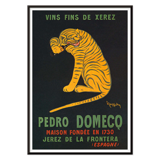
Xerez Pedro Domeco Poster
Leonetto Cappiello · 1930 · Iconic tiger poster leaping from deep black to advertise Xerez sherry
Poster from €9 · Framed from €16
Regular price From €6,00Regular price -
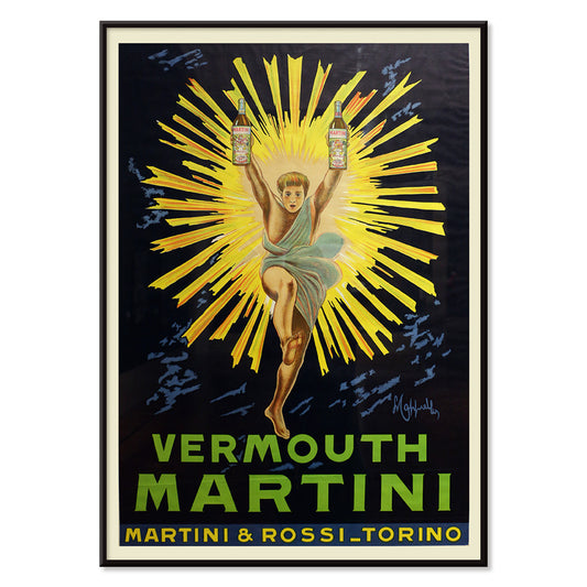
Vermouth Martini Poster
Marcello Dudovich · 1918 · Chic vermouth advertising poster featuring a poised woman in white and bold yellow accents
Poster from €9 · Framed from €16
Regular price From €6,00Regular price -
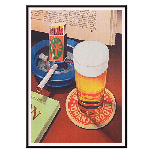
Beer and Cigarette Poster
Unknown artist · 1935 · Graphic beer and cigarette poster featuring a foaming glass and bold red and blue accents
Poster from €9 · Framed from €16
Regular price From €6,00Regular price -
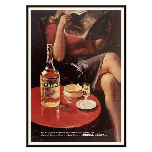
Cordial Campari Poster
Unknown artist · 1926 · Art Deco Campari poster featuring a poised woman and bold red geometric forms
Poster from €9 · Framed from €16
Regular price From €6,00Regular price -
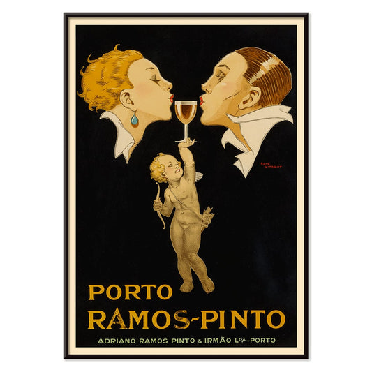
Porto Ramos-Pinto Poster
René Vincent · 1925 · Art Deco poster of a couple about to kiss as a cherub offers port wine
Poster from €9 · Framed from €16
Regular price From €6,00Regular price -
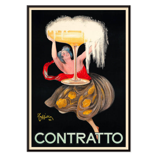
Contratto Poster
Leonetto Cappiello · 1922 · Jubilant champagne poster featuring bold lettering and a festive figure on black
Poster from €9 · Framed from €16
Regular price From €6,00Regular price -
Vermouth Martini Poster
Leonetto Cappiello · 1920 · Vibrant Vermouth Martini poster featuring a yellow-costumed figure on a dramatic black background
Poster from €9 · Framed from €16
Regular price From €6,00Regular price -
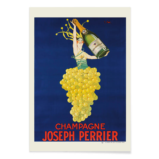
Champagne Joseph Perrier Poster
Joseph Stall · 1902 · Festive champagne poster with elegant figure and swirling grape motifs in vivid colors
Poster from €9 · Framed from €16
Regular price From €6,00Regular price -
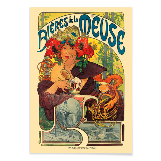
Bières De La Meuse Poster
Alphonse Mucha · 1897 · Radiant Art Nouveau beer poster featuring a flower-crowned muse and swirling hair
Poster from €9 · Framed from €16
Regular price From €6,00Regular price -
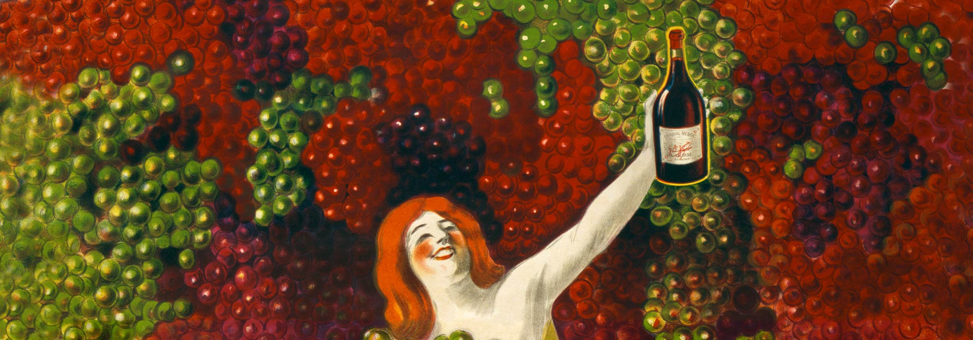
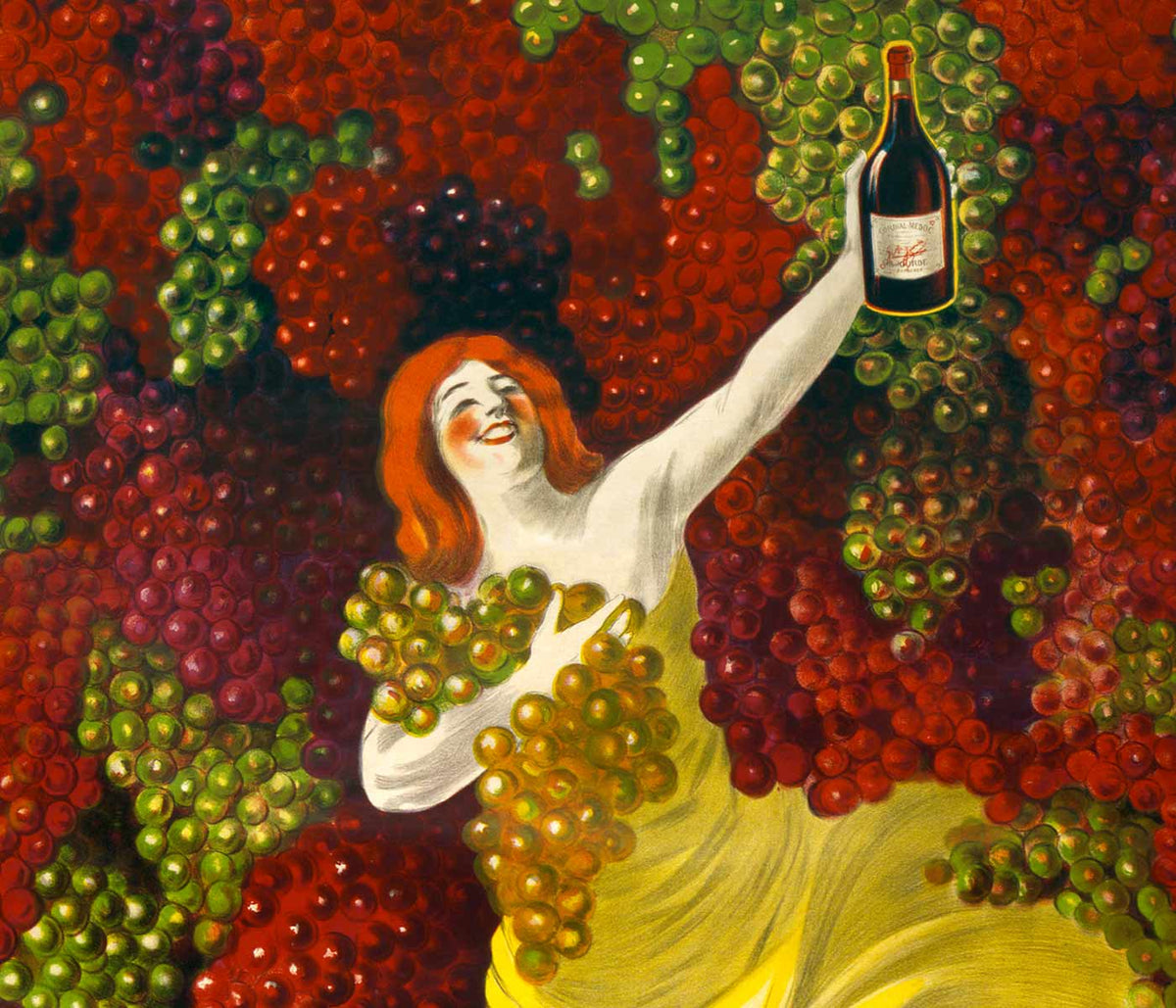
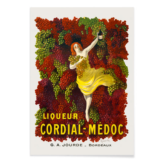
Cordial-Médoc Poster
Leonetto Cappiello · 1907 · Joyful liquor poster featuring a yellow-clad dancer with cascading grapes
Poster from €9 · Framed from €16
Regular price From €6,00Regular price -
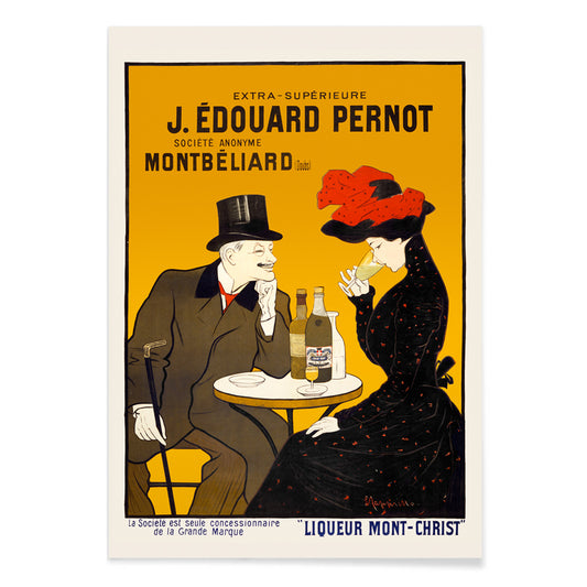
Man and woman at a cafe Poster
Leonetto Cappiello · 1900 · Chic café couple poster with bold black contrast and warm yellow red highlights
Poster from €9 · Framed from €16
Regular price From €6,00Regular price -
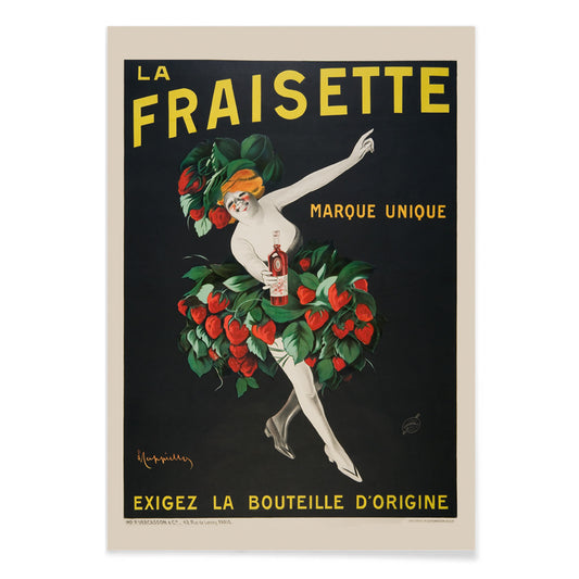
The Fraisette Poster
Leonetto Cappiello · 1909 · Playful strawberry-costumed figure poster glowing against deep black with vivid green leaves
Poster from €9 · Framed from €16
Regular price From €6,00Regular price -
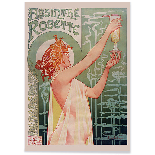
Absinthe Robette Poster
Privat Jean Baptiste Livemont · 1896 · Iconic Art Nouveau poster of a red-haired muse framed by green absinthe swirls
Poster from €9 · Framed from €16
Regular price From €6,00Regular price


The aperitif age in poster form
Between Belle Époque cafés and the bright rush of early modern streets, alcohol advertising became an art laboratory. Printed in chromolithography, posters prized clean registration and saturated inks so an image held from across a boulevard; cafés in Paris and Milan became open-air galleries. This vintage poster selection gathers print designs where bottles, grapes, and theatrical figures do the persuasive work, and the result reads today as wall art with social texture and decoration value.
Cappiello and the new language of impact
Leonetto Cappiello understood that a good poster is a street-level shout built from silhouette, contrast, and one unforgettable gesture. In Vermouth Martini (1920) by Leonetto Cappiello, the yellow burst is not background but force, turning the label into theatre. Xerez Pedro Domeco (1930) by Leonetto Cappiello swaps glamour for animal velocity, a tiger that makes appetite feel daring. For more of his graphic economy, see Leonetto Cappiello and its links to broader Advertising poster design.
How printing shaped color and mood
Chromolithography encouraged designers to think in plates and blocks: flat color fields, crisp edges, and carefully planned overlaps that created glow without painterly modeling. That technical grammar is why these vintage prints still feel legible at a distance and strong in a room. If you like the reduced palette and disciplined shapes, companion walls often come from Minimalist or Black & White collections, where negative space and contrast play a similar role, even when the subject changes.
Design placement for kitchens, dining corners, and bars
These art prints behave best where glass, metal, and light already do their work. In a kitchen, hang a citrus-bright poster above a sideboard and let yellows echo a bowl of lemons; for adjacent styling ideas, the Kitchen selection offers food and culinary imagery that holds the same graphic clarity. In a dining area, Porto Ramos-Pinto (1925) by René Vincent brings convivial geometry and warm reds that pair well with walnut, brass, and linen. In a hallway, one vertical vintage wall art piece near a coat rack suggests nightlife without needing a full gallery wall.
Curating a coherent wall art set
When pairing liquor posters, curate by palette and rhythm rather than brand. Champagne Joseph Perrier by Joseph Stall sits comfortably beside deeper tones pulled from Red, while a thin black frame sharpens silhouettes and pale wood softens paper patina; Frames helps keep the finish quiet. For a grounded, everyday counterpoint to the theatrical, Beer, Cigarette and Oranjeboom matchbox (1935) freezes a tabletop still life, making vintage decoration feel lived-in rather than nostalgic.