


-
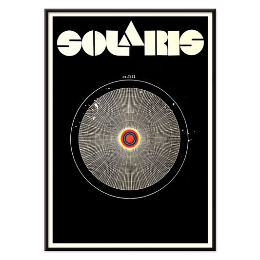
Solaris Poster
Unknown artist · 1972 · Hypnotic cosmic poster with orbiting forms and bold red-blue contrasts
Poster from €9 · Framed from €16
Regular price From €6,00Regular price -
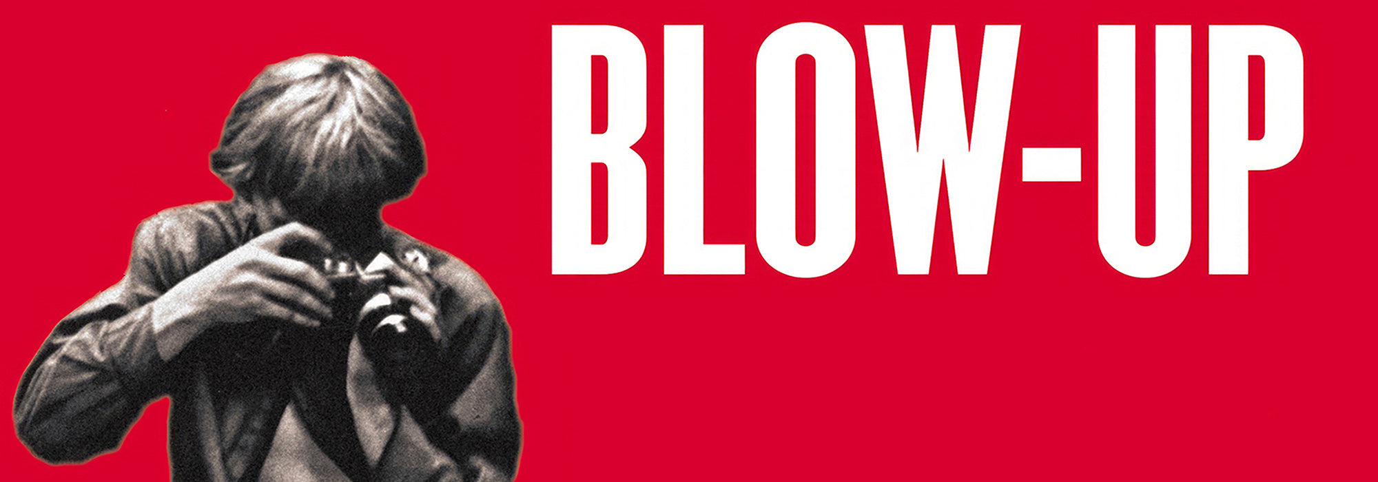
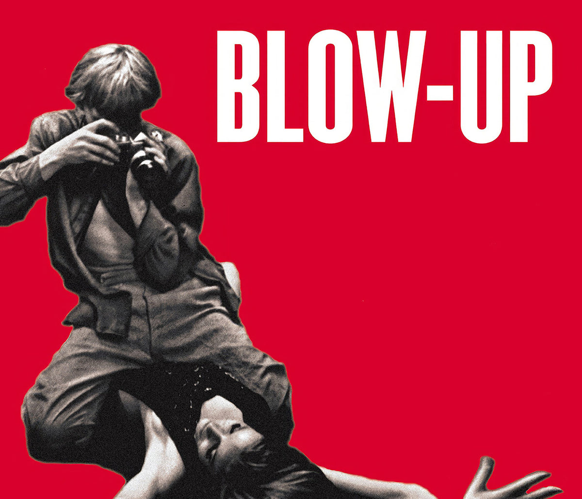
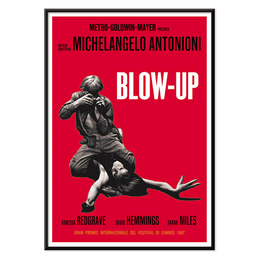
Blow Up Poster
Unknown artist · 1966 · Graphic movie poster with bold red field and stark photographic focus
Poster from €9 · Framed from €16
Regular price From €6,00Regular price -
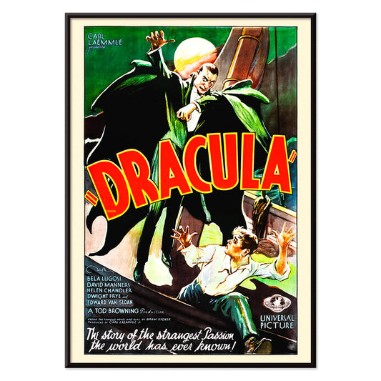
Dracula Poster
Unknown artist · 1931 · Dramatic horror poster with looming cloaked vampire silhouette against a bright full moon
Poster from €9 · Framed from €16
Regular price From €6,00Regular price -
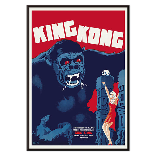
King Kong Poster
Boye · 1933 · Dramatic King Kong poster with piercing red eyes and a heroine in vivid red
Poster from €9 · Framed from €16
Regular price From €6,00Regular price -
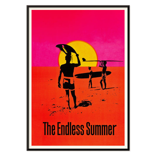
The Endless Summer Poster
Unknown artist · 1966 · Iconic surf poster with black surfer silhouettes crossing a glowing sunset circle
Poster from €9 · Framed from €16
Regular price From €6,00Regular price -
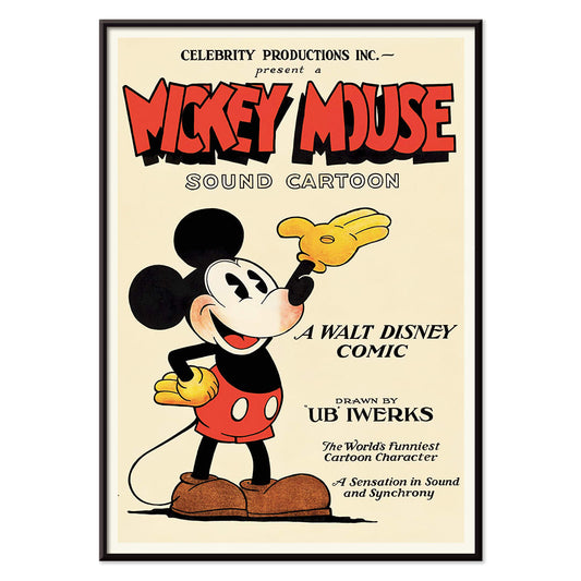
Mickey Mouse Poster
Unknown artist · 1928 · Cheerful Mickey Mouse poster with bold black outlines and vintage animation style
Poster from €9 · Framed from €16
Regular price From €6,00Regular price -
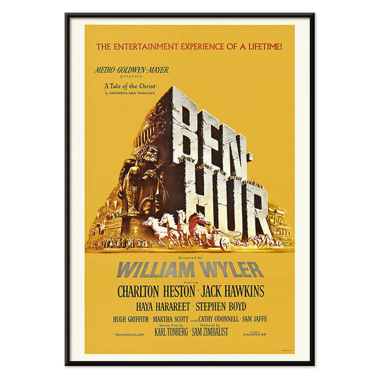
Ben-Hur Poster
Unknown artist · 1959 · Dramatic Ben-Hur poster capturing the legendary chariot race in classic epic style
Poster from €9 · Framed from €16
Regular price From €6,00Regular price -
Tarzan the Ape Man Poster
Eric Rohman · 1933 · Dramatic jungle poster featuring Tarzan carrying Jane through lush green foliage
Poster from €9 · Framed from €16
Regular price From €6,00Regular price -
The Revenge of Tarzan Poster
Unknown artist · 1920 · Classic jungle adventure poster of Tarzan wrestling a lion beneath bold title lettering
Poster from €9 · Framed from €16
Regular price From €6,00Regular price -
A Daughter of Destiny Poster
Eric Rohman · 1928 · Art Deco movie poster with a poised woman in a radiant yellow dress
Poster from €9 · Framed from €16
Regular price From €6,00Regular price -
The Cocoanuts Poster
Eric Rohman · 1929 · Art Deco swimmer movie poster with bold coastal colors and crisp, playful lettering
Poster from €9 · Framed from €16
Regular price From €6,00Regular price -
West Side Story Poster
Artcraft Lithograph · 1968 · High-contrast West Side Story poster with bold red and orange accents
Poster from €9 · Framed from €16
Regular price From €6,00Regular price -
A Raisin in the sun Poster
Artcraft Lithograph · 1959 · High-contrast theater poster with a stark profile set against a bold yellow sun
Poster from €9 · Framed from €16
Regular price From €6,00Regular price -
Where East is East Poster
Eric Rohman · 1929 · Dramatic movie poster of Lupe Velez playing a string instrument in vivid red and yellow
Poster from €9 · Framed from €16
Regular price From €6,00Regular price -
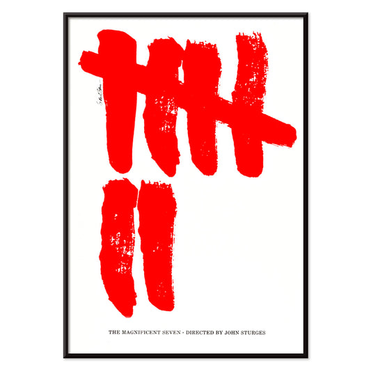
The Magnificent Seven Poster
Saul Bass · 1960 · Minimalist Western movie poster featuring seven red brushstroke tally marks on white
Poster from €9 · Framed from €16
Regular price From €6,00Regular price -
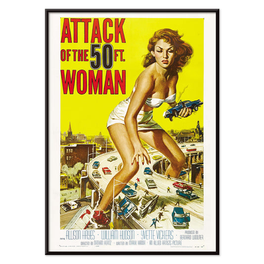
Attack of the 50ft Women Poster
Reynold Brown · 1958 · High voltage sci fi poster with a towering woman dominating cars and city streets
Poster from €9 · Framed from €16
Regular price From €6,00Regular price -
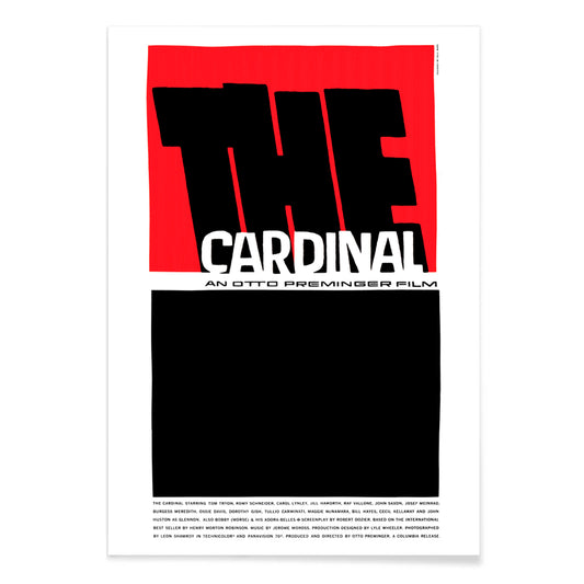
The Cardinal Poster
Saul Bass · 1963 · Minimalist movie poster with bold red and black forms and striking modernist composition
Poster from €9 · Framed from €16
Regular price From €6,00Regular price -
Saint Joan Poster
Saul Bass · 1957 · Iconic Saint Joan movie poster with bold red blocks and a solitary figure
Poster from €9 · Framed from €16
Regular price From €6,00Regular price -
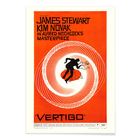
Vertigo Poster
Saul Bass · 1958 · Hypnotic spiral movie poster with stark figures that channel pure psychological suspense
Poster from €9 · Framed from €16
Regular price From €6,00Regular price -
The man with the golden arm Poster
Saul Bass · 1955 · Iconic movie poster featuring a jagged white arm motif with bold modernist typography
Poster from €9 · Framed from €16
Regular price From €6,00Regular price -
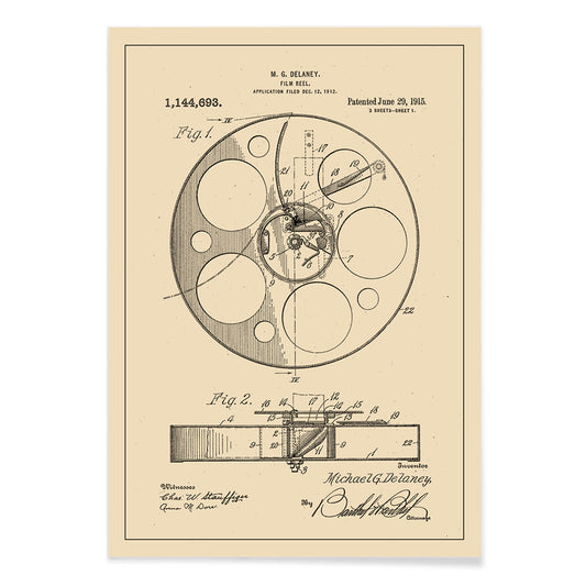
Film Reel Patent Poster
Michael G. Delaney · 1897 · Crisp film reel patent vintage print with precise diagrams and numbered components
Poster from €9 · Framed from €16
Regular price From €6,00Regular price


When film learned to speak in graphics
Movie posters were once a public language, designed to be read at speed on brick walls, station platforms, and cinema glass. This collection follows the era when illustration and typography became shorthand for plot and atmosphere: silhouettes, diagonals, hard contrasts, and colors calibrated for distance. The result is vintage wall art that still feels urban and immediate, hovering between publicity and design history. If you like pared-back compositions with strong structure, the sensibility overlaps with Minimalist posters, while the subject stays firmly in cinema and spectacle.
Modernism, lithography, and the poster as narrative device
Mid-century film promotion absorbed the lessons of European modernism: asymmetry, cropped forms, and type as image. Saul Bass is the obvious landmark because he treated the poster like a title sequence, compressing story into a few shapes. In Vertigo by Saul Bass, the spiral becomes a bodily sensation, an orange pull that turns psychological tension into geometry. In The Man with the Golden Arm by Saul Bass, the broken arm and jagged type translate jazz rhythm and fracture into a single visual beat. Around that modernist core, studio-era sheets often relied on painterly illustration and theatrical staging, closer in spirit to Advertising art, where persuasion depends on clarity, drama, and instant recognition.
Interior design: where cinema prints live best
Think first about viewing distance. In corridors and entryways, high-contrast movie poster prints read cleanly while you move, which is why graphic black ink and strong negative space work so well. If your palette is restrained, pair a film sheet with the tonal discipline of Black & White wall art to keep the room sharp rather than busy. Living rooms can carry more chroma: orange-black modernism, acid reds, or deep blues can anchor a seating area the way a rug might, without adding objects. Dining corners and kitchens tolerate type-heavy layouts because the eye already jumps between surfaces; for a broader mood-board approach, the documentary feel of Photo prints can also keep the cinematic theme grounded.
Curating a gallery wall: weight, rhythm, and framing
A coherent gallery wall is less about matching decades than balancing visual mass. Place a dense illustration like Attack of the 50ft Women by Reynold Brown, 1958 beside a spare modernist sheet so the eye gets both impact and pause. For classic monster drama, King Kong by Boye, 1933 brings steep diagonals and stage-like lighting that pairs well with angular typography nearby. Frame choices should reinforce the reading: thin black edges heighten graphic tension; warm wood adds an archival note that suits vintage decoration. For an easy material match, start with Frames, then decide whether your wall wants a more airy arrangement using Vertical Posters or a panoramic line using Horizontal Posters.
Why these images still feel public
Even in a private room, film posters retain the memory of crowds and marquees. A quieter piece like Blow-Up, 1966 keeps an editorial cool, closer to magazine design than theatre bombast, yet it still signals a night out, a mood, a city. That lingering public energy is what makes movie wall art so effective: it introduces tempo and narrative without needing literal scenes. For a wider view of graphic lineage beyond cinema, Famous Artists offers useful context in posters that share the same design intelligence.