


-
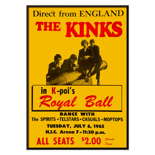
The Kinks at Honolulu Poster
Unknown artist · 1965 · Bold red and yellow concert poster for The Kinks live in Honolulu
Poster from €9 · Framed from €16
Regular price From €6,00Regular price -
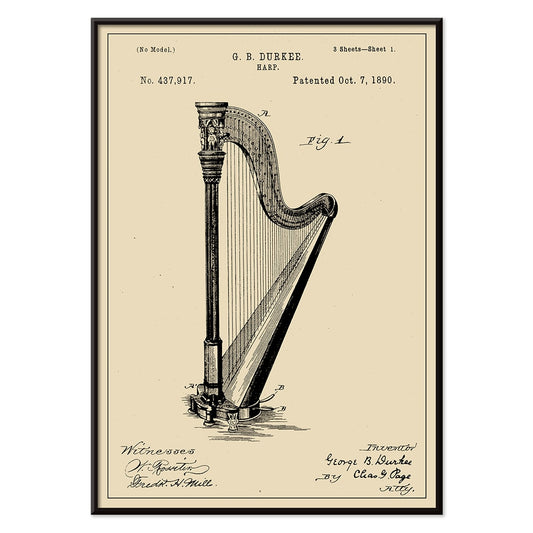
Harp Patent Poster
G.B. Durkee · 1890 · Crisp harp vintage print featuring precise patent diagrams and elegant archival typography
Poster from €9 · Framed from €16
Regular price From €6,00Regular price -
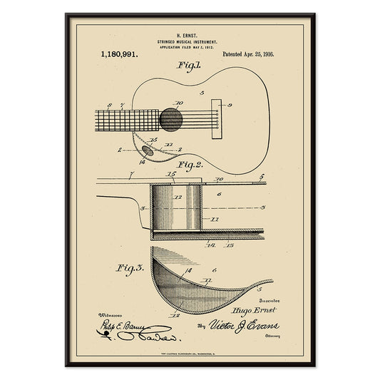
Musical Instrument Patent Poster
H. Ernst · 1916 · Intricate guitar patent print with precise diagrams and numbered callouts on warm beige
Poster from €9 · Framed from €16
Regular price From €6,00Regular price -
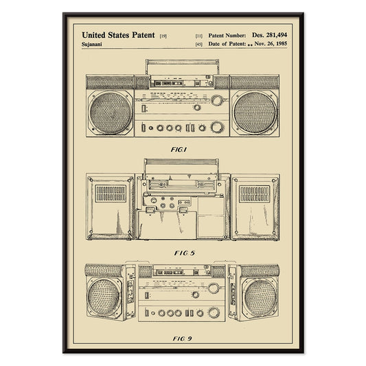
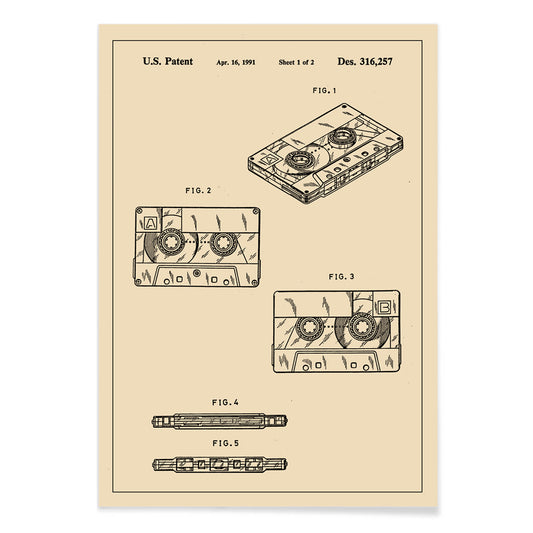
Cassette Player Patent Poster
Sujanani · 1985 · Crisp cassette player patent poster with precise black linework on warm beige background
Poster from €9 · Framed from €16
Regular price From €6,00Regular price -
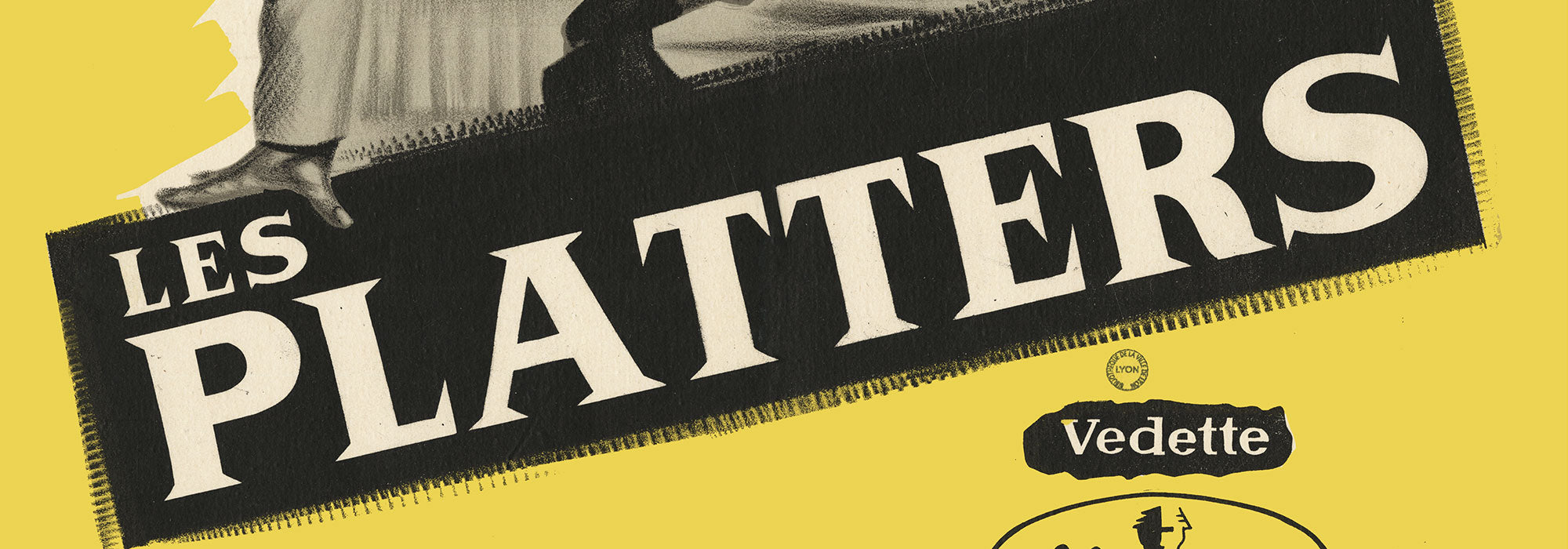
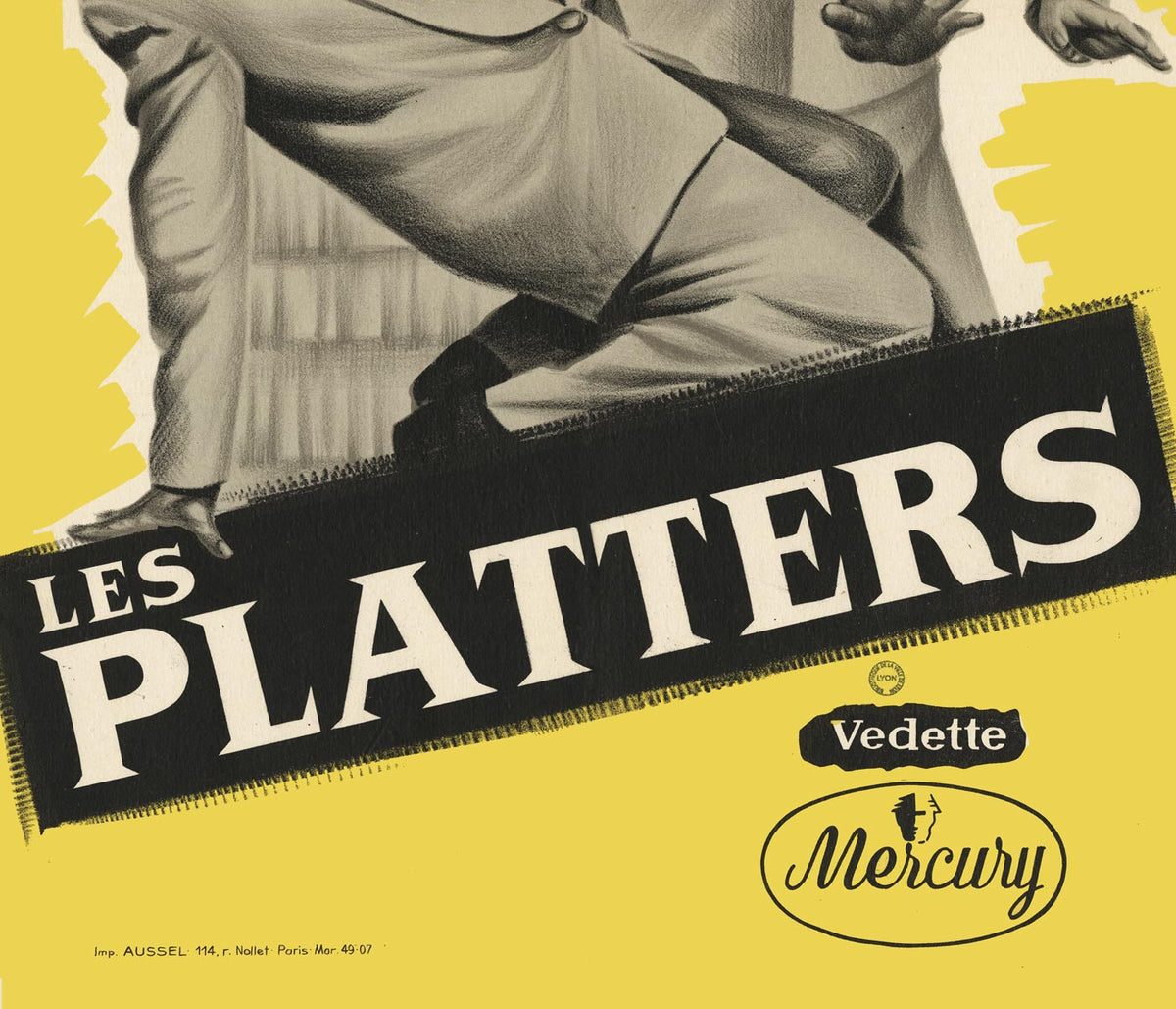
The Platters (1955) Poster
Unknown artist · 1955 · Retro vocal group poster featuring silhouetted performers on a vibrant yellow background
Poster from €9 · Framed from €16
Regular price From €6,00Regular price -
Randy Brecker Quintet Poster
U.S. Information Agency · 1987 · Graphic jazz poster featuring silhouetted musicians on a bold purple background with green accents
Poster from €9 · Framed from €16
Regular price From €6,00Regular price -
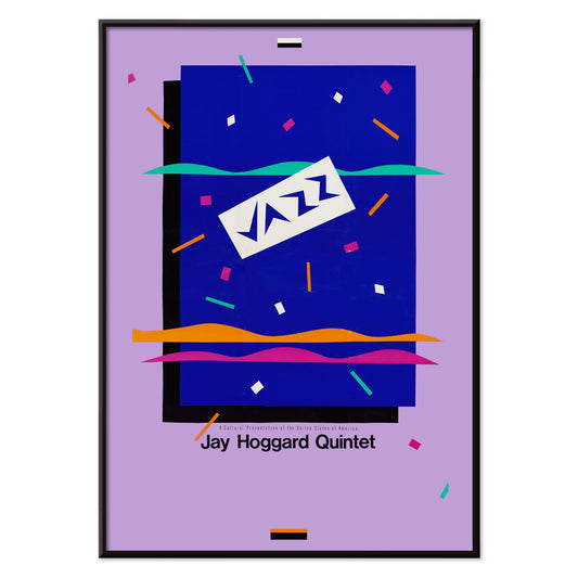
Jay Hoggard Quintet Poster
U.S. Information Agency · 1985 · Energetic abstract jazz poster with geometric rhythms echoing vibraphone improvisations
Poster from €9 · Framed from €16
Regular price From €6,00Regular price -
Louis Armstrong Appearance 2 Poster
U.S. Information Agency · 1955 · Energetic Louis Armstrong poster with bold primary colors and lively band silhouettes
Poster from €9 · Framed from €16
Regular price From €6,00Regular price -
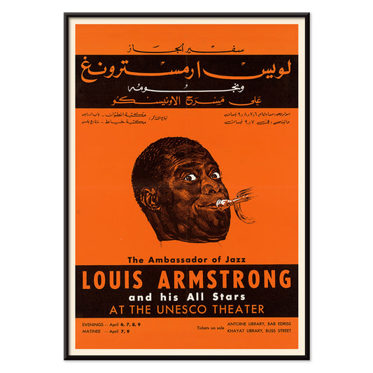
Louis Armstrong Appearance Poster
U.S. Information Agency · 1959 · Energetic Louis Armstrong poster with bold trumpet focus and high-contrast design
Poster from €9 · Framed from €16
Regular price From €6,00Regular price -
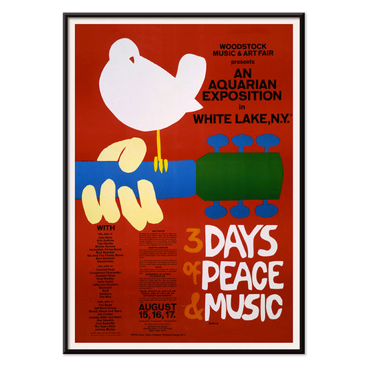
An aquarian exposition in White Lake Poster
Unknown artist · 1969 · Iconic dove-on-guitar Woodstock poster in bold red with retro festival typography
Poster from €9 · Framed from €16
Regular price From €6,00Regular price -
Turntable Patent Poster
Robert M. Like · 1977 · Technical turntable patent poster with labeled diagrams and clean black linework
Poster from €9 · Framed from €16
Regular price From €6,00Regular price -
Audio Tape Patent Poster
US Patents · 1969 · Cassette tape vintage print featuring precise technical diagrams and labeled components
Poster from €9 · Framed from €16
Regular price From €6,00Regular price


From ballroom bills to festival manifestos
Music posters sit at the crossroads of nightlife, printing, and public memory. Before streaming and social media, the poster was how a gig entered the street: a sheet of paper that carried a voice, a venue, and a date. In this collection, vintage concert graphics meet the quieter language of invention, where patents map the machinery of listening. The result is wall art that reads like cultural evidence, moving from mid-century institutional clarity to the charged shorthand of late-1960s counterculture. If you also collect broader graphic design, the same appetite for bold type and direct messaging runs through Advertising and the cleaner compositional logic of Minimalist.
Jazz diplomacy, state design, and modern typography
A striking chapter comes from U.S. Information Agency material, when jazz traveled as soft power and posters were designed to look official while still feeling alive. Louis Armstrong Appearance (1959) by U.S. Information Agency uses restraint, clear hierarchy, and a calm portrait focus that mirrors a well-structured set. The related Louis Armstrong, Dizzie Gillespie, Mahalia Jackson, Count Bassie and others reads like a roster of mid-century sound, where the typographic grid becomes the stage. For a more kinetic note, JAZZ. Randy Brecker Quintet leans on silhouette and high contrast, a graphic solution that translates improvisation into shape.
Room placement and palette decisions
In living rooms, music wall art works best when it echoes materials already present: walnut, chrome, smoked glass, wool, and leather. Posters with heavy black type settle naturally into a restrained scheme; for an even tighter palette, borrow cues from Black & White and let one loud word or date carry the mood. In studios and workspaces, patent drawings and diagram-like prints match the rhythm of tools and books, and they connect neatly to the curiosity found in Science. If a room already has saturated color, keep the poster selection typographic and reduce competing hues, so the print reads as structure rather than noise.
Curating: patents, abstraction, and framing discipline
The patent prints are the quiet counterpoint to concert ephemera, celebrating the built world behind music. Turntable Patent by R.M. Like is all mechanical geometry, with labeled arcs and engineered spacing that feels almost architectural. Pair this linear density with softer, open compositions from Abstract to create breathing room across a gallery wall. Frame choices matter more than scale here: technical linework benefits from a thin, crisp profile that keeps edges precise, and Classic Frame suits the archival, paper-forward character of a vintage print without adding visual weight.
Paper, myth, and the poster as souvenir
Some music posters work because they are efficient symbols: emblem, name, moment. Woodstock: Music Peace Guitar (1969) condenses an era into iconography, the kind of design meant to be recognized at a glance from across a street. At the other end of the spectrum, The Kinks in Honolulu (1965) carries the practical thrill of an announced night, where anticipation is built from type and scheduling. Hung together, these posters and prints behave like a record collection on a wall: specific, referential, and unmistakably vintage decoration.