


-
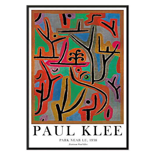
Park Near Lu Poster
Paul Klee · 1938 · Dreamlike abstract landscape art print with rhythmic blocks suggesting a quiet park
Poster from €9 · Framed from €16
Regular price From €6,00Regular price -
Joyful Mountain Poster
Paul Klee · 1929 · Joyful abstract mountain art print built from rhythmic color blocks and fine black lines
Poster from €9 · Framed from €16
Regular price From €6,00Regular price -
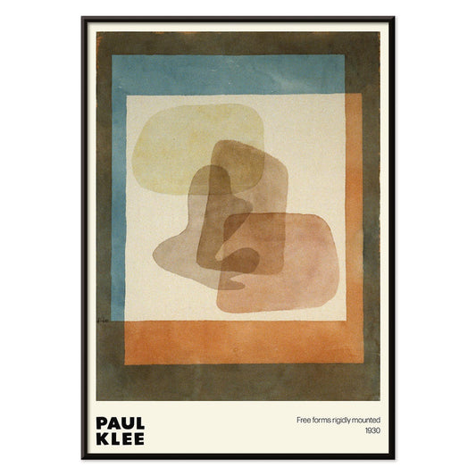
Free forms Poster
Paul Klee · 1930 · Playful abstract poster of free-form geometry with blue and orange accents
Poster from €9 · Framed from €16
Regular price From €6,00Regular price -
With the two lost ones Poster
Paul Klee · 1938 · Dreamlike abstract figures art print balancing delicate line and quiet symbolism
Poster from €9 · Framed from €16
Regular price From €6,00Regular price -
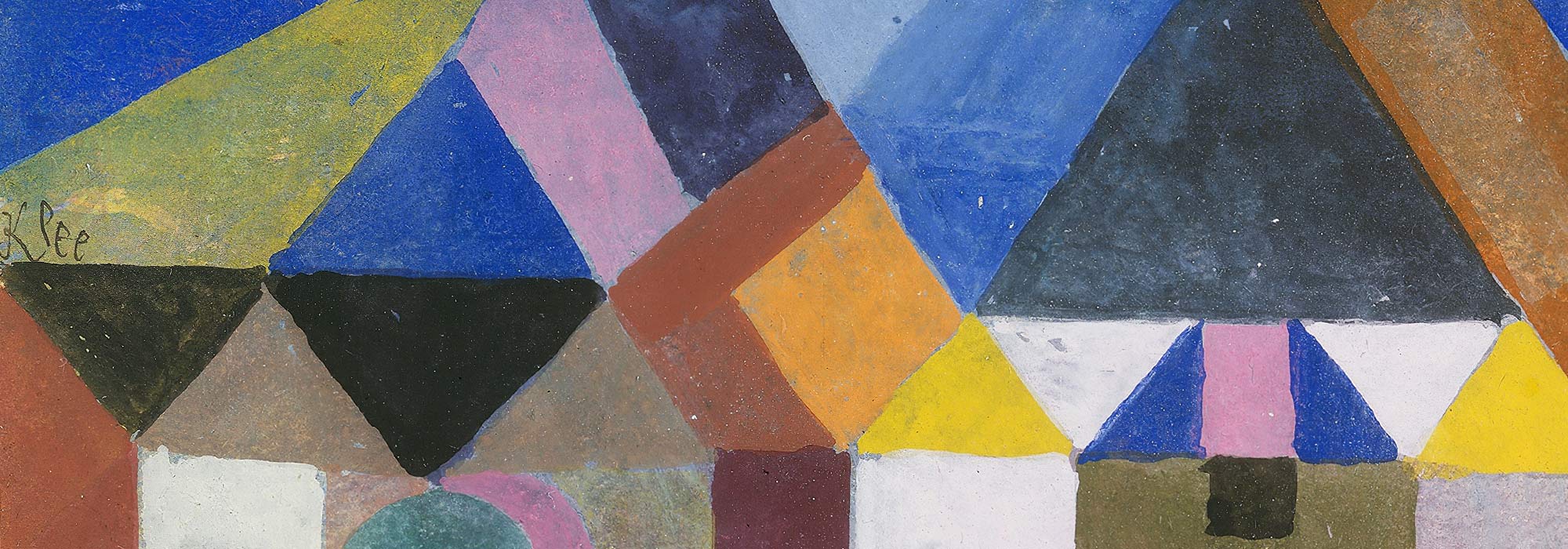
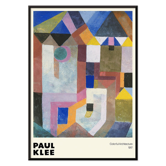
Colorful Architecture Poster
Paul Klee · 1917 · Playful geometric architecture poster with bright blocks of blue, pink, and yellow
Poster from €9 · Framed from €16
Regular price From €6,00Regular price -
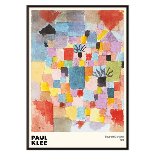
Southern Gardens Poster
Paul Klee · 1919 · Vibrant geometric garden poster with rhythmic blocks of red, blue, yellow, and green
Poster from €9 · Framed from €16
Regular price From €6,00Regular price -
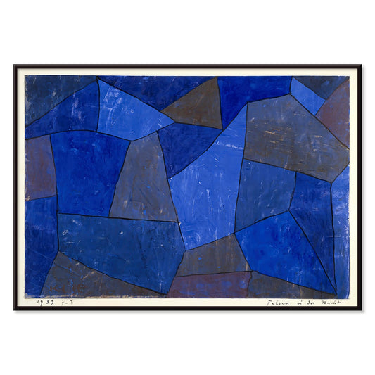
Rocks at Night Poster
Paul Klee · 1939 · Dreamy abstract art print of stacked blue forms evoking rocks in tranquil night
Poster from €9 · Framed from €16
Regular price From €6,00Regular price -
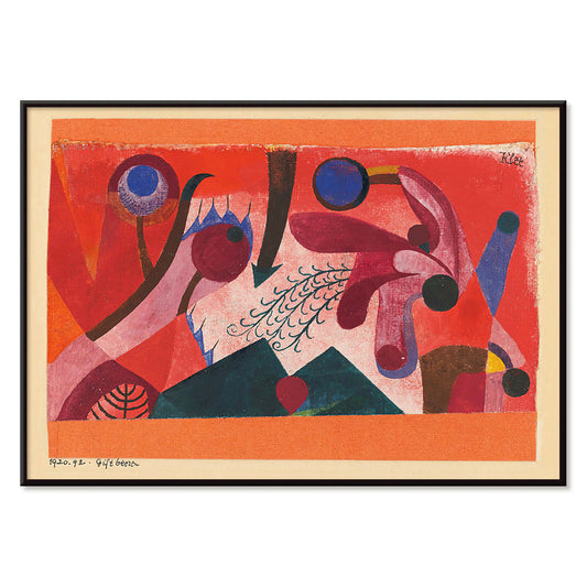
Poisonous Berries Poster
Paul Klee · 1920 · Playful abstract art print with berry like circles and rhythmic black linework
Poster from €9 · Framed from €16
Regular price From €6,00Regular price -
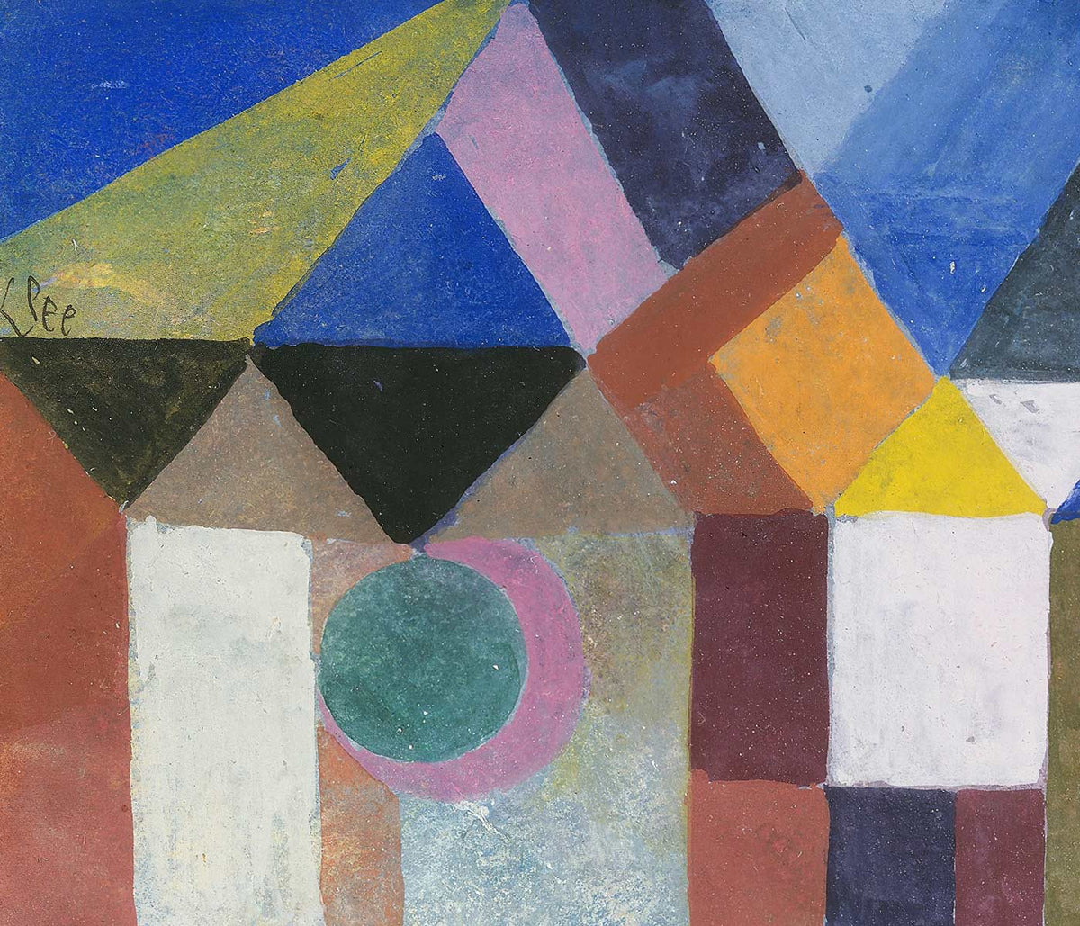
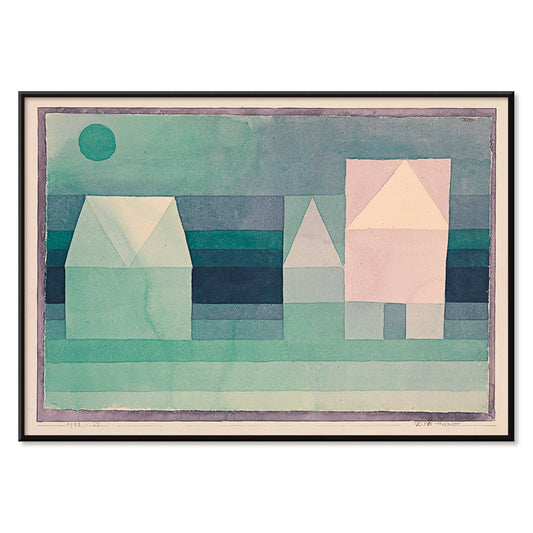
Three Houses Poster
Paul Klee · 1922 · Geometric village art print with three stylized houses in soft green, blue, and pink
Poster from €9 · Framed from €16
Regular price From €6,00Regular price -
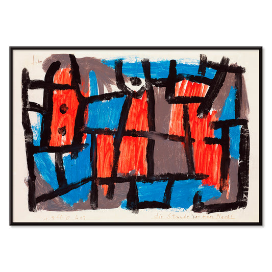
The Hour Before One Night Poster
Paul Klee · 1940 · Dreamlike abstract poster with black lines and red blue shapes on muted ground
Poster from €9 · Framed from €16
Regular price From €6,00Regular price -
Red and Green Gradation Poster
Paul Klee · 1921 · Modernist abstract poster featuring graded red and green blocks with fine black lines
Poster from €9 · Framed from €16
Regular price From €6,00Regular price -
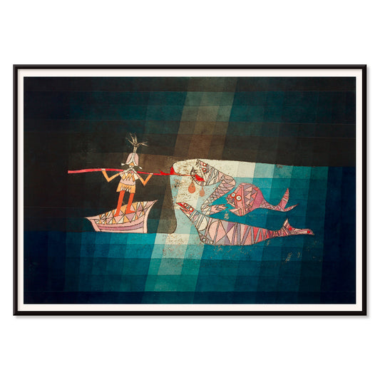
The Seafarer Poster
Paul Klee · 1923 · Playful abstract seafaring poster with rhythmic symbols evoking music and ocean travel
Poster from €9 · Framed from €16
Regular price From €6,00Regular price -
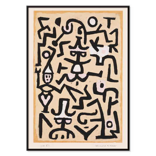
Comedians’ Handbill Poster
Paul Klee · 1938 · Whimsical abstract poster with stage-like figures drawn in spare black lines on beige
Poster from €9 · Framed from €16
Regular price From €6,00Regular price -
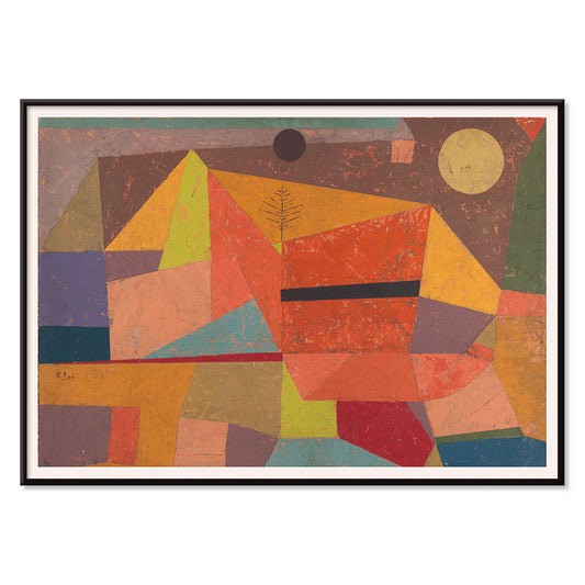
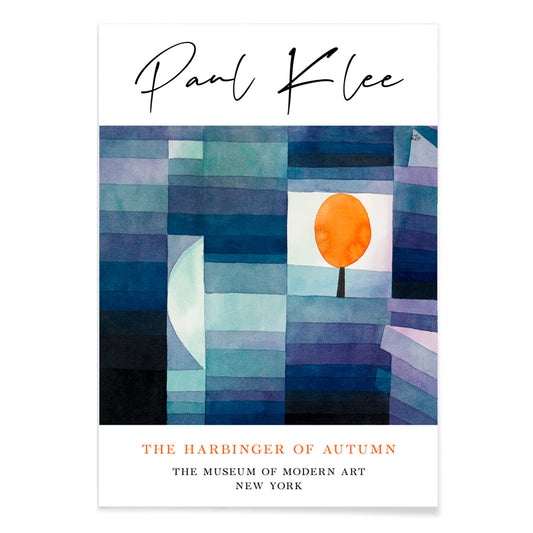
The Harbinger of Autumn Poster
Paul Klee · 1922 · Modernist art print of an orange tree in playful blue and orange geometry
Poster from €9 · Framed from €16
Regular price From €6,00Regular price -
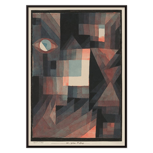
Senecio Poster
Paul Klee · 1922 · Mask-like geometric poster with warm orange and yellow blocks and steady eyes
Poster from €9 · Framed from €16
Regular price From €6,00Regular price -
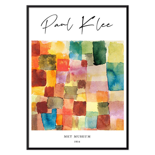
Color Patchwork Poster
Paul Klee · 1914 · Playful abstract art print of patchwork squares balancing warm reds and cool blues
Poster from €9 · Framed from €16
Regular price From €6,00Regular price -
May Picture Poster
Paul Klee · 1925 · Playful abstract poster of rhythmic color blocks balanced by fine black linework
Poster from €9 · Framed from €16
Regular price From €6,00Regular price -
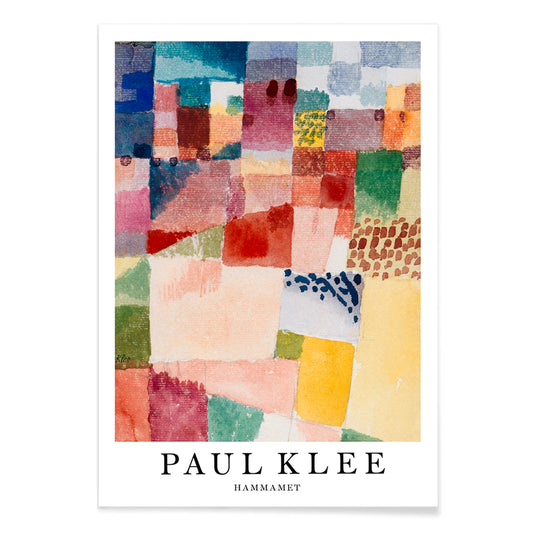
Hammamet Poster
Paul Klee · 1914 · Radiant abstract art print evoking Hammamet with mosaic blocks of red, blue, yellow
Poster from €9 · Framed from €16
Regular price From €6,00Regular price -
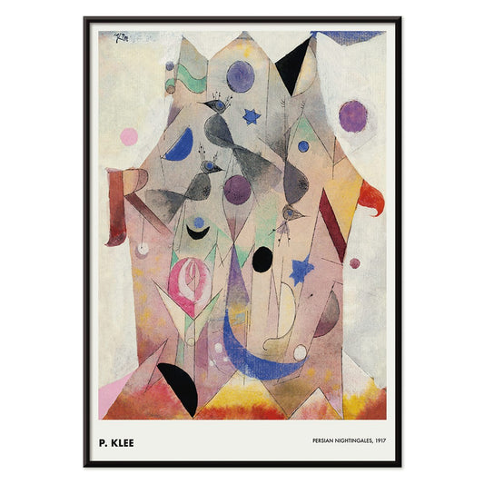
Persian Nightingales Poster
Paul Klee · 1917 · Dreamlike bird forms and jewel tones in an abstract art print
Poster from €9 · Framed from €16
Regular price From €6,00Regular price


A small universe of signs and color
Paul Klee’s pictures hover between childlike immediacy and strict construction: arrows, grids, trees, and drifting constellations arranged with measured pauses. From 1914 to 1938, his vocabulary grew into a kind of portable cosmology, well suited to poster and art print formats where paper texture and thin washes stay legible. Klee passed through Expressionism and Cubism, absorbed a Surrealist edge, and still kept his own syntax of symbols. For related visual languages, the abstract and classic-art collections show how modernism negotiated between invention and tradition.
Klee’s methods: watercolor, line, and music
Klee treated technique as thinking aloud. In The Harbinger of Autumn (1922), a flame-orange tree stands like an emblem against a calmly partitioned ground, a single motif carrying the whole season. He often layered watercolor beneath pencil, letting stain and resistance create a living surface; corrections remain visible as part of the image rather than something to erase. His titles act like musical markings, nudging mood and tempo. The Tunisian journey of 1914 sharpened his sense of luminous structure, and Motif from Hammamet (1914) turns architecture into a mosaic of sand, sea, and rose notes. Nearby, bauhaus context helps explain the analytical side of his play: exercises in rhythm, proportion, and balance.
Design notes for home decor
Klee works best when treated as a calibrated accent rather than a focal shout. In a dining nook, watercolor passages sit comfortably with pale oak, linen, and matte ceramics; in a study, his thin linework mirrors shelving, desk lamps, and the geometry of a work surface. If your room leans minimalist, choose one mid-sized print and leave generous wall space so the small marks can be read up close. In more layered interiors, a Klee poster can soften sharp furniture edges and introduce a measured, vintage inflection without turning the room into a period set. Warm whites, plaster textures, brass, terracotta, and sage pull out his quieter pigments while keeping the overall decoration restrained.
Curating a gallery wall around Klee
A Klee-centered gallery wall benefits from contrasts in density and material. The airy, avian patterning of Persian Nightingales (1917) pairs well with stricter geometry, making the surrounding pieces feel intentionally structured rather than merely assorted. For a hotter note, Poisonous Berries (1920) can sit beside monochrome work so its reds and violets register as a controlled pulse. If you want a broader modernist conversation, place Klee among famous-artists selections. Thin oak or matte black mouldings keep the line delicate, and the frames collection supports either a clean white mat for emphasis or an un-matted edge for a studio-sheet feel.
Why Klee still feels current
Klee is often described as playful, but the durability comes from discipline: each dot, square, and wavering line is positioned to hold tension without clutter. In wall art form, that intimacy reads like a note passed between artist and viewer, rewarding repeat glances in hallways, kitchens, or work corners. For homes that want decoration with curiosity rather than noise, his prints offer a quietly structured way to live with abstraction.