


- Early Autumn in Urayasu Poster
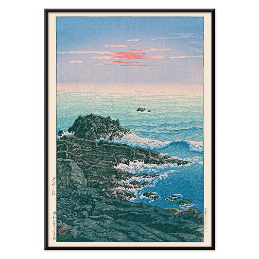
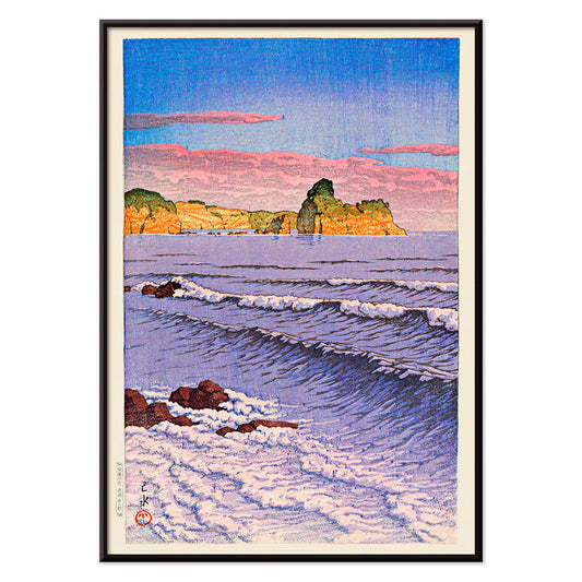
- Morning at Cape Inubō Poster
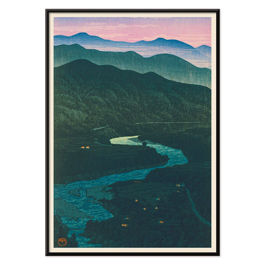
- Ecchu Umidani Pass Poster
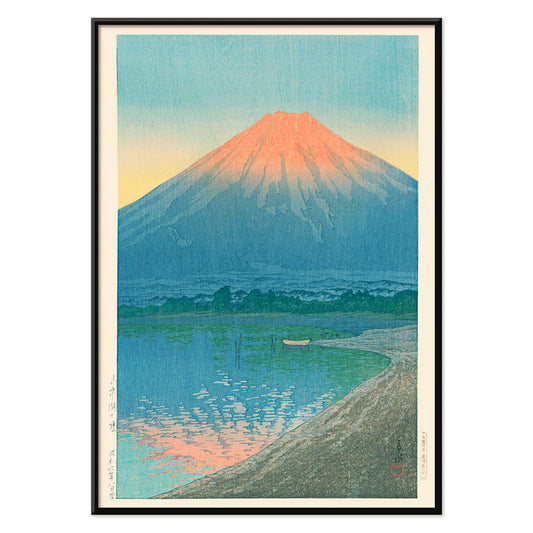
- Daybreak over Lake Yamanaka Poster
- View of the Eiffel Tower Poster
- Lisbon Bridge Poster
- Alfama Poster
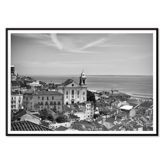
- Lisbon Old City 1 Poster
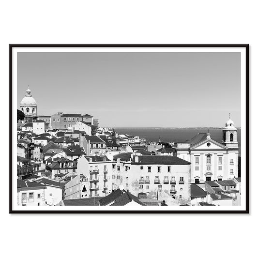
- Lisbon Old City 2 Poster
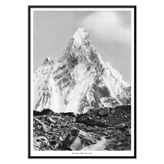
- Mitre Peak Poster
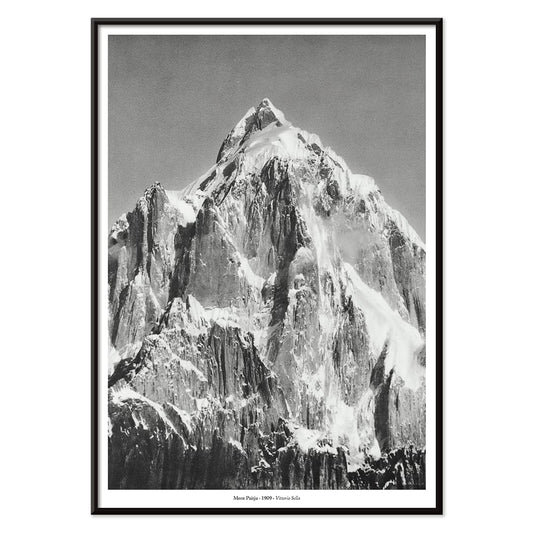
- Le mont Paitju Poster
- Le Siniolchu Poster
- Aiguille calcaire Poster
- Staircase Poster
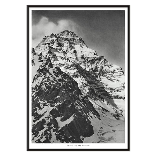
- Le pic K2 Poster
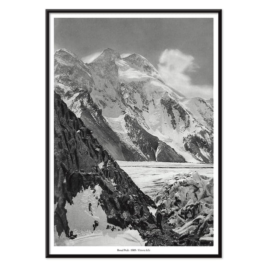
- Broad Peak Poster
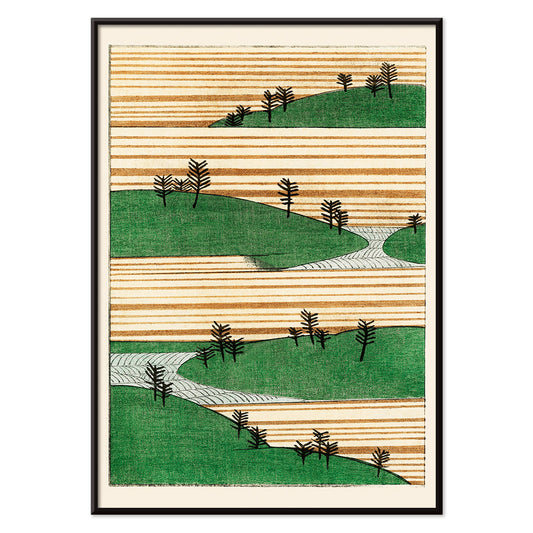
- Yoshino Poster
- Ryoson Poster
- Green Landscape Poster
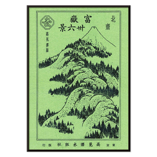
- Mount Fuji Poster
- The New Yorker Poster
- Iwakuni City Poster
- Brazil 2 Poster
- Travel to Morocco Poster
- Travel to Italy Poster
- Travel to Santorini Poster
- Travel to London Poster
- Travel to Venice Poster
- Travel to Paris Poster
- Faust , tragédie de Goethe Poster
- Lac Des Quatre-Cantons Poster
-
Early Autumn in Urayasu Poster
Kawase Hasui · 1931 · Serene waterfront poster with dusky sky, quiet village silhouettes, and still reflections
Poster from €9 · Framed from €16
Regular price From €6,00Regular price -
Morning at Cape Inubō Poster
Kawase Hasui · 1931 · Serene ocean poster with dawn sky, foaming waves, and a distant lighthouse
Poster from €9 · Framed from €16
Regular price From €6,00Regular price -
Ecchu Umidani Pass Poster
Kawase Hasui · 1923 · Serene mountain-pass art print with layered blue ridges and a winding path
Poster from €9 · Framed from €16
Regular price From €6,00Regular price -
Daybreak over Lake Yamanaka Poster
Kawase Hasui · 1931 · Serene Mount Fuji sunrise print with still lake reflections in cool blues
Poster from €9 · Framed from €16
Regular price From €6,00Regular price -
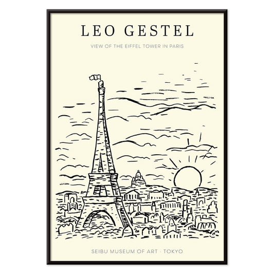
View of the Eiffel Tower Poster
Leo Gestel · 1921 · Expressive black and white Eiffel Tower poster rendered with dynamic modernist lines
Poster from €9 · Framed from €16
Regular price From €6,00Regular price -
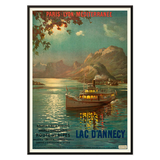
Lac d’Annecy 2 Poster
François-Charles Cachoud · 1902 · Serene lake poster with a solitary boat and soft Alpine twilight hues
Poster from €9 · Framed from €16
Regular price From €6,00Regular price -
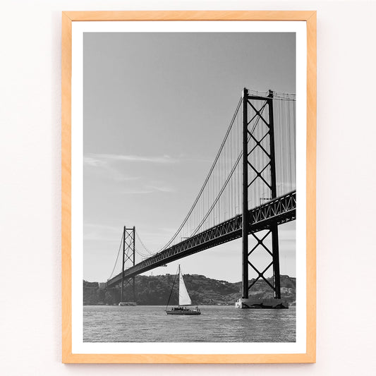
Lisbon Bridge Poster
MORYARTY · 2017 · Minimal black-and-white bridge poster with a lone sailboat and calm river space
Poster from €9 · Framed from €16
Regular price From €6,00Regular price -
Alfama Poster
MORYARTY · 1940 · Monochrome Alfama skyline poster capturing Lisbon rooftops in crisp graphic silhouette
Poster from €9 · Framed from €16
Regular price From €6,00Regular price -
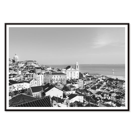
Lisbon Old City 1 Poster
MORYARTY · 2017 · Black-and-white Lisbon cityscape poster with layered rooftops and a calm waterfront horizon
Poster from €9 · Framed from €16
Regular price From €6,00Regular price -
Lisbon Old City 2 Poster
MORYARTY · 1950 · Monochrome Lisbon rooftops poster with stacked facades and quiet Old Town atmosphere
Poster from €9 · Framed from €16
Regular price From €6,00Regular price -
Fugaku sanjurokkei Poster
Hokusai · 1890 · Serene Mount Fuji poster framed by sweeping dark pines and distant blue hills
Poster from €9 · Framed from €16
Regular price From €6,00Regular price -
Mitre Peak Poster
Vittorio Sella · 1909 · Dramatic black and white Mitre Peak art print capturing sheer cliffs and misty alpine calm
Poster from €9 · Framed from €16
Regular price From €6,00Regular price -
Le mont Paitju Poster
Vittorio Sella · 1909 · Dramatic black-and-white mountain poster capturing Mont Paitju in crisp alpine light
Poster from €9 · Framed from €16
Regular price From €6,00Regular price -
Broad Peak 2 Poster
Vittorio Sella · 1909 · Stark alpine vintage print showing climbers on a glacier beneath towering Broad Peak
Poster from €9 · Framed from €16
Regular price From €6,00Regular price -
Le Siniolchu Poster
Vittorio Sella · 1899 · Monochrome Himalayan summit poster with crisp alpine light and dramatic snow ridges
Poster from €9 · Framed from €16
Regular price From €6,00Regular price -
Versant Ouest du pic K2 Poster
Vittorio Sella · 1909 · Monumental K2 mountain vintage print rendered in crisp blacks and silvery greys
Poster from €9 · Framed from €16
Regular price From €6,00Regular price -
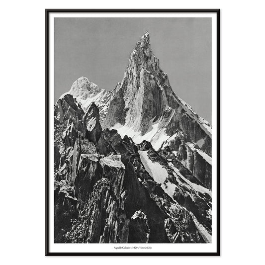
Aiguille calcaire Poster
Vittorio Sella · 1909 · Striking black-and-white mountain peak print featuring a limestone aiguille against open sky
Poster from €9 · Framed from €16
Regular price From €6,00Regular price -
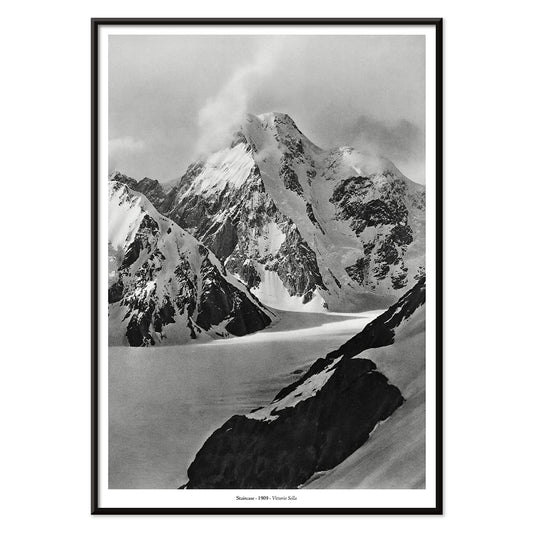
Staircase Poster
Vittorio Sella · 1887 · Striking black-and-white mountain print with stepped ridges rising into thin air
Poster from €9 · Framed from €16
Regular price From €6,00Regular price -
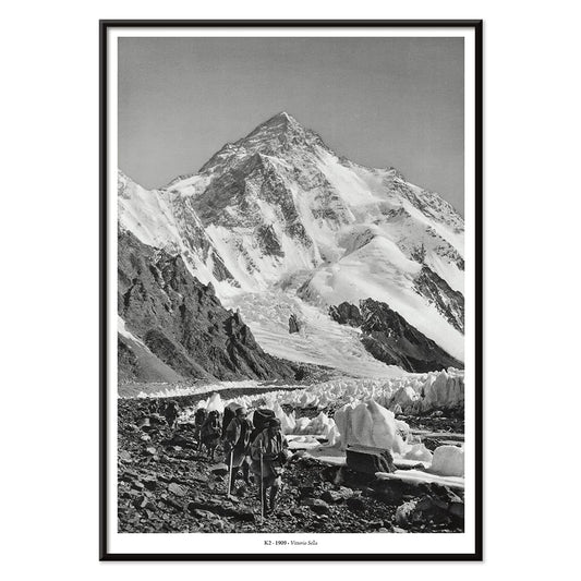
Le pic K2 Poster
Vittorio Sella · 1909 · Dramatic black-and-white K2 glacier poster capturing stark ridgelines and expedition-era atmosphere
Poster from €9 · Framed from €16
Regular price From €6,00Regular price -
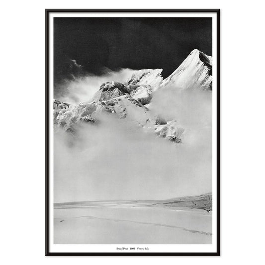
Broad Peak Poster
Vittorio Sella · 1909 · Dramatic black and white mountain art print with cloud-wrapped summit and deep shadows
Poster from €9 · Framed from €16
Regular price From €6,00Regular price -
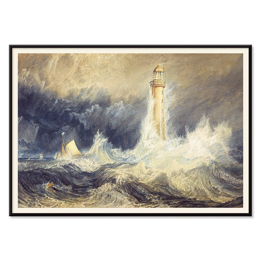
Bell Rock Lighthouse Poster
Joseph Mallord William Turner · 1819 · Dramatic seascape art print of Bell Rock Lighthouse amid breaking waves
Poster from €9 · Framed from €16
Regular price From €6,00Regular price -
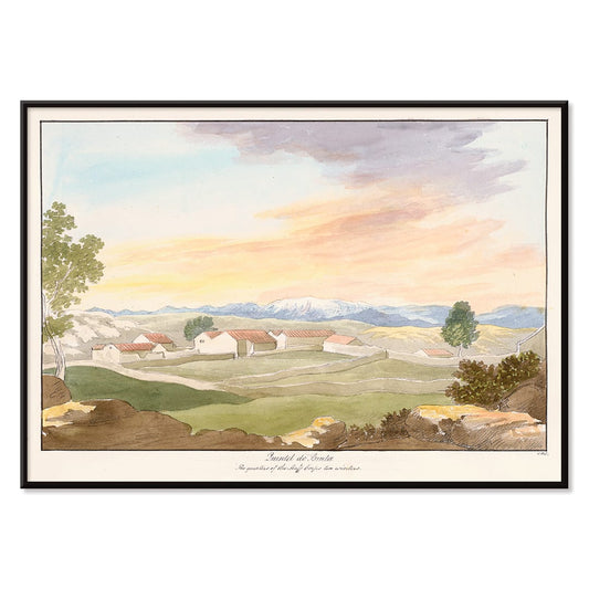
Quintel do Brula Poster
Charles Hamilton Smith · 1835 · Peaceful pastoral art print with sunlit fields, farmhouse silhouettes, and open blue sky
Poster from €9 · Framed from €16
Regular price From €6,00Regular price -
Bridge of Martorelle Poster
Charles Hamilton Smith · 1835 · Romantic landscape poster featuring a stone bridge over a tranquil river and distant hills
Poster from €9 · Framed from €16
Regular price From €6,00Regular price -
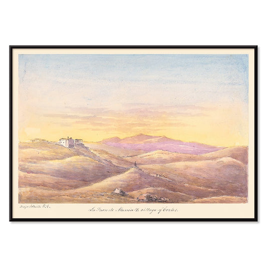
La Fuen de Munia Poster
Charles Hamilton Smith · 1835 · Serene sunset village poster with rolling hills and softly fading Mediterranean sky
Poster from €9 · Framed from €16
Regular price From €6,00Regular price -
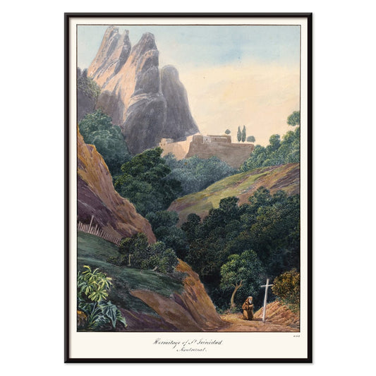
Hermitage of St Trinidad Poster
Charles Hamilton Smith · 1835 · Romantic mountain landscape poster featuring a small hermitage beneath dramatic Montserrat peaks
Poster from €9 · Framed from €16
Regular price From €6,00Regular price -
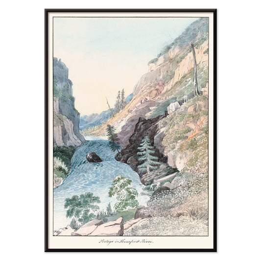
Portage in Hoarfrost River Poster
Charles Hamilton Smith · 1830 · Serene river landscape poster with hoarfrost haze and rugged cliffs
Poster from €9 · Framed from €16
Regular price From €6,00Regular price -
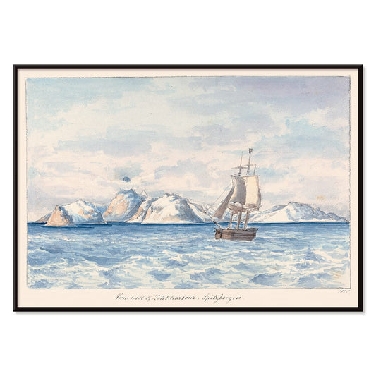
Lout Harbour Poster
Charles Hamilton Smith · 1830 · Quiet Arctic seascape poster with a lone sailboat beneath icy mountain ridges
Poster from €9 · Framed from €16
Regular price From €6,00Regular price -
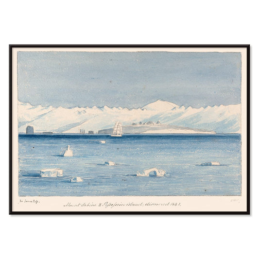
Mount Sabine Poster
Charles Hamilton Smith · 1830 · Dramatic polar seascape vintage print featuring a sailing ship drifting between towering ice
Poster from €9 · Framed from €16
Regular price From €6,00Regular price -
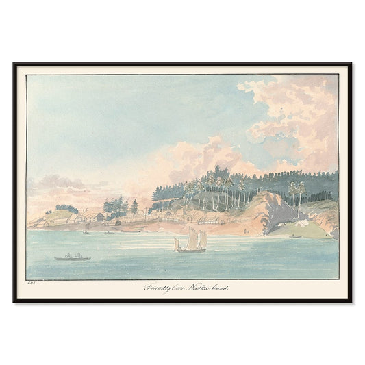
Friendly Cove Poster
Charles Hamilton Smith · 1830 · Serene coastal art print with anchored sailboats, wooded hills, and soft sea light
Poster from €9 · Framed from €16
Regular price From €6,00Regular price -
Yoshino Poster
Kamisaka Sekka · 1909 · Serene Japanese landscape poster with abstract green and blue hills on warm beige
Poster from €9 · Framed from €16
Regular price From €6,00Regular price -
Ryoson Poster
Kamisaka Sekka · 1909 · Serene seascape art print with stylized waves and a quiet coastal silhouette
Poster from €9 · Framed from €16
Regular price From €6,00Regular price -
West Point Poster
Frank Hazell · 1920 · Scenic Hudson Highlands poster featuring West Point architecture framed by autumn foliage
Poster from €9 · Framed from €16
Regular price From €6,00Regular price -
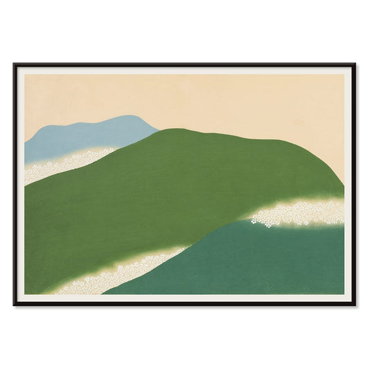
Green Landscape Poster
Watanabe Seitei · 1900 · Tranquil Japanese landscape art print with layered green hills and spacious, calming atmosphere
Poster from €9 · Framed from €16
Regular price From €6,00Regular price -
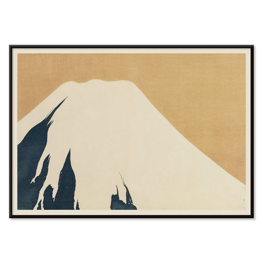
Mount Fuji Poster
Kamisaka Sekka · 1909 · Minimal Mount Fuji art print with calm blue tones and clean contours
Poster from €9 · Framed from €16
Regular price From €6,00Regular price -
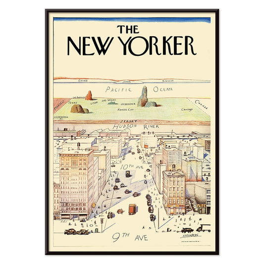
The New Yorker Poster
Saul Steinberg · 1976 · Witty New York cityscape poster with a map-like view and playful scale
Poster from €9 · Framed from €16
Regular price From €6,00Regular price -
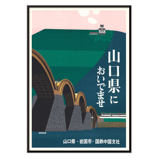
Iwakuni City Poster
Japan National Railways · 1960 · Serene travel poster of Kintai Bridge arches leading to a hilltop castle
Poster from €9 · Framed from €16
Regular price From €6,00Regular price -
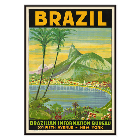
Brazil 2 Poster
Waldomiro Goncalves Christino · 1970 · Vibrant Brazil travel poster with bold shapes and sunny coastal mood
Poster from €9 · Framed from €16
Regular price From €6,00Regular price -
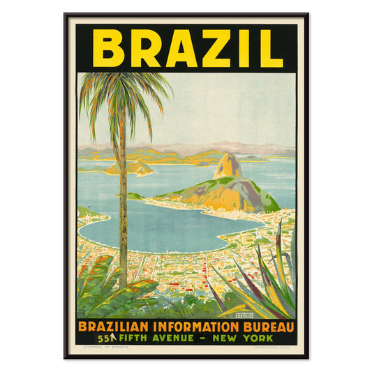
Brazil 1 Poster
Waldomiro Goncalves Christino · 1984 · Sunlit Rio travel poster featuring Sugarloaf Mountain in bold modern color blocks
Poster from €9 · Framed from €16
Regular price From €6,00Regular price -
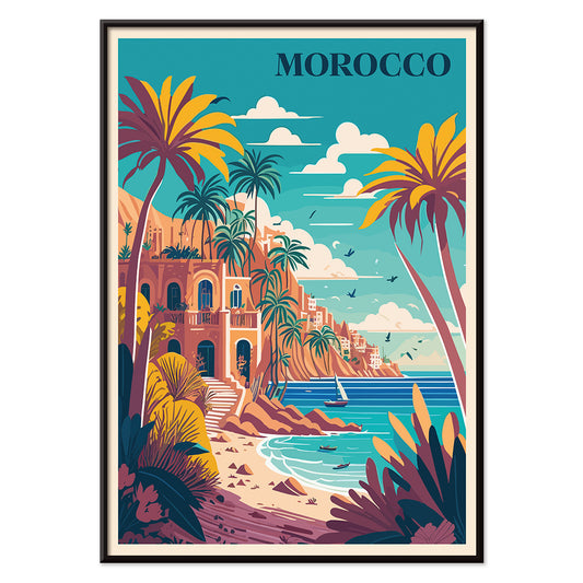
Travel to Morocco Poster
MORYARTY · 1930 · Sunlit Morocco travel poster with palms, white villa, and calm blue sea
Poster from €9 · Framed from €16
Regular price From €6,00Regular price -
Travel to Italy Poster
MORYARTY · 1920 · Sunlit Amalfi Coast poster with cliffside charm and sparkling sea atmosphere
Poster from €9 · Framed from €16
Regular price From €6,00Regular price -
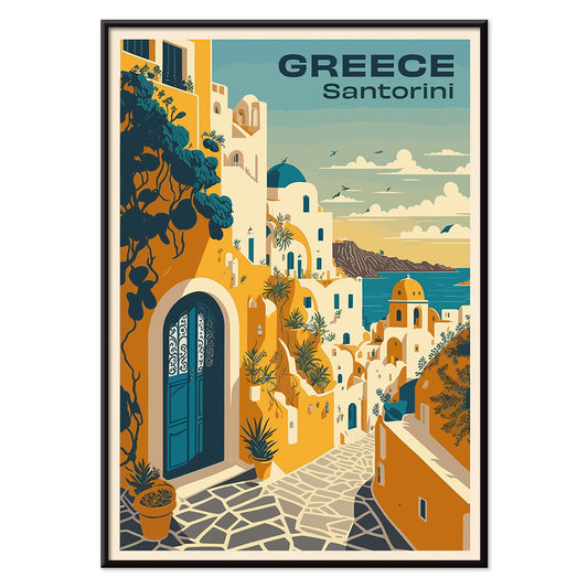
Travel to Santorini Poster
MORYARTY · 2023 · Vintage-inspired Santorini travel poster with white cliffside village and deep Aegean blues
Poster from €9 · Framed from €16
Regular price From €6,00Regular price -
Travel to London Poster
MORYARTY · 1930 · Classic London travel poster with a red double decker bus and clock tower in bold colors
Poster from €9 · Framed from €16
Regular price From €6,00Regular price -
Travel to Venice Poster
MORYARTY · 1930 · Romantic Venice travel poster with a gondola on a sunlit blue canal
Poster from €9 · Framed from €16
Regular price From €6,00Regular price -
Travel to Paris Poster
MORYARTY · 1929 · Elegant Eiffel Tower poster above Paris rooftops glowing with sunset blues and yellows
Poster from €9 · Framed from €16
Regular price From €6,00Regular price -
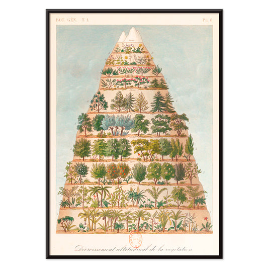
Decroissement Altitudinal de la vegetation Poster
Jean-Augustin Barral · 1860 · Educational scientific print mapping mountain vegetation zones in crisp colored bands
Poster from €9 · Framed from €16
Regular price From €6,00Regular price -
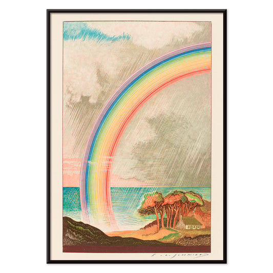
Faust , tragédie de Goethe Poster
F. L. Schmied · 1925 · Dreamlike Faust poster with a radiant rainbow over calm sea and coast
Poster from €9 · Framed from €16
Regular price From €6,00Regular price -
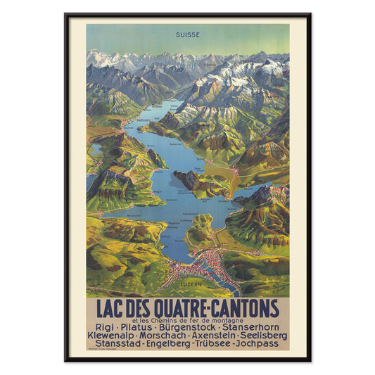
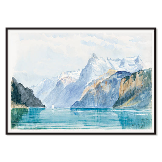
Lac Des Quatre-Cantons Poster
M. Bieder · 1935 · Swiss Lake Lucerne map poster with bright blue water and mountain relief
Poster from €9 · Framed from €16
Regular price From €6,00Regular price -
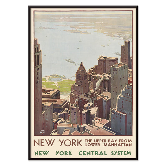
New York Central System Poster
Leslie Ragan · 1920 · Art Deco New York harbor poster with a sharp skyline and cool blue green tones
Poster from €9 · Framed from €16
Regular price From €6,00Regular price -
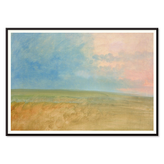
Landscape Poster
George Catlin · 1832 · Serene prairie horizon art print with expansive sky and softly blended tones
Poster from €9 · Framed from €16
Regular price From €6,00Regular price -
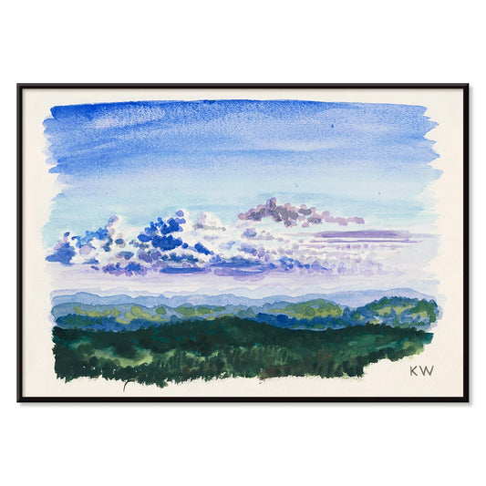
Naturstudie XXVII Poster
Karl Wiener · 1924 · Serene watercolor landscape art print with misty blue washes and soft green accents
Poster from €9 · Framed from €16
Regular price From €6,00Regular price -
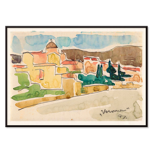
View of Verona Poster
Reijer Stolk · 1924 · Expressive Verona cityscape art print with warm facades, cool greenery, and bold outlines
Poster from €9 · Framed from €16
Regular price From €6,00Regular price -
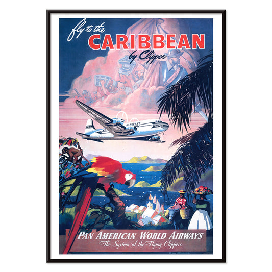
Fly to the Caribbean Poster
Mark Von Arenburg · 1949 · Sunlit Caribbean travel poster with a Clipper flying over palms and sailboats
Poster from €9 · Framed from €16
Regular price From €6,00Regular price -
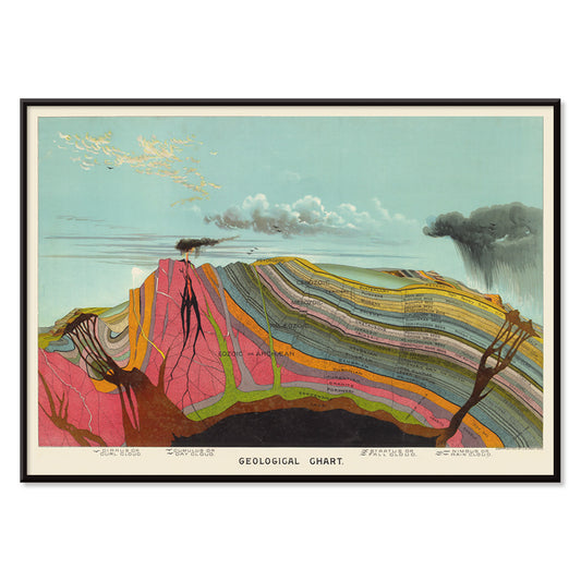
Geological Chart Poster
Levi Walter Yaggy · 1893 · Color-coded geological scientific print mapping Earth layers with clear labels and diagrammed sections
Poster from €9 · Framed from €16
Regular price From €6,00Regular price -
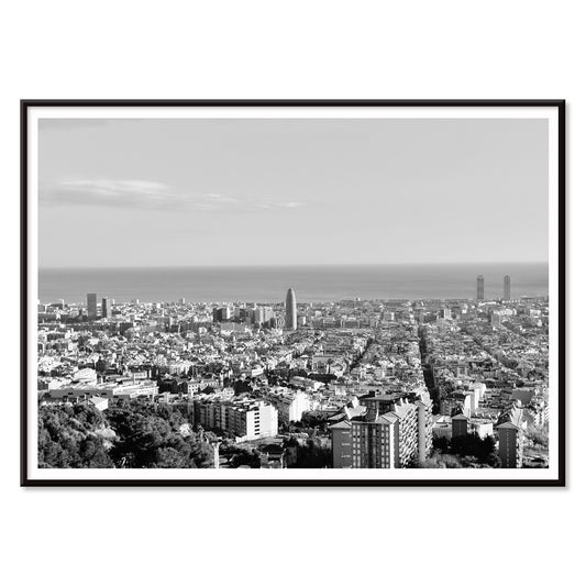
View of Barcelona Poster
Unknown artist · 1563 · Panoramic Barcelona vintage print featuring fortified shoreline, sailing ships, and distant hills
Poster from €9 · Framed from €16
Regular price From €6,00Regular price -
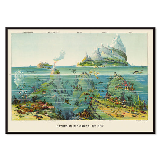
Descending Regions Poster
Levi Walter Yaggy · 1893 · Detailed scientific print mapping ocean depth zones with marine life in cool blues
Poster from €9 · Framed from €16
Regular price From €6,00Regular price -
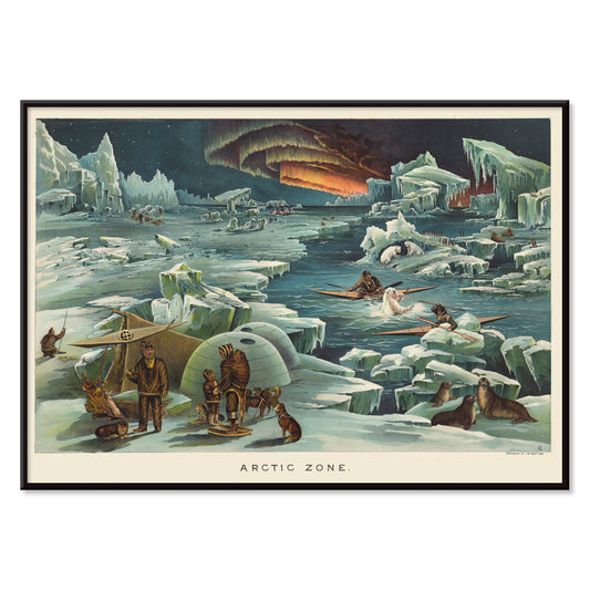
Artic Zone Poster
Levi Walter Yaggy · 1893 · Atmospheric Arctic exploration poster with sled dogs crossing snow under a green aurora
Poster from €9 · Framed from €16
Regular price From €6,00Regular price -
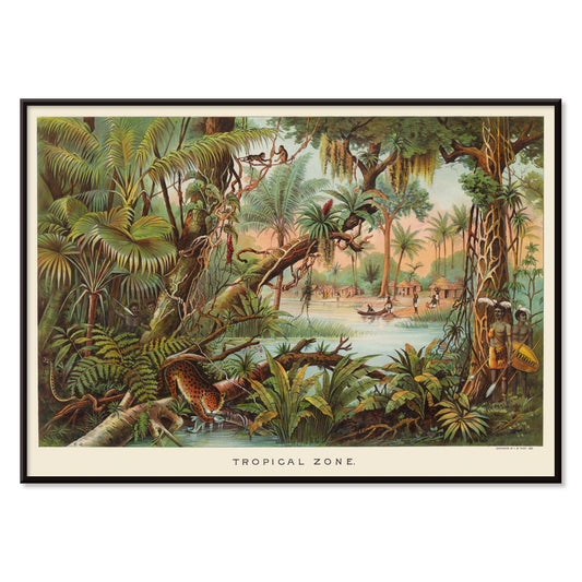
Tropical Zone Poster
Levi Walter Yaggy · 1893 · Lush jungle poster with layered palms, waterways, and wildlife in natural green tones
Poster from €9 · Framed from €16
Regular price From €6,00Regular price -
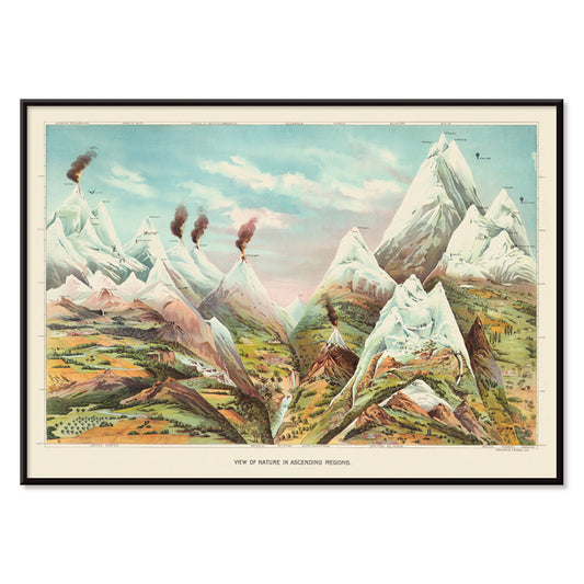
Ascending Regions Poster
Levi Walter Yaggy · 1893 · Detailed mountain ecosystem vintage print with labeled elevation zones and natural history vignettes
Poster from €9 · Framed from €16
Regular price From €6,00Regular price -
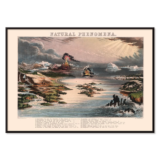
Natural Phenomena Poster
James Reynolds · 1852 · Detailed scientific print mapping volcanoes, lightning, clouds, and ocean currents in one scene
Poster from €9 · Framed from €16
Regular price From €6,00Regular price -
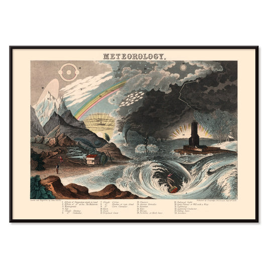
Diagram of Meteorology Poster
James Reynolds · 1846 · Detailed meteorology poster mapping winds and cloud forms in hand-colored diagrams
Poster from €9 · Framed from €16
Regular price From €6,00Regular price -
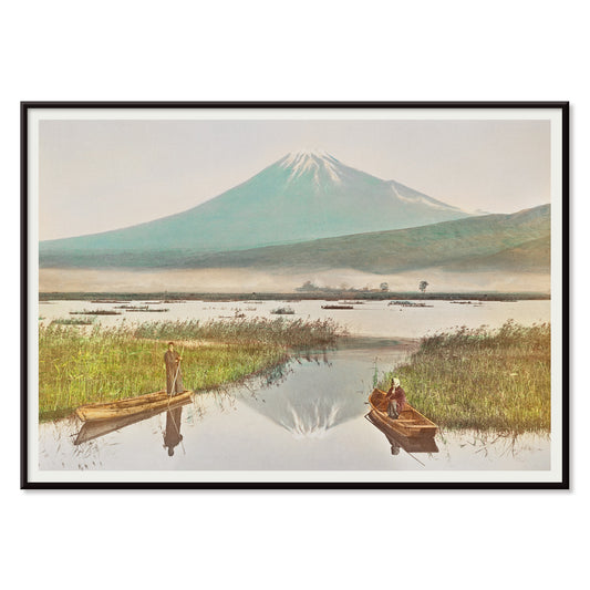
Mount Fuji as Seen from Kashiwabara Poster
Kazumasa Ogawa · 1897 · Hand colored Mount Fuji vintage print with calm boats and a quiet horizon
Poster from €9 · Framed from €16
Regular price From €6,00Regular price -
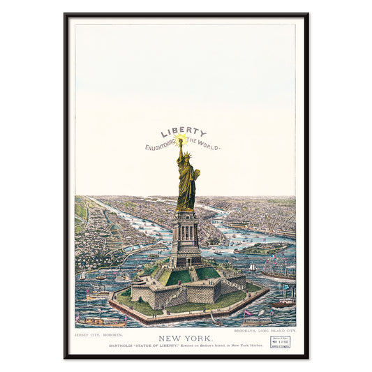
The Great Bartholdi Statue Poster
Currier & Ives · 1885 · Patriotic New York Harbor poster with the Great Bartholdi Statue and bustling steamships
Poster from €9 · Framed from €16
Regular price From €6,00Regular price -
Bay of Uri Poster
John Singer Sargent · 1870 · Serene Swiss lake poster with blue water, pale mountains, and airy sky
Poster from €9 · Framed from €16
Regular price From €6,00Regular price -
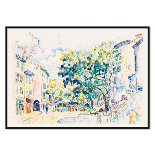
Antibes Street Poster
Paul Signac · 1918 · Luminous pointillist street art print blending blue sky, green shade, and sunlit walls
Poster from €9 · Framed from €16
Regular price From €6,00Regular price -
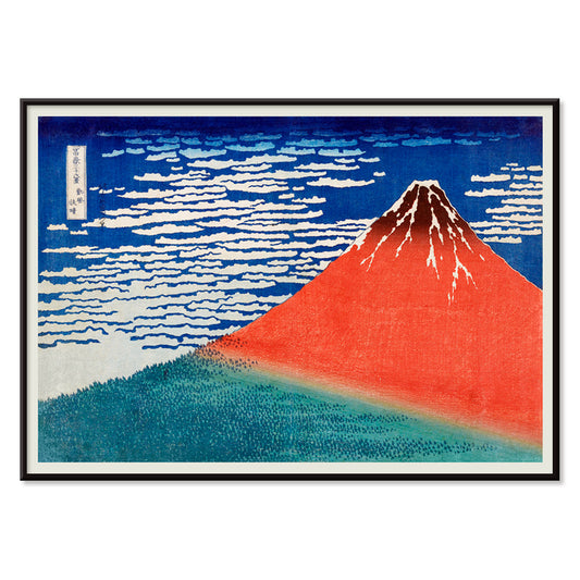
Fine Wind Poster
Katsushika Hokusai · 1829 · Iconic Mount Fuji poster with a red peak under crisp blue sky
Poster from €9 · Framed from €16
Regular price From €6,00Regular price -
Chinese landscape Poster
Lan Ying · 1279 · Misty mountain landscape art print with warm red foliage and spacious ink washes
Poster from €9 · Framed from €16
Regular price From €6,00Regular price -
Vic sur Cère Poster
Louis Tauzin · 1905 · Refined French travel poster showing Vic sur Cere gorge and river in Auvergne
Poster from €9 · Framed from €16
Regular price From €6,00Regular price -
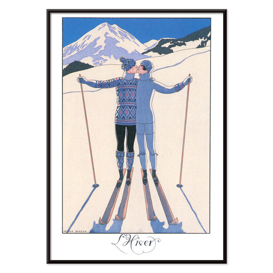
L’Hiver Poster
George Barbier · 1924 · Romantic Art Deco poster featuring a couple embracing in a crisp winter landscape
Poster from €9 · Framed from €16
Regular price From €6,00Regular price -
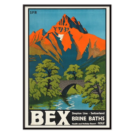
Bex Brine Baths Poster
Aime-Felix Nicollerat · 1896 · Alpine spa resort poster with stone bridge, rushing river, and radiant mountain peaks
Poster from €9 · Framed from €16
Regular price From €6,00Regular price -
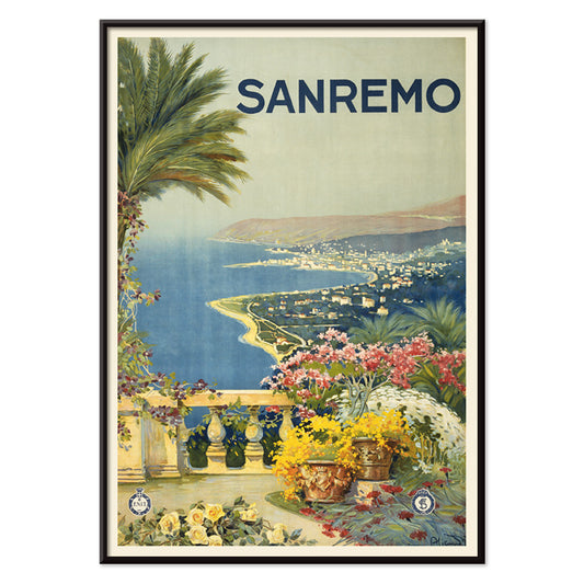
Sanremo Poster
Unknown artist · 1920 · Sunlit Sanremo travel poster with flowered foreground, palms, and a bright Mediterranean bay
Poster from €9 · Framed from €16
Regular price From €6,00Regular price -
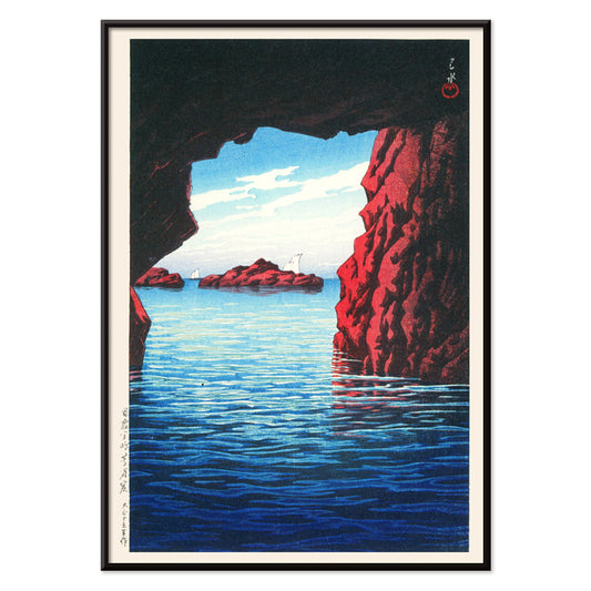
Souvenirs of My Travels Poster
Kawase Hasui · 1940 · Serene coastal poster showing a cavern in dark cliffs above bright surf
Poster from €9 · Framed from €16
Regular price From €6,00Regular price -
Morning Sea at Bikuni in Shiribeshi Poster
Kawase Hasui · 1933 · Serene shin hanga art print of fishing boats on calm blue water under a misty horizon
Poster from €9 · Framed from €16
Regular price From €6,00Regular price


72/172 items
- Early Autumn in Urayasu Poster
- Morning at Cape Inubō Poster
- Ecchu Umidani Pass Poster
- Daybreak over Lake Yamanaka Poster
- View of the Eiffel Tower Poster
- Lisbon Bridge Poster
- Alfama Poster
- Lisbon Old City 1 Poster
- Lisbon Old City 2 Poster
- Mitre Peak Poster
- Le mont Paitju Poster
- Le Siniolchu Poster
- Aiguille calcaire Poster
- Staircase Poster
- Le pic K2 Poster
- Broad Peak Poster
- Yoshino Poster
- Ryoson Poster
- Green Landscape Poster
- Mount Fuji Poster
- The New Yorker Poster
- Iwakuni City Poster
- Brazil 2 Poster
- Travel to Morocco Poster
- Travel to Italy Poster
- Travel to Santorini Poster
- Travel to London Poster
- Travel to Venice Poster
- Travel to Paris Poster
- Faust , tragédie de Goethe Poster
- Lac Des Quatre-Cantons Poster
- View of Verona Poster
- Fly to the Caribbean Poster
- Geological Chart Poster
- View of Barcelona Poster
- Descending Regions Poster
- Tropical Zone Poster
- The Great Bartholdi Statue Poster
- Fine Wind Poster
- Chinese landscape Poster
- Bex Brine Baths Poster
- Sanremo Poster
- Souvenirs of My Travels Poster
- Morning Sea at Bikuni in Shiribeshi Poster
Where the horizon becomes a story
Landscape is a quiet laboratory of mood: light, weather, distance, and the human urge to travel without moving. This collection gathers vintage poster and print imagery from late nineteenth-century painting to mid-century travel graphics, from alpine photography to Japanese woodblock visions. Some scenes feel documentary, others distilled into pattern and color, but all treat place as a kind of narrative.
Techniques, from carved blocks to silver gelatin
Japanese shin-hanga artists approached landscape like theatre, staging atmosphere through clean silhouettes and controlled gradation. In Fine Wind, Clear Morning (1829) by Katsushika Hokusai, Mount Fuji becomes a single red plane against a clear sky, a lesson in structural composition that still resonates with Minimalist wall art. A century later, Morning at Cape Inubō (1931) by Kawase Hasui shifts the drama to surf and shadow, using layered blues that feel almost cinematic. At the other extreme, Vittorio Sella’s expedition photographs such as Le pic K2 (1909) by Vittorio Sella turn texture and scale into subject matter, aligning naturally with the tonal restraint of Black & White prints.
Rooms, light, and the kind of calm you want
Landscape wall art is unusually responsive to lighting. North-facing rooms benefit from coastal scenes and pale skies that hold brightness longer; pairing a Hasui seascape with related prints from Sea & Ocean keeps the horizon line consistent without repeating the same palette. In corridors and stairwells, mountain imagery reads as upward momentum, while in bedrooms a gentler distance view can reduce visual noise. If your interior leans toward stone, linen, and oak, the humid greens and sunlit whites of Flower Garden and Bungalow, Bermuda (1899) by Winslow Homer sit comfortably alongside natural materials.
Curating by geography, then by rhythm
A strong gallery wall starts with rhythm rather than theme. Mix one broad horizon with one intimate foreground scene, then add a graphic counterpoint. Maps are especially useful because they introduce line-work and typography; a route diagram or coastal chart from Maps can sharpen the composition next to painterly color fields. For interiors that already feature vintage objects, travel-era graphics from Advertising can supply a period voice without overwhelming the quieter landscapes. When you want seasonal cadence and flatter color, the wider world of Oriental prints offers kindred motifs that pair well with landscape posters.
Why landscapes keep returning
Unlike portraiture, landscapes suggest a narrative and leave space for the viewer to finish it, which is why a vintage art print can sit across styles from Scandinavian restraint to antique cabinets. A useful approach is to choose one anchor image, then echo its dominant note elsewhere: Fuji’s iron red, Cross’s pastel haze, or Sella’s graphite greys in a textile, vase, or rug. The Pink Cloud (1896) by Henri-Edmond Cross is particularly effective when you need color that stays airy rather than heavy. For broader context on how different painters and printmakers handle distance, the view across Famous Artists helps clarify what you respond to: haze, hard edges, or pure pattern.