


-
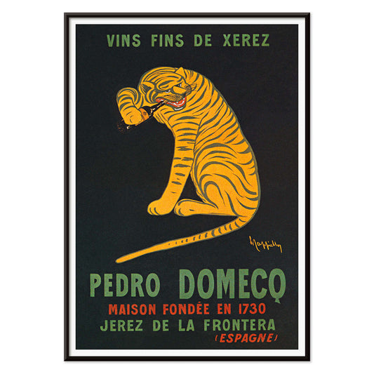
Xerez Pedro Domeco Poster
Leonetto Cappiello · 1930 · Iconic tiger poster leaping from deep black to advertise Xerez sherry
Poster from €9 · Framed from €16
Regular price From €6,00Regular price -
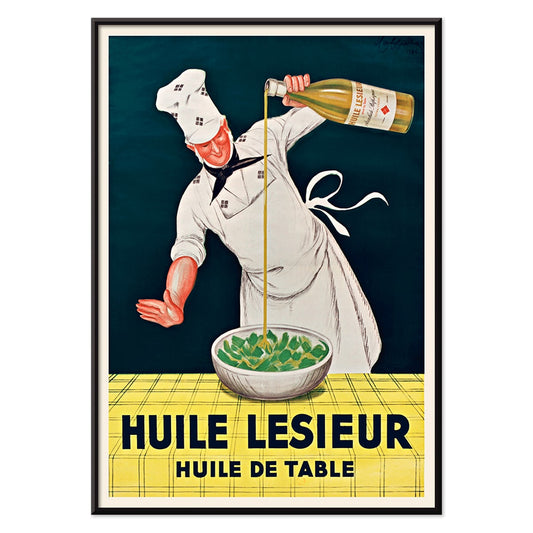
Huile Lesieur Poster
Leonetto Cappiello · 1930 · Spirited chef advertising poster pouring golden oil with bold red type on black background
Poster from €9 · Framed from €16
Regular price From €6,00Regular price -
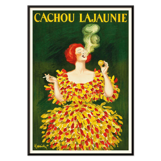
Cachou Lajaunie Poster
Leonetto Cappiello · 1920 · Iconic French advertising poster featuring a red-clad woman and swirling yellow smoke
Poster from €9 · Framed from €16
Regular price From €6,00Regular price -
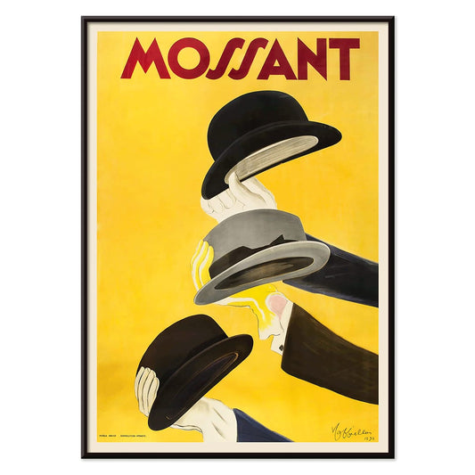
Mossant Poster
Leonetto Cappiello · 1938 · Striking hat advertising poster featuring three raised hands and bold color contrast
Poster from €9 · Framed from €16
Regular price From €6,00Regular price -
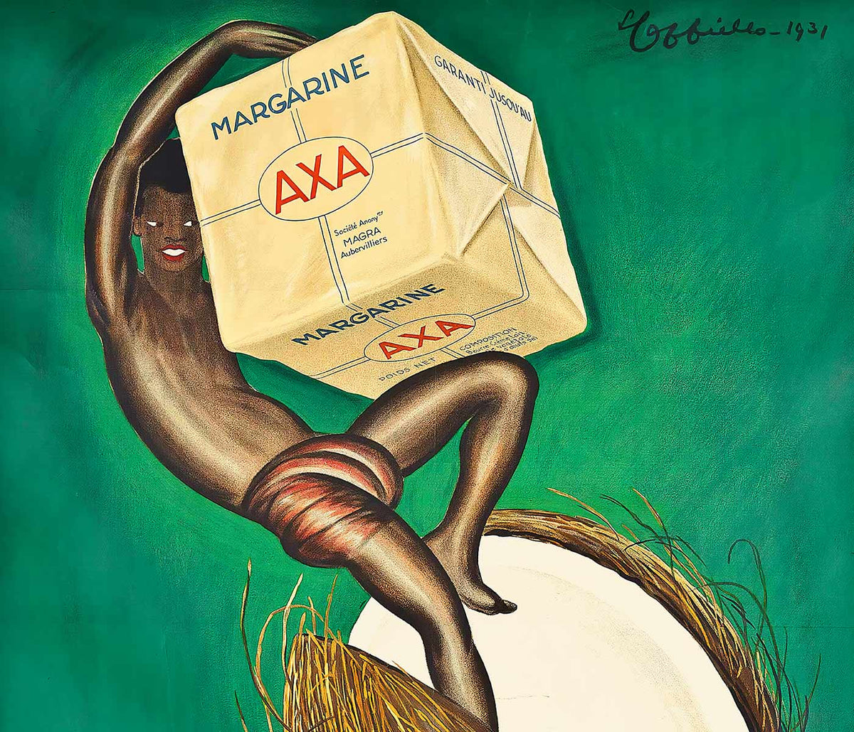
Margarine Axa Poster
Leonetto Cappiello · 1931 · Bold Margarine Axa poster with striking figure, green backdrop, and sunny yellow highlights
Poster from €9 · Framed from €16
Regular price From €6,00Regular price -
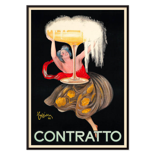
Contratto Poster
Leonetto Cappiello · 1922 · Jubilant champagne poster featuring bold lettering and a festive figure on black
Poster from €9 · Framed from €16
Regular price From €6,00Regular price -
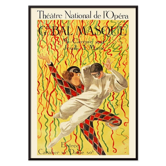
Grand Bal De La Mi-Carême Poster
Leonetto Cappiello · 1921 · Festive Parisian dance poster with bold contrast and carnival energy
Poster from €9 · Framed from €16
Regular price From €6,00Regular price -
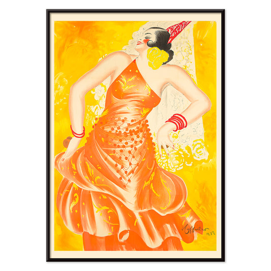
Conchita Supervia Poster
Leonetto Cappiello · 1932 · Striking opera singer poster with bold reds and yellows on a deep black background
Poster from €9 · Framed from €16
Regular price From €6,00Regular price -
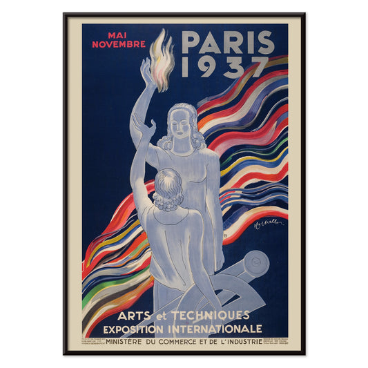
Arts et Techniques Poster
Leonetto Cappiello · 1937 · Festive Art Deco expo poster with bold figure and geometric Paris lettering
Poster from €9 · Framed from €16
Regular price From €6,00Regular price -
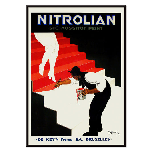
Nitrolian Poster
Leonetto Cappiello · 1929 · Striking Nitrolian poster of a worker painting stairs in bold black, white, and red
Poster from €9 · Framed from €16
Regular price From €6,00Regular price -
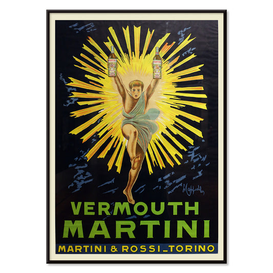
Vermouth Martini Poster
Leonetto Cappiello · 1920 · Vibrant Vermouth Martini poster featuring a yellow-costumed figure on a dramatic black background
Poster from €9 · Framed from €16
Regular price From €6,00Regular price -
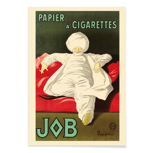
Rolling Paper Job Poster
Leonetto Cappiello · 1933 · Elegant advertising poster featuring a white-robed figure on vivid green
Poster from €9 · Framed from €16
Regular price From €6,00Regular price -
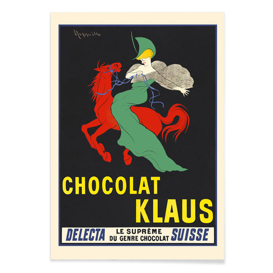
Chocolat Klaus Poster
Leonetto Cappiello · 1903 · Striking red horse and green-clad rider poster with bold Belle Époque contrast
Poster from €9 · Framed from €16
Regular price From €6,00Regular price -
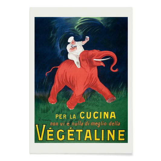
Vegetaline Poster
Leonetto Cappiello · 1910 · Playful chef riding a red elephant in a bold French advertising poster
Poster from €9 · Framed from €16
Regular price From €6,00Regular price -
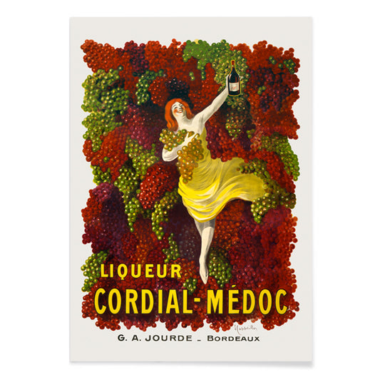
Cordial-Médoc Poster
Leonetto Cappiello · 1907 · Joyful liquor poster featuring a yellow-clad dancer with cascading grapes
Poster from €9 · Framed from €16
Regular price From €6,00Regular price -
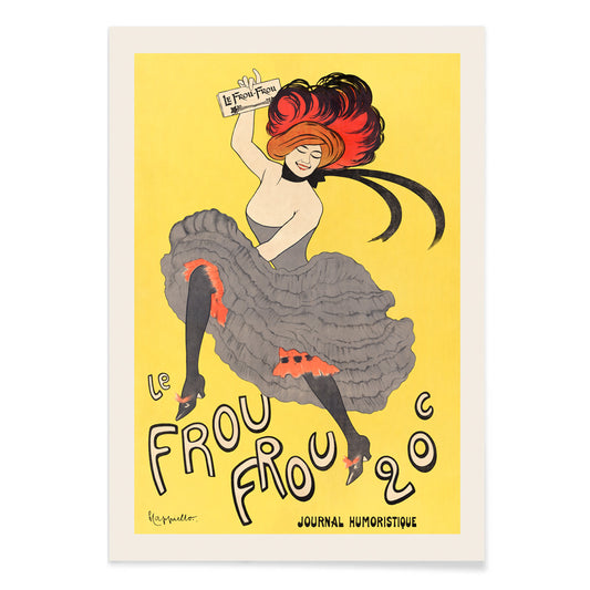
Le Frou Frou Poster
Leonetto Cappiello · 1899 · Spirited cancan dancer poster with bold typography and Belle Epoque night energy
Poster from €9 · Framed from €16
Regular price From €6,00Regular price -
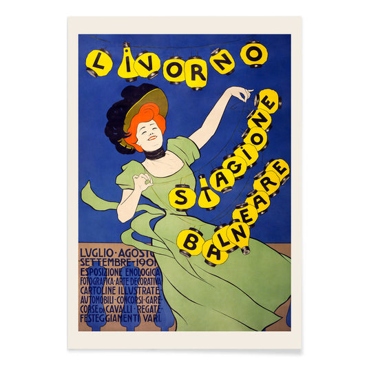
Livorno stagione balneare Poster
Leonetto Cappiello · 1901 · Spirited seaside poster with a green figure and glowing lanterns against deep night
Poster from €9 · Framed from €16
Regular price From €6,00Regular price -
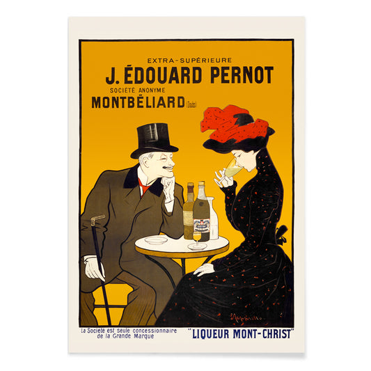
Man and woman at a cafe Poster
Leonetto Cappiello · 1900 · Chic café couple poster with bold black contrast and warm yellow red highlights
Poster from €9 · Framed from €16
Regular price From €6,00Regular price -
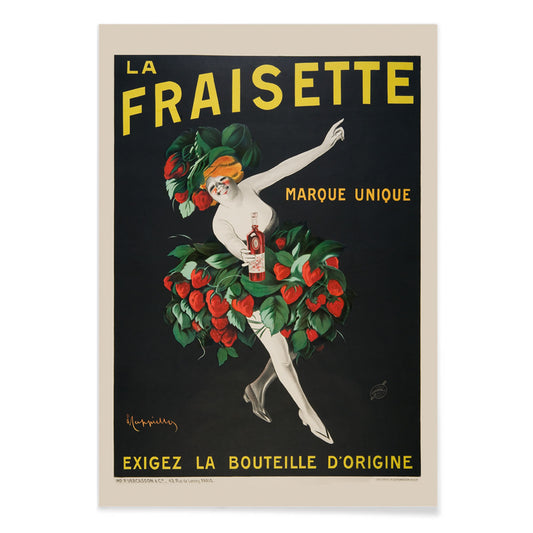
The Fraisette Poster
Leonetto Cappiello · 1909 · Playful strawberry-costumed figure poster glowing against deep black with vivid green leaves
Poster from €9 · Framed from €16
Regular price From €6,00Regular price -
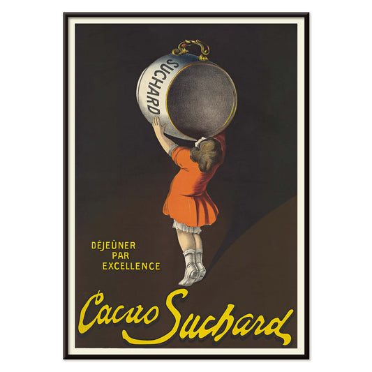
Cacao Suchard Poster
Leonetto Cappiello · 1911 · Vintage poster as a cocoa art print with a striking Suchard tin
Poster from €9 · Framed from €16
Regular price From €6,00Regular price -
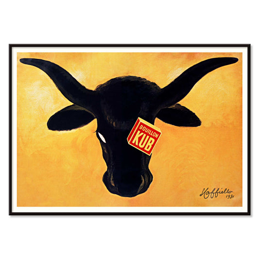
Bouillon Kub poster Poster
Leonetto Cappiello · 1931 · Bouillon Kub poster shows a black bull on orange ground
Poster from €9 · Framed from €16
Regular price From €6,00Regular price


Paris reads in images
In early twentieth-century Paris, the street became a moving gallery where commuters learned brands, venues, and pleasures through color and speed. Leonetto Cappiello made posters that work like visual punctuation: a single figure, a dark field, and an accent hue that snaps into focus from across the boulevard. His imagery belongs to the era when lithographic printing and mass circulation reshaped public taste, turning everyday commerce into a shared graphic language. Seen now as vintage wall art, these compositions still feel urban and immediate, closer to signage than to salon painting, yet full of wit.
Reduction as a modern strategy
Cappiello is often discussed as a counterpoint to the ornamental sweep of late Art Nouveau. Instead of filling the surface, he clears it, using negative space and flat color to make the subject unavoidable. In Vermouth Martini (1920), the bottle cluster and yellow flare read like stage lighting, while the black ground turns the figure into a crisp emblem. Vegetaline (1910) pushes caricature further: the red elephant and chef whites create a billboard-level contrast that relies on instant recognition. This poster logic anticipates later branding systems, where a limited palette and a repeatable character carry the message.
Using dark grounds and hot color at home
Because many Cappiello prints sit on deep blacks, they behave like strong anchors in a room rather than background pattern. In an entryway, a single poster can hold the sightline and echo the rhythm of a coat rack or console. Kitchens and dining areas welcome the appetite cues, especially when paired with café wood, brass, and matte ceramics; the ink-like blacks look richer against plaster white, sage, or tobacco walls. If you want the theme to stay culinary without feeling literal, pair this collection with Kitchen and a quieter natural counterpoint from Botanical. For broader street graphics, Advertising and Alcool extend the same era of typographic appetite.
Curating, spacing, and frames
A gallery wall works best when Cappiello plays the lead and neighboring works take supporting roles. Build a rhythm: one hero silhouette, then a calmer image with more air, then a repeat of strong color. Photography or line-driven prints help the eye recover; a companion from Black & White can act as a visual pause. Cachou Lajaunie (1920) brings a nocturnal, intimate note that suits a reading corner, while Margarine Axa (1931) leans on creamy yellows and crisp lettering that rewards simple framing. Thin black profiles sharpen the silhouette; pale oak softens the contrast and connects to warm flooring.
Street drama that still reads fast
The best Cappiello posters keep their original purpose: they must be understood instantly, yet remembered later. In Xerez Pedro Domeco (1930), the tiger’s forward tension meets the bottle’s vertical calm, producing a push-pull that feels almost cinematic. That speed is precisely why these vintage poster prints sit comfortably in modern decoration: they deliver character, color, and graphic clarity without needing a long look.