


-
Matisse Dancing Figures Poster
Henri Matisse · 1909 · Energetic dancing figures poster with bold red silhouettes set against deep blue
Poster from €9 · Framed from €16
Regular price From €6,00Regular price -
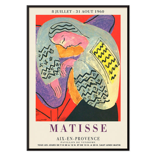
The Dream Poster
Henri Matisse · 1960 · Vibrant sleeping figure poster with flowing contours and bold, flat color shapes
Poster from €9 · Framed from €16
Regular price From €6,00Regular price -
Exposition Matisse Poster
Unknown artist · 1980 · Minimalist exhibition poster featuring a dancing figure in black line and bold red text
Poster from €9 · Framed from €16
Regular price From €6,00Regular price -
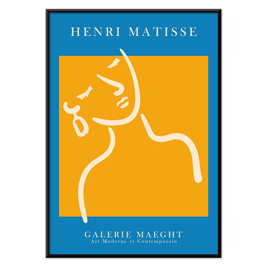
Girl with a earing Poster
MORYARTY · 2022 · Matisse inspired portrait poster with blue background, white face, and yellow earring
Poster from €9 · Framed from €16
Regular price From €6,00Regular price -
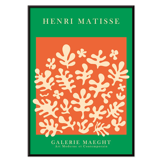
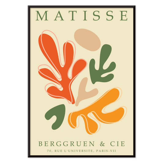
Orange cut outs Poster
MORYARTY · 2022 · Abstract cut-out poster with orange shapes and green accents on warm beige
Poster from €9 · Framed from €16
Regular price From €6,00Regular price -
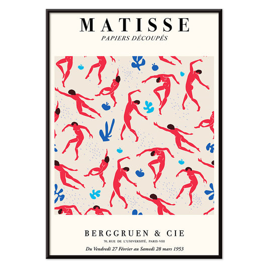
Papiers découpés 5 Poster
MORYARTY · 2023 · Colorful abstract faces poster built from crisp cut-paper shapes on a soft ground
Poster from €9 · Framed from €16
Regular price From €6,00Regular price -
Papiers découpés 4 Poster
MORYARTY · 1952 · Joyful cut-paper style abstract poster with bold red and blue shapes on beige
Poster from €9 · Framed from €16
Regular price From €6,00Regular price -
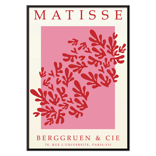
Papiers découpés 3 Poster
MORYARTY · 1949 · Matisse-inspired poster with bold red leaf shapes on airy white and pink
Poster from €9 · Framed from €16
Regular price From €6,00Regular price -
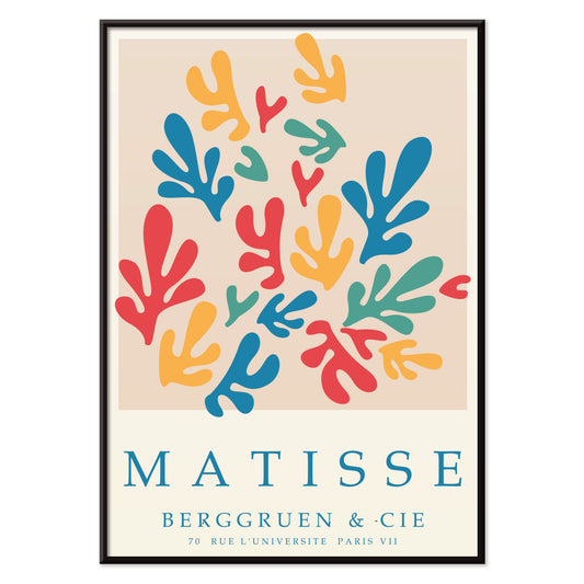
Papiers découpés 2 Poster
MORYARTY · 2023 · Matisse-inspired abstract poster featuring bold cut-paper shapes in vibrant primary colors
Poster from €9 · Framed from €16
Regular price From €6,00Regular price -
Papiers découpés 1 Poster
MORYARTY · 2021 · Vibrant cut-paper abstract poster with orange and green shapes on warm beige ground
Poster from €9 · Framed from €16
Regular price From €6,00Regular price -
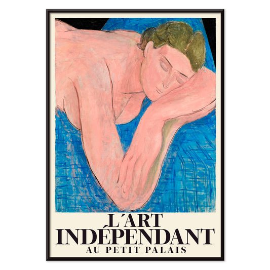
Le rêve Poster
Henri Matisse · 1935 · Dreamy reclining nude art print with fluid black lines and soft pink blue fields
Poster from €9 · Framed from €16
Regular price From €6,00Regular price -
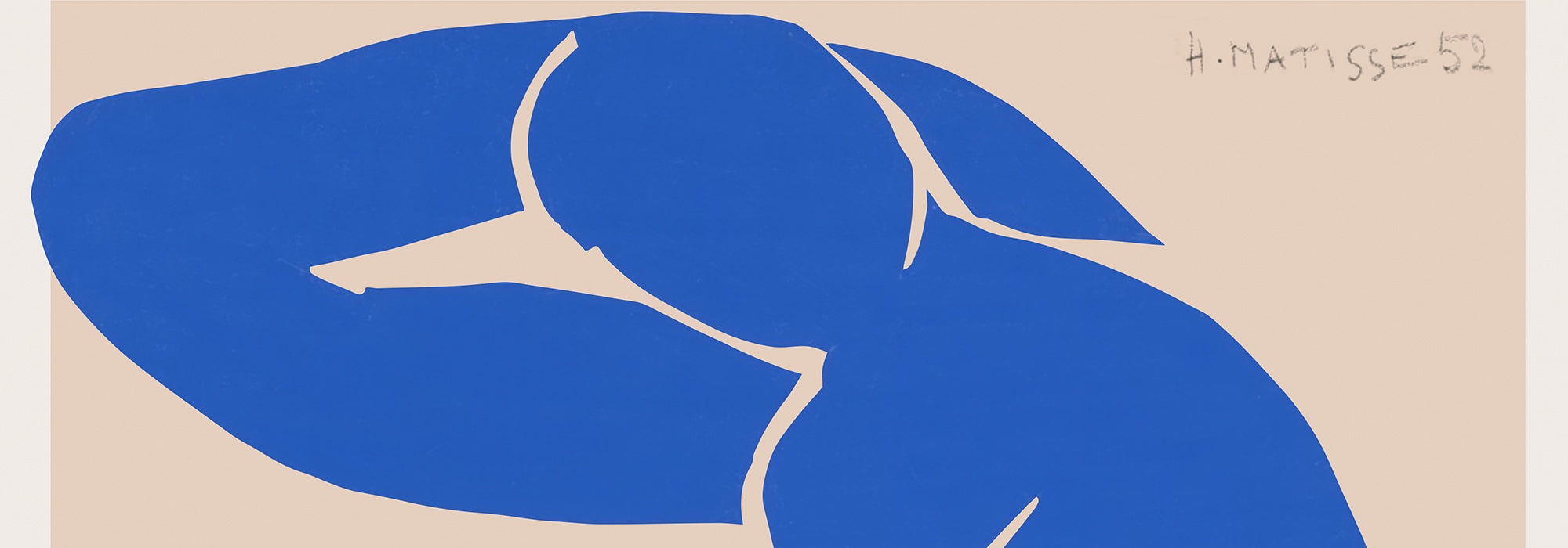
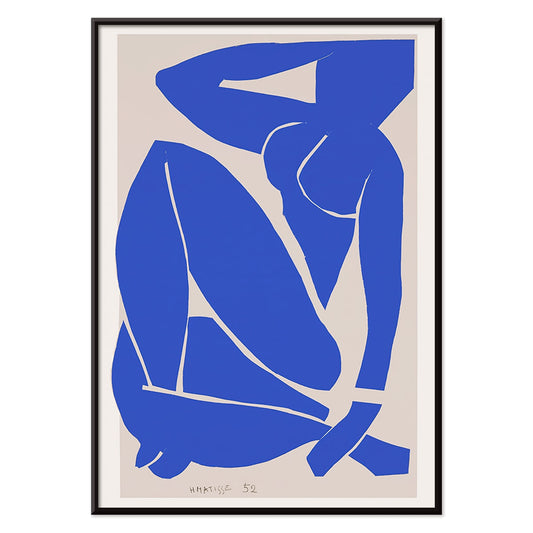
Nu Bleu III Poster
Henri Matisse · 1952 · Iconic blue nude art print with flowing cut-out silhouette on warm beige
Poster from €9 · Framed from €16
Regular price From €6,00Regular price -
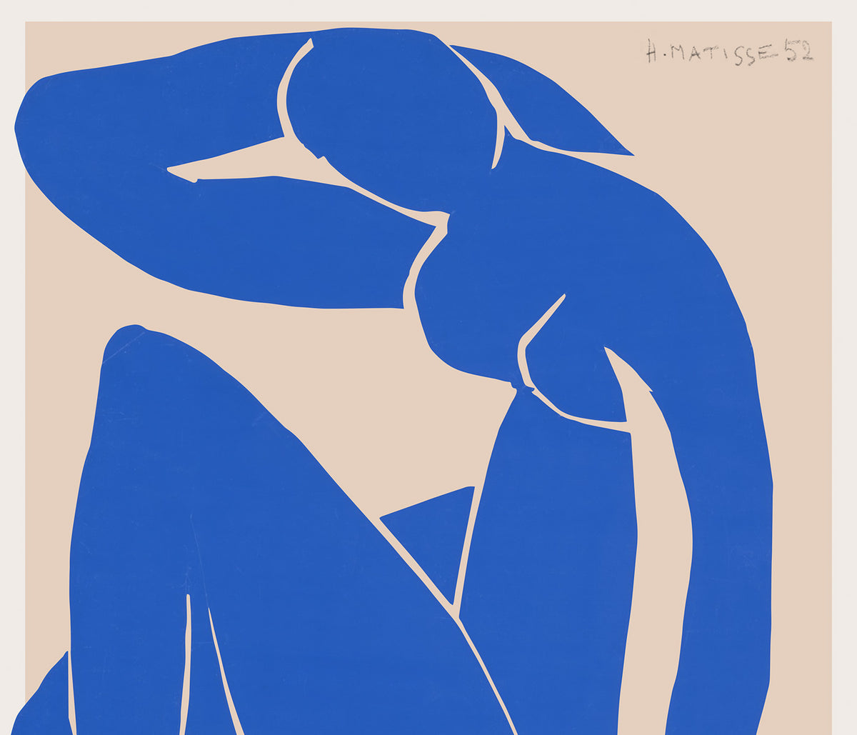
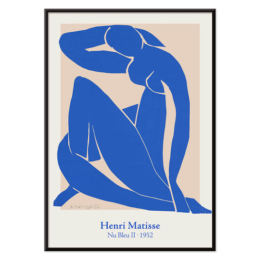
Nu Bleu II Poster
Henri Matisse · 1952 · Iconic blue nude poster in bold cut-paper shapes against a warm neutral ground
Poster from €9 · Framed from €16
Regular price From €6,00Regular price -
Maison de la Pensée française poster Poster
Henri Matisse · 1950 · Exhibition poster with a masklike face and blue lettering
Poster from €9 · Framed from €16
Regular price From €6,00Regular price -
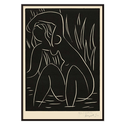
The afternoon Poster
Henri Matisse · 1941 · Minimalist art print of a reclining figure on a black field
Poster from €9 · Framed from €16
Regular price From €6,00Regular price -
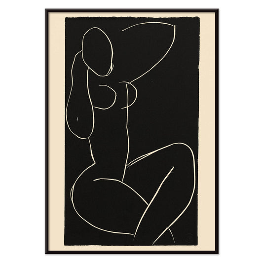
Seated nude with crossed legs I Poster
Henri Matisse · 1941 · Minimalist art print of a seated nude with crossed legs
Poster from €9 · Framed from €16
Regular price From €6,00Regular price -
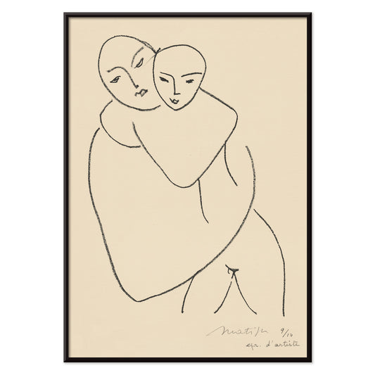
Vierge et enfant Poster
Henri Matisse · 1950 · Minimalist art print of a mother and child in spare black line
Poster from €9 · Framed from €16
Regular price From €6,00Regular price -
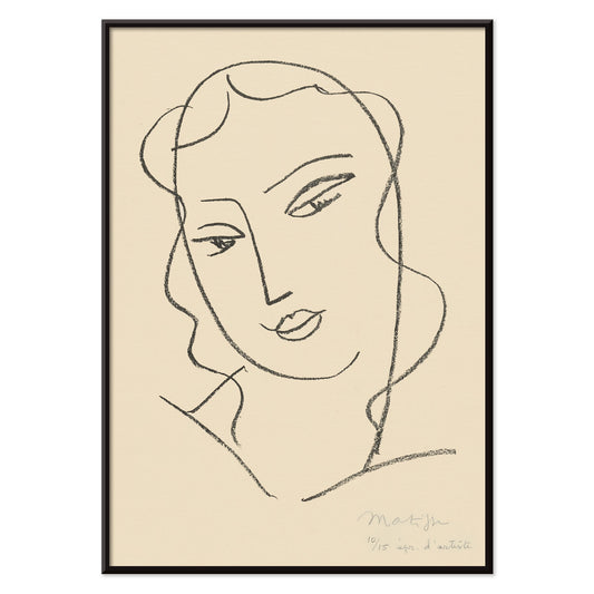
Veiled head Poster
Henri Matisse · 1950 · Veiled head becomes a refined art print with graceful black linework
Poster from €9 · Framed from €16
Regular price From €6,00Regular price


Paper cut, colour held in air
Henri Matisse’s late cut-outs read like light pinned to a wall: flat colour, decisive edges, and a relaxed sensuality that still feels modern. This selection gathers vintage poster and print interpretations of the papiers découpés alongside exhibition graphics, where blue, coral, lemon, and ink-black act like musical notes in a spare composition. In The Dream, Aix en Provence exhibition poster (1960), a reclining figure settles into warm planes, suggesting a Mediterranean afternoon assembled by hand. As wall art, these posters add decoration through rhythm and breathing space, rather than ornament.
Why the cut-outs matter
When illness restricted painting, Matisse turned to scissors, treating coloured paper as a way to draw directly with hue. The process was deliberate: sheets were painted with gouache, then cut, pinned, and repositioned across the studio wall until balance felt exact. That method makes negative space active, not empty, and it explains why the images hold up at poster scale. In Nu Bleu III, the figure folds into itself using only a few shapes, while the white ground carries as much energy as the blue body. Matisse Dancing Figures, Exhibition Poster compresses motion into pattern, showing how reduction can still imply pulse, music, and social joy.
Placing Matisse in the home
These prints work best where colour can behave like architecture. A large poster above a sofa can replace an accent wall; keep surrounding elements calm with linen upholstery, oak, travertine, or brushed steel so the print carries the tempo. Hang the image slightly lower than expected so the figure meets the room at eye level rather than hovering near the ceiling line. In kitchens and dining corners, the cut-outs feel fresh beside ceramics and greenery, and they sit comfortably with graphic styles from Abstract or the restraint of Minimalist. To echo the oceanic palette, mix in nearby notes from Blue, or sharpen contrast with Black & White photography.
Pairing, framing, and contrast
Framing choices change the reading of the work. A thin black frame makes colour feel crisp and architectural, while pale oak tilts the mood toward vintage domestic warmth. A generous mat gives cut edges room and lets smaller formats feel intentional. Nu Bleu II benefits from negative space, so keep nearby objects sparse and treat a single lamp or side table as a quiet counterpoint. For a more inward atmosphere, place it near Le rêve (1935), where line becomes more lyrical and the mood turns contemplative. If you want the typography of exhibition design to lead, combine Matisse with vintage graphics from Advertising or broader anchors from Famous Artists.
A modern vintage language
Matisse remains unusually useful in contemporary decoration because colour is treated as structure rather than surface. Even in print form, the hand-cut irregularity keeps the image human and prevents a room from feeling overly polished. Use one poster as a bright anchor, or build a measured sequence so the gallery wall becomes a lesson in how simplicity can still carry warmth, humour, and heat.