


-
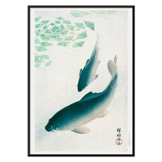
Koi Poster
Ohara Koson · 1926 · Serene koi poster featuring a drifting carp and tranquil blue water
Poster from €9 · Framed from €16
Regular price From €6,00Regular price -
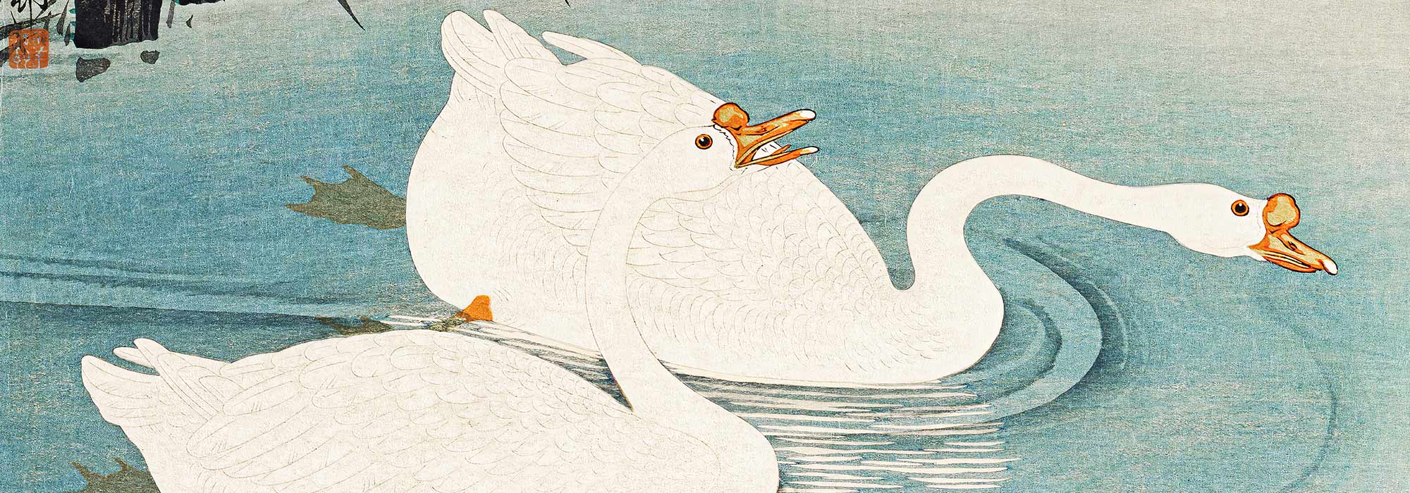
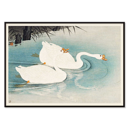
Geese amid Reeds Poster
Ohara Koson · 1928 · Serene waterfowl art print of white geese drifting through reeds on blue water
Poster from €9 · Framed from €16
Regular price From €6,00Regular price -
Flying Geese Poster
Ohara Koson · 1926 · Serene kacho-e print of two geese gliding above water and reeds
Poster from €9 · Framed from €16
Regular price From €6,00Regular price -
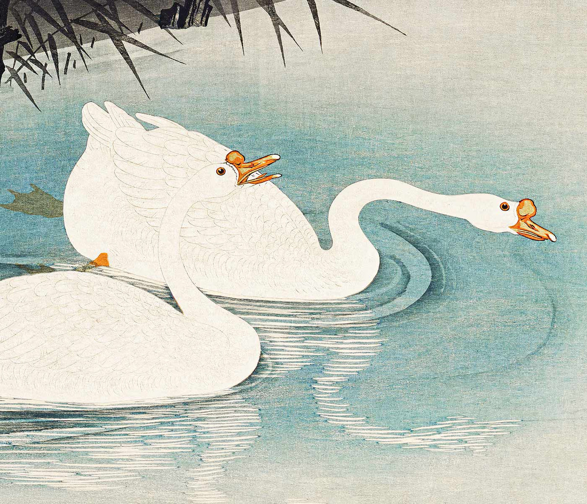
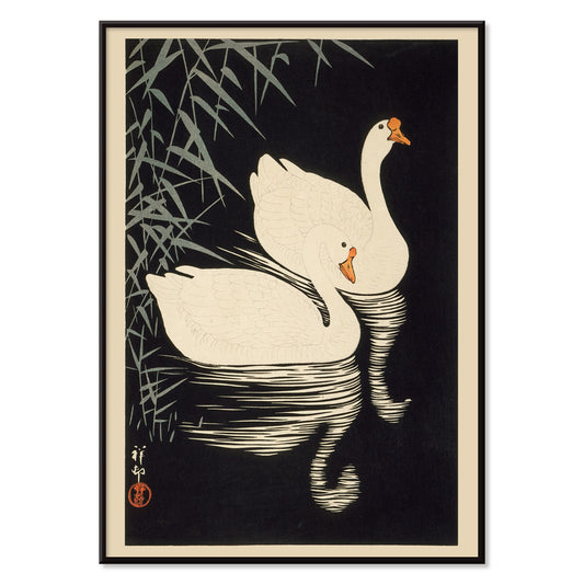
White Chinese Geese Poster
Ohara Koson · 1928 · Serene wildlife print of two white geese gliding beside reeds on calm water
Poster from €9 · Framed from €16
Regular price From €6,00Regular price -
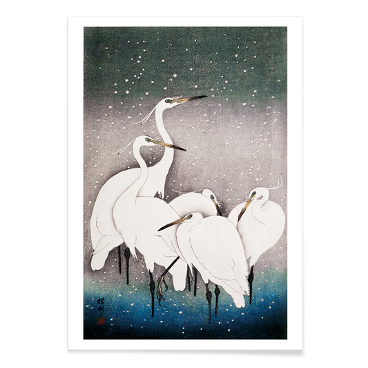
Group of Egrets Poster
Ohara Koson · 1925 · Tranquil egret print in winter stillness with soft blue shadows and crisp black accents
Poster from €9 · Framed from €16
Regular price From €6,00Regular price -
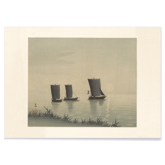
Fishing Boats Poster
Ohara Koson · 1910 · Quiet shin-hanga art print of three fishing boats drifting on calm evening water
Poster from €9 · Framed from €16
Regular price From €6,00Regular price -
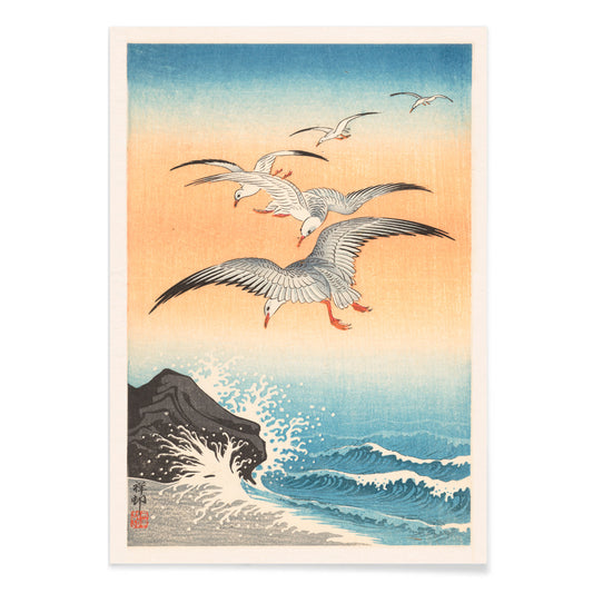
Five seagulls Poster
Ohara Koson · 1927 · Shin hanga art print of five seagulls gliding above indigo waves
Poster from €9 · Framed from €16
Regular price From €6,00Regular price -
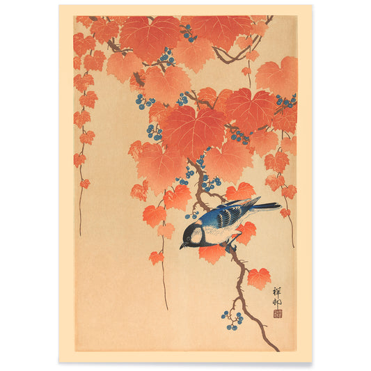
Paulownia branch Poster
Ohara Koson · 1910 · Graceful blue bird print perched on paulownia branch with autumn leaves and berries
Poster from €9 · Framed from €16
Regular price From €6,00Regular price -
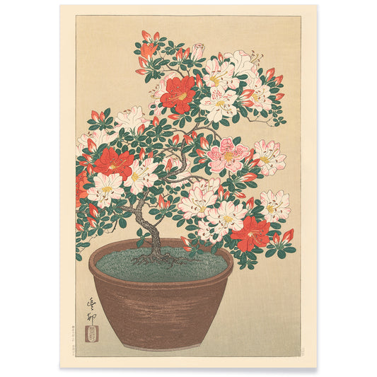
Flowering azalea Poster
Ohara Koson · 1930 · Graceful botanical print of red azalea blossoms and slender leaves on pale ground
Poster from €9 · Framed from €16
Regular price From €6,00Regular price -
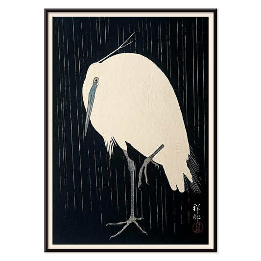
Egret Poster
Ohara Koson · 1910 · Serene egret art print with rain-streaked atmosphere and striking black-white contrast
Poster from €9 · Framed from €16
Regular price From €6,00Regular price -
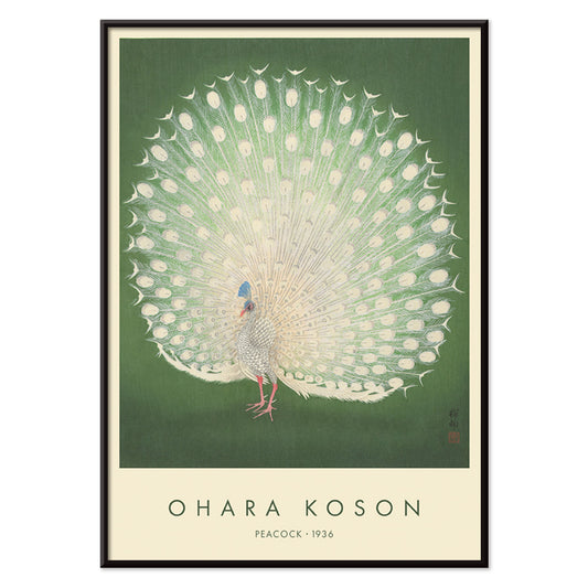
Peacock Poster
Ohara Koson · 1910 · Elegant white peacock art print with fanned plumage set against calm green ground
Poster from €9 · Framed from €16
Regular price From €6,00Regular price -
Flowering Water Lily Poster
Ohara Koson · 1910 · Serene botanical print of pink water lilies floating among rounded lily pads
Poster from €9 · Framed from €16
Regular price From €6,00Regular price -
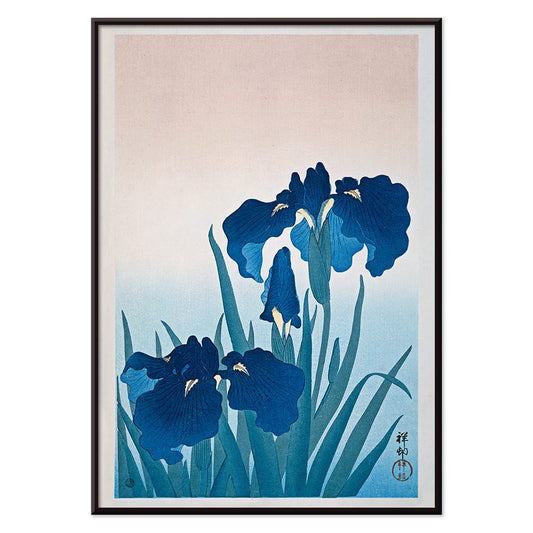
Irises Poster
Ohara Koson · 1925 · Serene blue iris botanical print with slender leaves and airy Japanese composition
Poster from €9 · Framed from €16
Regular price From €6,00Regular price -
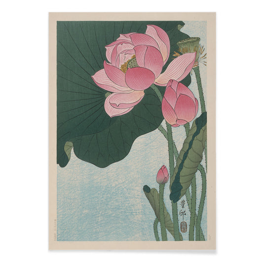
Blooming lotus flowers Poster
Ohara Koson · 1923 · Serene lotus flowers print with soft pink blooms and calm blue tones
Poster from €9 · Framed from €16
Regular price From €6,00Regular price -
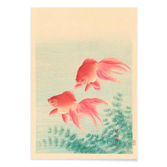
Two Goldfishes Poster
Ohara Koson · 1910 · Serene goldfish art print with delicate ripples and soft blue water gradations
Poster from €9 · Framed from €16
Regular price From €6,00Regular price


Shin-hanga hush, shaped by modern looking
Ohara Koson belongs to the shin-hanga revival of early 20th-century Japan, a moment when woodblock tradition met new tastes for atmosphere, cropping, and everyday subject matter. Rather than grand vistas, these posters linger on a wingbeat, a ripple, a branch under snow. The effect is intimate and designed for close viewing, a kind of visual pause that sits comfortably beside the broader language of Oriental prints and the pared-back logic of Minimalist wall art.
Woodblock craft: line, bokashi, and active emptiness
Koson’s compositions rely on decisions that are both technical and poetic. In Flycatchers on a nandina bush by Ohara Koson, the untouched paper operates as weather, turning negative space into snowfall and cold air. Carp or Koi (1926) by Ohara Koson uses a few decisive curves to describe muscle and motion, while scattered leaves imply the current without illustrating it. The soft fading you often see at the edges comes from bokashi gradation, where the printer manipulates pigment on the block to create a haze of dusk, mist, or shadow. Even floral studies such as Flowering azalea by Ohara Koson read like portraits, with limited reds and greens acting as punctuation rather than decoration.
Interior placement: light, materials, and breathing room
Because these vintage prints balance detail with open ground, they perform best in rooms that already contain texture: linen, raw oak, glazed ceramics, woven rugs. A single vertical poster works well in a narrow zone, such as beside a reading chair or at the end of a hallway, where it can function like a quiet window. In dining areas, fish subjects add coolness near dark stone or walnut without becoming themed decor; in bathrooms, the watery motifs can echo tile and glass while staying restrained. On white walls the ink feels crisp; on plaster or warm Beige tones the paper-like field becomes softer and more archival.
Curating pairs and gallery walls with control
Koson rewards disciplined grouping. Start with two or three prints that share margin and tempo, then vary subject matter: fish for movement, birds for stillness, a blossom for structure. Two Goldfishes by Ohara Koson pairs naturally with the koi, creating a subtle conversation about surface and depth. Frames should stay thin and quiet, in black, smoked oak, or pale wood; a generous mount preserves the deliberate emptiness, and Frames can help keep the line consistent across a set. For sharper contrast, place Koson near selections from Black & White, or extend the Japanese conversation through Kawase Hasui, whose streets and weather share a related sense of interval.
Why these images still feel current
What keeps Koson contemporary is his control of attention. A branch can carry a wall when asymmetry is handled with confidence, as in Paulownia branch by Ohara Koson, where the composition depends as much on what is left unprinted as on the inked forms. In an era of crowded surfaces, these posters remind interior design that emptiness is also structure, and that a gallery wall can be built from pauses as well as images.