


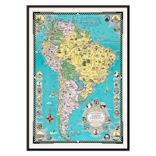
- The good neighbor of South America Poster
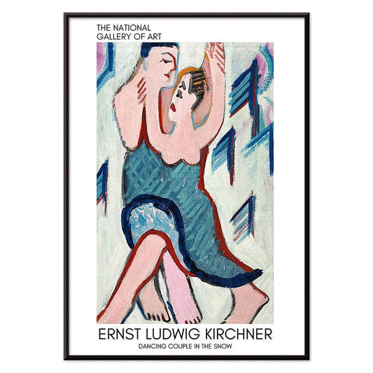
- Dancing couple in the snow Poster
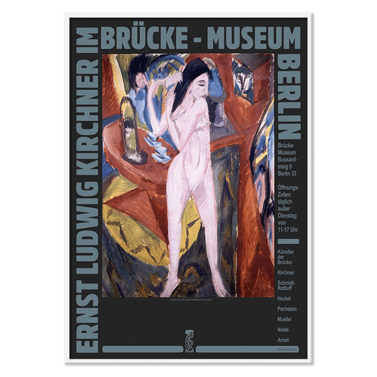
- Ernst Kirchner Exhibition Poster
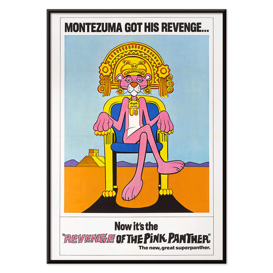
- Revenge of the Pink Panther Poster
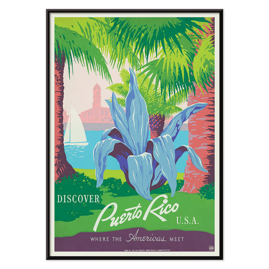
- Visit Puerto Rico Poster
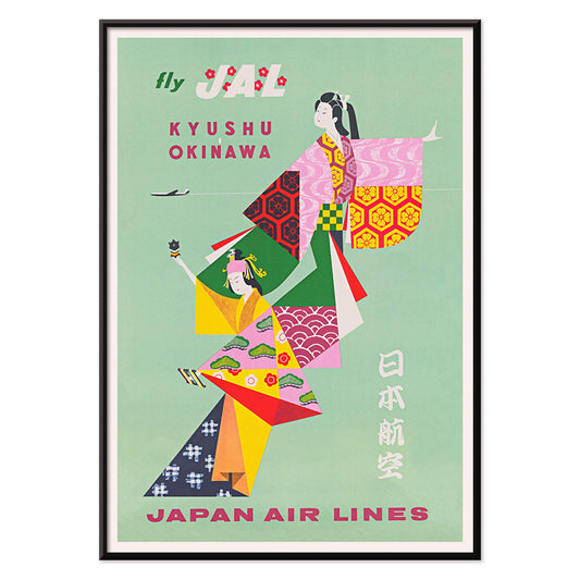
- Kyushu-Okinawa Poster
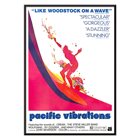
- Pacific Vibrations Poster
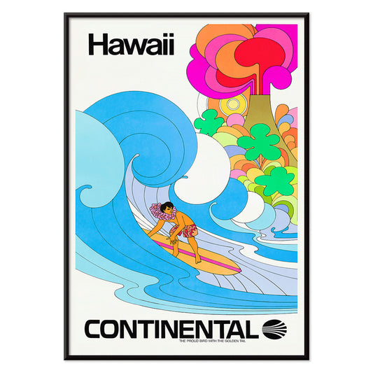
- Continental Hawaii Airline Poster
- Hibiscus Poster
- Swing into books Poster
- Mexican Art & Life 1 Poster
- The Ornamental Arts Of Japan IX Poster
- Le Printemps en France Poster
- Early Autumn in Urayasu Poster
- Morning at Cape Inubō Poster
- Ecchu Umidani Pass Poster
- The New Yorker 2 Poster
- Japanese Art Poster
- Zoologischer Garten Poster
- Circles in a circle Poster
- Heavy Red Poster
- Bleu de Ciel Poster
- The Endless Summer Poster
- Coffea Arabica 3 Poster
- Coffea arabica Poster
- Coffea Arabica 2 Poster
- General Natural History for All Classes PI.048 Poster
- Green Caladium Chantini Poster
- Zoologischer Garten München 2 Poster
- Atlas of the Munsell color system Poster
-
The good neighbor of South America Poster
Ernest Dudley Chase · 1935 · Bright illustrated South America map poster with animals, landmarks, and sea routes
Poster from €9 · Framed from €16
Regular price From €6,00Regular price -
Dancing couple in the snow Poster
Ernst Ludwig Kirchner · 1928 · Expressionist art print of a dancing couple in a vivid snowy landscape
Poster from €9 · Framed from €16
Regular price From €6,00Regular price -
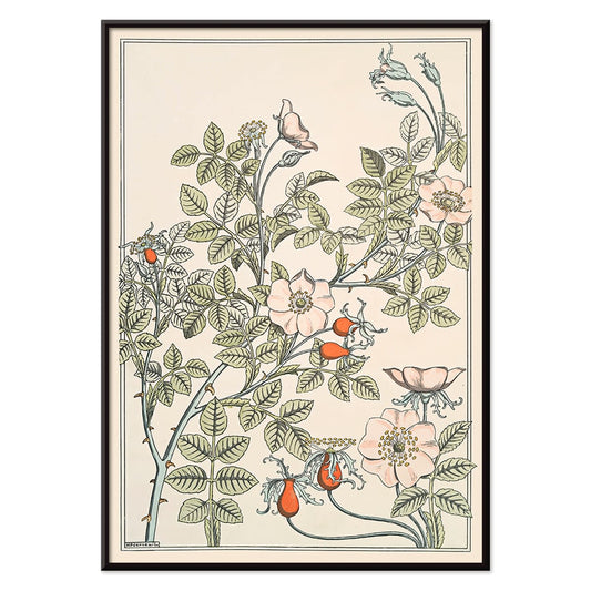
Eglantier Poster
Maurice Pillard Verneuil · 1896 · Graceful wild rose art print with flowing stems, leaves, and delicate blossoms
Poster from €9 · Framed from €16
Regular price From €6,00Regular price -
Ernst Kirchner Exhibition Poster
Ernst Kirchner · 1910 · Expressionist nude exhibition poster with bold black outlines and vivid blue and red
Poster from €9 · Framed from €16
Regular price From €6,00Regular price -
Revenge of the Pink Panther Poster
Unknown artist · 1978 · Playful Pink Panther movie poster with regal throne pose and bold retro colors
Poster from €9 · Framed from €16
Regular price From €6,00Regular price -
Secret Poster
Le Corbusier · 1987 · Enigmatic abstract poster with bold black lines and pink, orange, and blue blocks
Poster from €9 · Framed from €16
Regular price From €6,00Regular price -
Visit Puerto Rico Poster
Unknown artist · 1950 · Mid-century Puerto Rico travel poster featuring a sailboat and historic coastal fort
Poster from €9 · Framed from €16
Regular price From €6,00Regular price -
Kyushu-Okinawa Poster
Unknown artist · 1962 · Vibrant Japanese travel poster featuring traditional figures and bold island-inspired graphic shapes
Poster from €9 · Framed from €16
Regular price From €6,00Regular price -
Pacific Vibrations Poster
Unknown artist · 1970 · Vibrant surfer poster featuring dynamic figures in ocean blue with warm pink and orange accents
Poster from €9 · Framed from €16
Regular price From €6,00Regular price -
Continental Hawaii Airline Poster
Unknown artist · 1960 · Joyful Hawaii surf poster with lei-wearing surfer and psychedelic flower backdrop
Poster from €9 · Framed from €16
Regular price From €6,00Regular price -
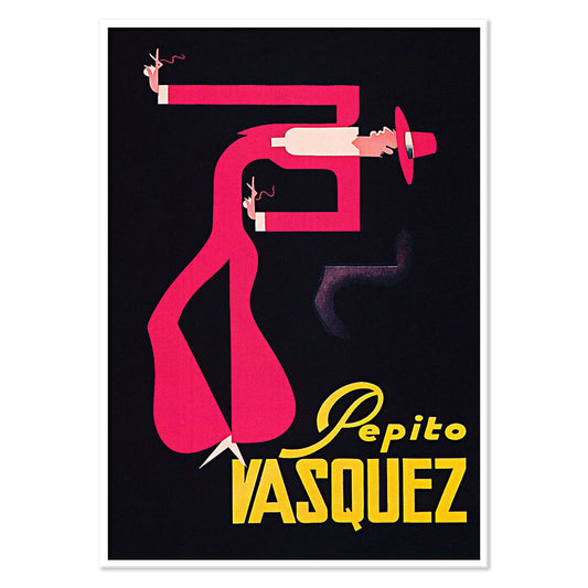
Pepito Vasquez Poster
Tito Livio De Madrazo · 1954 · Dynamic dance poster with an elongated ribbon-like figure on bold black
Poster from €9 · Framed from €16
Regular price From €6,00Regular price -
Hibiscus Poster
Georgia O’Keeffe · 1939 · Luminous hibiscus art print with sensuous close-up petals and calm modernist simplicity
Poster from €9 · Framed from €16
Regular price From €6,00Regular price -
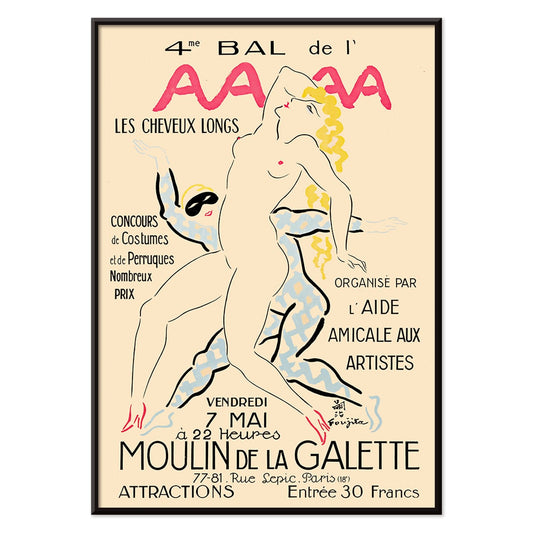
4eme Bal de l'AAAA Poster
Foujita · 1926 · Elegant Montmartre ball poster with crisp linework and soft pink yellow blue accents
Poster from €9 · Framed from €16
Regular price From €6,00Regular price -
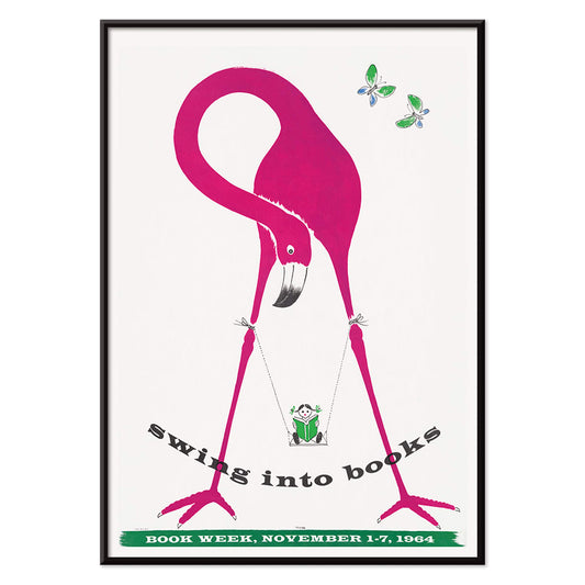
Swing into books Poster
Unknown artist · 1964 · Playful Book Week poster of a reading child swinging from a flamingo
Poster from €9 · Framed from €16
Regular price From €6,00Regular price -
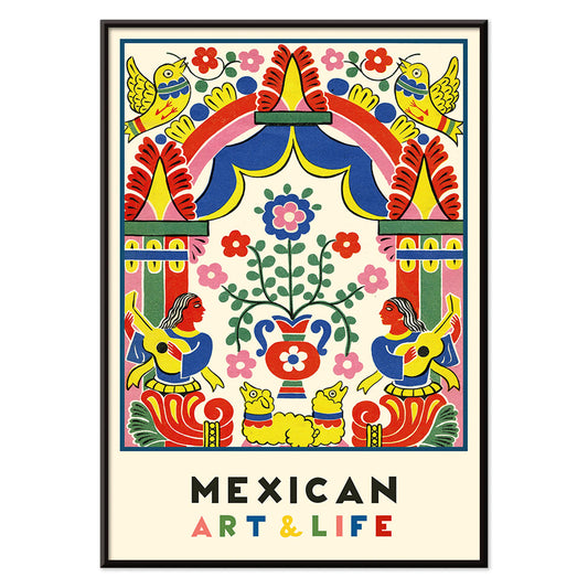
Mexican Art & Life 1 Poster
Unknown artist · 1938 · Vibrant modernist Mexican poster with bold folk-inspired geometry and lively color
Poster from €9 · Framed from €16
Regular price From €6,00Regular price -
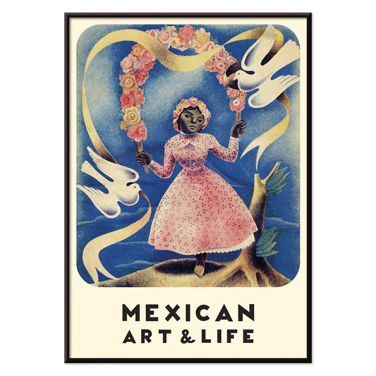
Mexican Art & Life 2 Poster
Unknown artist · 1938 · Vintage magazine poster of a girl in a pink dress holding white doves
Poster from €9 · Framed from €16
Regular price From €6,00Regular price -
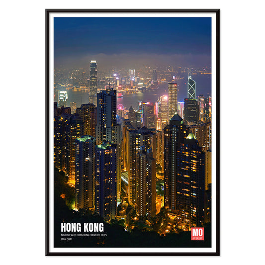
Hong Kong Nightview Poster
Mo Art Gallery · 2023 · Vibrant Hong Kong skyline poster with neon highlights shimmering across a deep blue harbor
Poster from €9 · Framed from €16
Regular price From €6,00Regular price -
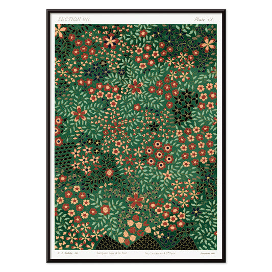
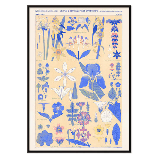
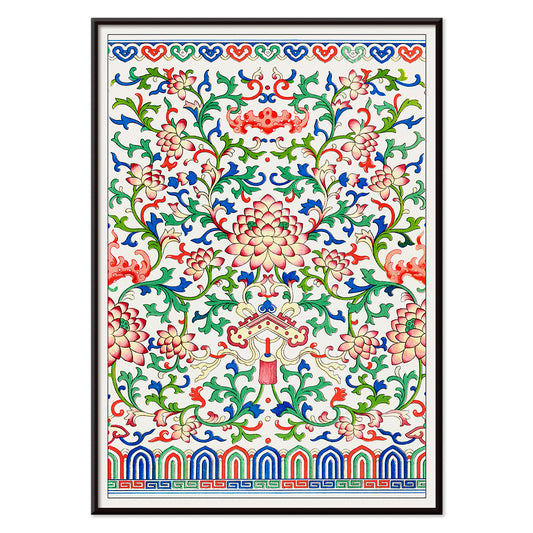
The Ornamental Arts Of Japan IX Poster
G.A. Audsley · 1884 · Refined floral vintage print with stylized blossoms and rhythmic foliage in rich tones
Poster from €9 · Framed from €16
Regular price From €6,00Regular price -
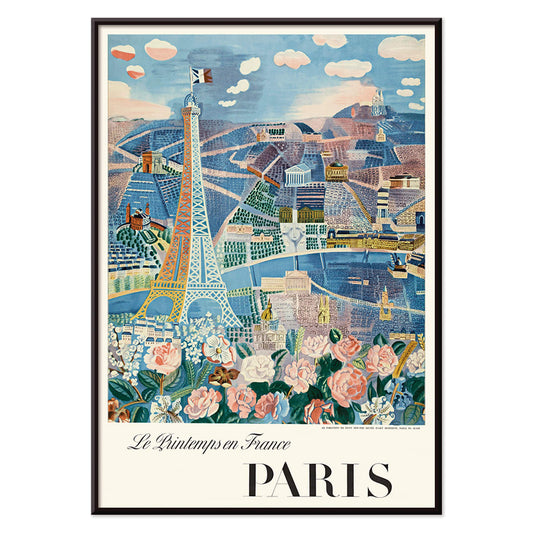
Le Printemps en France Poster
Raoul Dufy · 1925 · Joyful Eiffel Tower poster with airy springtime lines and bright Paris energy
Poster from €9 · Framed from €16
Regular price From €6,00Regular price -
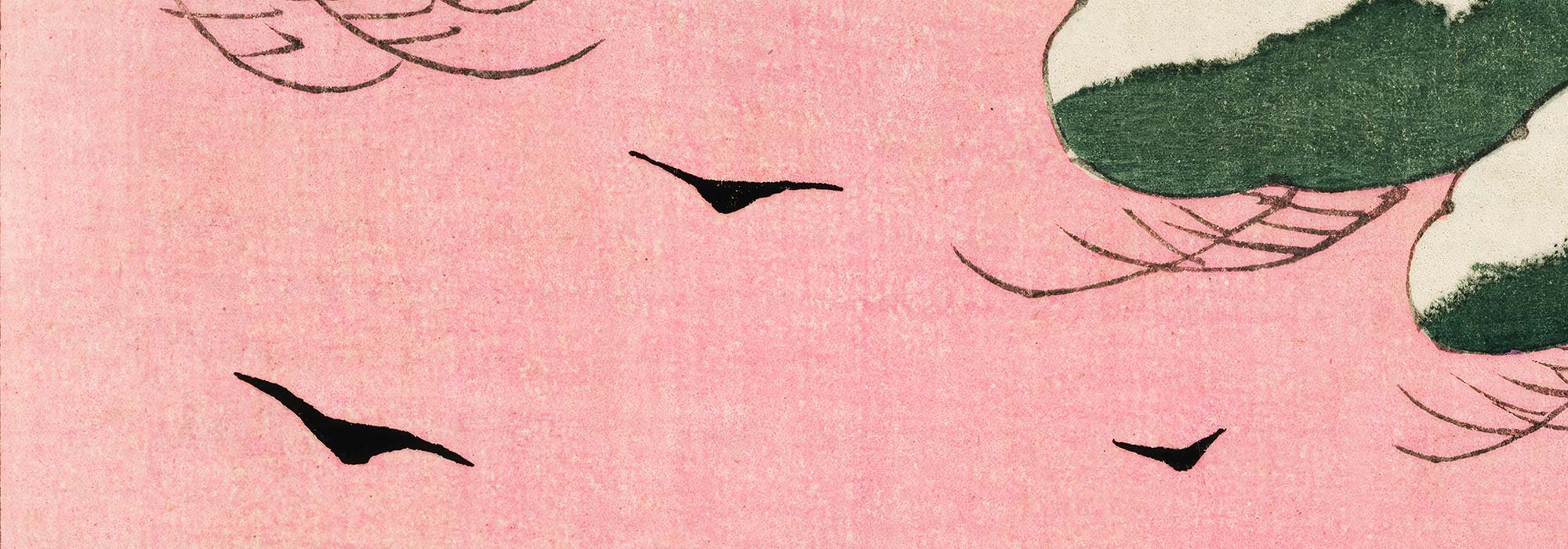
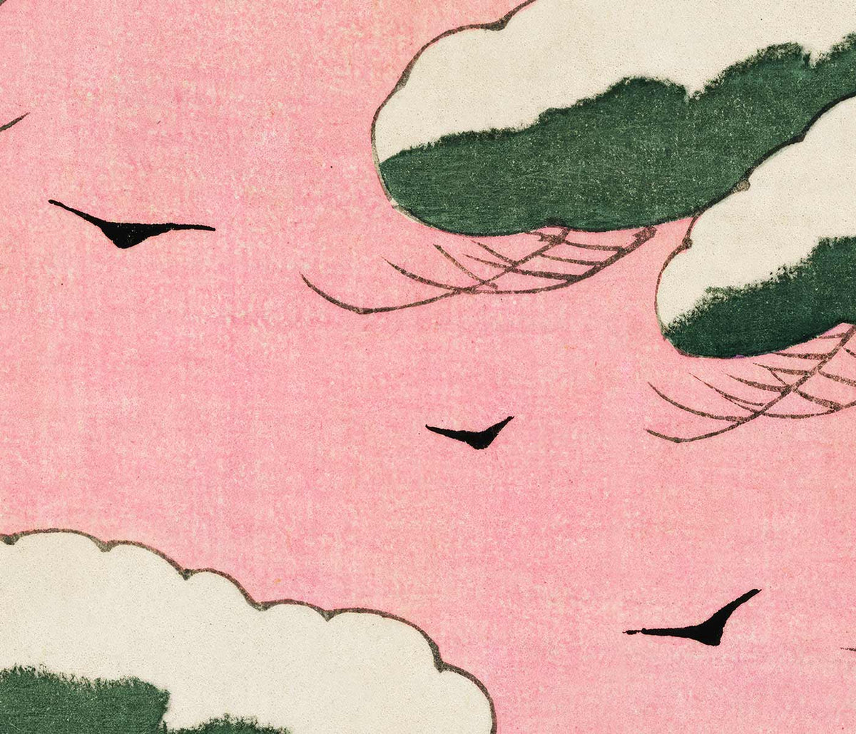
Early Autumn in Urayasu Poster
Kawase Hasui · 1931 · Serene waterfront poster with dusky sky, quiet village silhouettes, and still reflections
Poster from €9 · Framed from €16
Regular price From €6,00Regular price -
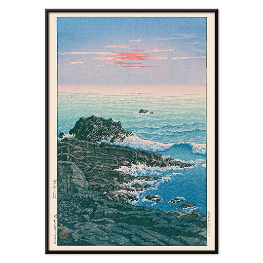
Morning at Cape Inubō Poster
Kawase Hasui · 1931 · Serene ocean poster with dawn sky, foaming waves, and a distant lighthouse
Poster from €9 · Framed from €16
Regular price From €6,00Regular price -
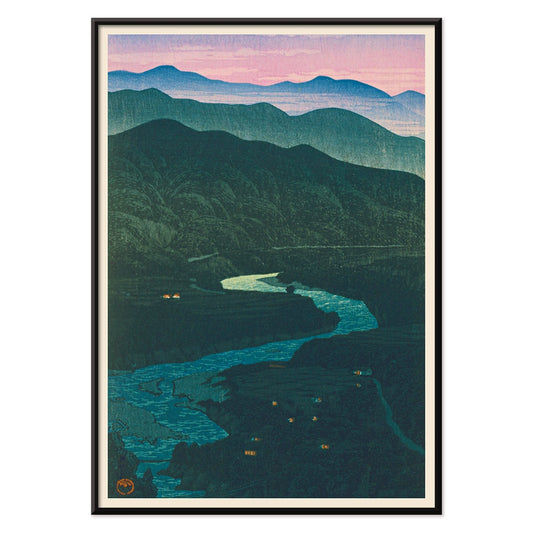
Ecchu Umidani Pass Poster
Kawase Hasui · 1923 · Serene mountain-pass art print with layered blue ridges and a winding path
Poster from €9 · Framed from €16
Regular price From €6,00Regular price -
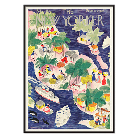
The New Yorker 2 Poster
Roger Duvoisin · 1935 · Whimsical tropical islands poster with playful shoreline details and bright mid-century color blocks
Poster from €9 · Framed from €16
Regular price From €6,00Regular price -
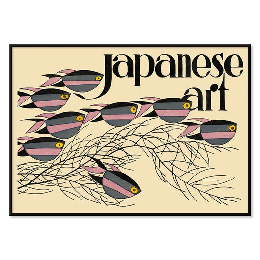
Japanese Art Poster
Julius Klinger · 1927 · Delicate fish and seaweed poster balancing Japanese-inspired linework with calm negative space
Poster from €9 · Framed from €16
Regular price From €6,00Regular price -
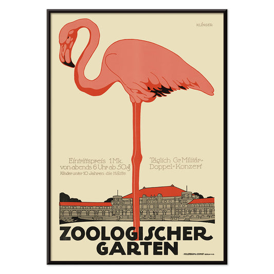
Zoologischer Garten Poster
Julius Klinger · 1910 · Elegant flamingo poster with Art Nouveau lettering and airy architectural framing
Poster from €9 · Framed from €16
Regular price From €6,00Regular price -
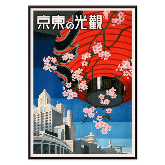
Come to Tokyo Poster
Unknown artist · 1930 · Vibrant Tokyo travel poster with red lantern and cherry blossoms on deep blue
Poster from €9 · Framed from €16
Regular price From €6,00Regular price -
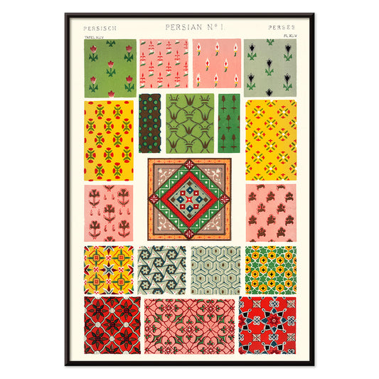
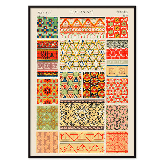
Persian 1 Poster
Owen Jones · 1899 · Ornamental Persian pattern poster with interlaced florals, medallions, and lively jewel tones
Poster from €9 · Framed from €16
Regular price From €6,00Regular price -
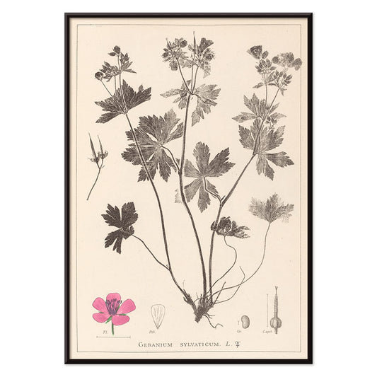
Herbier Français Pl.59 Poster
Antoine Cusin · 1867 · Delicate botanical print of woodland geranium with soft pink blooms and precise linework
Poster from €9 · Framed from €16
Regular price From €6,00Regular price -
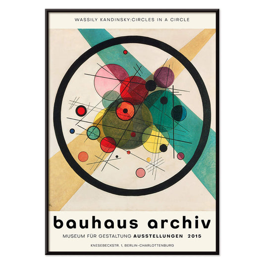
Circles in a circle Poster
Wassily Kandinsky · 1923 · Radiant abstract poster of layered circles floating on a deep black field
Poster from €9 · Framed from €16
Regular price From €6,00Regular price -
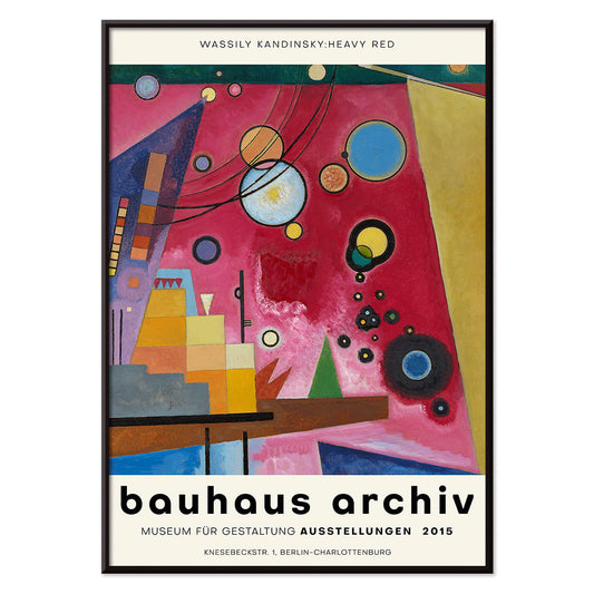
Heavy Red Poster
Wassily Kandinsky · 1924 · Dynamic abstract poster centered on a heavy red block with crisp geometric accents
Poster from €9 · Framed from €16
Regular price From €6,00Regular price -
Blue set of leaves Poster
Owen Jones · 1856 · Ornamental blue leaf botanical print with crisp symmetry and elegant Victorian design
Poster from €9 · Framed from €16
Regular price From €6,00Regular price -
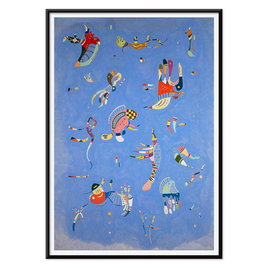
Bleu de Ciel Poster
Wassily Kandinsky · 1925 · Airy abstract art print of floating forms on sky-blue ground with bright accents
Poster from €9 · Framed from €16
Regular price From €6,00Regular price -
Persian 2 Poster
Owen Jones · 1899 · Persian-inspired geometric pattern poster with interlaced motifs in warm red, green, and beige
Poster from €9 · Framed from €16
Regular price From €6,00Regular price -
Pink floral pattern Poster
Owen Jones · 1897 · Decorative floral poster with repeating pink rosettes and stylized leaves in crisp symmetry
Poster from €9 · Framed from €16
Regular price From €6,00Regular price -
Chinese botanical illustration Poster
Owen Jones · 1897 · Decorative Chinese botanical print with stylized blossoms and balanced ornamental symmetry
Poster from €9 · Framed from €16
Regular price From €6,00Regular price -
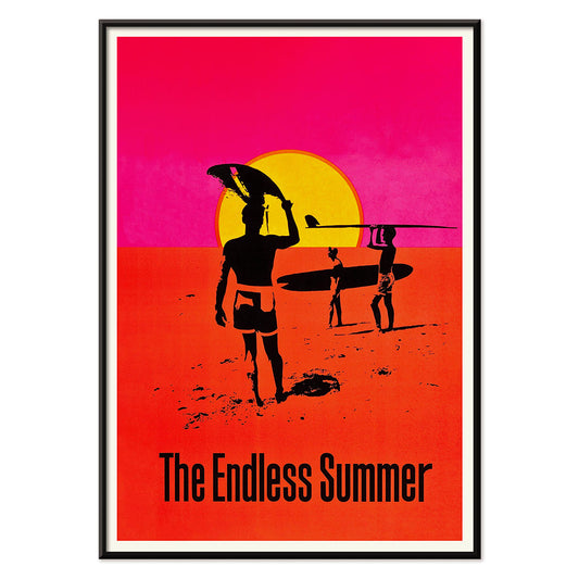
The Endless Summer Poster
Unknown artist · 1966 · Iconic surf poster with black surfer silhouettes crossing a glowing sunset circle
Poster from €9 · Framed from €16
Regular price From €6,00Regular price


- The good neighbor of South America Poster
- Dancing couple in the snow Poster
- Ernst Kirchner Exhibition Poster
- Revenge of the Pink Panther Poster
- Visit Puerto Rico Poster
- Kyushu-Okinawa Poster
- Pacific Vibrations Poster
- Continental Hawaii Airline Poster
- Hibiscus Poster
- Swing into books Poster
- Mexican Art & Life 1 Poster
- The Ornamental Arts Of Japan IX Poster
- Le Printemps en France Poster
- Early Autumn in Urayasu Poster
- Morning at Cape Inubō Poster
- Ecchu Umidani Pass Poster
- The New Yorker 2 Poster
- Japanese Art Poster
- Zoologischer Garten Poster
- Circles in a circle Poster
- Heavy Red Poster
- Bleu de Ciel Poster
- The Endless Summer Poster
Pink as an Accent, Not a Theme
In vintage poster culture, pink is rarely a single-note blush; it often arrives as a tint in skies, paper stock, petals, and lithographic ink. This collection gathers posters, prints, and wall art where rose, salmon, or fuchsia works like punctuation, warming a composition rather than dominating it. You will notice pink drifting through botanical illustration, modern geometry, and coastal light, where the colour reads as atmosphere or weather instead of sweetness. Because many of these images were made for books, exhibitions, or the street, their pinks feel like working ink and aged pigment, not a cosmetic overlay. For adjacent moods, the Abstract and Landscape collections extend the same quiet logic of colour and space.
From Belle Époque Lithography to Modernist Ink
Late nineteenth-century advertising and early twentieth-century modernism both used pink to seize attention, but with different tools. In Alphonse Mucha’s Job (1897), warm tones glow through ornamental line, giving commercial imagery the cadence of a salon poster. Decades later, Wassily Kandinsky’s Circles in a circle – Bauhaus exhibition (1923) uses pink as a counterpoint to black and teal, energising a disciplined field of forms. For a painterly bridge between the two, Henri-Edmond Cross’s The Pink Cloud (1896) breaks light into pointillist touches, showing how softness can be built from structure and repetition. If you want to trace those lineages further, Alphonse Mucha and Bauhaus give useful historical context.
Where Pink Works in Interiors
As home decor, pink-led decoration works best when it answers something already present: terracotta tile, oak, walnut, brass, or a striped textile. Kitchens and dining corners handle rosy botanicals particularly well, since the subject matter echoes ceramics and linen; pair this selection with Kitchen and Botanical. In calmer rooms, let pink sit beside graphite and cream by mixing in Black & White prints to keep contrast crisp. If your walls run cool grey, choose pieces where pink leans coral or violet rather than baby pastel; the hue will read as warmth against mineral tones. For a more illustrative, specimen-like approach to colour, the Animals collection often uses pink as anatomical signal rather than decoration.
Curating, Pairing, and Framing
Curate by temperature and subject. A travel or advertising poster with a hot pink accent can lift a quiet corridor; placing it near typography-forward work from Advertising keeps the rhythm graphic. For a softer narrative, Kawase Hasui’s Early Autumn in Urayasu (1931) sets pink into dusk light, especially convincing with pale wood or ash frames and an off-white mat. Natural history brings a strong silhouette: John James Audubon’s Pink Flamingo from Birds of America (1827) reads almost fashion-like when hung near blue glass, and it pairs cleanly with ocean hues from Sea & Ocean. To anchor a wall, introduce cartographic structure from Maps, letting pink appear as the surprise highlight rather than the headline.
A Colour That Behaves Like Light
What unites these vintage pieces is not a single palette, but the way pink behaves: sometimes opaque ink, sometimes a translucent wash, sometimes a paper-aged bloom. As wall art, it acts like light passing through a room, drawing attention to line, pattern, and negative space. Black lacquer frames push pink toward drama; pale timber keeps it airy, closer to pigment and paper.