


-
Redlands bicycle classic Poster
Karlis Smiltens · 1991 · Dynamic cycling poster with bold red, blue, and green racers in motion
Poster from €9 · Framed from €16
Regular price From €6,00Regular price -
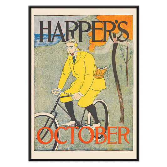
Harper for October Poster
Edward Penfield · 1894 · Autumn cyclist poster featuring bold flat colors and hand-lettered Harper's Magazine text
Poster from €9 · Framed from €16
Regular price From €6,00Regular price -
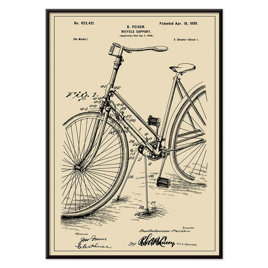
Bicycle-support Patent Poster
B. Peisen · 1899 · Detailed bicycle support vintage print with crisp patent diagrams and neat annotation
Poster from €9 · Framed from €16
Regular price From €6,00Regular price -
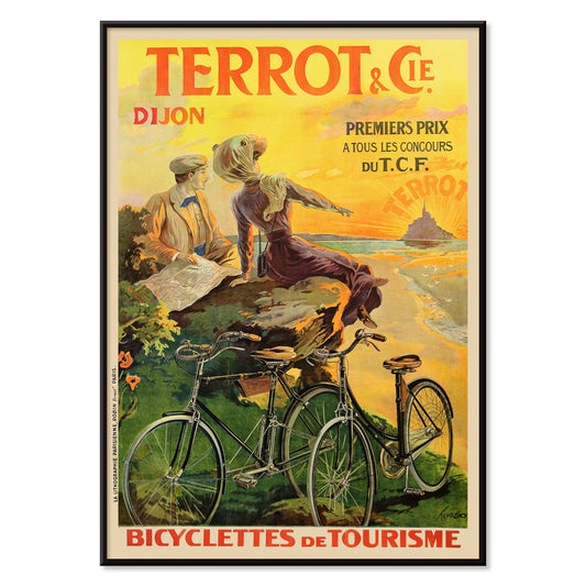
Cycles Terrot Dijon 2 Poster
Nicolas Tamagno · 1900 · Classic French bicycle poster showing a touring cyclist beneath a radiant sunset
Poster from €9 · Framed from €16
Regular price From €6,00Regular price -
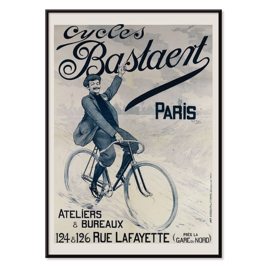
Cycles Bastaent Paris Poster
Charles Tichon · 1895 · Energetic cycling poster with bold Belle Epoque lettering and vivid blue atmosphere
Poster from €9 · Framed from €16
Regular price From €6,00Regular price -
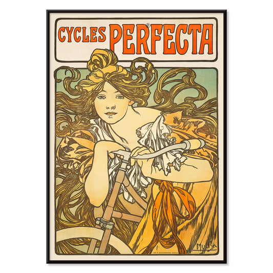
Cycles Perfecta Poster
Alphonse Mucha · 1897 · Art Nouveau bicycle poster with radiant muse, floral halo, and ornate lettering
Poster from €9 · Framed from €16
Regular price From €6,00Regular price -
Cycles Guyot Poster
Unknown artist · 1920 · Striking cycling poster with a yellow-clad rider and bold black typography
Poster from €9 · Framed from €16
Regular price From €6,00Regular price -
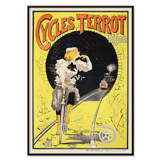
Cycles Terrot Dijon Poster
Unknown artist · 1900 · Dramatic French cycling poster showing a rider racing past a tunnel and train
Poster from €9 · Framed from €16
Regular price From €6,00Regular price -
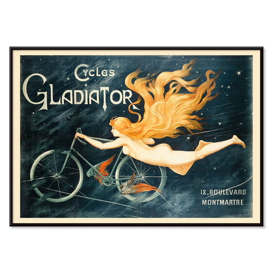
Cycles Gladiator Poster
C.B. · 1895 · Daring Art Nouveau bicycle poster featuring a triumphant rider and bold Cycles Gladiator lettering
Poster from €9 · Framed from €16
Regular price From €6,00Regular price -
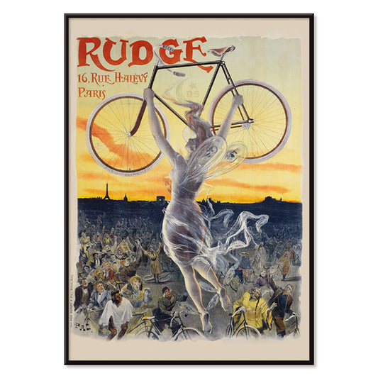
Rudge Poster
Jean de Paleologue · 1898 · Art Nouveau bicycle poster with winged muse lifting a gleaming cycle above crowds
Poster from €9 · Framed from €16
Regular price From €6,00Regular price -
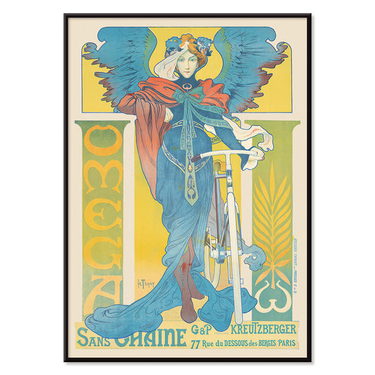
Omega Poster
Henri Thiriet · 1897 · Art Nouveau bicycle poster featuring a winged woman against bold blue tones
Poster from €9 · Framed from €16
Regular price From €6,00Regular price -
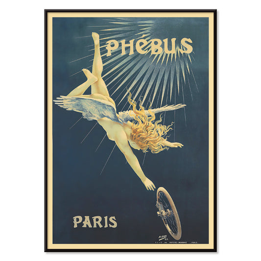
Phébus Poster
Henri Boulanger Gray · 1898 · Mythic winged figure and bicycle wheel in a luminous Art Nouveau poster
Poster from €9 · Framed from €16
Regular price From €6,00Regular price -
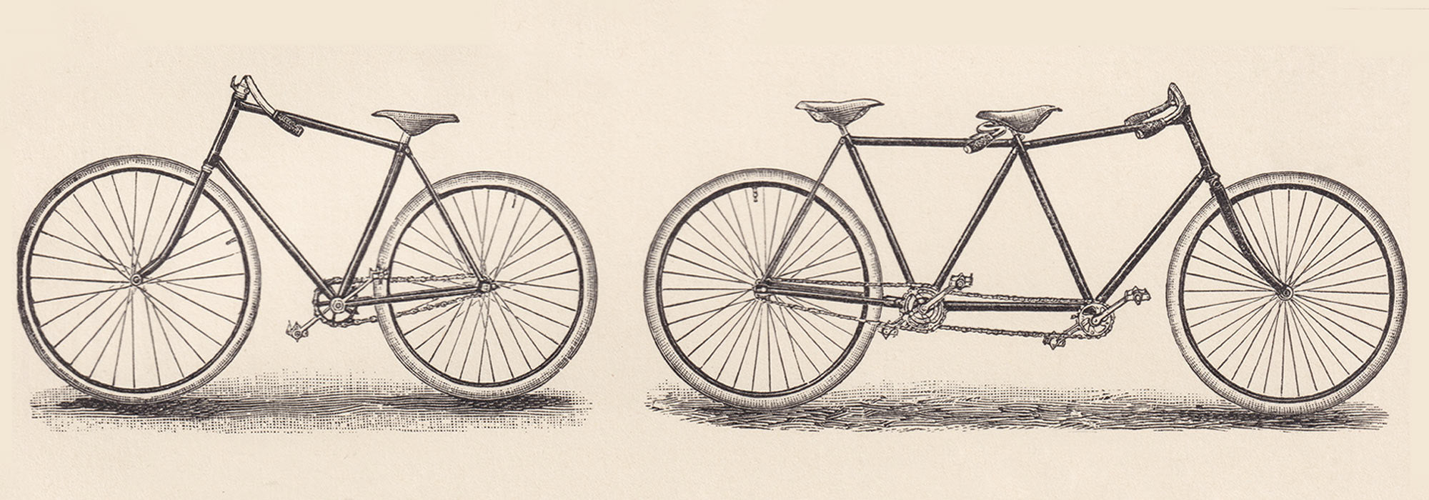
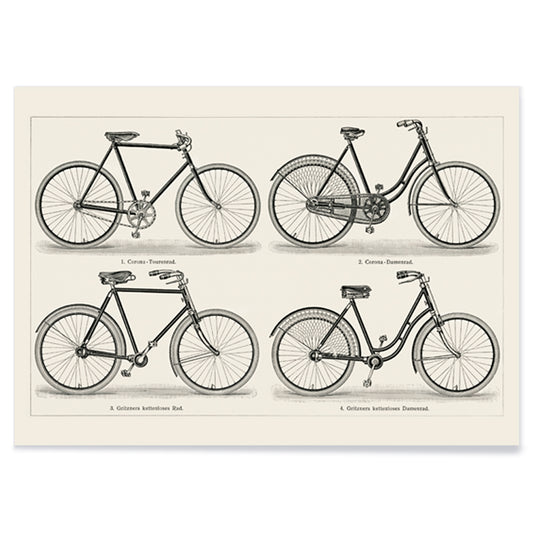
Fahrrader 1 Poster
Meyers Konversations Lexikon · 1894 · Detailed bicycle vintage print presenting late 19th century frame designs in crisp black linework
Poster from €9 · Framed from €16
Regular price From €6,00Regular price -
Bicycle patent Poster
Charles D. Rice · 1896 · Detailed bicycle patent print featuring technical diagrams in crisp black on beige
Poster from €9 · Framed from €16
Regular price From €6,00Regular price -
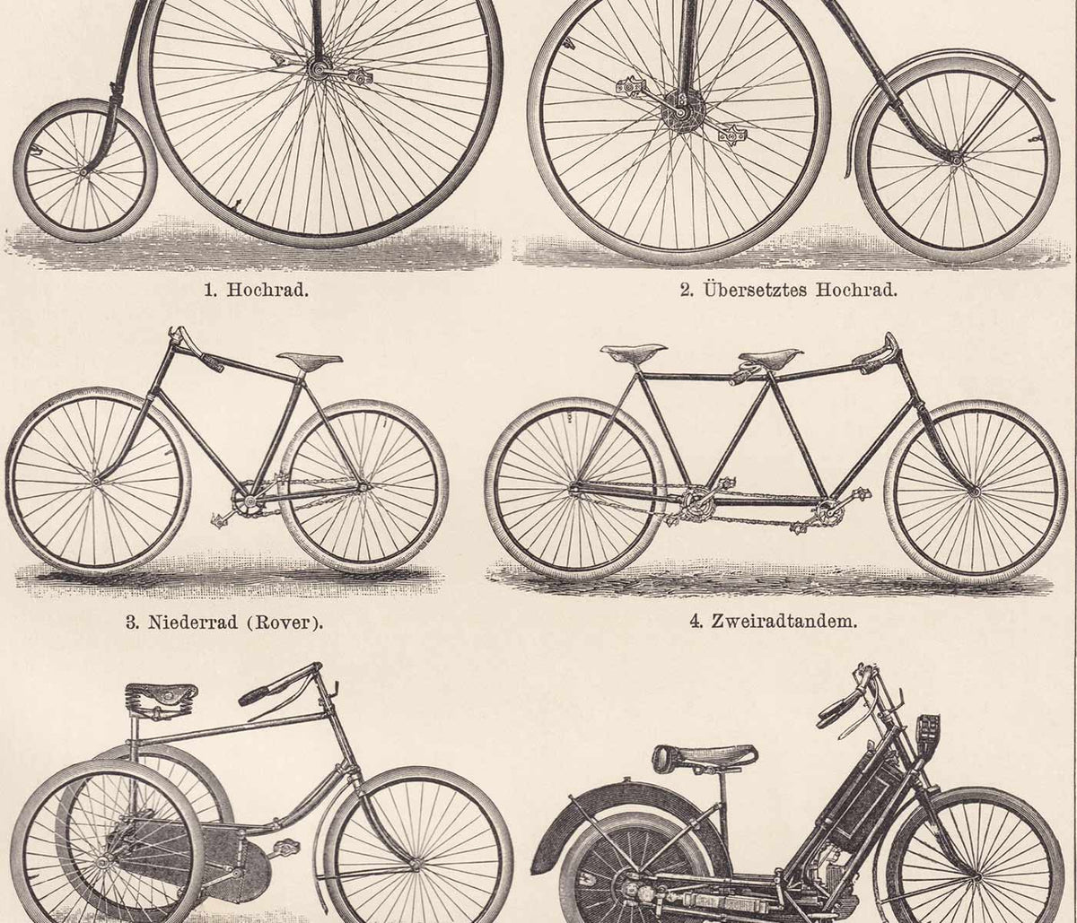
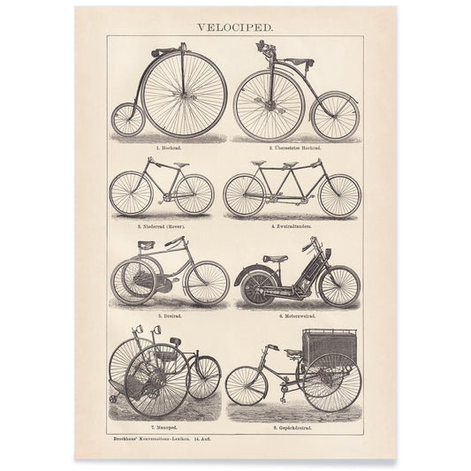
Vintage Bikes Poster
Józef Mehoffer · 1913 · Encyclopedic bicycle poster with crisp black line drawings on warm beige paper
Poster from €9 · Framed from €16
Regular price From €6,00Regular price -
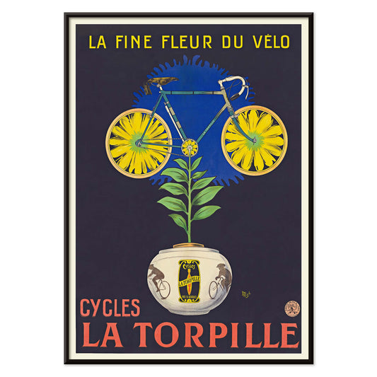
Cycles La Torpille Poster
Michel Liebeaux · 1923 · A bicycle poster with floral wit and strong Art Deco color
Poster from €9 · Framed from €16
Regular price From €6,00Regular price -
Royal-Fabric bicycle Poster
Michel Liebeaux · 1922 · Vintage bicycle poster with a climbing rider and Royal-Fabric lettering
Poster from €9 · Framed from €16
Regular price From €6,00Regular price -
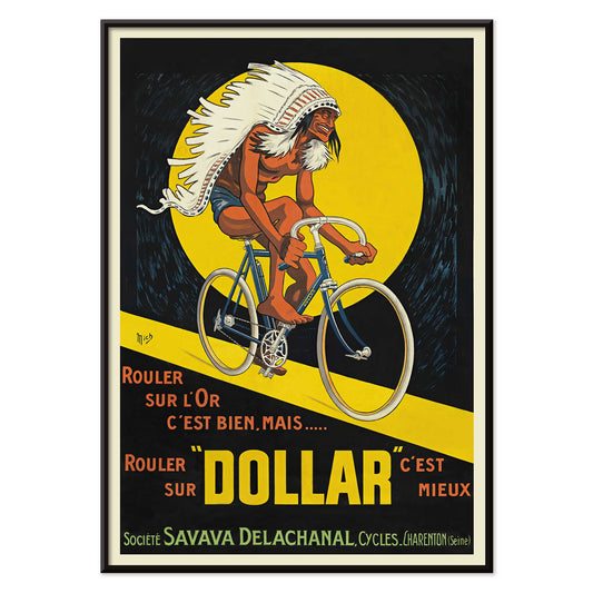
Dollar bicycles Poster
Michel Liebeaux · 1922 · Bold poster with a cyclist racing through a glowing yellow circle
Poster from €9 · Framed from €16
Regular price From €6,00Regular price -
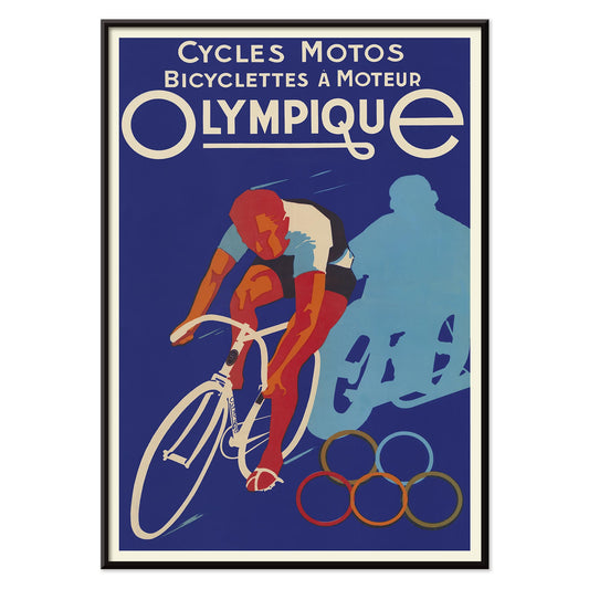
Cycles olympique Poster
Affiches Gaillard · 1931 · Vintage poster with a racing cyclist and Olympic rings
Poster from €9 · Framed from €16
Regular price From €6,00Regular price -
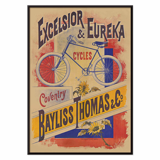
Excelsior and Eureka cycles Poster
Bayliss Thomas & Co · 1895 · Vintage poster with a blue bicycle and bold Victorian lettering
Poster from €9 · Framed from €16
Regular price From €6,00Regular price


The Belle Époque on two wheels
When the bicycle became widely available in the late nineteenth century, it quickly turned into a symbol of speed, leisure, and a new kind of urban freedom. Designers treated the machine as a motif made for posters: circles that repeat, diagonals that lean forward, and riders whose posture suggests momentum even on paper. In France and beyond, the cycling craze coincided with a boom in street advertising, so the vintage poster became both announcement and atmosphere. These works hold the soundscape of their moment: café façades, velodrome crowds, and the bright shock of ink on stone.
Lithography, persuasion, and modern identity
Many of the most memorable bicycle prints were made with color lithography, a process that rewarded flat tones, confident outlines, and theatrical composition. In Alphonse Mucha’s Cycles Perfecta (1897), the rider reads as an emblem of taste, framed by decorative borders and Art Nouveau rhythm rather than pure sport. Jean de Paleologue’s Rudge (1898) turns the street into a stage, with faces and signage forming a patterned backdrop that supports the central figure. Allegory also entered the sales pitch: Phébus (ca. 1898) by Henri Boulanger Gray borrows wings and sunlight to suggest that technology could feel mythic. Together, these images show how advertising folded glamour, gender, and aspiration into one readable surface, using typography as a design element rather than a caption.
Placing bicycle wall art at home
Bicycle wall art tends to suit transitional spaces where a sense of motion feels natural: entryways, stair landings, corridors, or above a narrow console. Warm plaster, stone, or linen textures flatter the creamy paper tones common in vintage prints, while a repeat of red, ochre, or butter yellow can be echoed in a rug stripe or book spine. To emphasize the commercial lineage, pair cycling imagery with the graphic wit of Advertising posters; for ornamental line and figure, connect it to Alphonse Mucha. If you prefer a pared-back room, technical bike diagrams can bridge into Minimalist interiors, where negative space lets the mechanism read cleanly and the typography becomes quietly architectural.
Curating a gallery wall: figure, diagram, and type
A strong gallery wall benefits from alternation: one lyrical figure poster, then a schematic, then a typographic-heavy advert, so the eye moves the way a bicycle wheel rotates. The Bicycle patent by C. D. Rice offers crisp geometry and annotation, and it pairs especially well with the restrained contrast of Black & White prints. For narrative warmth and travel-minded color, add Terrot And Cie. Dijon Bicyclettes De Tourisme (1900), where touring is sold as fresh air and companionship. Keep margins visible so the compositions can breathe, and consider a quiet profile from Classic Frame; consistent framing helps diverse posters read as one sequence rather than a collage.
The sensation these posters preserve
Beyond branding, bicycle posters record changing ideas about the body in public life: lighter, faster, self-directed. Their best visual tricks are simple ones, still effective as decoration today: forward-leaning diagonals, repeated circles, and lettering that feels like it is in motion. For context across other themes and eras, All Posters is a useful cross-section of how the vintage print evolved alongside modern design.