


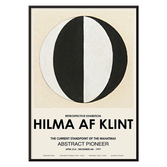
- The Current Standpoint of the Mahatmas Poster
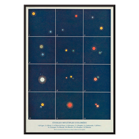
- Etoiles multiples colorées Poster
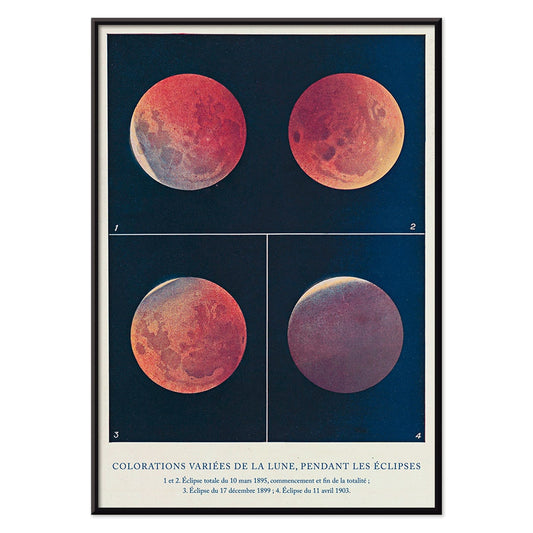
- Colorations variées de la Lune Poster
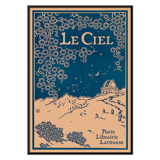
- Le Ciel Poster
- Tarot - The Moon 2 Poster
- Tarot - The World Poster
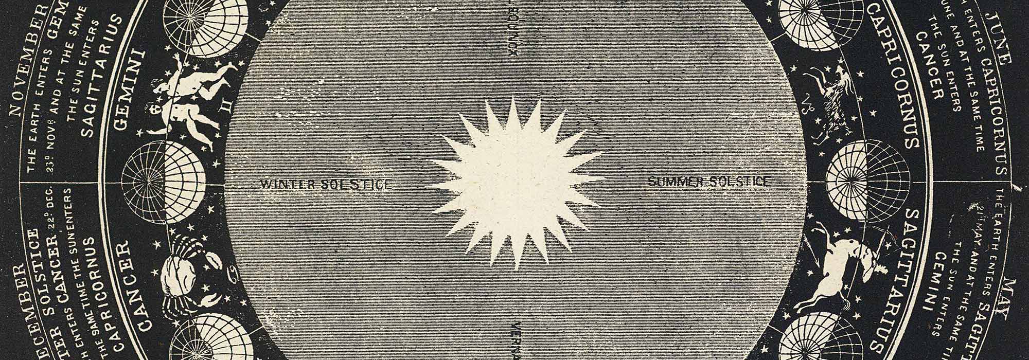
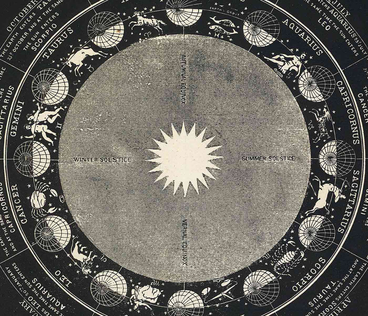
- Signs of the Zodiac Poster
- Tarot: The Moon Poster
- Tarot: The Fool Poster
- Tarot: The Sun Poster
- Tarot: The Star Poster
- Tarot: The Magician Poster
- Brahma Poster
- Matsyavatara Poster
- Palm reading Poster
- Libra Poster
- Scorpius Poster
- Aries Poster
- Virgo Poster
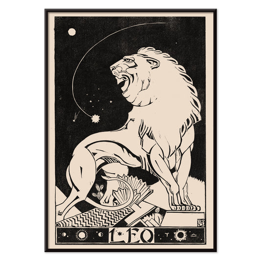
- Leo Poster
- Aquarius Poster
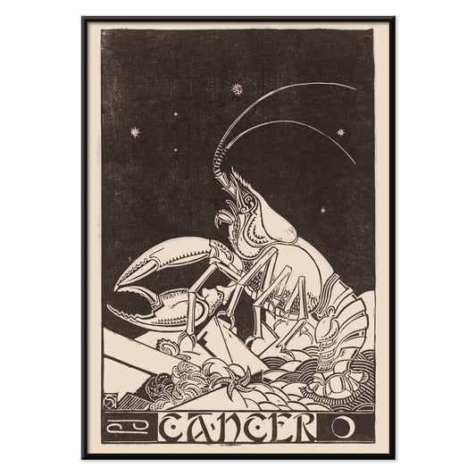
- Cancer Poster
- Gemini Poster
- Capricornus Poster
- Pisces Poster
- Sagittarius Poster
- Diagram no.4 Poster
- Diagram no.3 Poster
- Diagram no.6 Poster
- Diagram no.5 Poster
-
The Current Standpoint of the Mahatmas Poster
Hilma Af Klint · 1920 · Geometric art print featuring circles and triangles in bold black and white symmetry
Poster from €9 · Framed from €16
Regular price From €6,00Regular price -
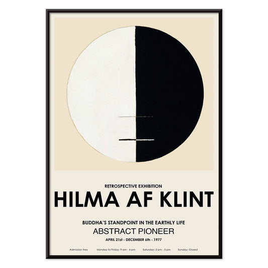
Buddha's Standpoint in the Earthly Life Poster
Hilma af Klint · 1917 · Meditative abstract art print centering Buddhist symbolism in a calm circular diagram
Poster from €9 · Framed from €16
Regular price From €6,00Regular price -
Etoiles multiples colorées Poster
Alphonse Berget · 1925 · Educational astronomy poster mapping multiple star systems in crisp blue with bright star points
Poster from €9 · Framed from €16
Regular price From €6,00Regular price -
Colorations variées de la Lune Poster
Alphonse Berget · 1925 · Chartlike lunar eclipse scientific print showing moons shifting from white to copper red
Poster from €9 · Framed from €16
Regular price From €6,00Regular price -
Le Ciel Poster
Alphonse Berget · 1925 · Art Nouveau astronomy poster featuring a deep blue sky with celestial diagrams
Poster from €9 · Framed from €16
Regular price From €6,00Regular price -
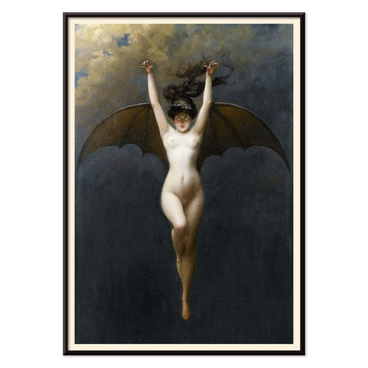
The Bat-Woman Poster
Albert Joseph Pénot · 1890 · Dramatic winged nude art print with batlike cloak and intense chiaroscuro
Poster from €9 · Framed from €16
Regular price From €6,00Regular price -
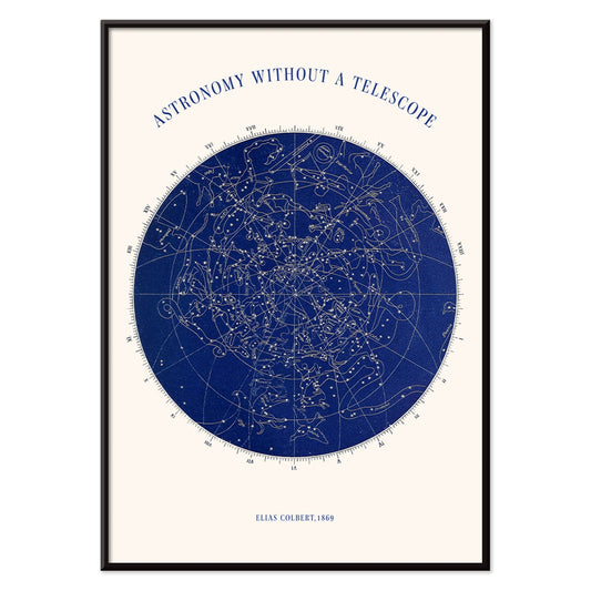
Astronomy without a telescope Poster
Elias Colbert · 1869 · Detailed celestial chart poster mapping constellations for stargazing without instruments
Poster from €9 · Framed from €16
Regular price From €6,00Regular price -
Tarot - The Moon 2 Poster
Rider Waite · 1910 · Mystical Moon tarot poster with twin canines, winding path, and dreamlike night palette
Poster from €9 · Framed from €16
Regular price From €6,00Regular price -
Tarot - The Lovers Poster
Rider Waite · 1910 · Iconic tarot vintage print of an angel blessing lovers beneath symbolic trees
Poster from €9 · Framed from €16
Regular price From €6,00Regular price -
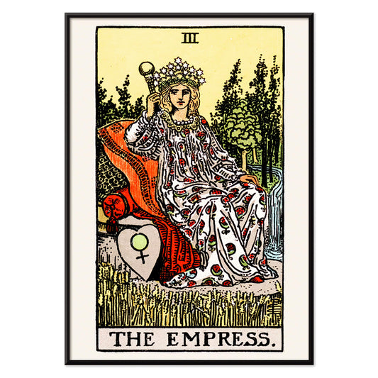
Tarot - The Empress Poster
Rider Waite · 1910 · Symbolic Empress tarot poster with starry crown, wheat field, and Venus shield
Poster from €9 · Framed from €16
Regular price From €6,00Regular price -
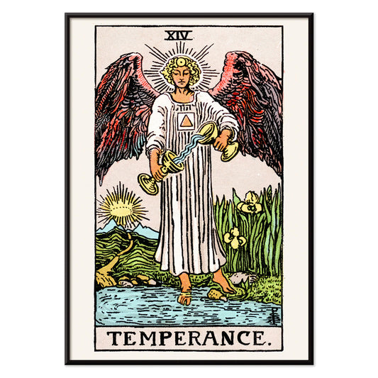
Tarot - Temperance Poster
Rider Waite · 1910 · Iconic Temperance tarot poster featuring an angel pouring water between two cups
Poster from €9 · Framed from €16
Regular price From €6,00Regular price -
Tarot - The Hanged Man Poster
Rider Waite · 1910 · Symbolic Hanged Man tarot poster with calm blue sky and radiant halo
Poster from €9 · Framed from €16
Regular price From €6,00Regular price -
Tarot - The Wheel Of Fortune Poster
Rider Waite · 1910 · Mystical Wheel of Fortune poster featuring a golden wheel, sphinx, and winged corner figures
Poster from €9 · Framed from €16
Regular price From €6,00Regular price -
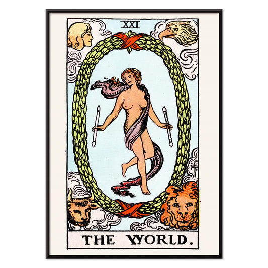
Tarot - The World Poster
Rider Waite · 1910 · Mystical tarot poster with dancing figure inside laurel wreath and four guardians
Poster from €9 · Framed from €16
Regular price From €6,00Regular price -
Tarot - Judgement Poster
Rider Waite · 1910 · Iconic Judgement tarot poster with angel trumpet and figures rising above blue water
Poster from €9 · Framed from €16
Regular price From €6,00Regular price -
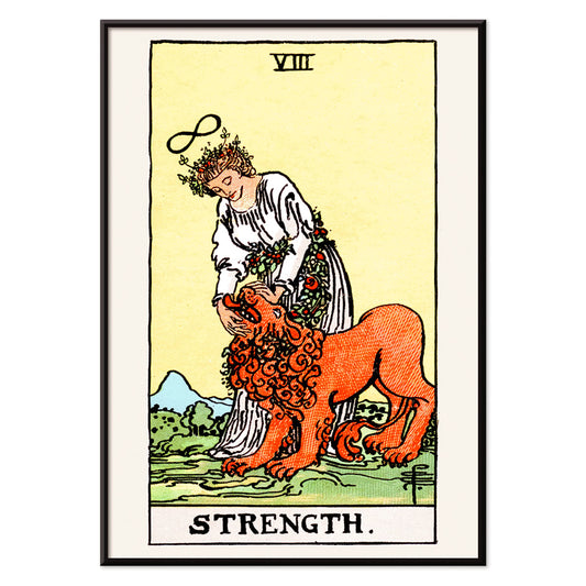
Tarot - Strength Poster
Rider Waite · 1910 · Symbolic Strength tarot poster featuring a calm maiden and lion beneath an infinity sign
Poster from €9 · Framed from €16
Regular price From €6,00Regular price -
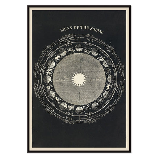
Signs of the Zodiac Poster
Asa Smith · 1850 · Detailed zodiac chart print pairing constellation emblems with crisp Victorian linework
Poster from €9 · Framed from €16
Regular price From €6,00Regular price -
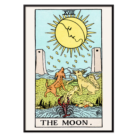
Tarot: The Moon Poster
Lauron William de Laurence · 1918 · Mystical Moon tarot poster with howling dogs, twin towers, and a winding path
Poster from €9 · Framed from €16
Regular price From €6,00Regular price -
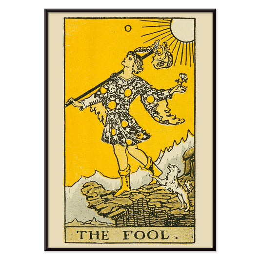
Tarot: The Fool Poster
Lauron William de Laurence · 1918 · Bright Fool tarot poster with bold outlines, sunny yellow ground, and loyal dog
Poster from €9 · Framed from €16
Regular price From €6,00Regular price -
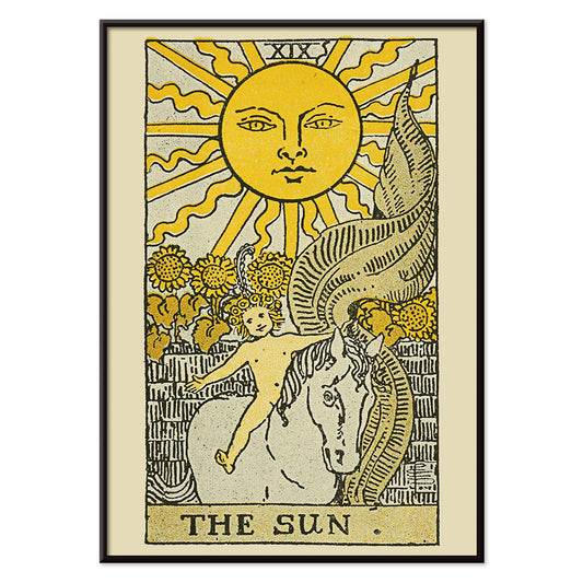
Tarot: The Sun Poster
Lauron William de Laurence · 1918 · Radiant Sun tarot poster with child on white horse beneath a beaming sun
Poster from €9 · Framed from €16
Regular price From €6,00Regular price -
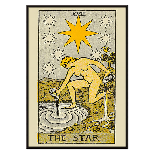
Tarot: The Star Poster
Lauron William de Laurence · 1918 · Symbolic tarot poster featuring a kneeling figure pouring water under bright stars
Poster from €9 · Framed from €16
Regular price From €6,00Regular price -
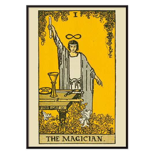
Tarot: The Magician Poster
Lauron William de Laurence · 1918 · Iconic Magician tarot poster with raised wand, symbolic table tools, and golden backdrop
Poster from €9 · Framed from €16
Regular price From €6,00Regular price -
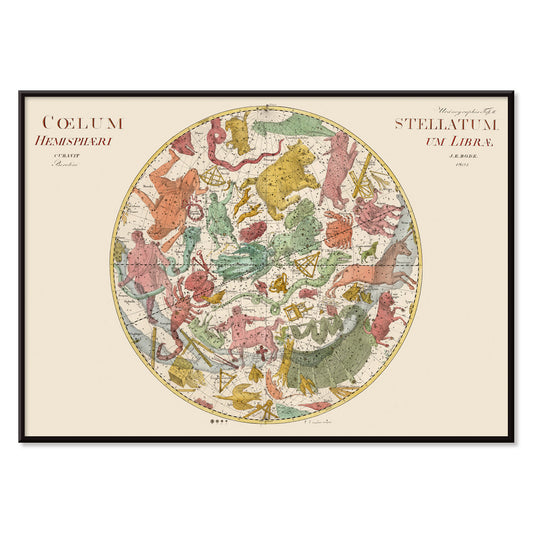
Coelum Stellatum Hemisphaerium Librae Poster
Johann Elert Bode · 1801 · Antique celestial map print centered on Libra with finely labeled stars and figures
Poster from €9 · Framed from €16
Regular price From €6,00Regular price -
Coelum Stellatum Hemisphaerium Arietis Poster
Johann Elert Bode · 1801 · Detailed celestial vintage print showing the Aries hemisphere with constellation figures and star grid
Poster from €9 · Framed from €16
Regular price From €6,00Regular price -
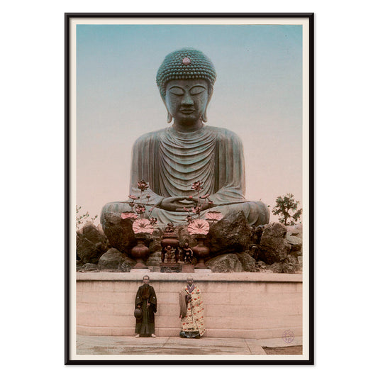
Large Buddha Poster
Kinbei Kusakabe · 1890 · Hand-tinted Buddha photograph print featuring a monumental statue in serene mineral tones
Poster from €9 · Framed from €16
Regular price From €6,00Regular price -
Brahma Poster
Jean-Jacques Chabrélie · 1840 · Vintage print of Brahma seated on a lotus with four faces and vibrant accents
Poster from €9 · Framed from €16
Regular price From €6,00Regular price -
Matsyavatara Poster
Jean-Jacques Chabrélie · 1840 · Mythic Matsyavatara poster with radiant blues and golden accents in a devotional composition
Poster from €9 · Framed from €16
Regular price From €6,00Regular price -
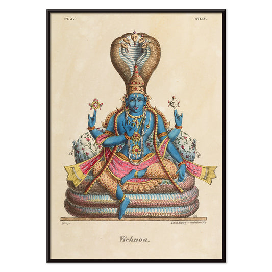
Vishnou Poster
Jean-Jacques Chabrélie · 1840 · Serene Vishnu poster with mythic throne scene and harmonious decorative details
Poster from €9 · Framed from €16
Regular price From €6,00Regular price -
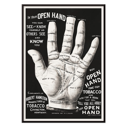
Palm reading Poster
Unknown artist · 2015 · Vintage-inspired palmistry poster featuring an open hand diagrammed with intricate black lines
Poster from €9 · Framed from €16
Regular price From €6,00Regular price -
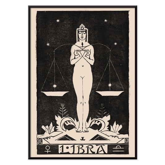
Libra Poster
Henri van der Stok · 1900 · Elegant Libra poster featuring a poised female figure with balanced scales in black and cream
Poster from €9 · Framed from €16
Regular price From €6,00Regular price -
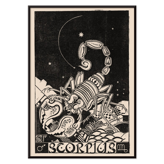
Scorpius Poster
Henri van der Stok · 1900 · Vintage zodiac poster of Scorpius rendered in crisp black linework
Poster from €9 · Framed from €16
Regular price From €6,00Regular price -
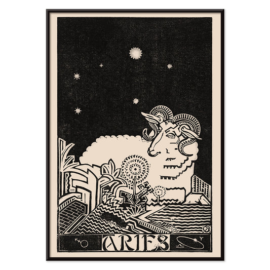
Aries Poster
Henri van der Stok · 1900 · Graphic Aries zodiac poster with bold ram silhouette and starry celestial backdrop
Poster from €9 · Framed from €16
Regular price From €6,00Regular price -
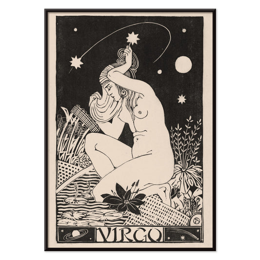
Virgo Poster
Henri van der Stok · 1900 · Art Nouveau Virgo poster with a poised maiden framed by ornate zodiac motifs
Poster from €9 · Framed from €16
Regular price From €6,00Regular price -
Leo Poster
Henri van der Stok · 1900 · High-contrast Leo zodiac poster with a roaring lion drawn in bold black lines
Poster from €9 · Framed from €16
Regular price From €6,00Regular price -
Aquarius Poster
Henri van der Stok · 1913 · Stylized Aquarius poster featuring the water bearer in graphic black on beige
Poster from €9 · Framed from €16
Regular price From €6,00Regular price -
Cancer Poster
Henri van der Stok · 1913 · Dreamlike Cancer crab poster set beneath stars in elegant black on beige
Poster from €9 · Framed from €16
Regular price From €6,00Regular price


- The Current Standpoint of the Mahatmas Poster
- Etoiles multiples colorées Poster
- Colorations variées de la Lune Poster
- Le Ciel Poster
- Tarot - The Moon 2 Poster
- Tarot - The World Poster
- Signs of the Zodiac Poster
- Tarot: The Moon Poster
- Tarot: The Fool Poster
- Tarot: The Sun Poster
- Tarot: The Star Poster
- Tarot: The Magician Poster
- Brahma Poster
- Matsyavatara Poster
- Palm reading Poster
- Libra Poster
- Scorpius Poster
- Aries Poster
- Virgo Poster
- Leo Poster
- Aquarius Poster
- Cancer Poster
Origins of esoteric print culture
Esoteric imagery sits at the crossroads of popular printing and private belief. Tarot archetypes, zodiac bodies, and diagrammed heavens were made legible for parlours, studios, and reading rooms, often starting as handbook plates before being scaled into poster formats. The late nineteenth and early twentieth centuries brought occult revivals alongside a growing appetite for scientific diagrams, so symbols circulated easily between mysticism and modern instruction. Within that tension, the esoteric poster becomes both a document of curiosity and a piece of graphic design. Nearby atmospheres appear in Space and the didactic clarity of Science.
Tarot, astrology, and the language of symbols
Tarot compositions were built for quick recognition, with figures staged frontally and objects arranged as a readable sequence. Lauron William de Laurence’s The Magician (1918) turns gesture into instruction: wand raised, tools displayed, the body acting as a diagram of intent. Astrology charts work differently, using rings, tables, and constellations to suggest order in the sky. Asa Smith’s Signs of the Zodiac (1850) treats symbols like a mechanical clock face, where each sign clicks into place. If you enjoy the same sense of measured arrangement, the line-work and labels of Maps offer a close visual cousin.
Interior placement and colour decisions
Because many esoteric prints are ink-forward, they behave like punctuation in a room rather than background texture. Paper tones tend to be warm, so a cream mat can lift the image and keep black linework from feeling heavy, while walnut or ebonised frames echo the inks. A zodiac chart above a writing desk reads as a quiet instrument panel; in a hallway, one larger chart can anchor a gallery wall among smaller pieces. Textured materials such as linen, wool, and aged brass suit the vintage mood, while cooler schemes can lean into nocturne blues. For stricter contrasts, cues from Black & White keep the composition crisp; for softer geometry, the palette relationships in Abstract help integrate symbols into contemporary interiors.
Curating pairings, scale, and frames
Curating this theme works best when you mix the mystical with the rational, letting diagrams and archetypes argue gently on the wall. Alphonse Berget’s astronomy plate Le Ciel (1925) brings typographic precision and concentric arcs that sit well beside modern furniture and clean shelving. The anatomical-cosmic schema in Diagram no.6 from Solar Biology has a quasi-medical authority that suits libraries, record shelves, or corridors where you want structure. For a looser, more intuitive counterpoint, Hilma af Klint, The Current Standpoint of the Mahatmas introduces soft geometry and colour fields that can bridge to figurative imagery in Oriental. Keep frames consistent when mixing eras, and vary scale so one chart provides a steady centre.
Living with symbols over time
What makes these vintage sources distinctive is their confidence in icons: a star, a hand, or a numbered planet is treated as both image and idea. Read them as histories of belief, as early information design, or simply as wall art with strange poetry. A single poster can hold a room’s focus, while a sequence of smaller prints builds a slow narrative across a gallery wall. Rotating a few works seasonally keeps the symbols feeling active without turning the space into a theme set.