


- Shaw or Irony Poster
- Onions Poster
- Radishes Poster
- Carrots Poster
- Les Lalanne Poster
- Punch Boutique Poster
- Judaism and Paganism Standpoint Poster
- Strawberry Thief Poster
- Matisse Dancing Figures Poster
- Woman Seated Back Poster
- Red Hair Blue Hat Poster
- Parler Seul 2 Poster
- The Current Standpoint of the Mahatmas Poster
- Bird passing through a Cloud Poster
- Blue Japanese Crane Poster
- Black Cat 4 Poster
- Black Cat 3 Poster
- El Maestro 1 Poster
- Rita Gaufres Poster
- Black Cat 2 Poster
- Kanagawa Great Wave Poster
- Cannabis Plate 2 Poster
- L'Art Independant Poster
- Kabuki Poster
- Prunus avium Poster
- Le Ciel Poster
- Flower Market Valencia Poster
- Morning at Dotonbori Poster
- Flower Market Lisbon Poster
- Flower Market Barcelona Poster
-
Voyage autour du monde 58 Poster
Louis-Isidore Duperrey · 1825 · Detailed mollusk shell scientific print arranged like a museum plate on warm paper
Poster from €9 · Framed from €16
Regular price From €6,00Regular price -
Voyage autour du monde 139 Poster
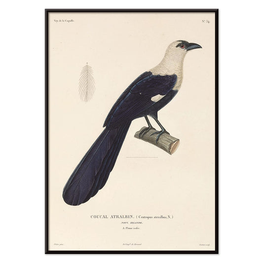
Louis-Isidore Duperrey · 1825 · Elegant bird scientific print with crisp linework and generous white space
Poster from €9 · Framed from €16
Regular price From €6,00Regular price -
Voyage autour du monde 148 Poster
Louis-Isidore Duperrey · 1825 · Natural history bird print with poised profile and delicate hand-tinted detailing
Poster from €9 · Framed from €16
Regular price From €6,00Regular price -
Voyage autour du monde 6 Poster
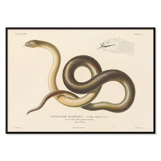
Louis-Isidore Duperrey · 1825 · Detailed scientific print of a coiled snake rendered with fine engraved linework
Poster from €9 · Framed from €16
Regular price From €6,00Regular price -
Voyage autour du monde 5 Poster
Louis-Isidore Duperrey · 1825 · Scientific print of a snake with crisp linework on warm beige background
Poster from €9 · Framed from €16
Regular price From €6,00Regular price -
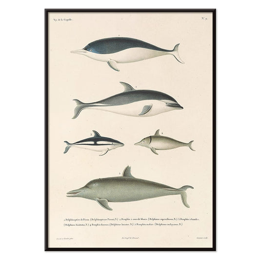
Voyage autour du monde 112 Poster
Louis-Isidore Duperrey · 1825 · Delicate dolphin scientific print arranged as a natural history plate in blue-grey tones
Poster from €9 · Framed from €16
Regular price From €6,00Regular price -
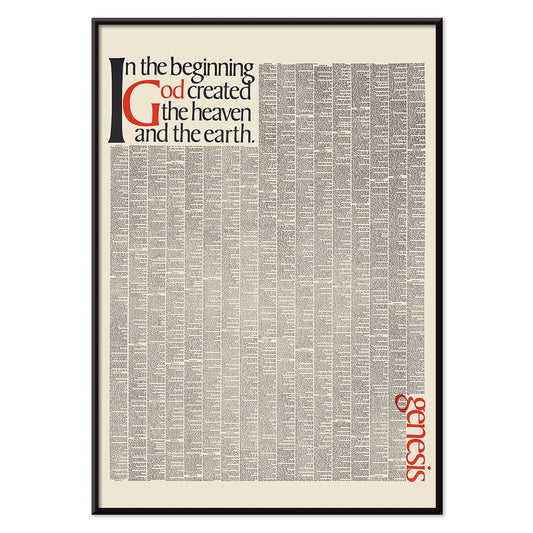
In the beginning God created the heaven Poster
Herb Lubalin · 1965 · Striking typographic poster turning Genesis into bold black and red word sculpture
Poster from €9 · Framed from €16
Regular price From €6,00Regular price -
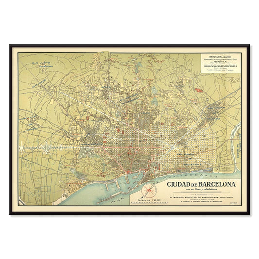
Antique map of Barcelone Poster
Unknown artist · 1858 · Detailed Barcelona city map vintage print with coastal outline and crisp street labels
Poster from €9 · Framed from €16
Regular price From €6,00Regular price -
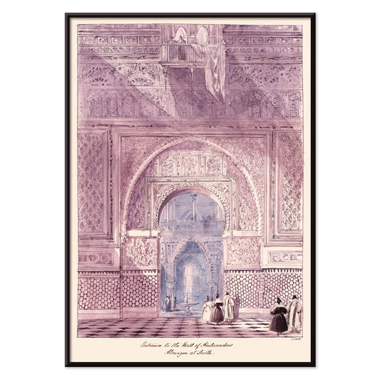
Hall of Ambassadors Poster
Charles Hamilton Smith · 1835 · Detailed architectural art print of the Alcazar hall with rhythmic Moorish arches
Poster from €9 · Framed from €16
Regular price From €6,00Regular price -
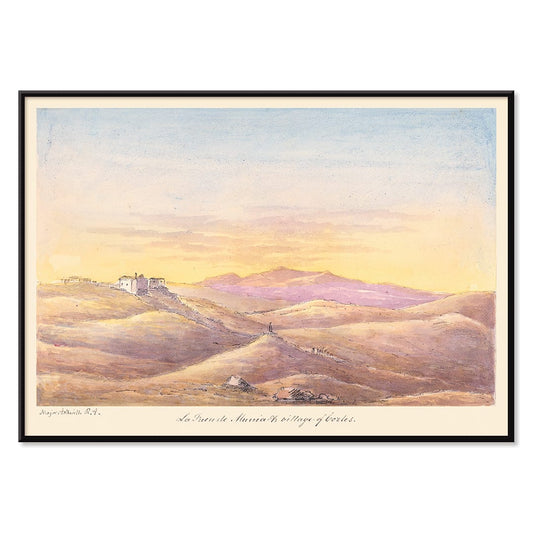
La Fuen de Munia Poster
Charles Hamilton Smith · 1835 · Serene sunset village poster with rolling hills and softly fading Mediterranean sky
Poster from €9 · Framed from €16
Regular price From €6,00Regular price -
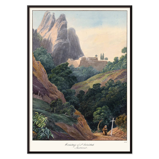
Hermitage of St Trinidad Poster
Charles Hamilton Smith · 1835 · Romantic mountain landscape poster featuring a small hermitage beneath dramatic Montserrat peaks
Poster from €9 · Framed from €16
Regular price From €6,00Regular price -
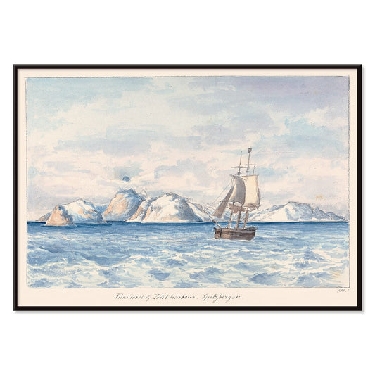
Lout Harbour Poster
Charles Hamilton Smith · 1830 · Quiet Arctic seascape poster with a lone sailboat beneath icy mountain ridges
Poster from €9 · Framed from €16
Regular price From €6,00Regular price -
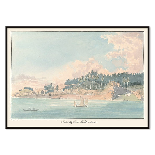
Friendly Cove Poster
Charles Hamilton Smith · 1830 · Serene coastal art print with anchored sailboats, wooded hills, and soft sea light
Poster from €9 · Framed from €16
Regular price From €6,00Regular price -
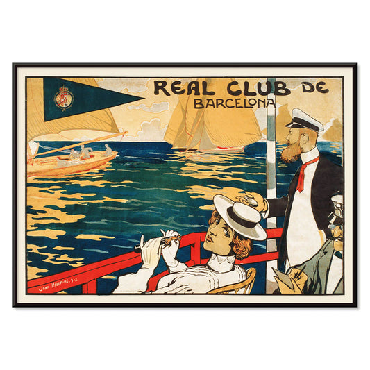
Real Club de Barcelona Poster
Joan Llaverias · 1902 · Refined sailing club poster with rhythmic sails and a breezy Barcelona seaside atmosphere
Poster from €9 · Framed from €16
Regular price From €6,00Regular price -
Cocorico Poster
Théophile Alexandre Steinlen · 1899 · Iconic rooster poster with bold black, red, and yellow in Belle Époque style
Poster from €9 · Framed from €16
Regular price From €6,00Regular price -
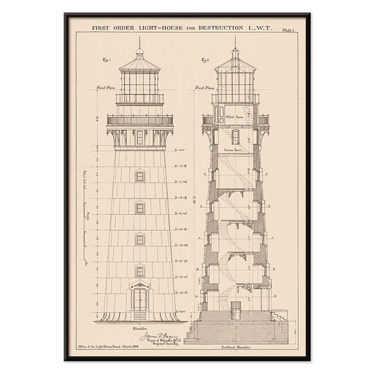
Section and Elevation of a Lighthouse Poster
Unknown artist · 1889 · Precise lighthouse elevation vintage print with sectional details in crisp black linework
Poster from €9 · Framed from €16
Regular price From €6,00Regular price -
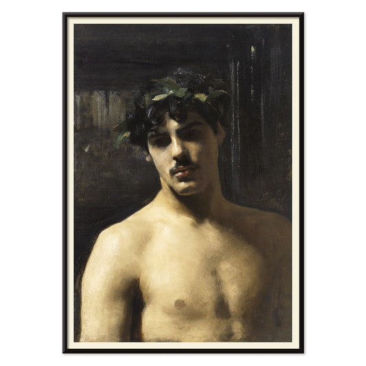
Man Wearing Laurels Poster
Singer Sargent · 1874 · Classical portrait art print of a laurel crowned man in earthy tones
Poster from €9 · Framed from €16
Regular price From €6,00Regular price -
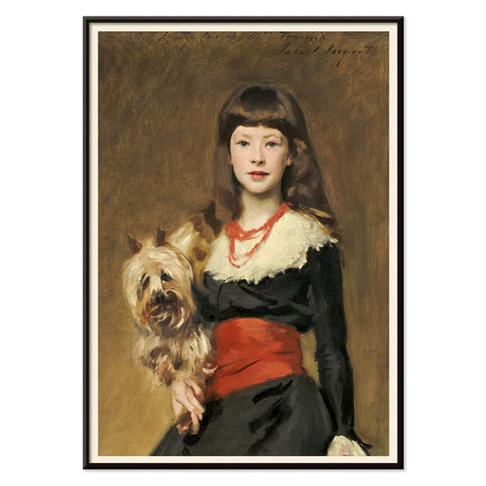
Miss Beatrice Townsend Poster
John Singer Sargent · 1882 · Elegant portrait art print of Beatrice with her dog in warm beige tones
Poster from €9 · Framed from €16
Regular price From €6,00Regular price -
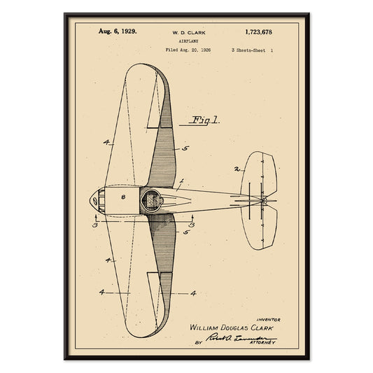
Airplane Patent Poster
W.D Clark · 1926 · Detailed scientific print of an airplane patent drawing with precise annotations on beige
Poster from €9 · Framed from €16
Regular price From €6,00Regular price -
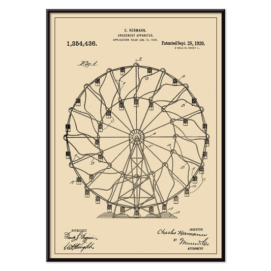
Amusement Apparatus Patent Poster
C. Hermann · 1920 · Crisp Ferris wheel patent poster with annotated engineering linework on warm aged paper
Poster from €9 · Framed from €16
Regular price From €6,00Regular price -
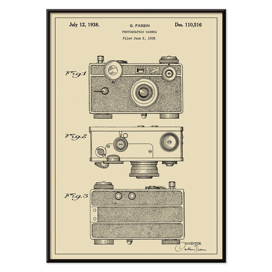
Photographic Camera Patent Poster
G. Fassin · 1938 · Precise camera patent print with numbered diagrams and crisp black linework
Poster from €9 · Framed from €16
Regular price From €6,00Regular price -
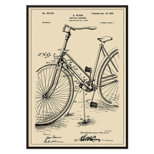
Bicycle-support Patent Poster
B. Peisen · 1899 · Detailed bicycle support vintage print with crisp patent diagrams and neat annotation
Poster from €9 · Framed from €16
Regular price From €6,00Regular price -
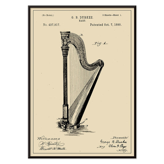
Harp Patent Poster
G.B. Durkee · 1890 · Crisp harp vintage print featuring precise patent diagrams and elegant archival typography
Poster from €9 · Framed from €16
Regular price From €6,00Regular price -
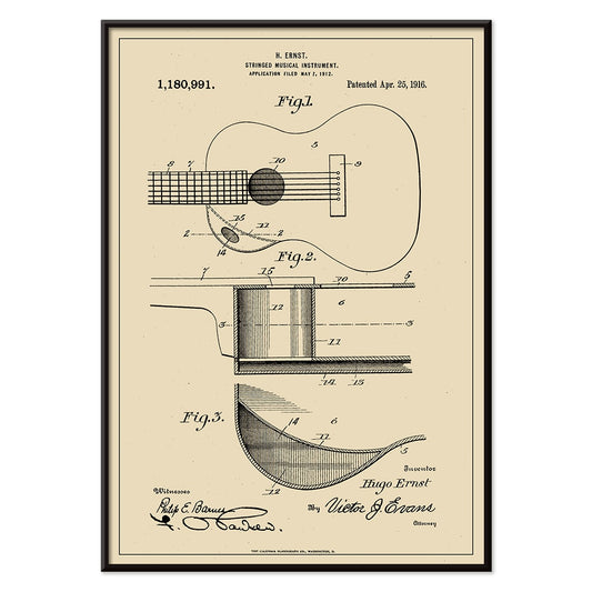
Musical Instrument Patent Poster
H. Ernst · 1916 · Intricate guitar patent print with precise diagrams and numbered callouts on warm beige
Poster from €9 · Framed from €16
Regular price From €6,00Regular price -
Corkscrew Patent Poster
T.M. Strait · 1883 · Detailed corkscrew patent vintage print with multiple technical views and annotations
Poster from €9 · Framed from €16
Regular price From €6,00Regular price -
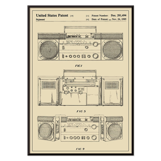
Cassette Player Patent Poster
Sujanani · 1985 · Crisp cassette player patent poster with precise black linework on warm beige background
Poster from €9 · Framed from €16
Regular price From €6,00Regular price -
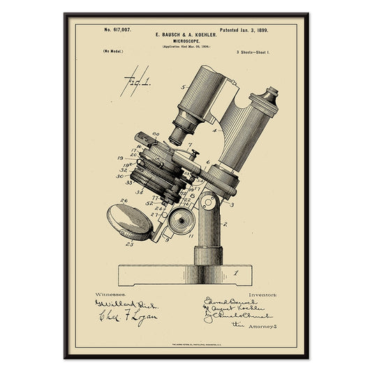
Microscope Patent Poster
E. Bausch · 1899 · Precise microscope patent print with crisp labeled linework on warm beige paper
Poster from €9 · Framed from €16
Regular price From €6,00Regular price -
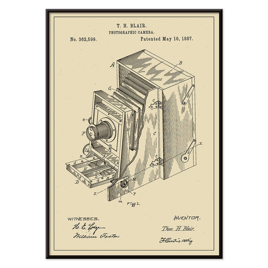
Photographic Camera Patent Poster
T.H Blair · 1887 · Detailed camera patent vintage print with crisp diagrams and numbered components
Poster from €9 · Framed from €16
Regular price From €6,00Regular price -
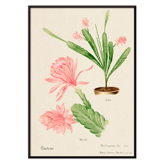
German empress cactus Poster
Unknown artist · 1899 · Delicate pink flowering cactus print with crisp botanical detail on warm beige ground
Poster from €9 · Framed from €16
Regular price From €6,00Regular price -
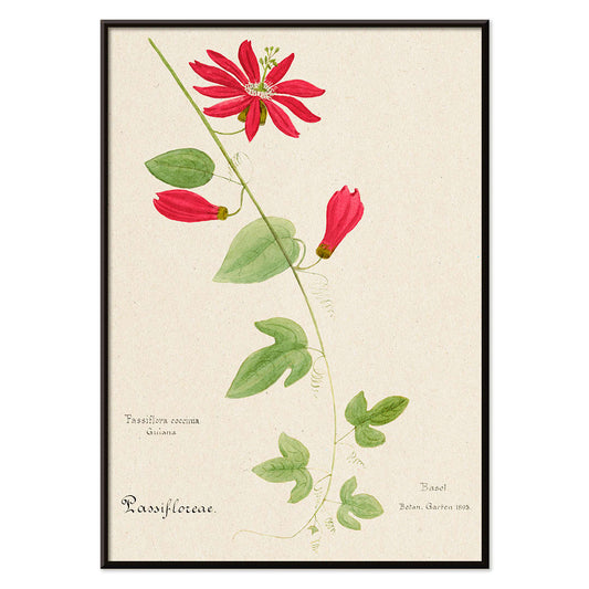
Red Granadilla Poster
Unknown artist · 1899 · Striking passionflower botanical print with scarlet blooms, green leaves, and airy beige background
Poster from €9 · Framed from €16
Regular price From €6,00Regular price -
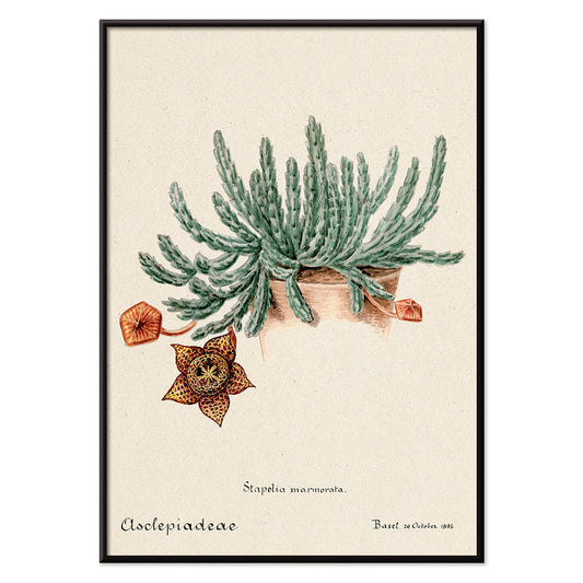
Starfish cactus Poster
Unknown artist · 1899 · Detailed starfish cactus botanical print featuring a dramatic speckled bloom on beige paper
Poster from €9 · Framed from €16
Regular price From €6,00Regular price -
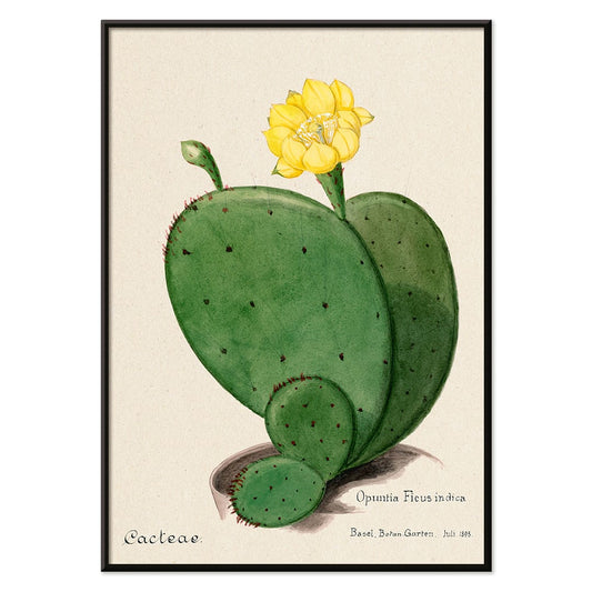
Indian fig opuntia cactus Poster
Unknown artist · 1899 · Detailed opuntia cactus botanical print with segmented green pads and a soft yellow bloom
Poster from €9 · Framed from €16
Regular price From €6,00Regular price -
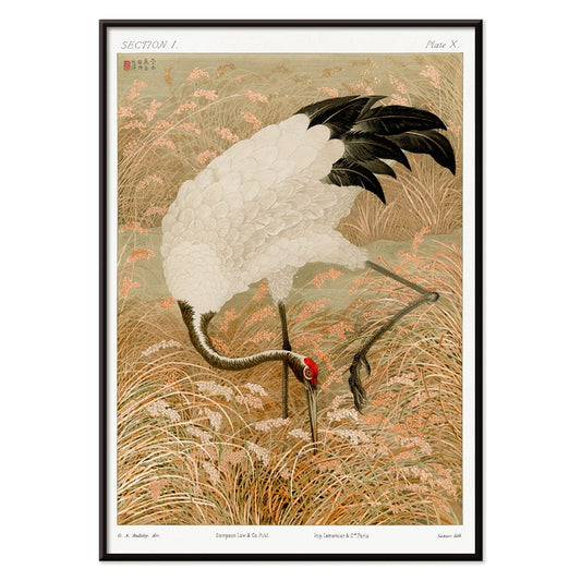
Sarus crane in rice field Poster
Unknown artist · 1884 · Graceful Sarus crane vintage print poised among rice stalks with warm beige calm
Poster from €9 · Framed from €16
Regular price From €6,00Regular price -
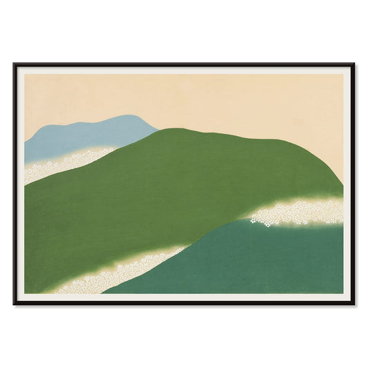
Yoshino Poster
Kamisaka Sekka · 1909 · Serene Japanese landscape poster with abstract green and blue hills on warm beige
Poster from €9 · Framed from €16
Regular price From €6,00Regular price -
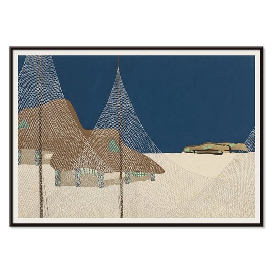
Ryoson Poster
Kamisaka Sekka · 1909 · Serene seascape art print with stylized waves and a quiet coastal silhouette
Poster from €9 · Framed from €16
Regular price From €6,00Regular price -
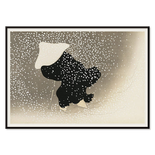
Tomoe no yuki Poster
Kamisaka Sekka · 1909 · Quiet snowfall art print balancing bold black curves with generous beige negative space
Poster from €9 · Framed from €16
Regular price From €6,00Regular price


36/587 items
- Voyage autour du monde 112 Poster
- Antique map of Barcelone Poster
- Real Club de Barcelona Poster
- Cocorico Poster
- Section and Elevation of a Lighthouse Poster
- Airplane Patent Poster
- Photographic Camera Patent Poster
- Bicycle-support Patent Poster
- Musical Instrument Patent Poster
- Corkscrew Patent Poster
- Cassette Player Patent Poster
- Microscope Patent Poster
- Photographic Camera Patent Poster
- Yoshino Poster
- Ryoson Poster
- Tomoe no yuki Poster
A Palette of Calm: Beige as a Design Filter
Beige is less a color than an atmosphere: sun-warmed paper, linen, unglazed clay, the quiet glow of age. This collection gathers poster and art print images whose grounds lean creamy, sandy, or parchment-like. It echoes sketchbooks, catalogues, and ephemera where margins deepen over time. As a backdrop, it softens contrast and lets graphite, watercolor, and saturated inks breathe. Many vintage posters began as lithographs, woodblocks, or studio plates printed on ivory stock; that mellow base brings the hand closer, turning wall art into intimate decoration.
Paper, Pattern, and the Mechanics of Print
A warm ground changes how detail reads. The paper becomes part of the motif, reminding you that a print was handled, posted, folded, or saved. William Morris’s Strawberry Thief (1883) carries Arts and Crafts ideals into dense rhythm, with indigo birds and pomegranate reds tempered by a vintage base; it sits naturally near the William Morris collection for more ornament-led prints. Japanese woodblock traditions also prize warm stock: Kawase Hasui’s Morning at Dotonbori (1935) translates canal light into layered inks, where separate blocks build tonal veils that feel like weather. In a different register, Katsushika Hokusai’s The Great Wave off Kanagawa (c. 1830) gains extra bite when foam and line cut across a creamy sky rather than stark white, a useful bridge toward Oriental wall art.
Room-by-Room: Working with Warm Neutrals
In living rooms, beige prints settle comfortably among oak, walnut, bouclé, and stone, acting as a visual pause between darker furniture and brighter objects. Pair them with paint shades like ecru, olive, and dusty terracotta, then repeat materials already in the space: linen curtains, a rattan lamp, or matte ceramics. If you want a natural cue without going fully colorful, introduce one restrained botanical plate from Botanical. In corridors and kitchens, a line-led image keeps home decor deliberate; Maps adds soft geography, while Minimalist and Black & White supply structure that still respects a gentle, vintage paper tone.
Curating the Mix: Contrast, Typography, and Frames
Beige does not require quiet composition. Ikko Tanaka’s Kabuki (1974) treats black calligraphy like architecture, and it pairs well with geometry from Abstract or the disciplined systems of Bauhaus. For a sharper jolt, Leonetto Cappiello’s Cachou Lajaunie (1920) introduces a theatrical silhouette and a citrus note that still sits politely on warm stock, echoing the streetwise energy of Advertising. To keep a gallery wall coherent, choose consistent margins and let frames do the joining: oak or walnut for a tonal stack, or brushed brass for a crisp edge; options live in Frames.
Why Beige Reads as Contemporary
Against glossy screens and bright whites, beige wall art restores tempo: fibers, plate marks, and faint aging become part of what you look at. The result is coherence without sameness, where pattern can sit beside seascape or typography beside ornament, held together by a shared warmth that suits both vintage decoration and modern restraint.